How to improve copywriting in your interface
If UX is about communication with the users, words are the soul to express how we communicate with others.

As a Product Designer, I have to juggle many roles and often times, I have been somewhat busy with creating wireframes, mockups and conducting usability tests that I forsake the importance on UX Copywriting.
If you are like me, this article might help you refocus your attention on UX Copywriting and give you some helpful tips on principles for writing.
Why Copywriting is important?
1. It provides the most context to your experience: In the example below, it illustrates 2 screens from the Bank of America application. They are no different than one another except the second image has its text blurred out. Visually, without text, the contextual meaning is lost. This illustrated that you can have images, buttons, cards or plenty of visual elements in your application, but without any text, application will cease to function.

2. It is cost-friendly to iterate or fix UX problems: Sometimes, a small text change can improve the experience. It takes up less resources (mockup designs and development effort) with text changes rather than complete redesign that involves more.
3. Text supports more devices: Think Zero UI or voice recognition software like Siri, Amazon Echo, or Google home. These products have no screens, but they still interact with users through words. Compared to mobile or web applications, you can’t use visual elements in those Zero UI, elevating the importance of using words as the primary communicator between the user and the device.
Principles for Writing
Here are some generate rules on how you should craft your text in any of the application you design.
Distill sentences into the simplest form possible.
Strive to lighten the cognitive load for users, and it does not always mean to remove words, it also means to simplify words or to makes things more precise.
Simple doesn’t mean less, a better definition would be “just enough”.
Here are pointers that you should think about when trying to be concise vs precise.
Precision vs Concision.
Being Concise is marked by brevity of statement, free from superfluous detail.
Being is Precise is sharply defined and accurate.
First, be clear on what you are writing for. What is the objective of writing the message?
- Is it a message to guide users?
- Is it a message to entice the user into exploring the feature?
- Is it a business requirement to educate users?
- Are you making something complicated simpler?
- Is it a call to action? If so, be clear about what action a user is taking.
When you are done with your draft, look through the text again.
- Are there any messages that are repetitive?
- Are there any inappropriate details?
- Are there any messaging that could be misleading to the users? (Go through the user journey to make sure that isn’t a break in the journey)
- Is a similar message used elsewhere throughout the application? Should you keep the messaging different or consistent?
- Is it a set of instructions? (Break them down further into individual steps)
Finally, do usability tests with users to make sure that users can complete a task on your application. This is one of the most efficient ways to sieve out misleading messages.
Example of Clarity
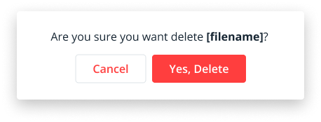
An example of being precise is illustrated below. It shows a confirmation dialog box to delete a file.
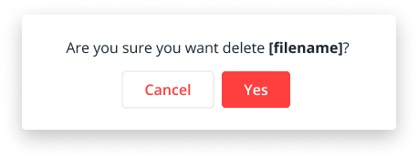
Having the text “Yes” or “Yes, I’m sure” might be clear to answering the question “Are you sure you want to delete [filename]? However, it is a clash of negative action vs positive undertone, to be precise, we added the word “Yes, Delete” to remove any possible misleading actions from the user. Since “cancel” could also mean “Cancel this file” to some users.
Use simple words
In one of my projects, I have had a feature to “Kill” a running job. Many discussions with stakeholders emerged as we debated about finding the right label to appropriate the word “Kill” as it has a negative connotation. We looked through the thesaurus and had “Terminate” and “Abort” as alternatives but both of them were not ideal as they had the same negative undertone. If we had thought about using simple words instead, the thesaurus would not be necessary, a simple use of the word “Stop” would suffice. Other examples are, instead of “Enable”, use “Let” and instead of “Deactivate” use “Remove”.
Simple vocabulary also makes it easier to translate to other languages should your application needs to be localised to other markets.
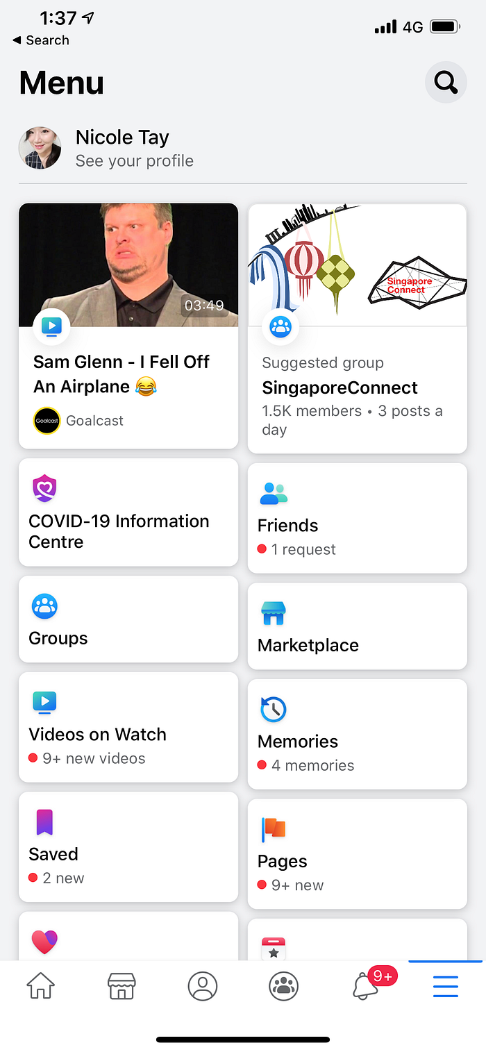
A good example would be Facebook, the application use simple vocabulary like “Groups”, “Marketplace” or “Videos on watch” to describe each of their product offerings.
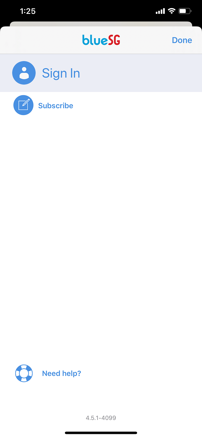
An example above shows the BlueSG application. It uses the word “Subscribe” in replacement of “Sign Up”. However, the word “Subscribe” have different meanings in different applications.
Subscribe could mean:
1. I can use paid features/content of an application after paying for the subscription.
2. I get notified of new content if I am subscribed.
So in the blueSG‘s case, I am also inclined to think that I am subscribing to their company promotion/newsletter and not subscribing to the BlueSG service. To make users even confused, the iconography does not represent the call to action well enough either. I think it would be clearer to use the most common vocabulary “Sign Up”.
Understand when to use jargons
Use jargons only if it is widely accepted in the industry. For example
- instead of “Buffering” use “Preparing video”
- instead of “This command is only supported on dual-core devices” use “This command isn’t supported on your phone”.
When you are unsure if a word steps into the Jargon territory, check with your users with research or usability testing. When speaking with your target users, take note of the vocabulary used by them.
You can also learn what type of vocabulary your users use by reading feedback forms, reviews, emails or other communication channels with your users. In some cases, investigating Google Trends & keyword can guide you in finding universal terms.
Demarcate sections, highlight keywords
It is often said that “People don’t read, they skim through the pages”. In Nielsen Norman Group’s Research, they found out that that 79 percent of our test users always scanned any new page they came across; only 16 percent read word-by-word.
As a result, having headers and sub-headers as a demarkation for your text allows users to quickly scan through and narrow down the areas where they are interested in.
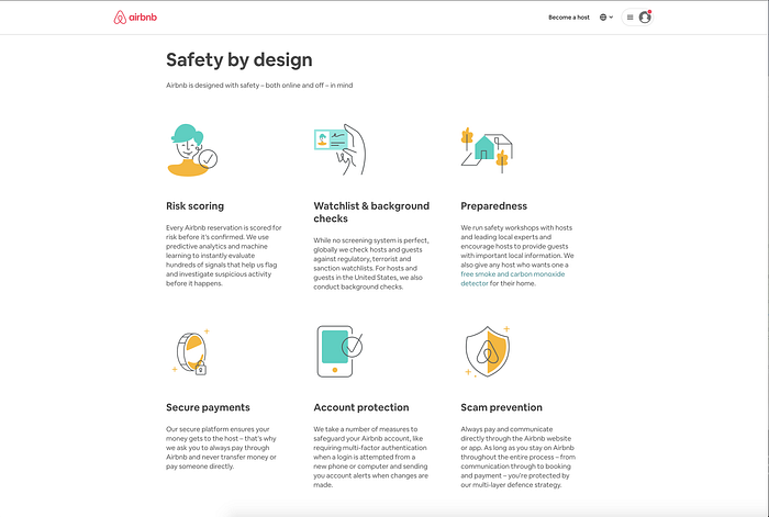
Airbnb does it well by having one idea per paragraph for users to pin down where they are interested in.
Nielsen Norman Group also found out that web usability improved by doing the following:
- highlighted keywords (hypertext links serve as one form of highlighting; typeface variations and color are others)
- meaningful sub-headings (not “clever” ones)
- bulleted lists
- one idea per paragraph (users will skip over any additional ideas if they are not caught by the first few words in the paragraph)
- the inverted pyramid style, starting with the conclusion
- half the word count (or less) than conventional writing
Consistency within the application
Take note of the language across the application. Are the labels in your application consistent? Do buttons with the same function have different names? For example, “OK”, “Done”, “Send”, “Next”? Are some labels more precise than others, like “Send Message” vs “Send”.
If your application happen to be very large, do a content audit of all the screens in your application. It will be very easy to catch these little inconsistencies if you do so.
The main things to look out for:
- Capitalisation
- Precision
- Tone
- Spelling: American vs British
- Punctuation
- Unit of Measure: Date & Time, Numbers, Currency, Decimal point, etc.
- Abbreviations
- Contractions
- Verb Tenses
- Passive vs Active
Many companies like Apple and Microsoft have a unified term library which could be useful when planning for your content as well. It guides the writer to which terms are appropriate, minimising multiple terms with similar meanings used in different locations of the product. For example, should the writer “malicious code” or “malware” (Hint: Answer here)?
Writing for Human
Remember that humans are ultimately the people that interact with your application and being too toneless will drift your application off with your users. Be emphatic if your users are going to encounter an error in your interface, what are they feeling in this situation? Craft a message that shows your empathy or delight them in times of frustration.
An example of Mailchimp’s Writing Principles is:
Friendly. Write like a human. Don’t be afraid to break a few rules if it makes your writing more relatable. All of our content, from splashy homepage copy to system alerts, should be warm and human.
You don’t have to be informal or dig deep into cultural references to write for humans, have a tone for your writing and stick with it. Below shows the Adobe Tone Guide that you may adopt to make your interface more human.
Motivational: Positive and encouraging
We’re looking out for you and cheering you on. You’ve got this!Helpful: Polite and respectful
We know you’re busy, so we’ll make this brief.Reassuring: Professional and reliable
We know you’re worried about this issue, and we’re here to help.Supportive: Concerned and empathetic
Something bad has happened and we understand how you feel. We want to inform, guide, and support you through this.
Consider writing for a broader range of devices.
Describe the Action, not the Behaviour. If you are designing a interface, consider using device agnostic verbs like:
- Choose
- Select
- View
Instead of
- Click
- Tap
- Press
- See
There are exceptions to this rule, for example “Double tap” or “Swipe up”, but generally when you use those text, you are designing for a very specific device.
These are some tips that I have gathered from UX Copywriting. UX Copywriting also has UX in its name, and the ethos is to continue improving its clarity through user testing and research. In my next article, I will give more in-depth information about the processes to verify content with users and setting up a tone for your product.
In the meantime, please feel free to give any feedback in the comments below! My first medium article and I am excited about what my readers think!

