Designing towards live parking map — a UX case study
I am Product Designer at SpotAngels, a parking app to help people find parking. Here is the design case study of our live parking map.
Background Context
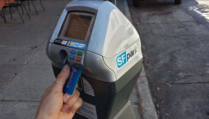
Parking is a huge problem in major cities.
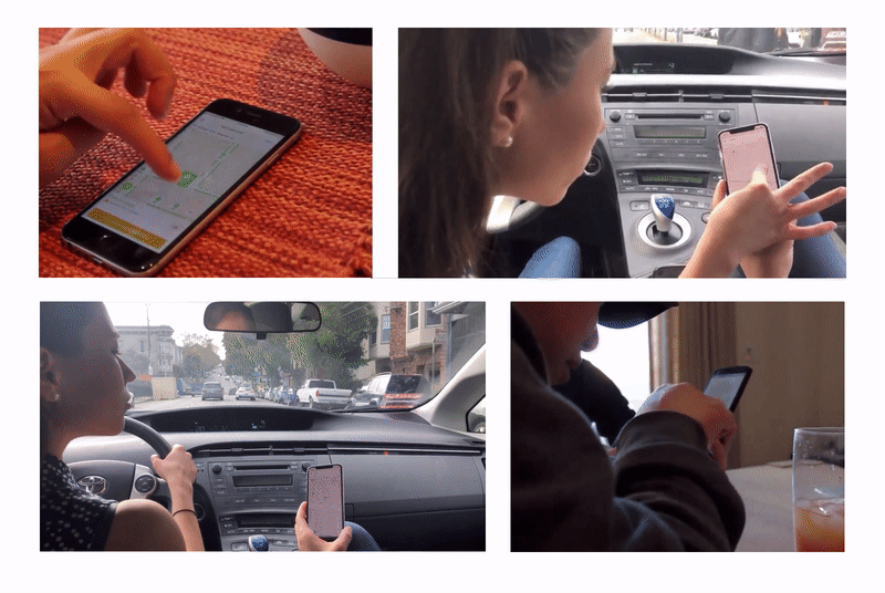
Drivers spend an average of 17 hours a year searching for parking spots. The hunt adds up to an estimated $345 per driver in wasted time, fuel, and emissions.
SpotAngels is a community-based app that helps drivers find parking thanks to a live crowdsourced parking map.
The app works by displaying a map with the location of all street parking spots, parking lots and garages. It helps drivers find free and cheap parking, comply with the rules and avoid tickets.
In 2018, the app was featured by Apple and Google as “Waze for Parking” among the best apps.

How to design a parking map?
Overview: Design a parking map to display parking information users need. Users have to be able to find free and cheap parking, filter the map by preference and locate their car.
My Role: Wireframing, User Experience Design, Interaction Design
Tools: Figma, Principle, Mapbox Studio

Before I joined the company, a pin was displayed in the center of the screen. You had to move the pin and press a park button to get the parking rules. At that time, we had the parking information in New York and San Francisco and we needed to display them on a map to help users in their parking hunt.

Proof of concept
When you design a map, it’s important to interact with a prototype as soon as possible: playing with something tangible, more advanced than static artboard screens, is always better. You should be able to zoom, scroll, tap icons to have a feel on how the product works.
My goal was to design an initial map as fast as possible in order to test it with users, spot weaknesses early and iterate. For that, I used Mapbox Studio.

Using iconography, colors, typography, and shapes, below is what the first version of our Map looked like.

Gathering feedback
We used this prototype to see how people would interact with it. We tested it with two scenarios:
- You’re at home scouting for parking around a destination
- You’re driving looking for the best parking spot
We ran user research sessions with both existing and new users to try to answer one question: What could be the perfect parking map?
1) Use the map to find the right spot
User story:
“I parked my car in a super expensive area: $7.25 per hour. While walking to my destination, I found out that I could have parked my car for free and save money!”
Use cases:
- I want to find free parking
- I want to find the cheapest meter
- I want to find the best garage
Assumptions
We could display different types of spots in various colors to help people identify quickly their best parking option.
Challenges
How to display parking spots? — Which icons and colors should we use? — What should the interaction with the map be? — What is the right zoom level? — How to provide the right information at the right moment?
Proof of concept
In order to design a parking map, we naturally listed all the possible combinations of parking rules to have an idea of the information to display.
This list helped us design our prototype and run user tests to identify problems before designing the best solution.

Problems & Solutions
a) A traffic Map
“It looks like a traffic map or an occupancy map.”
Context: In our prototype, we used green to represent a free of charge spot, orange a time limit spot, red a no parking spot, and blue a meter.
Problem: When some users saw the map for the first time, they instantly thought that the map was representing traffic in the city but not parking. While others guessed that the map was about parking, they mistook the definition of the different colors and assumed that it was representing the current occupancy of the spot: Green for “open”, orange for “might be open” and red for “occupied”.
Solution: We decided to never use green-orange-red together and came up with this alternative: color is for a price.
We use green when free of charge and blue when the driver has to pay for parking. We never use red, it drags too much attention. We use grey dots to indicate there are no parking spots.
Without green-orange-red colors, it didn’t look like a traffic map anymore.

b) Free spots
“Spots marked as Free on the map are open spots”
Context: When a parking spot is free of charge, we display it on the map in green with a label “Free” under the icon.
Problem: Some users thought that a free spot meant an open spot, not a free of charge spot.
Solution: We decided to never display “Free” for a spot. Instead, we displayed the max legal parking duration (e.g 2 days and 16h).

c) Make the street tapable
“Oh! I can tap on the street? I didn’t know that!”
Context: To represent parking spots, we displayed streets with icons on the map. Users can tap on a street or an icon to read the parking rules applied (e.g street cleaning hours, no parking hours, permit restriction, etc.).
Problem: Users tapped on the icons but not necessarily on the streets.
Because of the density of the map, we couldn’t always display an icon on each street.
Solution: We reduced the icon size to make sure that each street had its own icon.

d) No data
“When I open the app in my neighborhood, the map is empty”
Context: SpotAngels is 100% crowdsourced. Right now, we cover more than 25 cities but some users find out about us in areas where we don’t have coverage yet. So they just land on an empty map with no parking rules.
Problem: Users were confused, they landed on a parking map and could not see any parking rules. They were thinking that the app didn’t work.
Solution: We added a border and a city icon to the zones where we had coverage to help users differentiate covered versus non-covered areas.

e) Zoom in/zoom out
“The map is illegible when I zoom-out”
Context: On a map, users could pinch to play with the different zoom levels and get an overview of the parking situation on a specific street, a few blocks or a neighborhood.
Problem: When users zoomed-out, the map felt overwhelming and users could not see any parking rules.
Solution: Good design is always about context. So, we came up with a logic to display just what the user needs on each zoom level.

2) Make the map mine
User story
“I circled around blocs for a very long time and arrived twenty minutes late to an appointment. If I could have had an idea of the parking situation beforehand, I would never have taken my car.”
Use cases
- It’s 4 pm and I want to go to a restaurant at 7 pm. I want to check the parking situation beforehand.
- I am living in a residential neighborhood and I park my car on-street. I want to park my car for the longest duration with no street cleaning.
- I have $5 for parking and I don’t want to pay more.
- I don’t need on-street parking information, I just want to park in a garage.
Assumption
We could add filters in the app. Users would be able to know the parking situation at a specific time and for a specific duration.
Challenges
How do we get users to filter the map? — How does a user change filters? — How does a user understand that a filter is set and her map filtered?
Proof of concept
A lot of apps use filters. When you are looking for a restaurant on Google Maps, a shopping center on Apple Maps, a coffee shop on Foursquare or a home service on Yelp, you always have access to filters.

We used design patterns from the most famous apps and readapted them to our own use cases. We made a lot of explorations on which filters worked the best for us and adopted a combination of what others do.
We designed prototypes and ran user tests to find the best solution.

Problem/Solutions
a) Find the filter menu
Oh I didn’t see the filter menu!
Context: Filter menu is an important feature. Users should be able to access it easily from the map.
Problem: The filter button was sitting in the top right corner and a lot of users missed it.
Solution: We displayed all filters in bubbles below the search bar to make the feature more discoverable.

b) Filter the map
I didn’t know that the map was filtered
Context: When filters are saved, we have to display a filtered map to users.
Problem: When some users saved filters, they felt like nothing changed because the map remained the same.
Solution: We displayed filtered parking rules in grey to make it easier to understand which spot was filtered and which one was not.

c) Filters activated
I never know if my filters are set or not.
Context: It’s important to understand that when you change your filters, default filters are gone.
Problem: Some user could not remember if filters were set or on default.
Solution: When a user applied filters, their corresponding button is styled in blue.


3) Locate my car and avoid parking tickets
User story
“I parked my car in a city I was visiting and I could not remember where. I had to map by hand the streets I had visited, explore them one by one to finally find my car, 6 hours later…”

Use cases
- I want to find my car
- I want to know how long I can stay on a spot
- I want to avoid parking tickets
Assumption
People often forget their car location. We could let them park their car in the app and always display their car location. If we know their car location, we can provide parking duration and alert them when it’s time to move their car.
Challenges
How do we display users’ car on the map? — How do we remember a user’s car location? — How do we provide new services based on the car location?
Proof of concept
The very first version of SpotAngels already displayed the user’s car on the map. We improved this feature by designing prototypes and running user testing to find the best solution.

Problem and solution
a) How long I can park?
I want to know how long I can stay on this spot
Context: Users don’t want to read a complex sign. We want to tell them how long the can stay on a specific spot.
Problem: We were only displaying parking rules (eg. street cleaning 10:00 AM), but users had to calculate themselves how long they could stay.
Solution: We updated our wording to let them know exactly how long they could park, and displayed a countdown.

b) How do I go back to my car?
I want to find my car.
Context: Sometimes users have to park far away from their destination.
Problem: They might have forgotten the exact location or are unsure of which direction they can take to get back to their car.
Solution: On tap on the car’s location, indicated by a little car sign on the map, we displayed a “Get direction” button that would trigger the best itinerary.

c) When should I leave?
I want to be notified when it’s time to move my car
Context: With parking rules and car location, we can alert users when the parking duration will expire.
Problem: We sent notifications 30 minutes before the expired duration, but it was sometimes too late.
Solution: We let users personalize their notifications. The could be alerted the day after, one hour before, or even add alerts to their calendar.

d) Getting notifications
I don’t receive your notifications!
Context: We have to make 100% sure they receive an alert when it’s time to move their car.
Problem: Sometimes users notifications were turned off. They could not receive a parking alert and therefore would get a parking ticket.
Solution: We also sent an email to alert users when it was time to move their car.


Conclusion
The map is the center of the SpotAngels’ experience. It was essential to design a map that can provide all parking information in a clear, live and accurate way.
Even if the map is still in progress because we always iterate on it, we designed strong foundations and built the first step of a live parking map.
Our mission is to help people find parking. We have to guide them through the city but also through the parking rules. Our map’s job is to provide the best parking information and make it accessible to everyone.
Featured by Apple and Google
One of our best reward this year was to be featured three times by Apple and one time by Google. We were very proud of it, but we all think that it is only the beginning of the journey.


The team
This entire work was advised by Jonah Jones, our design mentor at SpotAngels. We co-design this map with him, helped by his experience in maps design and his valuable feedback.
I am also a part of an amazing team who works very hard to build the product they love. I would like to thank all of them for putting all those efforts in this project. Big thanks to all the SpotAngels team.
Questions?
Please ask any question you have 🙏

