How to incorporate content design into your design system
Looking to create a truly amazing and useful design system? Read on.

For people new to design systems, we have to start with a mention of Atomic Design. Brad Frost evangelized the concept of reusable design components that fit together in a system.
I know it’s hard to believe, but back in the stone age designers created all designs from scratch. Every product iteration was undertaken as a new creative effort because, you know, design.

But then developers, and hybrid designer-developers, hit the scene. They taught us that we don’t need to recreate the wheel every single time we design a new application. Instead, we could reuse the wheel—and just customize the treads.
Design systems became the norm. Much better!
Except for one big, glaring issue: no one was in charge of the words.
That’s where content designers, user experience (UX) writers, and UX content strategists came into the picture. We’re the people passionate about the shape and the sound of the writing in those systems.
Designers know that beautiful designs can fall apart if the content (the writing) is poor. As a content designer, I can tell you that beautiful writing can also fall apart if the visual design is poor.
Thankfully, design systems are finally evolving to include built-in content and writing guidance. We’re better at everything design-wise. And we’ve stopped a lot of the crazy phases that we all went through as designers.
It was only a few years ago that I worked with a designer who told me almost all UI text was ugly and unnecessary. And only a few years before that when mobile apps were gettin’ wild and crazy with the UI copy, throwing around the extreme sass, like “Error? I barely knew her! Call us for support.”
We’ve now reached consensus on some great approaches that work every time.
For example, we know that all apps should have voice characteristics like:
- Human
- Friendly
- Guiding
- Simple
We’ve gotten a lot smarter at building software products.
We know now that UI text, interactions, and visual design are inseparable. They’re parts of a single experience. It makes sense that we’d want to treat them that way when we build our design systems.
By integrating content design into your design system:
- Your designers will work faster with more confidence.
- Your developers and product managers won’t have to pinch hit on copy without any guidance.
- Your users will enjoy a higher level of consistency and clarity.
- Your user experience will improve.
Let’s check out how you can phase in content guidelines and patterns until you have a 100% combined content and design system.
Phase 1: Create design system examples along with your UX writers
At Google, a crew of us UX writing leads made some progress with Material guidelines by making sure that any examples shown were not hacky, poorly-written placeholder text or worse, Lorem Ipsum.
This was critical because designers across the company were—naturally— modeling their content after the text examples shown in the design system. They weren’t making a separate trip to the writing style guide to see what words, punctuation, or content pattern they should use. They assumed that the content examples they saw in the design system were illustrating the company’s content best practices and guidelines. They weren’t.
I felt really bad for the designers who didn’t know the content in the design system was just unofficial placeholder copy. And worse, some of these poorly written styles had spread to Google apps in production.
If you’re a UX writer hear this: abandon the idea of anyone using a stand-alone writing or content style guide.
We could promote it all day, but a style guide with fussy instructions on punctuation and grammar won’t help designers who rely on the design system guidelines for direction. Put the guidance where it matters, just like we do for all our users.
So, for the Material guidelines, we worked hard to make sure the text shown in the design system examples was reviewed and approved by UX writers. Woot! It was a huge achievement. Designers could learn from examples without digging around for offline content style guides. That got us through Phase 1.
Phase 2: Develop content patterns
In today’s world, content designers and UX writers are moving far beyond documenting grammar and punctuation in style guides. We’ve moved into creating reusable content patterns that align with component designs.
Let’s take a minute here to define a content pattern.
A content pattern, like a design pattern, is a conceptual shell with a predefined shape. We fill that shape with whatever is needed for the user at that moment in our task flows.
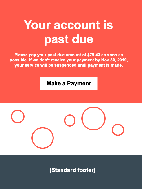
A content pattern is reusable and repeatable, just like a design pattern. (You could also call this email example a template, but that term only makes sense when we talk about document design.) We can think about how content patterns work by looking at a a simple content design for an email.
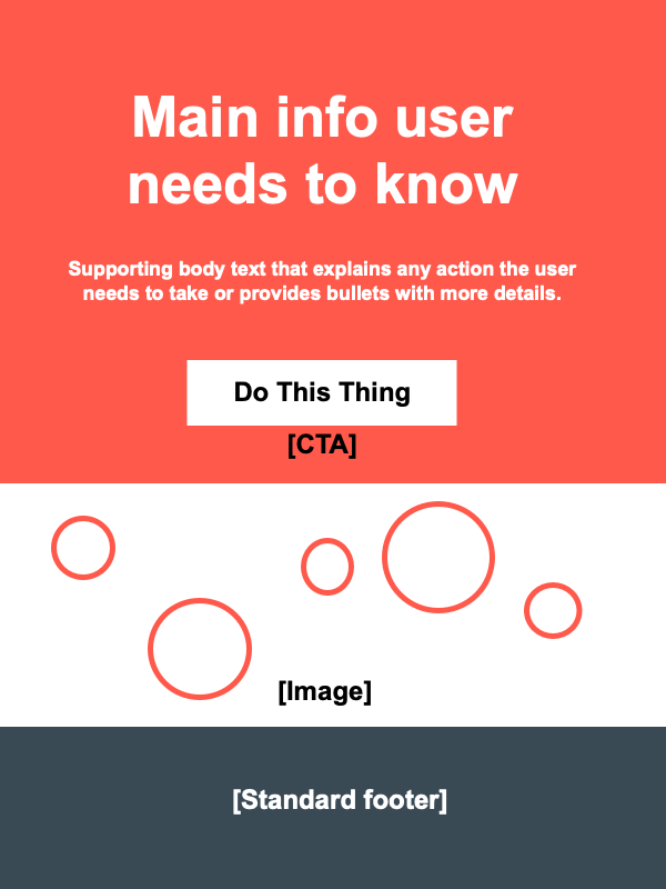
We can use and re-use this pattern (or template) in many ways to guide our communications.

Let’s look at a more complex example.
A drop-down mega-menu is a common design pattern. In any design system, it’s defined by interaction behaviors and visual design specs. Less often, that menu is also defined by a specific content pattern.
Let’s break this down with an example from HubSpot.

In this example of a complex drop-down navigation menu, Hubspot’s designers and writers have done a great job following a consistent content pattern.
Each component in this menu follows interaction and visual design patterns for:
- Font family and type sizes
- Line-item heights and list item widths
- Section layout rules and visual design specs
- Container and item link behaviors
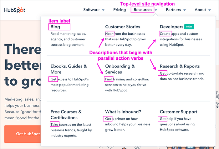
This example also follows a clear content pattern:
- Top-level navigation consists of single-word nouns that describe a major site area or hub
- Item-level heading labels are nouns that occupy a maximum of two lines
- Ampersands are used in headings for visual brevity
- Body text starts with an action verb, provides a useful description, and does not exceed 3 lines of text
- Body text spells out the word “and” for readability (no ampersands here)
Because the content pattern is consistent, the design is useful, predictable, and visually pleasing.
What happens when you don’t have this kind of consistency at the content level? Crazy stuff. Trust me. And none of it is good for users. Establish content patterns for all common interaction components in the system and stick to them.
That gets us through Phase 2. Let’s move on!
Phase 3: Align content patterns with your component patterns
Once your team has created content patterns for your common UI components (and more) you’ve reached nirvana. You can then show content guidance for UI text at the component level.
Following the design system, your designers can now pop in the content that works as they build out their customer-facing designs. Take a look at this example in the Material guidelines for dialogs.
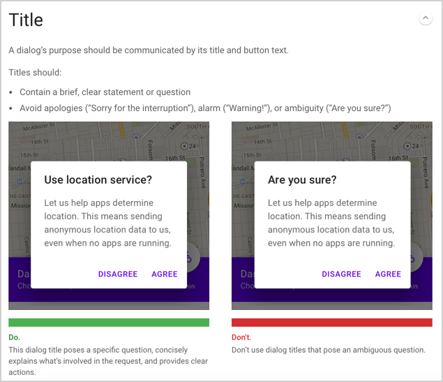
It lays down the rules for writing dialog titles and actions: A dialog’s purpose should be communicated by its title and button text.
Further down the page (not shown) it explains that the confirming action should always appear on the right and the cancel action on the left.
By explicitly detailing the requirements for the UI text, you’re also ensuring that designers or product managers don’t go rogue with bizarre off-brand approaches or even dark patterns.
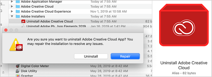
In the example above, Adobe doesn’t say why it’s better to “Repair” or why I might want to avoid uninstalling. There’s not enough info for me to make an informed decision. I might be so intimidated by the question: “Are you sure…?” that I decide to avoid uninstalling out of fear.
When looking at the button order, someone also decided it would be better if users “Repaired” versus “Uninstalled.” But that’s ignoring my needs as a user. It’s kind of dark. (Yes, I did actually click the wrong button and had to start the action over.)
I want to imagine that this isn’t how Adobe intends its designs to work. With explicit content design guidance in place, this (hopefully) wouldn’t happen.
So… how to get those component-level content guidelines in place.
Here’s a boost to get you started on content patterns
When it’s time to figure out how to write UI text for common components, you can start from this UX Writing Component Checklist.
The checklist spells out how the content should work for some of the major types of design components including:
- Instructional text & tooltips
- Onboarding
- Confirmation dialogs
- Error messages
- Dashboards
- Forms
- Notifications
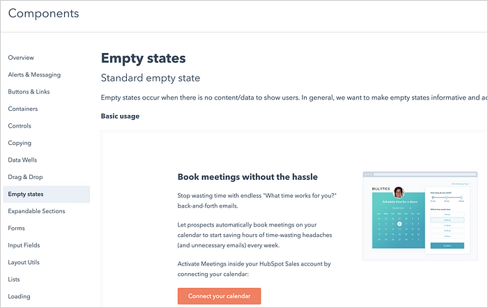
- Empty states
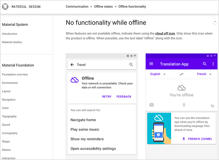
The number of design systems that include built-in content guidance is growing every day. Don’t miss examples from Google’s Material Design Guidelines:
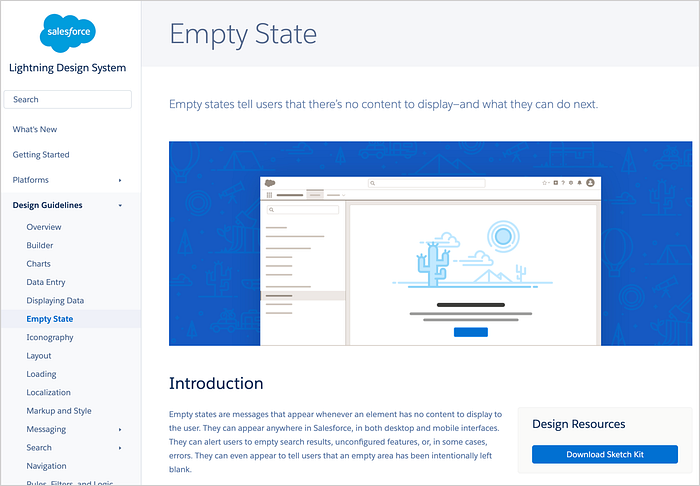
From the Salesforce Lightning Design System:
You might still need a line-item link somewhere that covers the nitty-gritty details of punctuation, terminology, or brand name usage. That’s OK.
But with content integrated into your design system:
- Designs are faster and easier to create
- Users are happier
- Teams are more united
I hope this helped to explain how to incorporate content guidance into your design system. Phasing the project makes it much easier to get done.
Thanks for reading!

