How to keep your design in check
Why using a simple tool to take care of the fundamentals will give you more freedom to be creative.

“It is common to misconceive how checklists function in complex lines of work. They are not comprehensive how-to guides, whether for building a skyscraper or getting a plane out of trouble. They are quick and simple tools aimed to buttress the skills of expert professionals.”
The Checklist Manifesto
 In Atul Gawande’s novel quoted above is a story about a checklist and the U.S. Army Air Corps. It was 1935, and their mission was to build the next-generation long-range bomber. Boeing Corporation answered the call with a “flying fortress”, praised for its style and scale. But when the time came for a test flight… the aircraft stalled, crashed, and two people died.
With no malfunctions or mechanical failures, the crash was marked as pilot error. This lined up with the fact that the aircraft was substantially more complex to operate and keep airborne than existing models. Even the best pilot available would require some assistance in order to minimise risk.
In response to the crash, the Army Air Corps created a checklist. It was a step-by-step breakdown for takeoff, flight, landing and taxiing, so no pilot would miss an essential step. With a checklist in effect, pilots went on and flew the flying fortress for 1.8 million miles, with zero accidents.

So, how does this apply to product design? While it’s no life-or-death-in-a-cockpit-30,000-feet-in-the-air scenario, designing a single application can still be a complex process. There could be hundreds of permutations in your interface to account for, not to mention dozens of different states, interactions and assets. And these all need to align with a business’ goals and objectives.
Whenever a project gets complex, you feel the information overload take over. Personally, I’ve fallen into this trap many times. You get so far into a project, that what you think is the simplest thing to do takes longer than expected, is riddled with mistakes, and you’re not even happy with.
I discovered a simple way to tackle this problem: checklists. But to understand how powerful they can be, let’s take a look at what a design process can look like without one.
Designing without checklists
It was 2018, and I was designing an online home loan application, usable on any device size. There were 100+ form fields, dozens of questions asking for one’s personal and financial situations in excruciating detail, and it had to be smart and smooth. Lots of brainstorming, mapping and exploration was needed for such a complex experience.
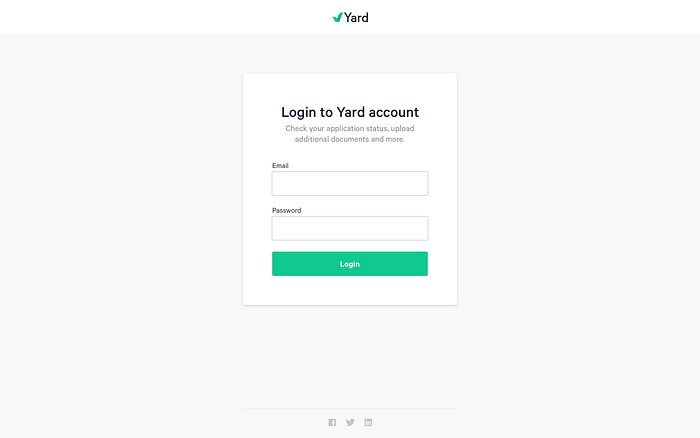
A few weeks into the project, the time came to put together a login page. I’ve made a login page countless times before — surely I can put something together real quick off the top of my head and it’ll be fine, right? I pieced something together, looked over it once, and moved on.
Why was I so eager to move on? There were bigger, more exciting challenges waiting. I had a complex, interesting product problem to solve in the home loan application. Form fields, navigation, charts — much more interesting than the everyday login page that I could do with my eyes closed.
Or so I thought. To my embarrassment, I had to revisit the login page multiple times. I forgot important links. I didn’t think of hover or error states. I didn’t even consider what it would look like on mobile.
Why I needed a checklist
Does forgetting those things make me a bad designer? I don’t think so. My head was full of ideas at the time, brainstorming other areas of the user experience. I saw the full home loan application as the prized piece, the experience that would make or break the overall success of the business.
But I still forgot the essentials of a login page. This is the real issue, because a poorly designed page will negatively affect the “prized piece” of the experience it surrounds.
Plus, a user expects whatever screen they are on at the time to provide the best experience it possibly can. In the moment of logging in, that page should include every element it needs to function. Then after logging in, the application is now the next best experience, and so on.
A user expects whatever screen they are on at the time to provide the best experience it possibly can.
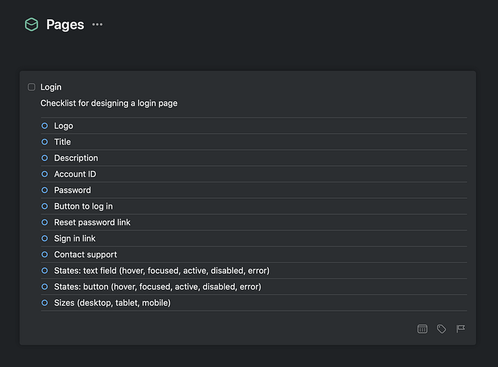
After fixing up the page, I had a thought. A login page is boilerplate in any product, and there are certain rules as to how it operates. Surrounding that is a product that can be anything. So what if we took advantage of that? If we know what a login page requires, and we know it won’t change, why not keep a list of that for next time?
My first checklist was created.
Designing with checklists
The next project came along — a wealth advisory app that needed a login page in both website and mobile app. When the time came, I let my checklist do the heavy lifting. The result?
I was so much more confident in what I had created. I left behind the “this is probably good enough” mindset and underlying fear of a mistake calling me back to the artboard in the future. I knew the critical fundamentals were in place, and I had no information overload to battle If I stopped now and continued, I knew I didn’t need to look back.
I quickly began to adapt this to other standard pages in websites and apps.
The value of the checklist
Checklists reduce the load on your brain by externalising repetitive, necessary information. If you keep it all in your head, you will inevitably forget parts of it and that can cause issues. It also takes up mental space that could otherwise be freed for creativity and problem-solving.
If checklists work for flying a bomber plane with a 103ft wingspan, let them work for you and your next project.
To help you get familiar with checklists, I created a website called Checklist Design. It outlines the best UI and UX practices for common pages, elements and flows in desktop and mobile products.
It was the most upvoted product in 2019 on Product Hunt, and has been a helpful resource for both designers and developers from junior to senior. I’m constantly adding content, and am always open to feedback, so get in touch!