How to launch a website survey that drives UX insights and action
Follow these steps to get actionable survey data without annoying users.
 User researchers love to hate website surveys, and justifiably so. Poorly-designed surveys are everywhere on the web, in part because tools make it easy to throw one up with lots of questions. Most website surveys annoy users and fail to capture data that results in UX improvements. At best, some of the data ends up in a presentation or dashboard.
But done right, web surveys can have real UX impact. On a recent project, we ran 2 short surveys that achieved actionable insights at a minimal cost to the user experience.
The setting was a usability study for a major regional health system that includes one of the top-ranked hospitals and medical schools in the U.S. Our primary research was moderated usability testing with 7 participants. To supplement our qualitative research, we gathered data from 2 large-scale website surveys.
Here’s what we did and what we learned.
Step #1: Pilot, Iterate & Launch
Every website is different, as is every website audience. We started by piloting a few surveys that we’ve found to be effective at both measuring UX and collecting qualitative responses on similar websites. We then tweaked the question wording and display criteria until we saw a strong response rate on this site. We settled on these 2 surveys.
Ease-of-Use Survey
This survey starts with a simple, multiple-choice ease-of-use question. For those who select “Difficult”, we ask an open-ended “why” follow-up. We served this to users as a popup after they’d visited 4 pages on desktop or 3 pages on mobile.

Task Survey
Here we flip things and start with an open-ended task question, and follow it with a multiple-choice question. We served this to users as they were about to leave the site — an exit-intent survey. (We used Qualaroo to run our surveys because it’s one of the few tools we’ve found with good exit-intent technology.)

We like these surveys because:
- They’re short — a max of 2 questions each — helping to maximize the response rate and minimize user annoyance. In both surveys, we still get useful data even if some users don’t answer the second question.
- They give us both quantitative and qualitative data.
- In combination, we get a good picture of both common tasks and top frustration reasons, and the relationship between the two.
Step #2: Analyze
Once we received 600 responses, we turned the surveys off and started our analysis. To analyze the results, we:
- Gathered all survey responses in a single spreadsheet
- Calculated some ease-of-use metrics
- Filtered the list to responses with likely task failure or frustration
- Manually categorized the task failure and frustration reasons
- Counted the responses within each of those categories
Here were our top findings:
- The #1 task area causing failure/frustration was Medical Records, in particular the task of trying to access or log into that part of the site. Example comments: “Hard getting the activation code”, “Can’t get on [records section]”, “Total waste of time”, and “almost impossible to get into.”
- The #2 task area causing failure/frustration was Search, in particular the task of searching for a doctor. Example comments: “circle around to the same information or dead end links” and “not able to search for a doctor and see their patients feedback.”
- The #3 task area causing failure/frustration was Contact Info & Appointments. Example comments: “cant find email addresses for physicians or their admins”, “where is email for [name]?”, “Patients should be able to communicate with Doctor through email”, and “Can I make an appointment online?”

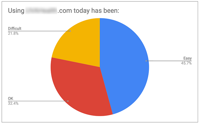
The surveys also showed that 46% of the respondents found the site easy to use; 22% found it difficult to use. By itself, this was the least useful finding. But it gave us a baseline to compare the site against peer/competitor sites and against future versions. And it allowed the team to set a measurable target that motivates action. Can we make usability improvements that increase the “Easy” share from 46% to over 60% by next year?
Step #3: Share
We shared these survey findings at a stakeholder workshop, just after the health system’s marketing team had watched 5 of the moderated usability sessions. After sharing the top frustration/failure areas, we showed quotes from each area similar to the ones above.
While the biggest insights on this project came from qualitative testing, the survey allowed the team to:
- Establish and understand their benchmark usability score
- Validate/invalidate/quantify their qualitative findings
- Identify new UX issues that did not come up in moderated testing
The Surprising Insight
While surveys often help us find small UX issues that qualitative research failed to surface, it’s rare that we uncover major new issues. On this project, we did.
At the start of the project, the marketing team said that the patient records section of the site was out of scope. A different team owns that section of the site and it’s a hard section to change, we were told.
So we excluded records-related tasks from our moderated testing, and ensured that users in the records section of the site did not get the survey popup.
Despite its exclusion, survey data showed Patient Records as the #1 website frustration area, by far. How was this possible? Because the specific problem was access: many users could not even get into that part of the site.
After the workshop, the attendees shared this survey finding with the team that owns patient records. They included powerful user quotes that supported the finding. It worked: motivated by this surprising insight, a project is underway to improve this critical website flow.
Keys to Survey Success
Here are some lessons learned from this project and similar projects we’ve led:
1. Keep surveys super-short — 2 or 3 questions at most.
Long surveys lead to low response rates and less representative data. As Jakob Nielsen says, “you can’t trust [survey] data if it doesn’t represent your users.”
2. Include an open-ended question.
It’s tempting to think you know the top possible answers to your “why” question or task question — and to give people a list of responses to choose from. It certainly makes the analysis cleaner and easier. Avoid the temptation, at least for the first round. You’ll often be surprised at the responses, and there is huge value in hearing about problems in your users’ own words.
3. Pilot and iterate before you launch.
Because it’s so important to get a good response rate, and because every site is different, always test and iterate before launching the final survey.
4. Focus on user pain during analysis.
User frustration, problems, task failures. That’s where the biggest insights and opportunities come from.
5. Quantify qualitative survey data by categorizing and counting.
Categorizing open-ended responses is tedious, but it allows you to count, compare, and quantify insights.
6. Share survey data and insights after showing qualitative research.
Surveys should almost always be a supporting act. Once your stakeholders have qualitative observations in mind, survey data can help to validate or supplement those findings.
Follow these tips for your next website survey, and you’ll increase your chances of generating surprising insights and a better UX.


