How to level up your UI design skills

There was a point when I had a breakdown over my UI design skills. I was working on multiple projects back then, mostly early-stage startups. I knew that my designs were technically fine and at a level that could be successfully used elsewhere. In this article, I will pinpoint a few ideas for how you can leverage your UI design skills that I wish I had known back then.
Words that make a difference
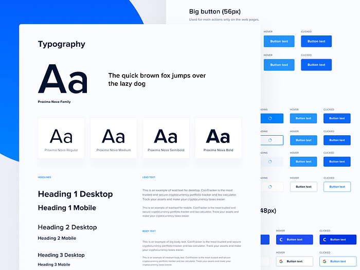
Due to the high pace I had to deal with, as well as the start-up clients that sometimes seemed not to be very passionate about their new businesses, I mainly opted for popular and hackneyed typefaces. This isn’t necessarily a bad idea, unless your choices have concrete reasons. Yes, there are lots of attractive products that use popular typeface choices like Lato, Roboto or San Francisco, but this choice should always be thought through.
Typography is undoubtedly the most distinctive layer of UI design. Don’t be afraid to experiment with various typefaces or try different pairing ideas. Even a relatively small change like this may dramatically impact the whole perception of your designs. It sounds quite obvious, but always try to use real content. Don’t have access to world-class copywriters? Fake it till you make it.

The devil is in the details
Another aspect that made my designs look ordinary was essentially the lack of branding. There were a few factors that contributed to this. The main ones were the lack of budget for proper branding and the lack of vision. No, not every start-up needs $150k brand guidelines from day one, especially for an MVP, but without any “spice”, your designs will fail to stand out.
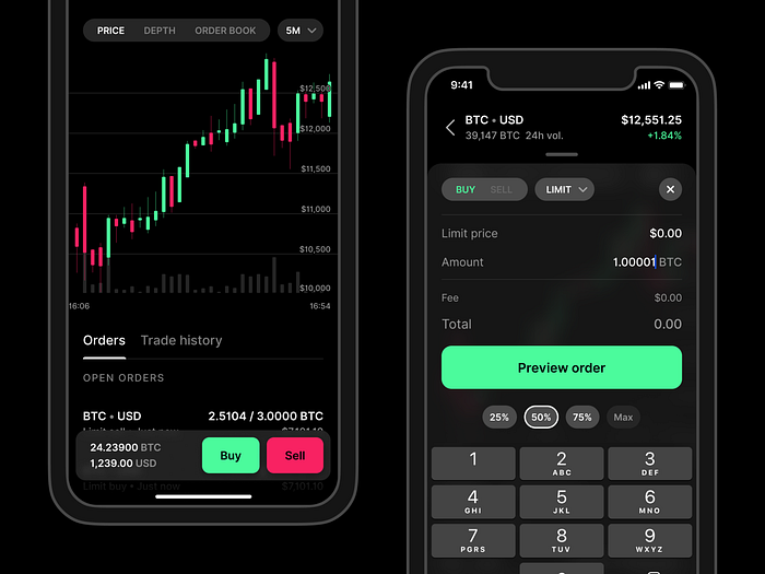
What can you do without any clients’ preferences or brand guidelines? Make sure that the typeface and colour scheme match with your product’s personality. An app for booking doctors’ appointments won’t look good with orange colours and a quirky typeface. The same goes for an app for crypto traders; it won’t look good with pastel colours and an elegant, serif typeface. You can consider using a complementary icon set or a pattern that will add a personal touch.

The ability to adapt
Low-contrast is becoming an emerging and well-known design trend, and not only on Dribbble. It sacrifices readability for aesthetics, which strains our eyes even more and makes our designs less accessible to users. Insufficient contrast degrades the user experience along with discoverability and confidence. Have you ever used your phone outside? It’s obviously a rhetorical question, but designers often forget about this context.
It’s fairly simple to design for high-resolution retina displays and validate our designs on our newest iPhone in an office with bright light all over the place. We often forget that not every user has the newest device, nor will they always be using our apps in a closed room. Low-contrast text is nearly impossible to read outside. Another aspect to keep in mind is designing for dark mode. Negative contrast polarity is growing in popularity. Not only does it save our battery but it increases the readability as well. Our designs should also be adaptable to dark colour schemes.
Design unification
Although this could be a separate article or even a series of articles, consistency and cooperation with developers is crucial to your workflow. It’s fairly easy to lose track of all the components you’re using within your designs and forget to communicate certain parts of your work well enough. That’s why you should always try to document your work in a way that’s accessible to every team member. You can do it in many ways.
Start by documenting all the design tokens you’re using. Make sure that every component you’re using for your design has different states. Create a page that will be the one source of truth for your developers when it comes to the typography, colours, icons and grids. This will not only save their time, but will also allow you to think of the project more holistically. Constraints can actually make you more creative than you might have thought.
Focus is also a design skill
We are humans, not robots. The ability to focus on one thing at a time is now more difficult than ever before. Constant notifications on your phone and computer are becoming bright moments of pseudo pleasure. At the same time you need to be familiar with lots of UX patterns and ideas. Not only does this speed up your work, but it also lets you improve the detail in your designs.
My tool of choice is time blocking. I divide parts of my day into smaller chunks that will be spent on one type of task. I personally prefer using 2h blocks, but you should experiment with various time frames. You can mark your time in an application like Google Calendar or the default calendar app on Mac, but a paper version will also do the job.
Improving your skills takes a lot of practice and patience. Leveraging these skills step-by-step will allow you to produce high-quality work. Never forget to listen to others’ feedback, not only from designers. Think of your projects in a broader way; they are digital products, not just collections of screens.
Jakub is a Freelance Product Designer. You can find him on Dribbble, Medium or check out his design gig.

