Member-only story
How to lock aspect ratios for responsive media in Figma
Tips & tricks for responsive design & media.
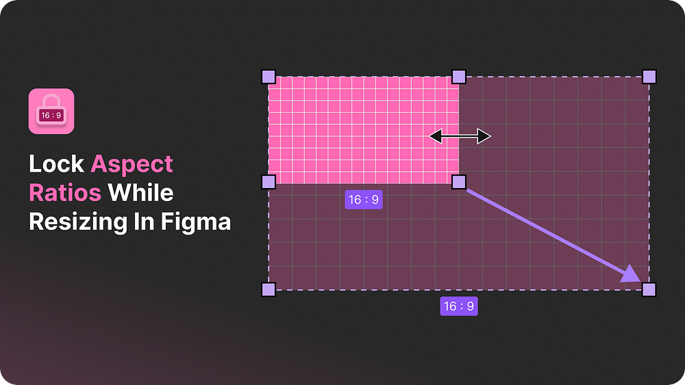
When designing responsive layouts in Figma, a tricky problem is ensuring that media elements, like images, maintain their aspect ratios while resizing.
This is important when you want your designs to scale smoothly across different screen sizes, without cropping or distorting your visuals.
In this article, we’ll introduce a smart aspect ratio hack that works perfectly for images and other media content. This trick ensures that the image’s height and width both adjust proportionally.
Unlike Figma’s native constraints, which tend to crop or stretch media when resized horizontally, like this:

Why default constraints don’t work
Figma’s “Constrain Proportions” setting might seem like the right tool for maintaining an image’s aspect ratio. However, it has a critical limitation when applied to fluid media.
When you resize the container holding the image horizontally, the height remains fixed, causing the image to be cropped at the edges.


