Member-only story
How to make your Figma components easier to use
What you can do to optimize the UX for component consumers

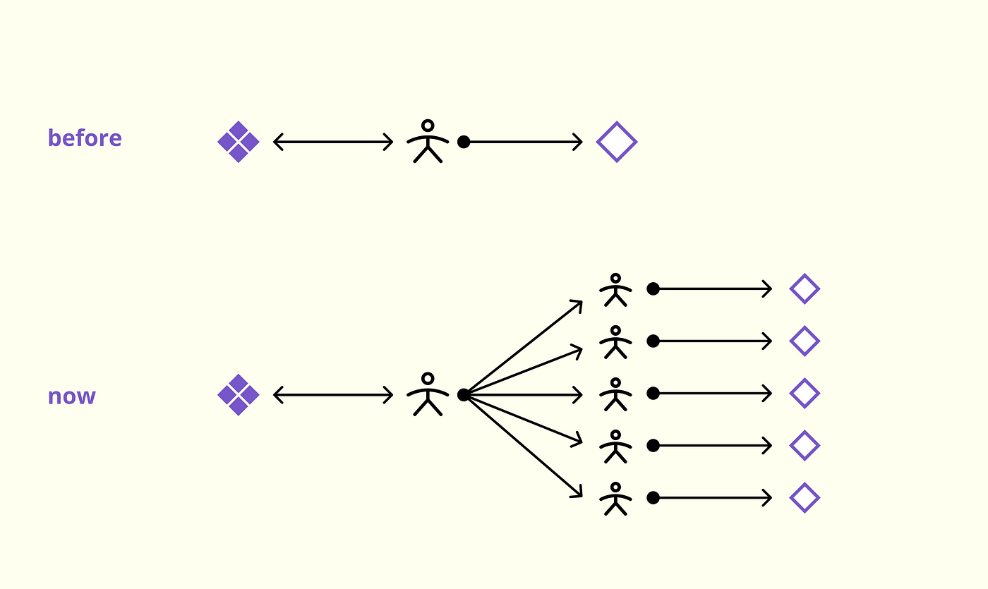
Several years ago it was common that components were created solely for personal use.
Yet in 2022 design teams are growing and there are now more Design System designers. Combine this with the continued maturity and complexity of component libraries and you get the potential for a knowledge gap between component creators and component consumers.
Ensuring a component has all the necessary variants can no longer be the sole factor of determining if the component is “complete”. Component creators now need to make sure their components are intuitive, informational, and consistent with development.
That being said, here are seven ways to make Figma components easier to use:
1. Property defaults
Because components have so many variants, it’s crucial to show the default value for each prop, so that when consumers drag in the component it shows the variant they will most likely use.

