How to manage space in Figma using tokens
And how to make the spacers handy and clear with the help of components

Space, or in other words, empty space is one of the core elements in design that is often overlooked. Design elements next to each other are perceived as meaningfully connected. As the space between elements increases, their connection weakens. Elements with more space around them are perceived as more important. Playing with the space can help to set the rhythm of an entire composition in design.
In Figma, there are many ways to set spacings for elements. In day-to-day work, in my opinion, the best way to do this is to use Auto layout or Layout grid. However, when it comes to handover designs to developers, both methods are not very transparent. After all, the developer needs to measure the spacing between elements “manually”.
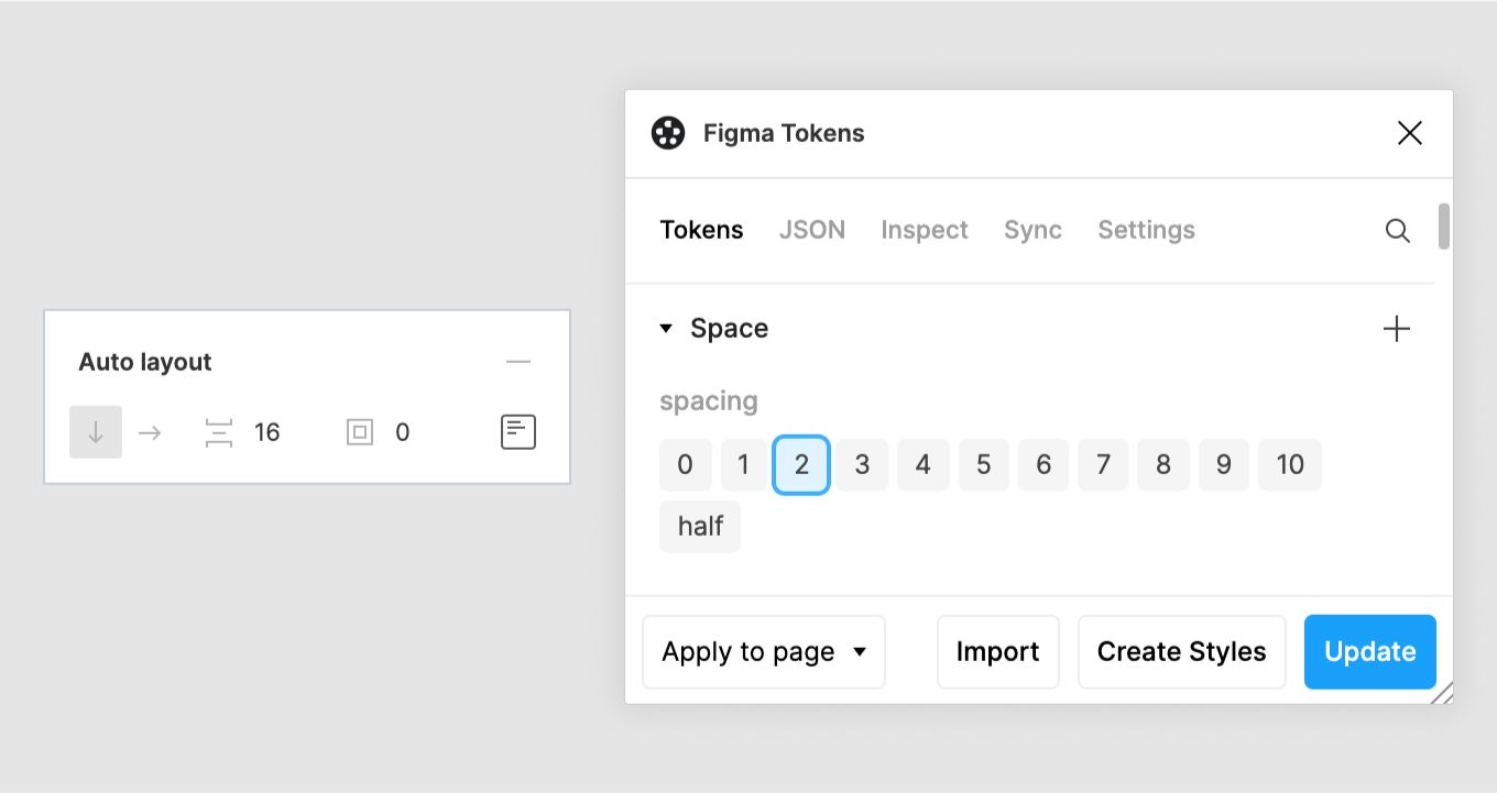
Spacing in design systems
To make the work with the spacing more clear and consistent in design systems, as a rule, the spacers are set in a form of constants or special components.
In our FREE NOW design system Wave we have spacers in our code controlled by a set of constants. It is very handy and the values of the core spacers are known by developers and designers.

Most of the time, we documented the spacing separately, explicitly specifying where and how much spacing should be on the layout.

When we migrated our Wave design library to Figma, we started using tokens, among other things. We use the wonderful plugin Figma Tokens to manage the tokens.

And the spacings are also set with tokens now.

And we tried to use the Figma Tokens plugin to apply these spaces to some components. However, with time I found that it is not very convenient to set spaces for elements directly through the plugin (despite the flexibility of the plugin):
- It’s not immediately clear which spaces are set through the plugin and what are the values.
- Without the plugin, it is impossible to use space tokens. That is designers who want to use them need to use the plugin (and also synchronize the token library).

I needed a solution that would allow designers to specify space in a simple way without having to use a plugin all the time. And make the spacing values visible to developers when necessary.
Spacing components
When we worked in Sketch, we documented spacings with special components. In Figma, we do the same in most cases.

The logical next step was to now bind these components to tokens. But how to do this? After all, the space token sets the space and the Figma Tokens plugin honestly follows this rule, so there is no way to simply bind the size of our spacing components to the space tokens.

Let’s try to figure it out…
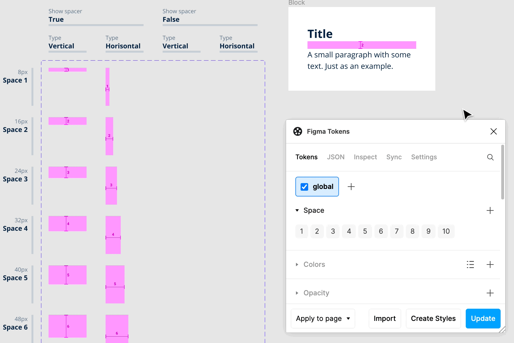
Tokens set the distance between elements. With the Figma Tokens plugin, you can set spacings only for Auto layout.
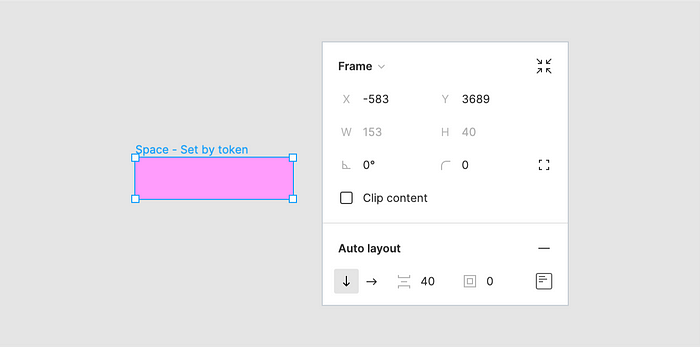
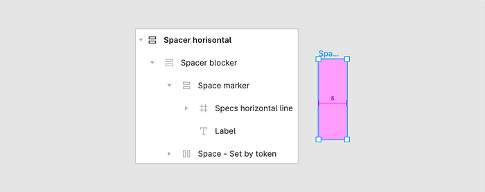
I’ll create a simple Auto layout with two rectangles and set the distance between them with a token. I named it “Space - Set by token” so that I don’t forget where the spacing is set.

I will paint the block in the “usual” color and set a zero value (more precisely — 0.001px to get a real 0) for the height of the top and bottom rectangle so that only the spacing is taken into account in the height of the block.
Next, I need to add text to indicate which token is being used. Adding text to my Space - Set by token block won’t work because the height of the text will also be included in the height of the block. I will group the text and the Space - Set by token into another Auto layout.

Now I need to make it so that the text is centered. For example, to make the text occupy the entire height/width of my Spacer block. To do this, I need to make the width of the Space - Set by token block zero. And then paint the Spacer block itself in the color I want.
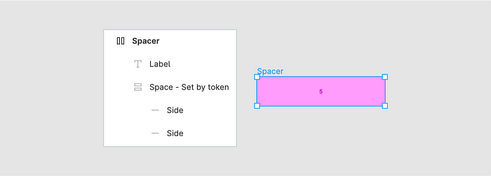
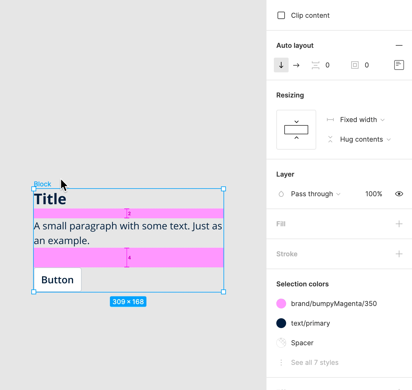
At the same time, for everything to work as it should, I need to set the correct Resizing parameters:
- “Spacer” — Hug contents for width and height
- “Space - Set by token” — Fixed width and Hug contents for height
- “Label” — Fill container for width and Hug contents for height
In principle, it would be possible to create the component already with this. For each spacing value and direction. However, I have many space variants, and I need somehow foresee that someone could accidentally stretch the height of the component and thus set it to an incorrect value.
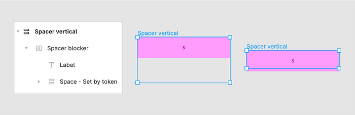
Locking spacing
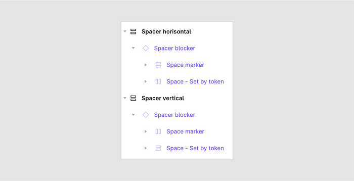
First, I’ll solve the stretching problem. I will need to make the spacing indicator not depend on how the designer stretches the component. The easiest thing to do is to put the spacer in an additional container. I will rename “Spacer” to “Spacer blocker” and put it in the new Auto layout. Then, I need to set the correct Resizing parameters for both blocks:
- “Spacer blocker” — Fill container for width and Hug contents for height
- “Spacer vertical” (outer Auto layout) — Fixed width and Hug contents for height.
Thus, the color-coded Spacer blocker block will depend only on the height of the internal “spacer” Space - Set by token and will not react to stretching of the external block Spacer vertical.
A small visual improvement
Since I’m changing the spacing component anyway, why not also improve its appearance? For example, show in a more “common way” that it is spacing, and what type is: vertical or horizontal.

Now it remains to make a similar horizontal spacer.
Extracting basic components
The main difference between the vertical and horizontal spacing blocks I created is the Spacer blocker block. For different spacing values, I just will need to change the spacing value in Space - Set by token. On this basis, to simplify the creation of spacers for all sizes and to be able to adjust the logic and appearance in the future I will create basic components for the Spacer blocker: separately for vertical or horizontal types.

And, accordingly, I will use these basic components inside the spacers.
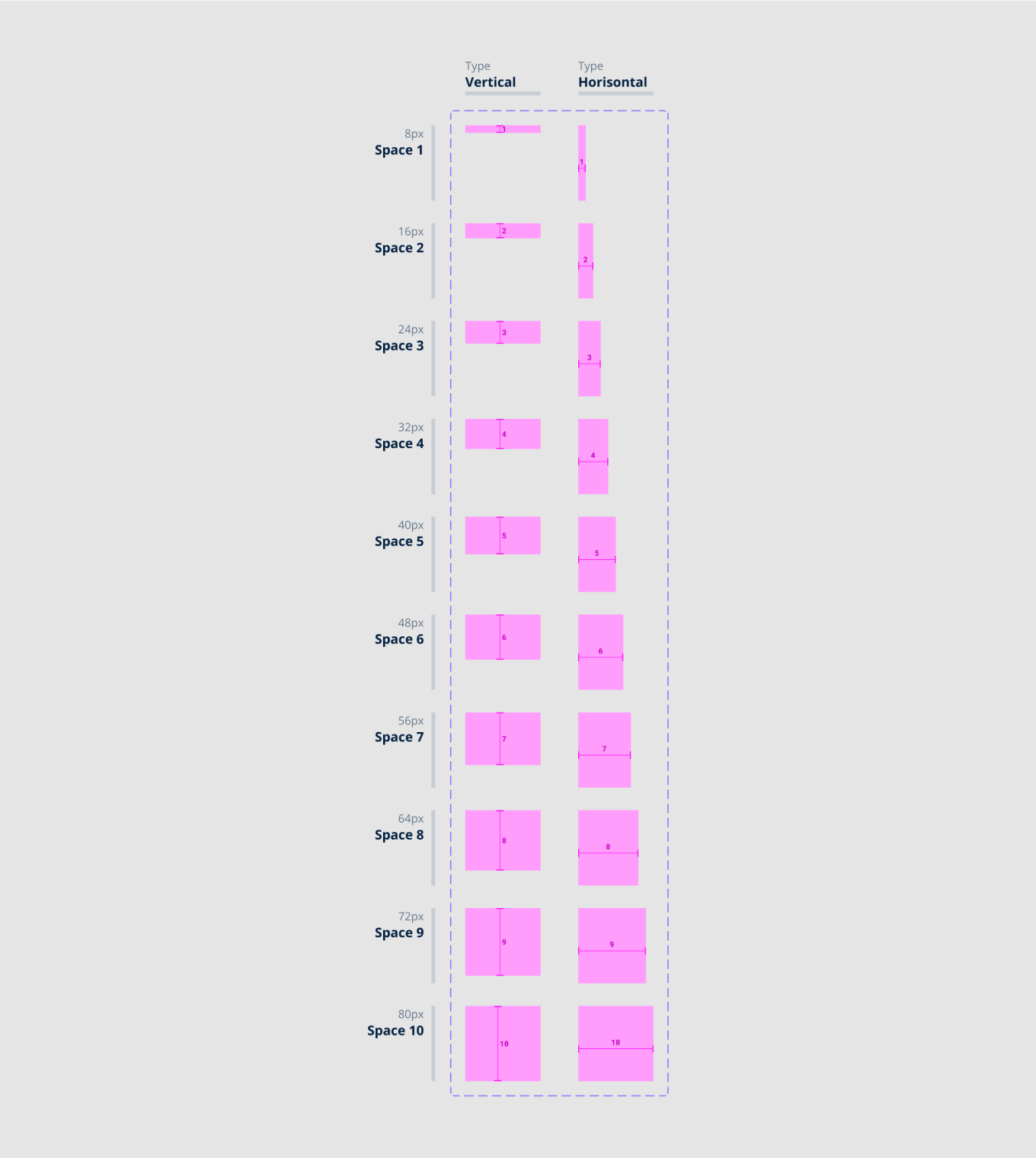
Component set
And now, finally, I can create components for all the spacers.
And I could use them already in my work… but I will do a bit more.
Making it possible to hide components
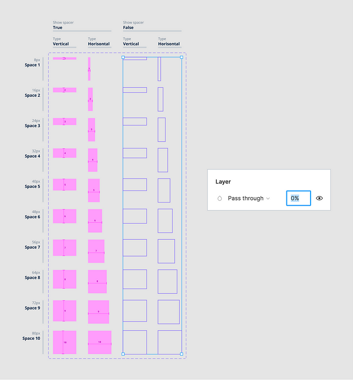
Let’s make it possible to hide spacing components without removing them.
I will add a new boolean property for the variants — “Show spacer” (it will be true by default) and duplicate all variants. For the new ones, I will change the Show spacer property to false.

Then make all of these new variants completely transparent.
Simplify the selection of spacing components in a group
The final touch is to make it possible to select the spacers in a group. When it’s one or two spacers, it’s easy to do manually. However, when there are a lot of them it will be quite difficult (especially when they are not visible).
The easiest way to select objects in a group is by color. Accordingly, I need to use a unique color for the spacing component that I can use to select them in any group.
Earlier I decided to lock the spacer changes and to do that I need the color of the component itself to remain transparent.

So, I will make a new transparent color style. For example, based on transparent white.
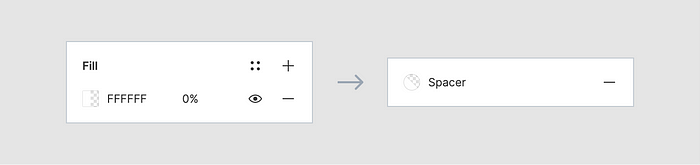
All that remains is to apply this color style to all the spacing component variants.
And now I can easily select the spacers in a group with Select by color. Even if they are not visible
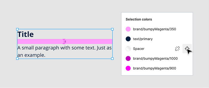
And then show or hide the spacers.
Updating tokens
The component I created allows me to set spacings and hide components themselves, if necessary. At the same time, the spacing values are tied to tokens and if I need to change these values the component will update itself (thanks to the plugin Figma Tokens).
You can try everything in work in this file.

