How to use Adobe CC shared libraries and make the most of it?
Being able to share the assets when we are several UX/UI working on different files for the same project became essential. It is the best way to ensure style guidelines are respected and coherence of the product is guaranteed.
As of today, the most common solution is to store all the components in a big file that needs to be downloaded by the team. Any time someone updates or changes a component he/she needs to warn the rest of the team and re-send the new file for everyone to download… not very convenient right ?
In order to solve this issue (and to pursue my quest of discovering the best methods to work in atomic design), I decided to start looking into shared libraries… and ended up fully deep diving into it!
Adobe shared libraries: Introduction
Adobe libraries enable several people who work on one project to use the same assets. These assets act as symbols or dynamic objects and once drag & dropped in a document, they remain linked to the library. Any update of the asset in the library will automatically update all the occurrences of it.

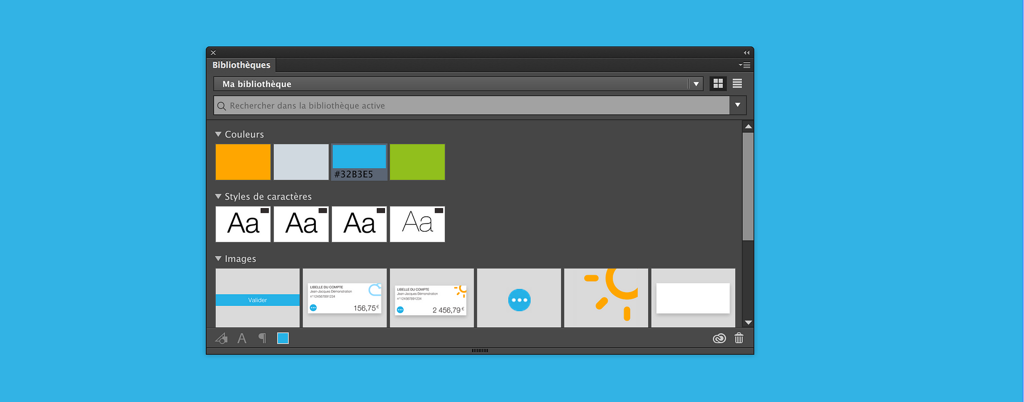
You can show the library by clicking in the tab “window / libraries”. The library supports colors, texts’ styles, paragraphs’ styles and assets (images, icons, components…).

The shared library becomes the single point of reference for your team, always up to date and shared between all the designers.
Create a new component
What is great about Adobe shared libraries is that they support any kind of components: from the simplest ones (atoms, molecules) to the most complex (organisms, templates and pages).
Before adding a component to the library you should always ask yourself how it is going to be used in mockups. With already several shared libraries to my credit, I learnt some very useful tricks which may be useful to other designers…
Anticipate the touch zone
Anticipating the touch zone of a component will avoid sticking it to other components during the design phase. For example, we are going to integrate a 27 px button in a transparent square of 44 px:

Trick: if the component is in a clearly labeled group before being add in the library, it will directly take the name of this group.
Think of components as “blocks”
The first purpose of those components is to speed up building screens. You should therefore think of them as blocks or lego bricks that are going to be add one after the other.
Trick: Integrating the component into a slightly bigger frame also allows you to anticipate evolutions (as of today Adobe components do not support very well the changes of size…).
Cut components in sub-components
At first, I used to create too complex components. For a menu and it’s active states for example, I started with making an organism by declension … Bad idea! Because if for instance the icon “ Your profile” was to changed, I would then have to echo the modification on 7 different components:
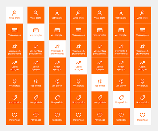
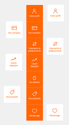
By dividing my component into molecules I now only have 2 components to modify if this icon changes;)
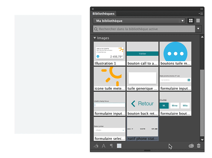
Use components
To find a component in my library (which can contain more than 200 assets!), I mainly use the search bar. Be careful however to tick the box “active library” to search only in the current library.

There are then two ways to use the components of the library: Import a linked asset or import the copy.
Import a linked asset
By drag & dropping a component, we import a linked asset. It creates a symbol and if we modify it, all the other occurrences of that symbol will be modified.
It is useful for recurring components which do not need text customisations (for example: images, icons, native switch…).
Trick: we can break the link of the symbol by going to the options of “Links” panel and by clicking “Linked artwork”.
Import the copy
This imports an asset which is not linked to the library anymore.
This import is mandatory since we want to work on a component without touching all the other occurences (For example if it contains text that we want to be able to edit).
Modify an existing asset
It is dangerous to have a shared library from witch one modification can potentially affect about twenty different files if the library is not correctly managed.
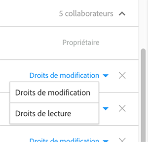
Adobe thus allows us to define the “managers” of the library. Those managers will be able to modify components (with a « can edit » permission) while others will only be able to use components (with the “Can view” permission).
To modify a component and if you have the right permission, you can:
- “ALT+double-clic” directly on the asset
- Double-click on it’s image in the library
- Pass by the “link” panel / “modify the original”
It enables you to realize when we are going to modify a “Master” asset which is therefore going to impact all the linked occurrences.
You should then always anticipate, measure and plan all the impacts of the modification of an asset before making it.
Caution: the change of size of an asset is currently poorly supported (if supported at all). It is thus necessary to avoid, as far as possible modifying the size of a component if it’s already used in several files. If you have to make it anyway, you will have to open every files were the component is being used and manually change it one by one to put it back to the good size.
And what about Sketch ?
Even if I still work on Illustrator for certain projects, Sketch is slowly becoming my favorite tool.
I have therefore also tested the principles of shared library with Sketch, thanks to the plugin: Craft.

Here is a list of the pros and cons of this plugin versus the Adobe library:
Pros
- Be able to use an other server than Adobe’s Cloud to store components (Drive, Dropbox…)
- Be able thus to have a versioning of components
- Be able to sort out components and classify them in “folders”
Cons
- The craft plugin is really not user friendly (we do not really know what we are going to modify, or what is going to be impacted)
- It is a plugin and thus it’s evolutions are not still connected to the evolutions of Sketch (difficult for now to base a whole workflow on that)
- No permission system (right or view only)
- the “overrides” of the symbols does not work with the shared components, which is a shame because it would make a real difference versus Adobe libraries.
The last word
For me, neither Adobe nor Craft are perfect solutions, especially when it comes to work with atomic design methodology. Components should be much more dynamic and much more connected to each other…
However, this is still a small revolution for designers, and with new co-creation softwares like Figma being developed we can expect assets sharing to continue evolving a lot in the next months.
If you too are fascinated by shared libraries and/or if you have experimented Adobe, Sketch or even other solutions, do not hesitate to share your point of view in the comments!


