PART 2
How to use cognitive biases to improve your conversions (Part 2)

Did you know that the human brain makes around 35 000 decisions every single day? Most of them are unconscious and automatic, and we don’t even know about them. The only way the human brain can process this crazy overload is by using many shortcuts, simplifications, and rules of thumb. However, it often leads to various cognitive biases.
Understanding these biases can help you both design a better experience and improve your conversion rates. In this two-part article, I’m going to walk you through the ten most common biases and will demonstrate how you can utilize them. Read also:
How to use cognitive biases to improve your conversions (Part 1)
Remember, there is a thin line between the ethical use of cognitive biases and their misuse to manipulate or scam. Always use them ethically and avoid dark patterns which might boost your sales short term but harm your business in the long run. [10]
Cheerleader Effect
If you were a fan of the “How I Met Your Mother” serial, you know what I’m talking about. This cognitive bias, also known as the group attractiveness effect, causes a group of people or objects to seem more attractive than each of them individually alone.
The human brain treats them as a “set of items” and evaluates them as a whole without taking individual items into account. Instead of that, it averages all items, which causes some of them to look better than they are and the others worse. It helps us to tackle large crowds and clusters of objects.
The effect was recently backed by research by Drew Walker and Edward Vul. [6]
How to Use It?
If your competitors are playing a higher league when it comes to brand perception, try to smuggle your product between them by simply comparing their features. No matter the comparison results, your product will look instantly better just because it’s part of the group of more prominent products.
Another way is to use products from a different category (non-competing) with a good image and make a strategic partnership with them. It might cover a cross-promotion, recommendation, bundling of products, etc. Your product will immediately seem more appealing.
When presenting items such as a set of features, team members, reviews, or testimonials, always prefer to display them as a coherent group to benefit from the cheerleader effect.

Serial-Position Effect
For the correct message delivery, the length of the content and position of information in the text is critical. According to several pieces of research [7], the human brain tends to remember the very beginning (Primacy Effect) and the end (The Recency Effect) of the served information. Middle parts of the long lists or descriptions are forgotten shortly after reading.
At the beginning of the list, we’re more concentrated, and our memory capacity is fresh. Before we finish reading, we’re able to process the first items and save them into our long-term memory. In comparison, words from the end of the list are saved and retrieved from a highly accessible short-term buffer.
How to Use It?
Always start any sales pitch, important product, or service description with the most important message you need your customer to save into long-term memory. Then you can follow with a brief description with a few more details and end with a carefully tailored statement that helps you get into your user’s short-term memory and persuade them. Information at the end of the list really stands out in a person’s mind.
Think about what information the user needs in a particular moment of the user journey. It’s easy to get overwhelmed by the number of new instructions and options.

Scarcity Effect
Do you remember the last time when you were booking your holiday hotel via booking.com? Suddenly a post popped up saying that there is only one room left and 17 other people are watching this hotel. You were most likely saying to yourself: “Gosh, I should hurry up. Such a good deal.”
The scarcity effect is a cognitive bias that makes us value more a scarce object. We subconsciously interpret the shortage of a product by its popularity and quality. We perceive it as something exclusive, maybe even luxurious. The more difficult it is to acquire the product the more attractive it is for us. [8]
How to Use It?
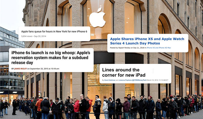
Whenever Apple launches a new product, it’s immediately out of stock. Every new iPhone, MacBook, or AirPods is sold out in a few hours. Do you believe it’s just an accident caused by poor planning? No, it’s a brilliant example of the use of the scarcity effect. Unavailability triggers a fear of missing out, and as a result, even more, people want it.
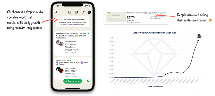
When Robin Hood, a commission-free stock-trading app, launched, they already had 1 000 000 customers. How did they achieve it? They brilliantly utilized fear of missing out in their pre-release campaign. Right after subscribing for early access, one got an email saying there are 12 458 people ahead. To get priority access, you had to share your referral link with your friends.
Some e-shops showcase how many products are left in stocks and how many people currently see the offering. Another way can be listing the sold-out products among other search results. Booking is well known for the use of scarcity throughout their website.
Time-limited or quantity-limited special offers always cause a scarcity effect and make us instantly desire the product. It creates a feeling of urgency and exclusivity. Limited products can work for the owner as status symbols and let them feel unique and special.
Sunk Cost Effect
A friend of mine once told me, “I’ve already spent so much money on smoking that I’m not gonna quit it because somebody told me so.” Even though he meant it as a joke, the quote is an excellent example of sunk cost fallacy.
Simply said, we tend to take our incurred costs (money, time, emotions) into account when making decisions in the present or the future. We want to make the most out of the money we already spent or the time we invested. As a result, we attribute a much higher value to these options with sunk costs and cannot evaluate other variants. [5]
You can see this fallacy plays a significant role in many decisions in our everyday life. In restaurants, we tend to finish the food (despite being full) because we already paid for it. We tend to stay in our relationships (even though it’s no longer bringing us any value) because we already invested too much emotion in them. We tend to continue non-profit operations because we supported them in previous months and don’t want to “lose” our investment.
How to Use It?
A typical example is upselling of your already paying customers to a much better option for a slightly increased price. Additional costs simply seem to be small compared to the original amount paid to look at it with the sunk cost optics.
Consumer electronics brands use this tactic to sell insurance for phones and other pricey gear, phone carriers to sell you higher (more expensive) plans with many new free minutes. Supermarkets use this tactic to sell you bubble gum or candies at the end of shopping while you’re waiting in a queue at the cash register.
“Once buyers have paid a hefty sum for your products, they can often be persuaded to kick in a little more for a truly stellar experience.” — Greg Wise
If you’re selling anything online, you know that one of the critical points of the whole process is check outflow. In the complex forms where users have to fill in their address, a delivery method sometimes makes registration and pay at the end. Add a progress bar to your multi-step form. Knowing how many steps you’ve already done and how much time you’ve already spent makes it much harder to leave the process.
Single Option Aversion & Paradox of Choice
Imagine that you’re shopping for a new printer. It’s not a simple job, but you approximately know what you’re looking for. I’ll offer you a printer which perfectly matches all your needs. Will you buy it right away, or will you search a bit more so you can decide adequately?
It seems like that based on the research paper from Tulane University, only around 10% of people are ready to buy the product even if they can’t see other alternatives. With adding just one extra compelling alternative, already 33% of people are prepared to shop. [9]
We’re all internally fighting our fears of being deceived or tricked. Doing “research” by comparing other variants, no matter how small and vague, create a sense of security which helps us justify our decision.
On the other hand, it might get overwhelming to decide what option to choose when we’re presented with too many of them due to shopping paralysis. This effect is called Hick-Hyman’s Law. It says that the time it takes to make a decision increases proportionally to the number and complexity of choices. Do the hard work for your customer and present just enough options.
How to Use It?
Giving users just one option increases their desire to see other options. Without creating a paradox of choice — set 2–3 options so your customers can see the alternatives without becoming confused. All of these options should be equally profitable for you.

Avoid creating a category for only 1 product. Lack of options will make your customer feel like they’re missing something and force them to look elsewhere.
Ensure that you’ve clearly explained the differences, benefits, and limitations of all your subscription plans and in-app purchases. If your app contains more than two or three different subscription plans, think about simplification.
Other resources
- https://www.amazon.com/Thinking-Fast-Slow-Daniel-Kahneman/dp/0374533555
- https://www.amazon.com/Predictably-Irrational-Hidden-Forces-Decisions-ebook/dp/B002RI9QJE
- https://www.sog.unc.edu/sites/www.sog.unc.edu/files/course_materials/Cognitive%20Biases%20Codex.pdf
- https://www.verywellmind.com/what-is-a-cognitive-bias-2794963
For more content like this, follow me on Twitter: @michallangmajer.