
How to use type for aesthetic and user-friendly text
Text is an important, if not the most important element in a design. It conveys the information that the user needs. How can we make sure the text in our design is readable and accessible? How to select the right type?
Ok, let’s start with the basics: What is typography?
Typography describes the arrangement of type to make written language legible, readable and appealing. The arrangement of the type includes the selection of fonts, the font size, line lengths, line-spacing, letter-spacing and kerning.
Elements of typography
Typeface and font
A typeface is a design of type, while the font is the variation in a particular size and weight (such as extra bold, bold, regular, light, italic, condensed, extended).
Mean line
The mean line indicates the top of a character’s body (or the top of the x-height).
Baseline
The baseline is the line on which most of the letters are placed.

x-Height
The distance between the baseline and the top of the lower-case letters is called x-Height.
Kerning
Kerning adjusts the spacing between individual letters to achieve a visually appealing result.
Tracking
Tracking, or letter-spacing, is the consistent adjustment of the optical distance between letters.
Leading
Leading (or line-height) is the spacing between two lines of text. Well-designed leading makes the text more legible because it helps the eye to go from one text line to the next one. The standard leading is 120% the point size of the font, but it can vary according to the typeface.
Negative space
In typography, negative space describes the area between individual text elements e.g. paragraphs or different sections of text. When used well, the negative space can greatly improve the readability of the copy.
The different typeface classifications
Serif
Serif typefaces are often used for printed materials, but they can also be used for digital products.
This typeface can be used for body text and headlines.
Sans Serif
Sans serif typefaces have good readability on displays, especially on low-resolution screens.
Sans Serif can be used for body text and headlines.
Monospace
Every character has the same width. Often used in programming.
For body text, it’s not ideal (besides code), but it can be used for headlines.
Display
Display types are made for type at large sizes. Most effect typefaces are display types.
Shouldn’t be used for body text, but can be used for headlines (It’s very important to pay attention to the legibility).
Script
Script typefaces mimic calligraphy or handwriting.
Shouldn’t be used for body text, but can be used for headlines (Same like for Display typefaces, it’s very important to pay attention to the legibility).
Cameron Chapman from Toptal created a very helpful overview of the different typeface classifications:
https://www.toptal.com/designers/typography/typeface-classification
Best practices
Let’s take a glance at the bigger brands. What kind of typography are they using?
Airbnb
Uber
Dropbox
Evernote
Intercom
Spotify
Basecamp
Slack
They all use sans serif, either geometric or humanistic style. Some brands like Basecamp and Intercom or Airbnb and Spotify use the same typeface, but a different variation. Every typeface has very good readability. They use a bolder variation of the typeface for their headlines to ensure a good contrast to subheadlines and body text.
Some guidelines for better typography in user interfaces
Keep the number of used fonts at a minimum
Using more than 3 different fonts makes a website look unstructured and unprofessional.

Good contrast and the choice of the right color is very important for legibility and perception.
A contrast that is too low harms the legibility of the text. A contrast that is too high is also not good. The right balance must be found here.
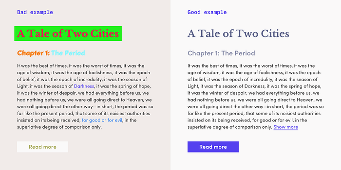
Make sure your text and highlighted elements are recognizable for colorblind people, too. An example: If you use grey text and highlighted text in red, they may see no difference.
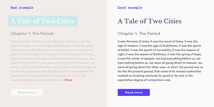
Use as few colors as possible for your content (less than 3).
Text that is too strongly designed can be misunderstood or viewed as a different element (as advertising or something similar). Also be careful with the color blue, because blue is often used for links.
Sans serif fonts are better for text on screens than serifs (which are better for print).
Sans serif typefaces are often the best choice for digital devices, but these are rules of thumbs and no laws. There are great serif fonts that are also suitable for body text.
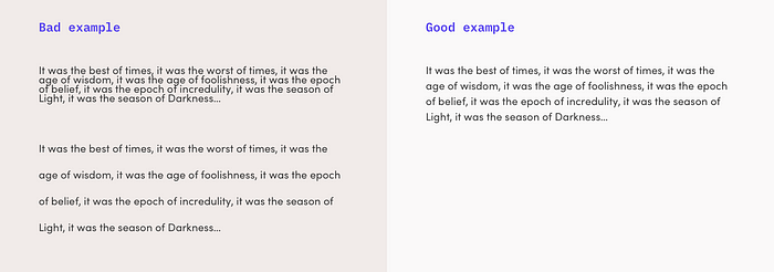
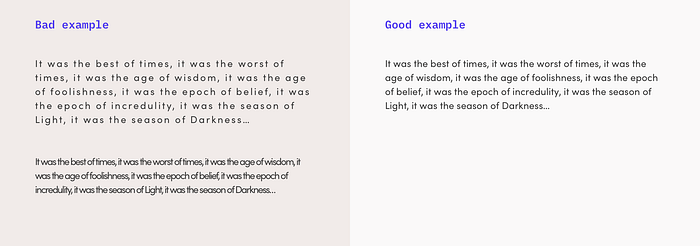
Pay attention to your line space
For your line space aim for about 140%-180% of the text size for optimal legibility.
Reduce the length of your text
If you have long text lines, it can confuse the eye, so limit your line length to 70–80 characters.
Small text needs more spacing
The smaller fonts are more difficult to read and so the letters need more space to be better recognizable.
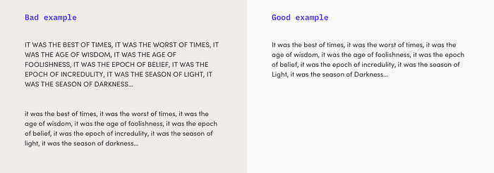
Content should always use mixed capitalization.
The user will have difficulties with reading the content if all the text is upper or lower case.
Pay attention to your character spacing
Is it too wide or too narrow, it will affect the legibility of the text.
Create a good hierarchy for your text elements
Starting with the base size of your body text, you define the typographic scale for all other text elements (headings, subheadings and so on). A nice tool for that could be https://type-scale.com/.
Like most elements in digital products, the functionality should be recognizable, interactions simple and the experience user-friendly and pleasant. Text that is difficult to read will harm the customer experience, so make sure to do it right.
Three criteria should be considered when choosing the typeface for your product:
Legibility
Individual letters and punctuation marks should be recognizable.
This is where the elements of kerning and line spacing come into play.
Readability
The overall picture of the text is important here. Is it possible to read the text without a struggle?
Versatility
A visual hierarchy on your website is essential. Make sure your chosen typeface will have different font weights and styles.
All of that are guidelines, no rules.
It doesn’t mean you have to use sans serif and geometric fonts only in your next project. Medium is using a serif typeface, and as you can see it works great. The type should match the brand or product. If the user doesn’t think much about the typography at all and simply has a pleasant reading experience, then you’ve done everything right. ;)

