Visualize data from UX standardized questionnaires
Opportunities of standardized questionnaires for UX Research

Standardized questionnaires are popular among UX designers and researchers. They are valued for their psychometric qualities and predefined procedures.
However, I noticed that standardized questionnaires offer more opportunities for analysis and visualization than those commonly exploited by UXers.
In this article, I propose to explore the opportunities of standardized questionnaire data analysis. We’ll see how far we can go in analyzing and visualizing standardized questionnaire data. We will also see that not all analyzes are appropriate for all questionnaires and that data visualization requires some good practices to be efficient.
To serve as an example in this article, I created a fake standardized questionnaire. I present to you the FLARE, composed of 10 items measuring the dimensions of perceived quality and pleasure of use, by 5 subscales: Functionality, Learnability, Aesthetics, Rewarding, and Efficiency. Warning, the FLARE questionnaire has been created for this article only and has no real psychometric quality.
To see the details of the FLARE questionnaire, please visit https://rpubs.com/paulamat/flare
Quick Summary
As you may know, standardized questionnaires consist of scales, subscales, dimensions, and items. This hierarchy aims to provide a reliable measurement of the dimensions being studied. In this article, we’ll see examples in this order:
- Raw data
- Transformed data
- Summary by subscales
- Inferences
- Summary by dimension
- Final score
- Two qualitative variables
- Two quantitative variables
Let’s go!

Raw data
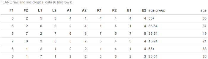
Let’s start at the beginning, with the raw data. Raw data refers to data that has not been processed or manipulated in any way.
As with many questionnaires, in the case of the FLARE, the 10 items take the form of scales ranging from 1 to 7 (Disagree-Agree). For this example, I generated 200 rows of random data. Let’s imagine that we collected the data from users after testing a product. The raw data will look like this:

If for any reason we wanted to visualize the raw data, there was no great difficulty. We make the distribution of each variable. In the case of the FLARE, the variables go from 1 to 7 and are therefore considered ordinal. A bar graph will do very well. For example, here’s the distribution of a question related to the perceived value:

From this graph, we can observe the distribution is highly centered around high values. Users most frequently choose a high value on that scale.
Of course, it’s a self-administered questionnaire so we won’t conclude that, for example, value or usability are high, but that “perceived” value or “perceived” usability are high.

Transformed data
The particularity of a standardized questionnaire is also the data transformation method. Very often it is not the raw data that are analyzed but rather the data transformed by a scoring system. This is the case for example with the SUS or the UMUX. For the latter, the scoring is done by a calculation that includes several items (Brooke)(Finstad). In the case of the FLARE, the scoring system is a transformation from variables ranging from 1 to 7 to variables ranging from 1 to 100, before averaging by subscale.
The transformed data, therefore, look like this:
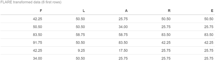
This time, the transformed scores can take on a large number of values ranging from 1 to 100, so we will consider them as numerical data. To visualize the distribution of one of the variables, we can use a histogram:
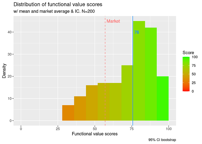
Using this graph, we can visualize the mean score as well as the distribution of respondent scores. Visualizing distribution (how scores spread around the mean) can help the interpretation of the final score. The color code makes it easier to interpret the valence.
Of course, it is very useful to be able to compare the results with other products on the market. This is one of the advantages that the SUS owes to its popularity (Sauro). In the case of FLARE, we can also view an average score for competitive products. For practical reasons, it is assumed that this market score is the same for each subscale.
It is a good idea to make a graph self-sufficient by including a title, names of the variables, names of the axes, value types (counts, relative frequencies, percentages), data source, and sample size (Deline et al.).
For accessibility, color is information that requires to be double-coded. See https://accessibility.psu.edu/images/charts/ for more about chart accessibility.
See an example of UMUX transformed data visualization here: https://rpubs.com/paulamat/umux

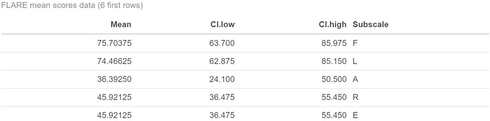
Summary by subscales
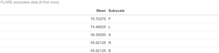
Subscales refer to a set of related items that measure a specific dimension within a larger questionnaire.
If we had to visualize every variable to understand the data, it would be tedious. That’s why the goal of statistics is to reduce the data. In meCUE, for example, there is no scoring, only the descriptive statistics of the raw data (Minge et al.). In the FLARE, this is done by averaging each subscale. Thus, the reduced data look like this:
To graph the averages of each subscale, it is possible to use a so-called “radar” graph. The results of the DEEP questionnaire are sometimes presented in this way (“Questionnaire DEEP — La grande Ourse”), but this type of graph is criticized in the statistical community (Robbins and Heiberger). In our case, we can use a bar graph or a dot graph. If the bar graph is rather intended to represent proportions, it is sometimes used to represent a mean as a deviation from the baseline:
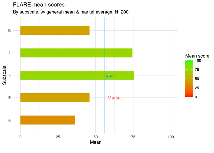
From this graph, we can see that perceived value and usability lead the way with high mean scores, while emotion and aesthetics are pretty low. The general mean score is centered, just behind the market reference value.
See an example of meCUE subscales visualization here: https://rpubs.com/paulamat/mecue

Inferences
So far we have visualized the sample data, but we are primarily interested in the population from which the sample was drawn. Inferences are made by analyzing data from a sample in order to make conclusions about a larger population. One main objective is to quantify the uncertainty associated with the conclusions drawn from the data.
Since we have calculated averages, we can also calculate the confidence intervals that accompany them. The confidence intervals show the uncertainty associated with each mean. If we want to calculate the confidence intervals for each item, we get these data:

To represent them, we use a graph similar to the previous one to which we add the error bars, which represent the confidence intervals. This time, we want to have more granularity in the visualization. Therefore, it is the transformed items that are presented:

We can see that each mean has a large confidence interval. The mean of F2, for example, is 69 in the sample but could go below 50 or above 75 in the population, and we are 95% sure about that.
In this last graphic, the color code makes it possible to differentiate the different subscales of the questionnaire. Different hues are used to help people with color vision deficiencies.
The confidence intervals are actually large because they are calculated by the bootstrap method. We do not assume that the data is normal in the population and we have only one sample.
Summary by dimension
Dimensions refer to the underlying constructs or concepts that the questionnaire aims to measure.
In the case of the FLARE, these dimensions are perceived quality and pleasure of use. For the FLARE, the scores of the two dimensions are the means of the constituent subscales. We obtain this data:
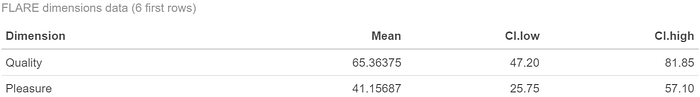
To visualize where the mean scores are on these two dimensions, there is nothing like a dot plot:
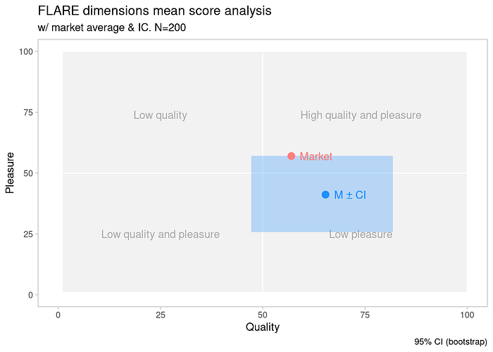
This type of visualization is proposed by the AttrakDiff questionnaire (“Méthode Attrakdiff — La grande Ourse”). The confidence interval reminds us that in the population studied, the score can change category.

Final score
The most representative statistic for a standardized questionnaire is the final score. Usually, we have one final score per dimension, so some standardized questionnaires may have multiple final scores as they measure multiple dimensions. In the case of the FLARE, we’ll use the functional value mean score.
To represent it, a simple dot plot is sufficient. If the psychometric qualities of the questionnaire allow it, interpretation aids can be added, such as the SUS categories (Bangor et al.) (Sauro). When creating the FLARE, we also validated interpretation categories:
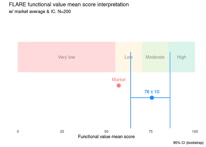
From this graph, we can see that the mean score of perceived value place the product in the “moderate” value category. The confidence interval shows that the real score (population score) could be in the “low” category.
See an example of SUS mean score visualization here: https://rpubs.com/paulamat/sus

Two qualitative variables
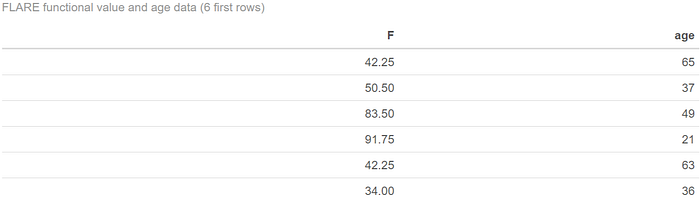
To characterize the respondents’ profiles, the questionnaire ended with sociological questions. We hypothesize that the usability score varies according to the age of the respondents. Here are the raw data again, with the age variable:
In addition to the classical analyses of questionnaire data, it is possible to perform bivariate analyses. In this case, we try to explore the relationship between two variables.
By transforming the numeric ages into age groups, we have made it an ordinal variable. With two categorical variables, we analyze the relationship by observing the frequencies associated with each combination of variables. Graphs showing frequencies are common among standardized questionnaire practices, such as for representing the PrEmo (Desmet). To graph these frequencies, we create a graph like this one:
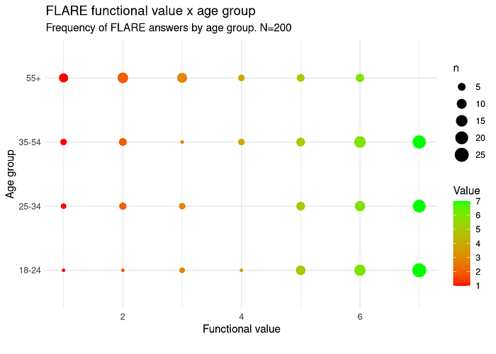
On this graph, we can observe that users who gave most of the high values on that scale are 18 to 54 yo, and users who are more than 55 yo tend to give weak values.
To go further, it is also possible to associate this graph with its complement, which presents numerical indices of the relationship between the two variables:
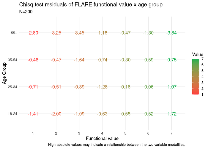
These are the residuals of a chi-squared test. High absolute values (>2 or <-2) may indicate a positive or negative relationship between the two variable modalities. A more complex statistical test will let us know if this relationship is real.
In this last graph, because the information is textual, colors are darkened to ensure readability.

Two quantitative variables
Let’s keep the age variable numeric. We still hypothesize that the value score varies according to the age of the respondents. If the two variables are treated as quantitative, this analysis takes the form of a correlation analysis, or regression if we believe age predicts the perceived value. Here is the data:
We’ll use transformed value scores because we want quantitative variables. If the two variables are quantitative, we can use a dot plot:
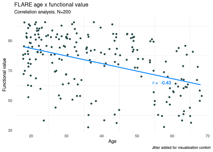
The direction of the line shows that the more the users are aged, the less they perceive value in the tested product. It’s a negative correlation. More analysis needs to be done to see if age can really predict the perceived value in the population.
Conclusion
From descriptive analyses to bivariate analyses, including inferential estimations, data from standardized questionnaires offer many opportunities for analysis. The most interesting aspect from the data point of view is their hierarchical structure of items, subscales, and dimensions.
But careful. In this article, I created the FLARE questionnaire as an example because not all analyzes are appropriate for all questionnaires. By taking a fictitious example, I allowed myself to get out of the box. Before customizing data analysis from a standardized questionnaire, it is good to ask yourself if you are infringing the philosophy of the questionnaire.
Statistics relating to items, subscales, and dimensions should not be confused. Moreover, it should be remembered that the validity of a questionnaire to measure a dimension is inseparable from its internal structure, its analysis, and delivery procedures.
Finally, it is worth remembering that not all questionnaires are free of rights. The AttrakDiff and PrEmo questionnaires, for example, are subject to license and cannot be used without precaution.
Authorizations
PrEmo (Product Emotion Measurement Instrument) was created by Laurans, G. and Desmet in 2017. Thanks to Pieter Desmet, Delft University of Technology / IDE, for allowing me to discuss PrEmo (email on April 16th, 2023).
AttrakDiff was created by M. Hassenzahl, M. Burmester and F. Koller in 2003. Thanks to Franz Koller for allowing me to discuss AttrakDiff (email on April 13th, 2023).
UMUX (Usability Metric for User Experience) was created by Kraig Finstad in 2010. Thanks to Kraig Finstad, PhD, Principal Associate, Dunlap and Associates, Inc. for allowing me to discuss UMUX (email on April 26th, 2023).
SUS (System Usability Scale) was created by John Brooke in 1986. From what I could find, SUS is not copyrighted and there is no specific license agreement associated with its use. However, it is still important to correctly attribute the original creators.
meCUE (modular evaluation of key Components of User Experience) was created by M. Minge, L. Riedel and M. Thüring in 2016. meCUE is freely available as an application and thus not subject to rights of use. See https://mecue.de/home/nutzungsbedingungen.html
R code
All visualizations in this article were created with ggplot2 in R from randomly generated data.
Do you guys wanna see the code? 🤓 It’s right here: https://rpubs.com/paulamat/flare
Works Cited
“Accessibility at Penn State | Charts & Accessibility.” Penn State | Accessibility, https://accessibility.psu.edu/images/charts/. Accessed 26 April 2023.
Bangor, Aaron, et al. “Determining What Individual SUS Scores Mean: Adding an Adjective Rating Scale — JUX.” Journal of User Experience, https://uxpajournal.org/determining-what-individual-sus-scores-mean-adding-an-adjective-rating-scale/. Accessed 27 April 2023.
Brooke, John. “(PDF) SUS: A quick and dirty usability scale.” ResearchGate, https://www.researchgate.net/publication/228593520_SUS_A_quick_and_dirty_usability_scale. Accessed 27 April 2023.
Deline, Stéphane, et al. Statistique descriptive. De Boeck supérieur, 2017.
Desmet, Pieter. “Developing 14 Animated Characters for Non-verbal Self-Report of Categorical Emotions.” Delft Institute of Positive Design, https://diopd.org/wp-content/uploads/2002/05/Laurans-Desmet-2017-Developing-14-animated-characters-author-version.pdf. Accessed 27 April 2023.
Finstad, Kraig. “(PDF) The Usability Metric for User Experience.” ResearchGate, https://www.researchgate.net/publication/220054775_The_Usability_Metric_for_User_Experience. Accessed 26 April 2023.
“Méthode Attrakdiff — La grande Ourse.” La grande Ourse — Agence UX/UI, 17 February 2021, https://lagrandeourse.design/blog/ux-research/methode-attrakdiff/. Accessed 26 April 2023.
Minge, Michael, et al. “The meCUE Questionnaire. A Modular Tool for Measuring User Experience.” meCUE, https://mecue.de/Homepage%20Content/02%20Links%20&%20Literatur/2016_minge_th%C3%BCring_wagner_kuhr.pdf. Accessed 27 April 2023.
“Questionnaire DEEP — La grande Ourse.” La grande Ourse — Agence UX/UI, https://lagrandeourse.design/ressources/questionnaire-deep-activites-ux/. Accessed 27 April 2023.
Robbins, Naomi B., and Richard M. Heiberger. “Plotting Likert and Other Rating Scales — Naomi B. Robbins.” Proceedings of the Survey Research Methods Section, http://www.asasrms.org/Proceedings/y2011/Files/300784_64164.pdf. Accessed 27 April 2023.
Sauro, Jeff. “5 Ways to Interpret a SUS Score — MeasuringU.” MeasuringU, 19 September 2018, https://measuringu.com/interpret-sus-score/. Accessed 27 April 2023.
Sauro, Jeff. “Measuring Usability with the System Usability Scale (SUS) — MeasuringU.” MeasuringU, 3 February 2011, https://measuringu.com/sus/. Accessed 27 April 2023.
Valdespino, Anastacia. “UMUX (Usability Metric for User Experience) — Qualaroo Help & Support Center.” Qualaroo Help & Support Center, 15 December 2020, https://help.qualaroo.com/hc/en-us/articles/360039072752-UMUX-Usability-Metric-for-User-Experience-. Accessed 26 April 2023.

