Member-only story
How visualizing my Agile backlog improved productivity
Taking a cue from Data Science as a UX Designer.
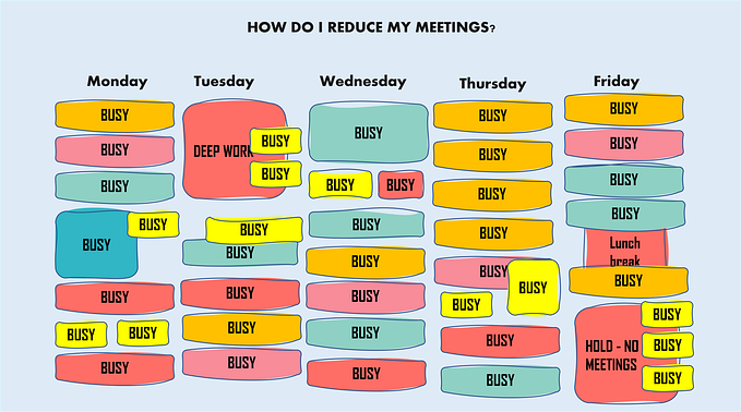
Yesterday, I made about 3 months of project progress clearer to the entire team.
I didn’t have one-on-one interviews with stakeholders or anything drastic.
I simply organized all of the information we had collected and visualized it.
I should know about visualization as a UX Designer. Between designing prototypes, creating design artifacts, and explaining research findings, I thought I knew most of the ways to visualize things.
But it was a technique from Data Science that got me to visualize our Agile backlog.
It made my life a lot easier. And it can make yours easier as well. Here’s how.
Data-aware design
As I mentioned in a previous post, I’ve been getting into Data Visualization and understanding the way that Design and Data Science can interact.
One of the key parts of that interaction is that Designers can make data wrangling, a tedious process for data scientists, easier by designing well-structured questions and systems for data intake.
But I hadn’t understood the importance of well-structured data until I saw how the visualization was used in Data Science.
Visualization was often a key part of Exploratory Data Analysis, which involves visualizing data to see if certain relationships exist among data, or whether it was worth exploring further.
And it’s usually best used at the beginning.
Rather than waiting until all hypotheses are formulated, just looking at a visualization of the data might give you insights as to what steps you should take next.

It’s a much different approach than UX Design, and for good reason: Data Science usually works with a set of well-established requirements and data, often after something is built.
On the other hand, you might not even have the requirements down with your team during…