Improving Venmo’s experience through user research — a UX case study

Introduction
Our goal in this assignment was to improve the user experience of Venmo, the first peer-to-peer payment app to succeed in combining social interactions to financial transactions.
Project Type: UX Case Study
Team: Monikka Ravichandran, Natalie Yeh, and Yirang Choe
Duration: 12 Weeks
Role: Content Writing, User Research & UX Design. A lot of my efforts went into bridging the gap between our skill sets to ensure we were best positioned to produce good results.
Skills: User Research, Mobile UX Design, Wireframe, Prototyping
Why Venmo?
We were initially attracted to Venmo due to its success in combining a fun social component to the otherwise private, awkward money-related discussions. As users ourselves, it pained us to see that our favorite payment app that we used every day had UX problems that when fixed would greatly improve the overall user experience.

Our Design Process
Our approach to figuring out the right problems to solve, and choosing the right solutions to design was to use the creative process, the Contextual Design. This design process suited well to our needs as understanding current pain points and areas of improvement in Venmo required us to work in partnership and participation with users. Our process was iterative in which several ideas were developed, tested and refined a number of times, an essential part of good design. This project explores problems and possibilities for Venmo to succeed in the saturated and highly competitive P2P marketplace.

According to Don Norman, any design process starts with the understanding of the problem and its users. We too kicked off our project with understanding the FinTech sector, the popularity of Venmo, Venmo’s userbase, and its competition.
Desk Research
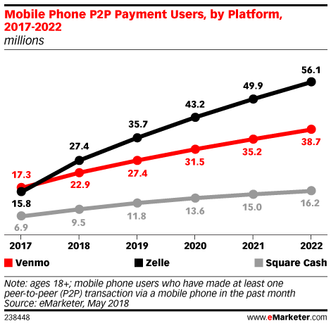
Desktop Research allowed us to better understand the various challenges faced by users using mobile payment apps. We learned that data of an active user’s mobile payments is worth more than $400 per year in revenue. In addition to Venmo’s popularity, growth, huge customer base, we found that there is an alarming level of safety and privacy concerns among users from our preparatory research. There is a project by a Berlin-based privacy researcher called ‘Public by Default’ that highlights the privacy risk when exposing our transaction history in Venmo.
We conducted elaborate desk research to gain a broad understanding of the product domain. Our aim here was to learn about the users, their goals, the context of use, and user environment from previous research, related case studies and other sources. The insights and findings from desk research were used in defining our project and user interview focus.
Competitive Analysis
To get a big picture of how Venmo is currently doing in the market, we looked at its major competitors including Apple Pay, Square Cash, Snapcash, Zelle, Google Wallet, Splitwise and Paypal. By comparing their attributes and features, we managed to evaluate some strengths and weaknesses Venmo has.
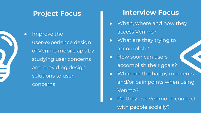
Project Goals
We then drafted our project and interview focus as follows.
The assumptions or hypotheses that needed validation through user interviews were
- Venmo reduces friction between friends in financial matters
- Use of social features such as comments and emojis in transactions reinforce creativity
- Friends who are Venmo users providing advertising and awareness is the reason for its fast adoption
- The default privacy setting for transaction history being public is a cause for concerns
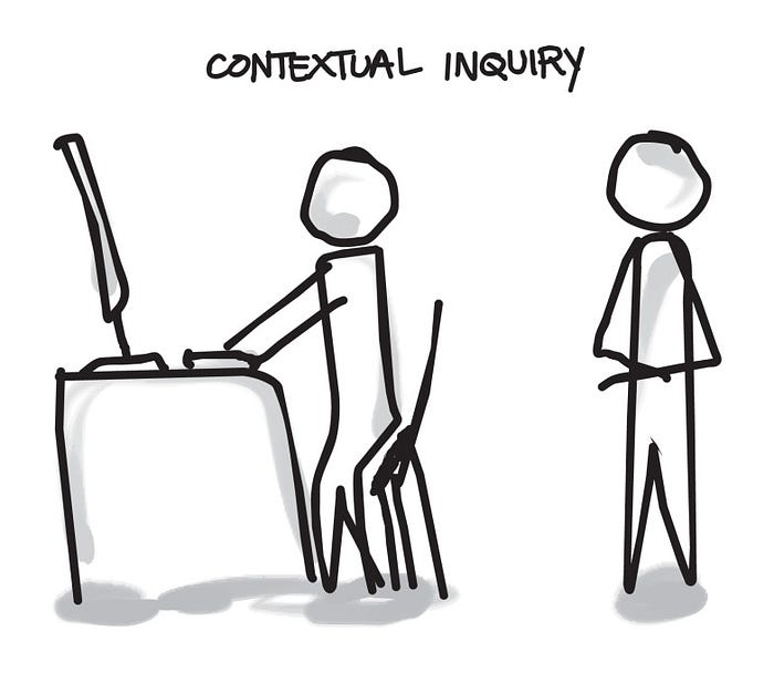
Contextual Inquiry
First, we drafted up a user research plan and an interview guide detailing our recruitment steps, project schedule, interview process, and tasks. We then recruited, observed and questioned 10 participants comprising of adults in the age group of 20-40 with diverse educational and occupational backgrounds. Conducting these interviews in the user’s environment allowed us to understand their context of use and nuances when using Venmo that the users otherwise may not have been able to articulate in an interview. Our users were all familiar with Venmo with varying levels of proficiency in Technology and used different devices (Android/iOS) or platforms (Web/Mobile) to access Venmo.

The Interpretation Session
Once the interviewer and user developed a shared interpretation of the work through discussion, we had team interpretation sessions to hear the whole story of an interview, clean up discussion notes and capture insights relevant to the design problem.
During the interpretation sessions, we developed individual contextual models to capture every aspect related to using Venmo and consolidated them when we finished interpreting all the user interviews to reveal common patterns and structures without losing individual variations.
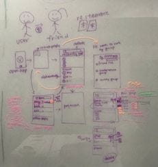
Contextual Design Models
Based on the nature of our design problem and the type of data we were gathering, we decided to develop the Day-in-the-Life and Sequence models to help us see what mattered and simplify data complexity.
Multiple models give multiple perspectives on the user

The Affinity Diagram


“The Affinity Diagram is the simplest way to organize field data. It arranges the notes from Interpretation Sessions into a hierarchy that reveals common issues and themes across all users. The Affinity shows the scope of the problem: it reveals in one place all the issues, worries, and key elements of the users’ lives relevant to the team’s focus. It also helps define the key quality requirements on the system: reliability, performance, hardware support, and so forth.”
— Karen Holtzblatt
We had 358 independent notes from the Interpretation sessions of the 10 user interviews. We printed them on post-it notes in random order. We then grouped the notes on a wall to reveal distinct design issues and insights. We labeled the groups with blue sticky notes to characterize the point made by the group. The blue labels were then organized into larger areas of interest under pink labels, and the pink labels were grouped under green labels to show themes. Our Affinity Diagram can be found here.


Once the affinity was built, we explored the data and its implications for the design. We analyzed the challenges and opportunities faced by our users when using Venmo app and invented design ideas to improve, enhance, and enliven user experiences when using Venmo. We walked the data, placing design ideas in post-its on the wall next to the data that stimulated the thought. Finally, we built a shared focus for visioning design solutions through discussions.
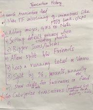
Design Challenges
From the models and affinity diagram, we found some design challenges and areas of improvement in Venmo. Some of them are listed below.
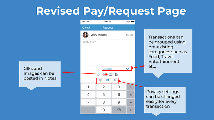
- Security and privacy concerns
- Unreliable search results
- Privacy setting set to “public” by default
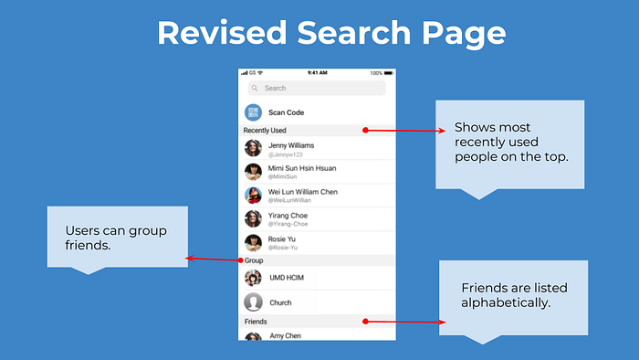
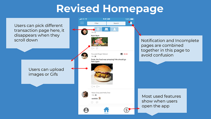
- Low discoverability of features
- Lack of social features
Visioning
Following the Wall Walk, the next step was the Visioning Session. We analyzed the design problems and came up with a few design ideas through collaborative storytelling and brainstorming. We used the consolidated data to drive conversations on how to improve user’s work practice. This results in several visions that capture the story of how the users do their work in the new world that we invented.
The vision produces a high-level future story, rich with new product concepts
The final step in Visioning was to evaluate the visions to identify coherent product concepts. Our visions provided design direction, structure, and coherence. Vision Evaluation resulted in a set of well-defined product concepts, each with a clear purpose, delivering value to the user in a way that is within the project goals. Identifying and sketching out the product concepts helped us bring parts back together in coherent units that can be designed and delivered together.
Prototyping
Based on the product concepts, we designed high fidelity prototypes of Venmo with new features and functions.
Conclusion
We enjoyed working as a team to improve the user experience of one of our favorite mobile apps — Venmo. We were surprised at the effectiveness of Contextual Inquiries and the quality of the insights we gained from them. One of the main challenges for us was to recruit participants. As students’ our connections and network being limited, we had difficulty in finding the right participants with diverse backgrounds for user interviews. We hope to get better at designing good user experiences in time.
Thanks for reading. Please leave your questions, feedback, and comments below.


