Why I love filing my taxes: a UX/UI analysis of TurboTax
“I’m so excited to file my taxes this year!” — said no one, ever.
Well, I love filing my taxes for one reason and one reason only: TurboTax. I’ve been filing using their software for a few years, and every year, the experience has gotten better — faster, easier, and dare I say it — fun. From a UX/UI perspective, TurboTax gets it right.
Before I dive into what makes TurboTax so user-friendly, a backstory…
More Than Just Tax Software
The first time I filed my taxes using TurboTax, I remember submitting them and then excitedly calling my dad, marveling at this newfound step I had taken into adulthood. It was then that he shared the story of the first time he filed his taxes in the United States.
My family immigrated to the United States in 1999. My dad knew nothing about the filing process, and without a service like TurboTax, he was forced to come up with a very tedious solution: printing every available tax form directly off of the IRS website. He then read through the instructions for every form and did his taxes by hand. On paper.
I’m astounded when I consider my dad’s situation: an immigrant filing his taxes for the first time, in a foreign language, in a foreign county, with a complicated financial situation, everything manually calculated on paper. I think about how much time, money, and energy a software like TurboTax would have saved, and how grateful I am that TurboTax not only exists today, but also makes filing my taxes seamless.
In this post, I’ll be using Jakob Nielsen’s 10 heuristics to analyze what makes filing with TurboTax such a positive experience. Along the way, I’ll provide a few suggestions for how to make their product even better. For simplicity, I’ll focus only on TurboTax’s desktop version, although a lot of my analysis applies to the mobile version of their software as well.
The views in this post are entirely my own; this is not a post sponsored by or affiliated with TurboTax. I’m just a big fan.
Aesthetic and minimalist design
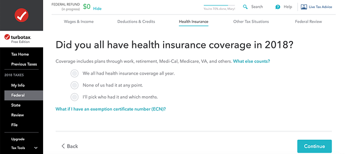
The screenshot below shows one of TurboTax’s first questions for the user. TurboTax knows that filing taxes can be complicated and confusing, and by using a clean, minimalist design, they help break the process down into manageable steps. This series of checkboxes is the primary interface on the page — there are no other questions, ads, or blog post links to compete with the question at hand or diminish its visibility. Each icon box is the same size, so no one prompt gets more attention than another.

These kinds of clear visuals are consistent throughout; users are never presented with more than a few questions per screen. If the questions are easy and don’t require a large cognitive load, TurboTax might group them together on one screen; but if a series of questions requires more thought and attention, they are typically presented one at a time.
Recognition rather than recall
TurboTax’s entire software is built on the principle that the user should never have to recall large amounts of information from their own memory. One way that TurboTax minimizes memory load is by automatically pulling data that the user has previously inputted (rather than making the user enter the same information multiple times).
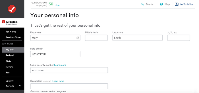
The image below is from the first step of filing. TurboTax requires some additional personal information, like Social Security number and Occupation, but the user does not have to retype their name and date of birth — instead, the system recalls the information from when it was provided during the account setup process.

One improvement to further reduce memory load would be to indicate which fields are optional vs. mandatory. As far as I could tell, the software only notifies users when data is missing from mandatory fields as they’re getting ready to file during TurboTax’s CompleteCheck, which comes at the very end of the tax filing process. Users then have to go back to the form with the missing information and and fix it, which forces the user to recall a question in the filing process that could have been a number of steps back.
It would be helpful for users to know when they’ve skipped a mandatory field right as they’re filling out that form. Since most fields are likely mandatory, TurboTax should only indicate optional fields to reduce the number of visual distractions on the form.
User control and freedom
Have you ever started to fill in a tax form and realized you don’t have all of the information you need? TurboTax has a solution for that: offer the “Back” button at almost every step in the process. Users can easily return to the previous screen without an extended dialogue (“Are you sure you want to leave?” “Are you really sure?”).
Consistency and standards
Thankfully, it’s increasingly rare to find a website that blatantly violates widely-accepted web standards. TurboTax is no exception. For instance, the interface never uses color as the only indicator of a state change — there’s an underline style as well as a color change to indicate a clickable state for links. Adding redundant indicators like this is great for accessibility — color should never be the only visual means of conveying information.
Here are a few more ways TurboTax upholds web best practices:
- Pressing the “back” button takes users back one screen — not two, not five, and not to the very beginning.
- Users can press the “tab” key on their keyboards to navigate between form fields. The “tab” key automatically focuses user input on the next form field — another important accessibility feature, mainly for users who rely on screen readers.
- Sidebar navigation appears throughout every step of the filing process, allowing users to navigate to the most important parts of their tax return. This navigation is consistent throughout the software; it doesn’t change from step to step and provides context for which step of the process the user is on.
Flexibility and efficiency of use
TurboTax gets better every year by offering accelerators to speed up interactions for expert users. For example, if a user has filed their taxes with TurboTax in the past, they’ll automatically pull their returns from the previous year and prompt users to update their information. This is a neat shortcut that saves users time (and encourages them to keep using the software every year).

Users can also choose to connect their account with dozens of payroll providers, banks, and other financial institutions. TurboTax will automatically grab any data that’s needed for the tax filing process and directly input it into the software so that the user doesn’t have to type it all in manually — another nice accelerator.
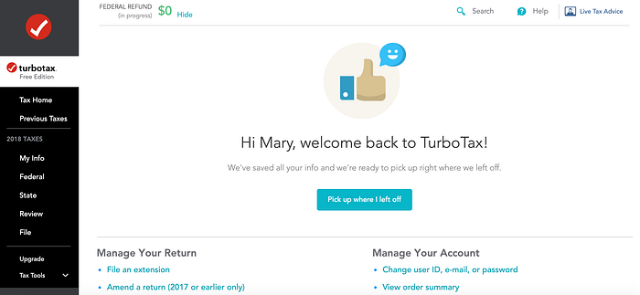
Finally,TurboTax stores users’ progress and welcomes them back to that step each time they log in. This feature saves the user the task of remembering exactly where they left off.
Match between system and the real world
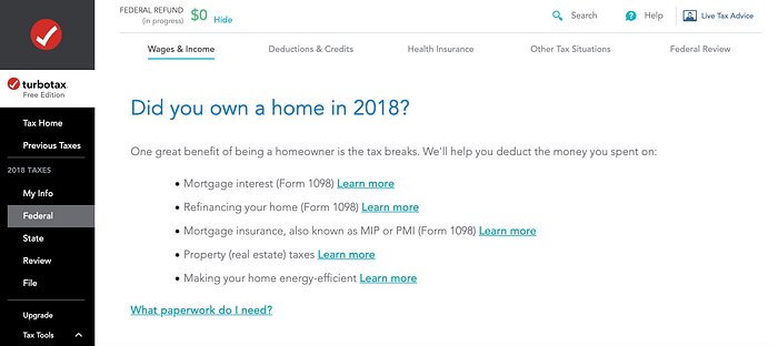
TurboTax speaks the user’s language. Taxes are confusing and complicated, so TurboTax uses plain language that anyone can understand, even if they’ve never filed their taxes before. “Did you own a home in 2018?” is a question that a 10 year old could answer.
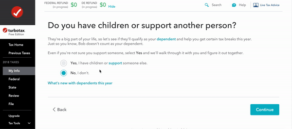
Questions are presented in a natural and logical order. In the example below, users are first prompted to select if they have children or others they support. If they select “no”, this part of the process is done and they get taken to the next set of questions. If they select “yes,” they then get asked who they support. And finally, they are prompted to enter that person’s personal information. Using conditional logic, TurboTax ensures that users never have to answer questions that don’t relate to their tax situation.
Help users recognize, diagnose, and recover from errors
TurboTax does a good job preventing errors by following most of Nielsen’s 5 properties of good error messages.
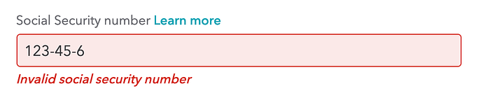
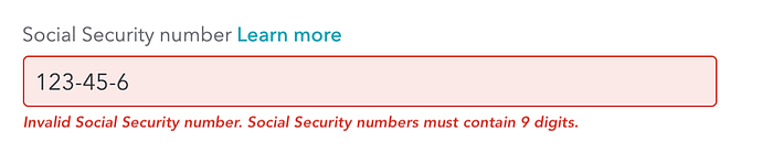
- Error messages should be obvious — TurboTax makes it very clear that an error has occurred by doing two things: (1) highlighting and outlining the field with the error in red (2) displaying an error message underneath the faulty field. To promote accessibility, TurboTax combines color and text so that colorblind users will notice the issue.
- Precise — the error message describes the issue using clear and precise language. In the example below, the user entered an invalid Social Security number. It doesn’t just say “error” without further explanation.
- Human-readable language — the error message uses human understandable language: “Invalid Social Security number.” It doesn’t say “error code 10001” or use language only developers can understand.
- Polite — the error message is polite and straightforward. It’s not condescending and it doesn’t bring the user down for making a mistake.
- Constructive — this is actually one that TurboTax doesn’t do so well. “Invalid Social Security number” doesn’t tell the user why the input was invalid. Is it because the user forgot a number? Did they provide input in an incorrect format? Is the Social Security number itself is invalid? The error message could be made more specific by telling users how to fix their invalid input (e.g. “Social Security numbers must contain 9 digits”).
Visibility of system status
For operations that last longer than a few seconds, TurboTax displays a progress bar so that the user clearly sees the progress of that operation. This feedback is essential to avoid confusion, frustration, and abandonment.
Users could potentially benefit from an overall progress bar to show their progression through the tax filing process (shown in the mockup below). The progress bar could update in real-time and would offer the user valuable information for what’s often a time-consuming process.
Error prevention
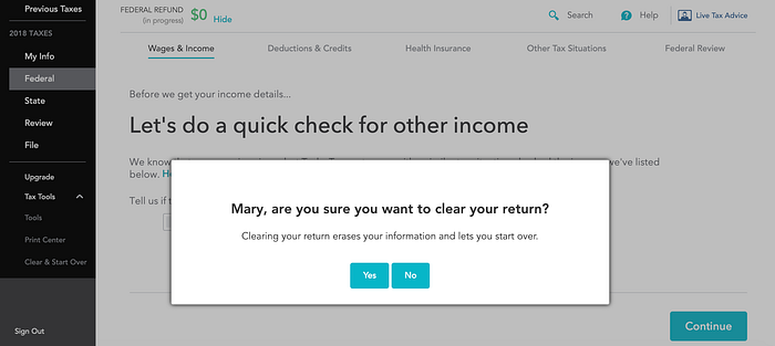
In situations where a user makes critical errors, there’s an option to clear the return and start from scratch. This feature is useful, but it could be potentially catastrophic if a user accidentally clears their return after spending hours working on it. In a case like this, TurboTax presents users with a confirmation option that forces them to double confirm before they commit to the clearing action.
Help and documentation
Sometimes, a system must provide help and documentation for the user. Since filing taxes can be a complicated process, TurboTax has built an extensive Support Center that users can search to find answers for frequently asked questions. Their Support Center follows the four properties of good documentation:
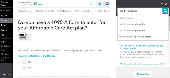
- Easy to search — the Support Center is available directly within the software and users can access it anytime by clicking on the “Search” button. The Support Center opens up in a sidebar within the TurboTax interface, so users aren’t taken away from their current question. There’s also a search field where users can enter a query. While users are typing in their query, they are presented with search suggestions — a feature that helps users form better queries.
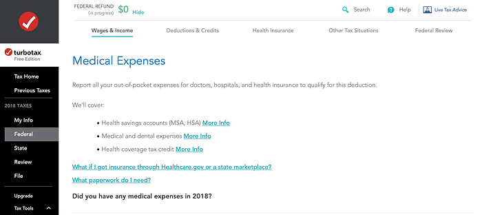
- Focused on the user’s task — aside from the Support Center, there are also relevant links throughout the software to answer users’ most frequently asked questions. For example, as a user is entering their medical expenses, helpful links such as “What paperwork do I need?” and “What if I got insurance through Healthcare.gov or a state marketplace?” are displayed. They appear only on prompts that are relevant to the question at hand — so there wouldn’t be a healthcare related link on a question about investment accounts.
- List concrete steps to be carried out — the answers in the Support Center typically offer users a list of next steps — whether that’s compiling the forms they’ll need, ways that they should answer a specific question, or even a note saying “you don’t need to worry about this information right now.” Answers are typically in the form of bullet points or numbered lists, so they are easy to follow.
- Not be too large — the Support Center is quite robust, but the searching capabilities and the fact that the help is contextual prevent it from feeling too large or overwhelming.
One Final Note
A couple of people have pointed out that TurboTax is one of the biggest lobbyists to block simplifying the tax filling process. Don’t get me wrong — I’m all for simplifying filing taxes by offering pre-populated returns. It would save us more than $2 billion in tax fees every year and 225 million hours in time spent preparing taxes. But we’ve been talking about a return-free system since 1985, and more than three decades later, we’re still waiting. Plus, even with the return-free system, if you disagree with the amount the IRS says you owe, you’d still have to file your taxes by hand, which is where TurboTax will still come in handy.
For the time being, until we make real headway with a return-free system, TurboTax is the solution to the massive UX problem of filing your taxes.
Paper taxes are a massive UX nightmare and basically violate every principal of a seamless experience. With traditional paper forms, the user needs to manually determine which forms they need, which is a tedious process given that the IRS website lists almost 1,000 different forms. On each form, all possible options are presented sequentially, and the user must wade through all the possible conditionals regardless of whether they apply. Plus, many forms require the same information, so the user has to repeatedly write in the same information.
These 3 issues are enough to make my head spin — but TurboTax solves for all of these. With a few simple questions, TurboTax determines exactly which forms a user needs based on their financial situation and only prompts the user to fill those out. Questions are based on conditional logic, so the user never sees a question that’s not relevant to their tax situation. When multiple forms require the same information, TurboTax automatically pulls in data that the user previously inputted.
In this sense, TurboTax is not only making their own interface simple and easy to use — they are simplifying the entire experience of filing your taxes. What could be a major headache for a lot of people (like my dad back in 1999) is now a task that can be done in an afternoon. And that is what makes all the difference.

