I redesigned Apple Maps and replicated an Apple product launch for it
Quick-fire question; what is the single most important and widely used feature in a phone — asides from texting and instant messaging friends, coworkers and family? Maybe you guessed right, perhaps this feature is so integrated into your life that you didn’t even think about it — either way, it is your phone’s GPS. It is reasonable to say that GPS technology has changed society’s lives in ways we never could’ve imagined. Gone are the days of using physically printed maps and almanacks, when we now have smartphones with navigation apps. Since the launch of the iPhone and the App Store, consumers have been able to use different apps for their personal navigation needs. Everyone has a preference, and apps have come out to try and address every need.
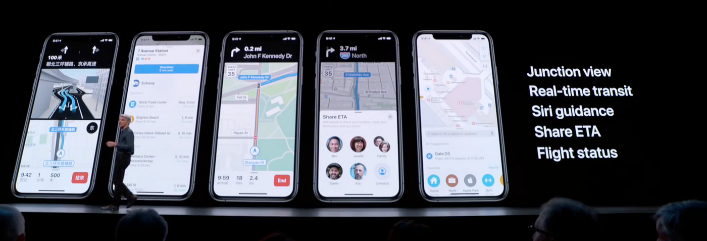
With iOS 13, which was revealed during WWDC19, the Apple Maps experience gets much better. Apple released new, more detailed maps, rebuilt from the ground up. Along with this release came a redesigned navigation panel, easy access to ‘go-to’ and ‘must-see’ destinations, real-time transit information, ETA sharing, Collections, Look Around (3D preview experience), Flyover, Flight status and more. All these features bring Maps closer to being a suited replacement to Google Maps, but still, Apple Maps isn’t quite there just yet. Everyone knows they can, and will, get there, it’s just a matter of time.
Massive kudos to the Apple Maps team for working hard on all the newly-released features; it’s certainly made my experience a lot better using the app. After doing a lot of research about what goes into building a product at a scale as large as Apple, my key takeaway was this; it’s hard. Like, really, really, absurdly hard. I must have second-guessed myself a million times before deciding on the designs you will see below.
As a huge Apple user, I’ve always been fascinated by how the company focuses on design in every single product and service they offer to their customers. I credit my beginning in learning about the importance of user experience design to Apple, and I now know that it is a crucial and necessary step in developing any product or service. There aren’t many companies out there that focus nearly as intensely on design as Apple does. From what I’ve seen, Apple embraces design and focuses on every detail imaginable like no other. Apple isn’t perfect, but they are one of the world leaders in design, and they come pretty damn close to perfect.
I’ve been using Apple Maps as my daily navigator since the iOS 13 public beta came out, and started taking notes of what I would change, improve, and add to Apple Maps. Why did I do this? Because Apple Maps still isn’t doing enough for a lot of users. A simple search of “Apple Maps” on Google search will reveal a plethora of articles stating it’s not a true replacement yet. Going through the comments sections of many Reddit posts will also reveal the vast list of feature requests that users have. Instead of waiting for Worldwide Developers Conference (WWDC20) to see what Apple Maps will look like and what features will be added, I decided to redesign Apple Maps based on the data I collected through different forms of primary and secondary research.
This blog post was made to guide you through my design process in a detailed manner (something I consciously excluded from the case study) and to use storytelling to deliver the full perspective and understanding of this project. Before you continue reading this story, I would highly recommend you visit the product launch landing page and case study.
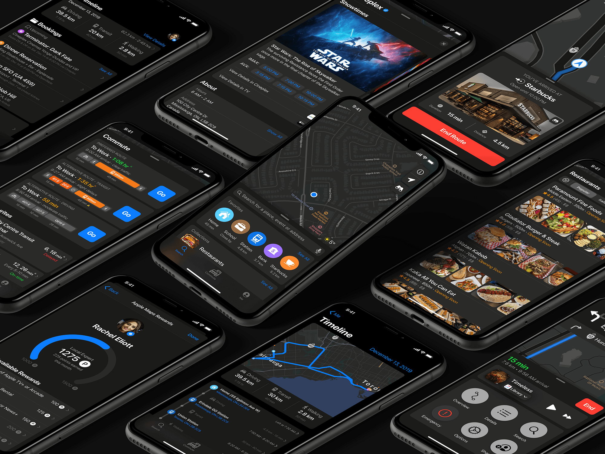
Here’s a sneak peek of what you can expect to see:


And there’s a whole lot more.
Check out the first part of the case study by clicking here. Once you finish checking that out, come back here (part two) to dive into why and how these designs came to be for 12 different features.
This experience was a lot of fun for me and a tremendous learning experience, because I firmly believe that Apple Maps is the underdog in the navigation space, but will come out a winner, eventually.

Google Maps is very reliable, but has recently become overstated and overused, in my opinion. Apple and Google have two very different business models, so I understand the route Google Maps takes when developing products, but still see myself using Apple Maps in the future. Why? Because of its intensely smooth system integration, aggressive simplicity, and the new features I designed (which might, or might not, be included) outlined below. I put in these new features because they can make Apple Maps the Personal Navigation System of your dreams; imagine having a live, well-integrated, constantly-updated diary in your life, with minimal effort. That was my goal here.
One more thing
I would like to say that by doing this, I do not mean offence to anyone’s work in the team or at Apple. I have also only designed this new experience for iPhone XS Max, iPhone XR, and iPhone 11 Pro. The Apple team regularly ensures that their new feature updates work on every iPhone, Mac, and Apple Watch, each that is getting their next respective iOS, macOS, and watchOS updates. This all means much more work, different devices, different user experience guidelines, resolutions, and many more roadblocks that I haven’t even begun to go through. Seriously, kudos to you, Apple Maps team.
Final warning: if you haven’t gone onto my portfolio and seen the product launch page and case study already, you can do so at www.aymanjaddaa.com/apple-maps.
Anyways, if you have, read on, and…

1. Slight layout redesign

The first thing you see when you open the Apple Maps app (theoretically speaking) is the overall layout design. As mentioned in the case study, I decided to make everything more “round”, akin to the look of the Reminders, Health, Find My and Wallet apps. I predict Apple proceeding to use a “rounder” design system for more apps in the future. We’ve already seen it, with their design team using the font ‘San Francisco Rounded’ for small headers and numbers, which I get into later.
In my redesigned app, the background of the app is darker and loses its transparency. The reason behind this design decision was these issues that users have experienced:
- Users who had Dark Mode enabled found that the Apple Maps wasn’t dark enough to match the rest of the operating system. Users wanted a more consistent black or dark grey background. I went about solving this by making the ‘Search’ and ‘Commute’ tabs use Apple’s System Grey 6 Dark colour, based on the iOS 13 Design Kit, while the ‘Me’ tab is now just black.
- Users complained that the text was hard to read in some cases. The current Apple Maps failed the few contrast tests that I conducted on Color.review. The new redesign certainly performs better, but still fails in a few (but less) places. I couldn’t change too much because I wanted to stick to Apple’s iOS 13 colour palette.
2. The San Francisco Rounded font is now used in Apple Maps
As mentioned earlier, the Apple design team seems to be comfortable using the San Francisco Pro Rounded font in non-Apple Watch based apps. That tells me that sometime in the future, it will be more consistent in iOS.
After showing my test group two screens, one that used the standard SF Pro Text/Display, and the other that used SF Pro Rounded and SF Pro Text/Display, more users said the SF Pro Rounded font was easier to read, especially for numbers and small text.
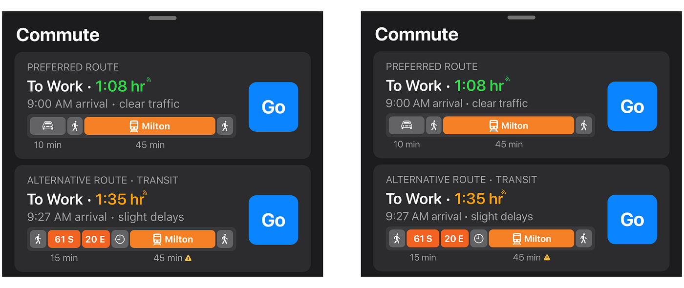
3. The ‘GO’ button doesn’t pop out anymore

You will notice the Go button is now blue and is written as “Go” instead of “GO”. Why would I change such an intuitive colour choice? Well, my question back to you is if blue depicted an action or link everywhere through the iOS, why was the GO button in green? Nowhere in any iOS app on the iPhone will you find a different action button colour, except Maps.
From my understanding, the GO button ‘depicts’ a traffic light. Green means go, orange means hold, and red means stop. It does make sense, but users reported they found the colour popped out too much and was off-brand.
Here is what Apple’s Human Interface Guidelines says:

“Incorporate refined, unobtrusive branding. People use your app to be entertained, get information, or get things done, not to watch an advertisement. For the best experience, subtly incorporate your brand through your app’s design. Using colours from your app icon throughout your interface is one great way to provide context in your app.”
When I asked a few users what the first colour they saw in the Maps icon was, many said blue. This discovery further solidifies why the Go button should be blue, not green. I didn’t make the rules, Apple did.

As to why the GO button is now not all upper-case, it is to keep the buttons and all text more consistent. All buttons in Maps are capitalized, but not upper-case. Even the “End Route” button isn’t capitalized. I decided to stick with consistency here.
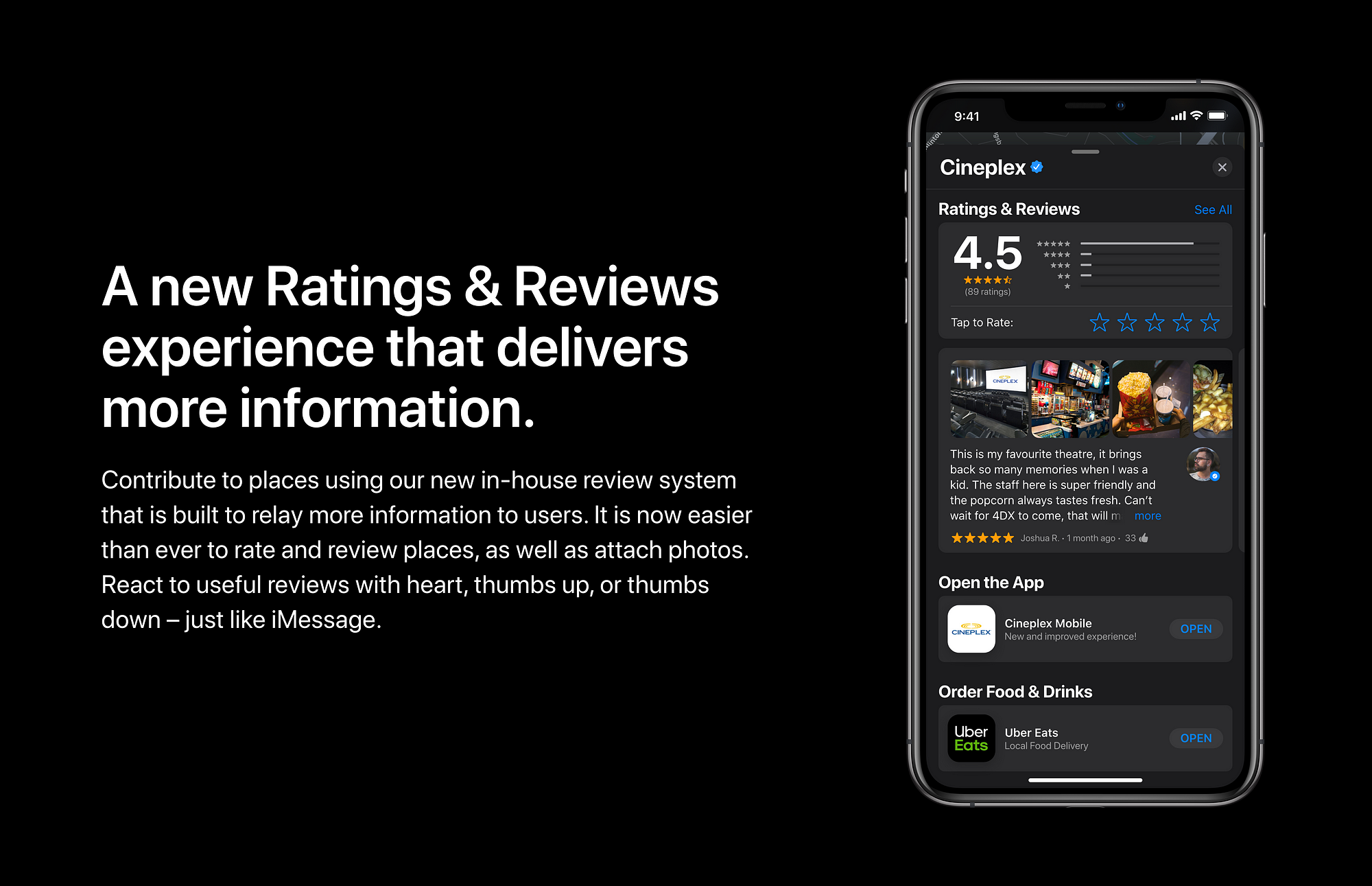
4. Ratings & Reviews interface goes through a makeover
The Ratings & Reviews interface was also altered. I removed the “out of 5” text in the graphical rating representation. Most users I interviewed found it redundant, as did I. A lot of things are based on a 5-star rating scale — hotels, Yelp, OpenTable, Google Maps, App Store reviews, and many more. Users found ratings easier to comprehend by just showing the rating in both numerical terms and visual terms.

The review interface wasn’t changed much and is similar to the current Apple Maps interface, as users found it pretty intuitive. I could’ve changed the layout to look more like App Store reviews, but based on some of the research I conducted; I found that users perceive reviews with pictures to be more trustworthy than just user names. To make sure reviewers still kept their privacy, I kept the format as “FirstName.LastNameInitial”. This was also because of a recent story of how a user got harassed online for posting a negative review. The “Write a Review” action has now been removed since users will automatically get a popup asking for a review after they rate a place. This is in place to increase the conversion percentages for reviews written.
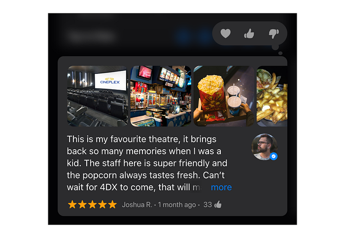
The three features I added were; the ability to see reactions to a review, post photos in a review, and the new Local Export badge near a reviewer’s picture. Similar to how iPhone users can hold on an iMessage and leave a reaction (Love, like, dislike, laugh, show excitement, and question), I wondered if users would like to have the same experience in reviews. After doing some more research and interviews, I found that while most users use reviews to see if they can trust whatever place they’re checking out, they felt more comfortable when reviews were approved or vetted by other people.
5. Places have a Verified badge now
This may be considered by some as a minor flaw, but it goes a long way. One of the research findings that piqued my interest was that users often complained about businesses and places having incorrect, or outdated information. To fix this issue, I’ve added the ability for accurately and actively-managed businesses in Apple Maps Connect to have a blue badge beside its listing name (similar to Twitter’s ‘verified’ blue tick) to show that it is accurate and has the latest and most updated information.

Apple’s current way of managing a place of business on Apple Maps isn’t as easy, nor as simple, as it should be; it requires users to visit the Apple Maps Connect web portal, and have them manage and edit the necessary information there. This already way too many steps to think about.
As mentioned in my case study, one of the first steps I would like to take with this case would be looking into designing an app that allows business owners to manage their Apple Maps listings, rather than having to use the web portal. Through making this process easier and more accessible, I genuinely believe this would increase the amount of accurate data Apple Maps has and get more businesses listing businesses on Apple Maps.
6. The Directions screen is now more capable of making trip planning easier

After showing my test group the new directions screen, most to all voted for the new one, as opposed to the old one, citing the reason so as that they liked having more options on one screen. This is as opposed to clicking “My Location” on the directions screen before to see all the options they had, in terms of transit.
Another feature request that I deduced from a few people in my test group was the ability to change the mode of transport options while driving/walking/biking. I had already shown them the new options for each method of transportation, but they brought up the how bothersome it was to end a trip just to change route options, or to go digging in Settings. I agreed and changed it. When a user changes a setting to something like “Avoid Highways”, it should automatically change the route guidance to use local streets instead.
7. The HUD while navigating is now simpler and easier to read
The navigation screen now has a slightly different layout. You might be thinking, “But Ayman, why did you copy Google Maps??”. I didn’t. Well, technically I didn’t; If it works and it’s backed up by statistics, then why not make use of it? Being uniquely different is good and all, but it should never be at the expense of ensuring the proposed solution is the one that best fixes previous issues, and performs the best.

I decided to ask my test group what they saw first when looking at a navigation screen (in both Google and Apple Maps), but I got such varied answers that it didn’t help me solve this issue. Instead, I used a heat map to help visually explain the reasoning behind this layout decision; seeing is believing. Below is the heat map of a navigation screen in both Google and Apple Maps. I used VisualEyes’ AI-powered assistant to help me validate my UX assumptions.

As you can see, Apple Maps users don’t have a clear way of knowing where to look first on the screen, currently. Multiple tests were done to consider different use cases and ensure accuracy with said hypothesis. I tested it out in both light and dark mode, and with different route information. I also tried uploading the whole screen a user sees versus just the navigation bar.
Based on my research and the generated heat map, I think the results speak for itself — users found the redesigned layout easier to read, especially while driving since every second counts.
8. Movie theatres in Apple Maps display showtimes
One minute feature I thought could add a lot of value to users was the ability to book movie tickets right through the app. With the existing ability to see events and make reservations at restaurants in Apple Maps, being able to see movie listings is something a lot of people will enjoy and seems to be the next logical step. Users can see movie listing times, the movie summary, and have the option to see details in both the Cineplex app (our Canadian movie chain) and Apple TV app.

Apple already has tons of data on movies, TV shows, music, and more, because of the iTunes Store, so integrating that data to help users is a perceivable and viable feature. This solution reduces clicks and user interactions between many different apps and removes the need to search the movie up manually in Spotlight or in Safari.
Once I showed this feature to my test group, they immediately all loved it, and confirmed it would save them a lot of time and hassle. And hey, it also keeps people tied into the ecosystem that we all love so much.
9. Revamped ‘Hey Siri’ overlay and experience

One complaint I found in my research was how users weren’t too satisfied with how to activate Siri while driving because they feared they would miss a stop, turn, or exit since Siri took up the whole screen. To solve this issue, the best solution I found was to have a Siri overlay that hovers over the route guidance information in the navigation screen. When users use it, they are only able to hear Siri’s answers — no text will be shown. This mode called Siri Audio Mode and is automatically enabled while navigating to a destination, particularly when driving.
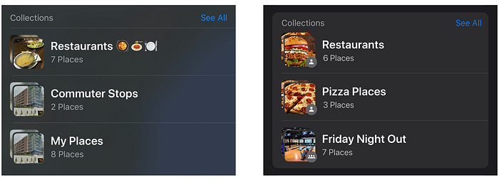
10. Collections can now be private, shared, or archived
During my research, I found a few pain points focused on Collections, listed below:
- Users had no way of knowing if their Collections were shared or not.
- Users who used a shared Collection didn’t get any updates when the Collection owner added or removed a new place.
- Users wanted the option to archive Collections, especially for their trips where it might not be too helpful, or if a user was back in their home country. Having Archived Collections allows users to keep a list of places they’ve visited in storage, in case they want to revisit them or share with their family and friends later.
Based on these pain points, I designed a new solution that will meet user needs and wants.
11. Gamification entices users to contribute more to crowdsourced data
One of the parts I had the most fun doing for this case study was the new Local Expert Program. As someone who likes to review places, I’ve been to a lot of restaurant locations and places, and I would be excited if this concept came to fruition in the near future.
The reason why I decided to include this program was that people LOVE gamification. Here are a few apps and services that use it: Google Maps, Yelp, Todoist, LinkedIn and many more. Humans love getting rewarded for behaviours and getting motivated by an incentive to do something.
Google Maps’ version of this has been in existence for a few years now. It’s called the Local Guide program, which used to occasionally gives away prizes like free movie rentals, Google Drive storage, and more, but because of the vast number of users now, rewards aren’t rewarded as they were before.
Regardless, it’s been a very successful venture for them, and Apple has the resources to replicate that same level of success. While the rewards, as they are now, may not be enticing to some, they are still things a lot of people will see the value of. Apple, being Apple, of course, can afford to reward users who send in feedback and reviews for routes, destinations, business information, and so much more. Crowdsourcing this data is essential now that Apple has its map data, as well as a large enough user base.
The program is based on a point system. Here is how users can accumulate points:

Anyone who is a Local Expert is a person who has accumulated 250 points and will get a blue badge near their Apple Maps profile. Once 250 points have been reached, users get to keep the Local Expert badge and flaunt it to other reviewers, family and friends. To add more of an incentive to becoming and achieving the Local Expert badge, users can unlock custom iMessage stickers as an added benefit.
There would not be any levels, like Google’s Local Guide program. While it does have its benefits, it is better to offer tangible rewards that users can benefit from, instead of just a badge. Apple can also consider giving users points multipliers depending on how many devices they own, or services they’re subscribed to. It may cost more in the long run, but it can be a better enticement for users — which will equate to better quality data over time, stronger loyalty to Apple, and lower costs of multiple-device user acquisition.
12. Routes in the Search menu now keep previous sessions saved and can be scheduled for later
One issue I encountered — though some might consider it minimal — as a commuter is where I look up a route, then switch into any other app, and switch back, I find that that the route I was looking at is gone. For me to see that same route again, I have to:
- Look up the place again
- Click on directions
- Change the starting point (if I’ve changed places)
- Select the form of transportation; in this case, it’s transit
- Change the timing to whatever time I was using prior
- Route the trip
That’s a lot of steps, and it can get draining and tiresome. Apple Maps currently allows users to see the directions they were viewing in the ‘Recently Viewed’ section when on the Maps homepage, but it doesn’t save your previous starting point, mode of transport, or arrival/departure time settings. It will simply use your new location as a starting point, leaving you to do all the work again.
This solution helps majority of the people I asked, who admitted they don’t ever start a trip when using public transit. Instead, they usually looked up a route and follow the steps without pressing ”GO” to start the navigation, and this is because of a few reasons, the main one being battery drainage.
The solution to this issue of remembering past searched routes would allow users to look up directions and keep their settings saved when they go back to the directions screen, and/or it would enable users to schedule a trip.
Let’s go over the first solution. the layout would be similar to the way it currently is set up, but it would show your last saved settings, so your starting location, the time set to leave/arrive, and form of transportation. This can be done through an automatic save on Maps, or even a button to ‘save this search’.
The second solution is simple; it would allow users to schedule a trip in Apple Maps. Currently, users get Siri Suggestions that get data from Mail, Calendar, Wallet and more. Instead of having a user create an event in their calendar for their trip with travel times set so that they get a notification then, users will now be able to schedule a trip easily within Apple Maps. By making this a two-way flow of information, users will be relieved of having to use 2 different apps to make and manage their schedule. Siri would be able to gather updated information from the Maps and use that to update your Calendar ‘time to leave’ alert, and vice versa; any changes made to your calendar will automatically create alerts or changes in the Maps app.
This feature wouldn’t just be for transit users, but also for those who drive. Every phone GPS already supplies the latest traffic data both near a user’s location and near a user’s final destination (which is based on calendar events, bookings and more). So it shouldn’t be too big of an operation to create user notifications for when they should leave, based on a scheduled trip.

I hope you enjoyed the in-depth analysis of why certain features were changed. Before we end off, I wanted to share a crazy idea and a thought that I wanted to keep out of this case study.
1. Crowdsource review data from multiple services
Instead of building a whole new review system, why not rely on crowdsourcing multiple reviews into one platform? Apple currently uses Yelp, OpenTable, and TripAdvisor, for example, for their respective reasons. Why not keep those partnerships in place and combine reviews from these three sources — and even more, like UberEats, SkiptheDishes, DoorDash, Foodora, or even Google Maps?
The solutions shown in my case study already includes enhancing MapKit by allowing apps to be able to “talk” to Apple Maps and view/manage their bookings — which is a stepping stone to the idea of crowdsourcing reviews. This doesn’t necessarily stop at just reviews; it can be a whole lot more.
One thing to keep in mind, however, is that the reason why Apple had an unsuccessful launch was that they crowdsourced multiple map data points from different suppliers. This changes things, by a lot. For all I know, the word ‘crowdsource’ is probably banned within the Apple Maps team at this point, given all the grievances it’s given them in the past.
2. Apple may be on to something…
After doing this case study, I realized how it could be more of an opportunity for Apple to win in the navigation space, long-term. Google Maps has a very different business model — it relies on data to advertise and tailor places to users. Apple, on the other hand, is not in the advertising game. For them, the main focus is offering a system-integrated solution that it: (1) keeps users in the ecosystem, and (2) provides a replacement product to a product that fishes for consumer data, which is against Apple’s code of ethics.
Apple has the upper hand in ensuring their product performs better for a fewer number of people, thus resulting in better percentage results. If you’re an Apple fan who watches their keynotes like me, you probably noticed how Apple Executives love to show their iOS adoption rates vs Android update adoption rates. Apple is in the quality business, not the quantity business. It’s also in the business of being the best, not necessarily the first.
Apple can offer more integrated features, better options for customers, and more, all shown in my case study, with the limited number of current users. They don’t have to appeal to the 1 billion+ Google Maps users (2017 data). Instead, they can focus just on the smaller user base that they have, and strive for higher satisfaction.
Apple is spending billions of dollars on rebuilding their maps from the ground-up, so I’m sure they have a lot of plans to recoup massive returns over time, and this might just be the way to increase their adoption rates and rate of returns on their investments.

That’s it, folks!
If you’ve stuck through all the way, you’re a trooper! Yes, as you may guess, I’m preparing for the new Star Wars movie. I hope you enjoyed my work and I thank you for joining me on this journey of mine, to understand the reasoning behind why I redesigned, added, or changed certain features.
I would appreciate your feedback because I do plan on compiling it and potentially running this project through another iteration based on the feedback I get. I know that as a Junior Business & Product Designer, I have lots to learn, so your feedback will also allow me to improve in my craft.
If you liked my work, make sure you check out my two other projects; Apple Carrier, which offers users a consistent iOS app experience to manage and track cellular usage, and Apple Authenticator, which allows users to be more aware of two-factor authentication and enjoy a password-less login experience for their favourite products and services. In case you’re wondering, I’m currently looking for a full-time work oppportunity. Contact me by visiting the About page on my portfolio!
Before you leave, I do have one favour to ask: if you enjoyed my work so far, which I hope you have, then please send this someone who might be interested or even shoot me some feedback — I’m always looking to improve my craft!
Cheers!


