I took part in a Daily UX Writing Challenge
Here’s how I did it and what I learned.

First a bit about the challenge
Ryan Farrell is the creator of the challenge, you can sign up for the challenge at dailyuxwriting.com. After signing up you will get a daily prompt in your email for 14 days with a challenge and a character limit for the solution. For each challenge you have to come up with a solution under 10 minutes. You’re only asked to come up with UX copy, but I went ahead and created some User Interface designs for good measure (the UI part of course took more than 10 minutes). I also assumed the character count included spaces and punctuation marks. So here’s my solutions and what I learned.
Lets go!
Challenge 1
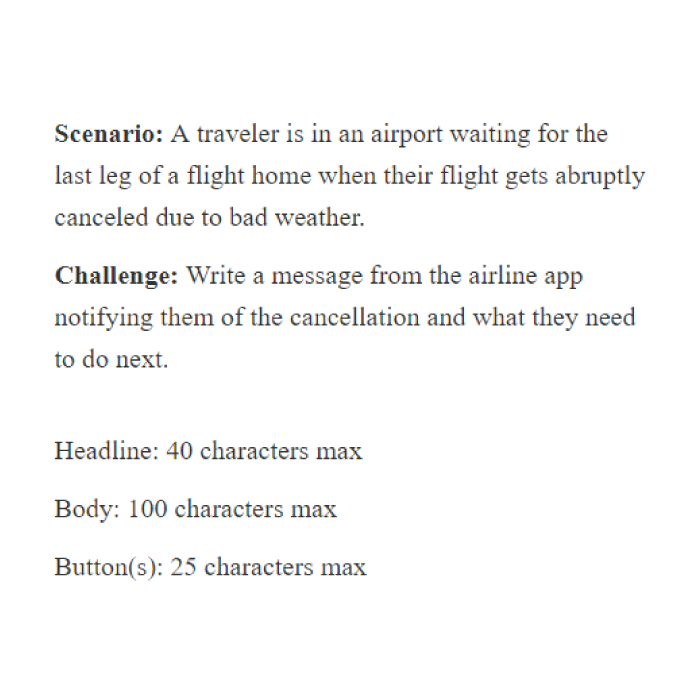

Takeaway: Be direct
In this scenario the airline has informed the user that due to weather they had to cancel his flight home. So I thought it was probably not the time to get too creative and use witty words infused with humor. I wanted the content to be direct and tell the user what happened, give reasons, other important information and avoid jargon.
Challenge 2
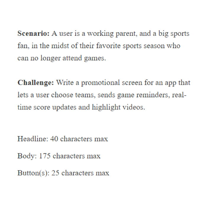

Takeaway: Tone of voice
According to an article by the Nielsen Norman group there are four dimensions of tone of voice: humor, formality, respectfulness, and enthusiasm. By using a specific tone of voice, you can convey the feel about the content which in return sparks similar emotions from the user. For example in this scenario I used an enthusiastic approach to fit with the sports theme and to make the user feel excited about joining the app.
Challenge 3

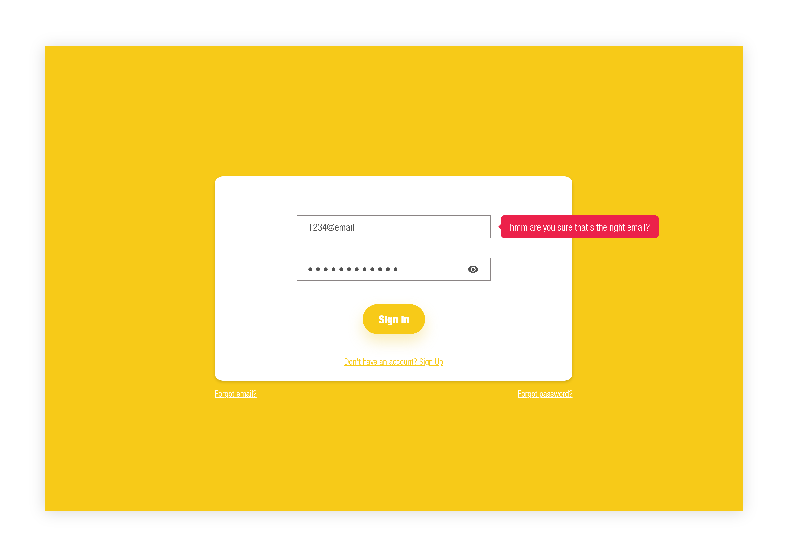
Takeaway: Don’t be robotic
I didn’t want to be robotic and use generic error messages like invalid input. In certain cases depending on the product and the user demographic you might have to be a bit robotic. But if it’s not required, I think it’s always better to be more human like and use simple everyday words. After all humans are the end users of your products not robots.
Challenge 4
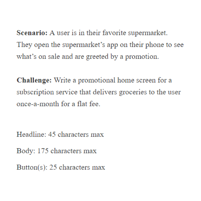

Takeaway: Be more conversational
Tying into the previous takeaway, in this design I tried to make it a conversation between the app and the user. In the headline I am asking a question from the user. If the question is interesting to the user, chances are they might keep on reading to find out more details. Continuing this conversation I gave options as if the user is answering back saying “Sign me up” or “No thanks”, rather than saying “Accept” or “Decline”.
Challenge 5


Takeaway: Maintain consistency
Here are three different screens a user might return back to after being forced out of an application. On all three of them I kept the same theme from words and sentences to the layout of placing them. Another thing to remember on keeping consistency when writing for apps is not using different synonyms in different places for the same function or process, if you chose a name stick with it. One of the foolproof ways of keeping consistency is making a Content Style Guide. Referring to a Content Style Guide can help you keep a consistent language and a brand specific tone throughout different channels. For example check out Frontify’s awesome Content Style Guide that I have linked below.
Challenge 6

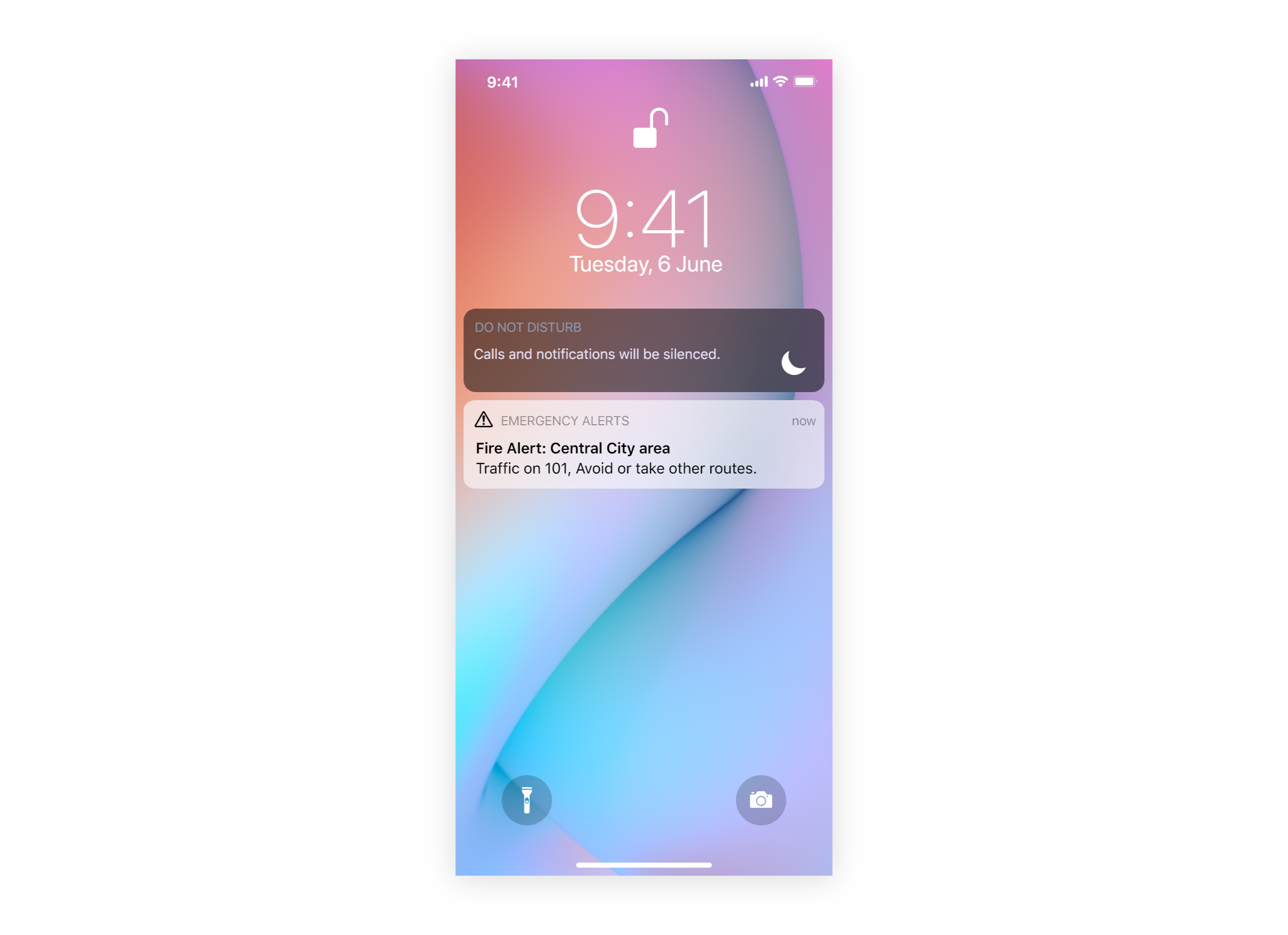
Takeaway: Don’t repeat information
In this challenge I had to come up with content for an alert message. Taking the character count into consideration as well as this being an alert message, I didn’t have the liberty to use long detailed sentences. Because of this I had to make every word count, so I made sure that I didn’t repeat the same word twice, and tried to make the message as concise as I could. I didn’t want to confuse the user with unwanted noise.
Challenge 7

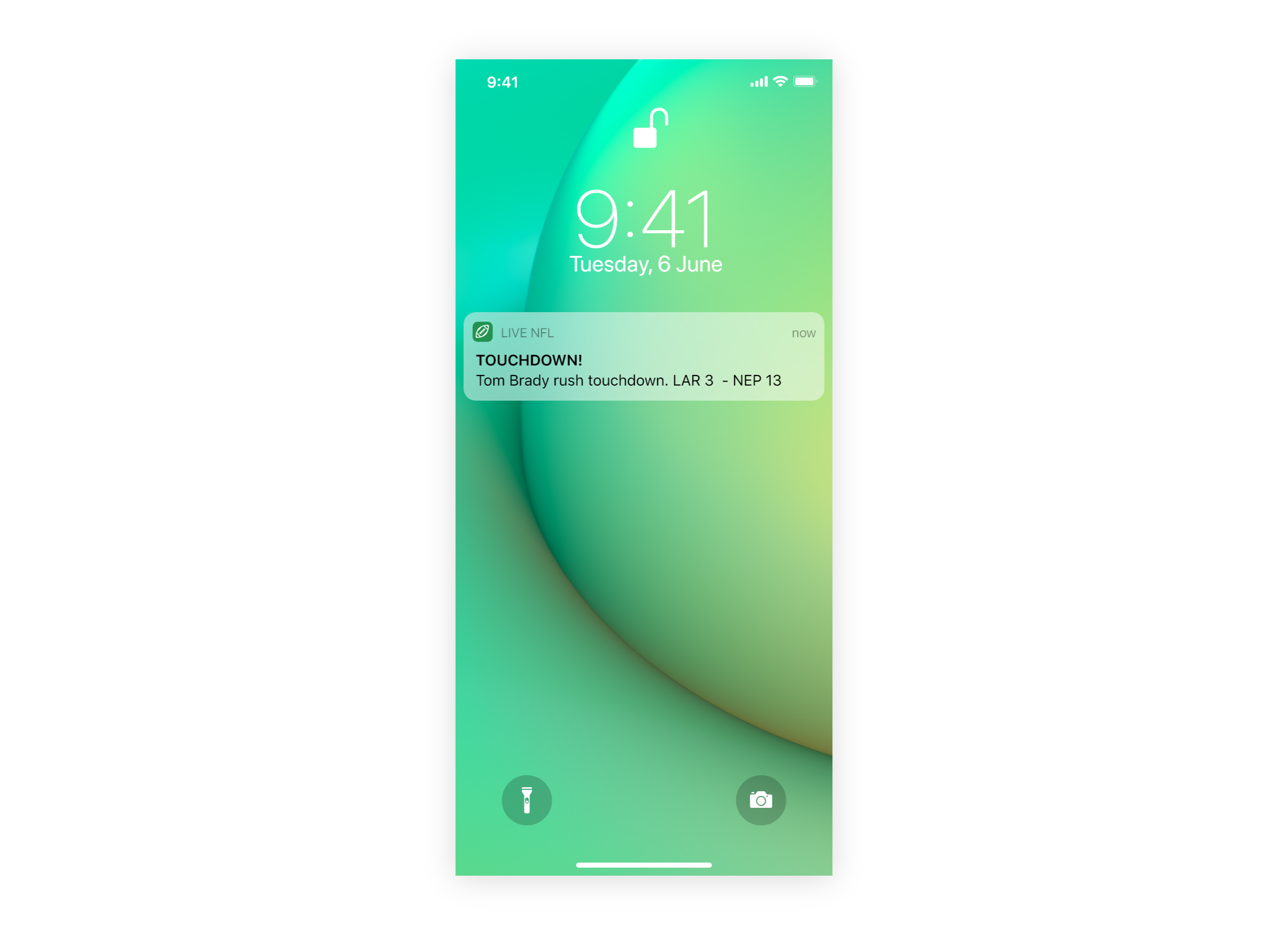
Takeaway: It depends on the context
Similar to the previous one, in this challenge I had to come up with an alert message to update the user about the current state of a sports match. But in this scenario contrary to the point mentioned in the previous challenge of no repeating words, I decided to repeat a word since it was the main highlight and the reason for receiving the message. So yeah I guess sometimes rules has to change depending on the situation.
Challenge 8

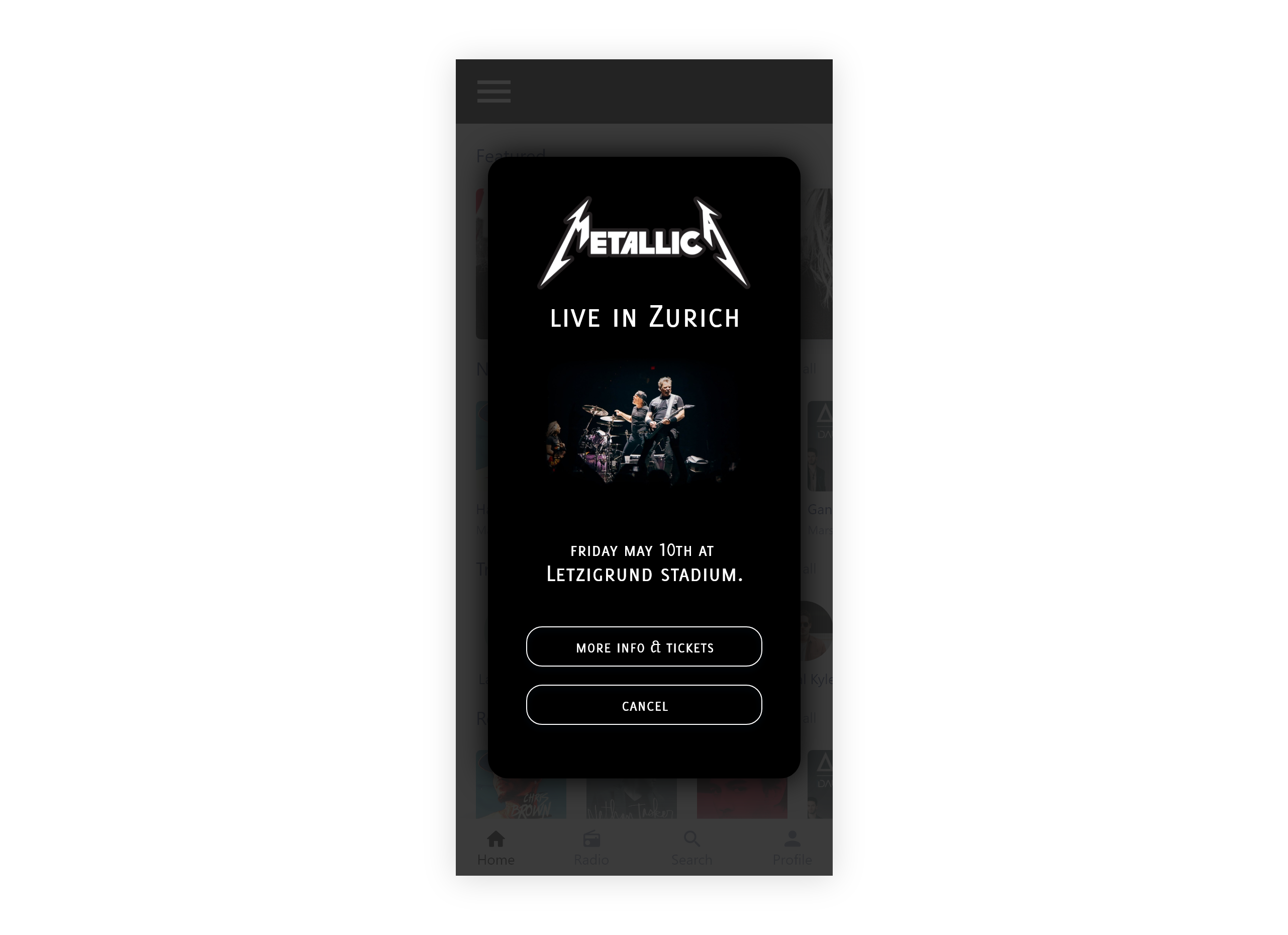
Takeaway: Don’t info dump
I only wanted to show the most necessary details first to grab the users attention. Tunneling too much information at once can overwhelm the user, so I thought it would be better to first grab their attention with the key details with the option to access other relevant information if they want to. Also rather than having a button as “Buy tickets” I decided it would be more user friendly to use “More info and tickets” so the user won’t feel like they are immediately going into the process of purchasing tickets without having all the information.
Challenge 9


Takeaway: Be polite
It’s the golden rule, the principle of treating others as one’s self would wish to be treated. No one want’s to feel like they are being attacked, especially by a machine. So be cautious that your message isn’t the straw that broke the camel’s back, or more like the error message that made Sam throw his phone at a wall with a speed of 100 MPH. So for this challenge the goal was to deliver the error message as smoothly as possible, without sounding offensive or disrespectful.
Challenge 10


Takeaway: Incorporate other elements
Sometimes words by itself isn’t enough. This challenge had one of the lowest character count limits. To overcome the character limit issue, I made use of an illustration which would give the user an idea of what their information would be used for, which I assumed is to find vehicles around the user’s location. Human brains can process visuals faster than sentences, and since I was struggling to get the message across to the user with just text, I decided this was a good opportunity to include a graphical element.
Challenge 11
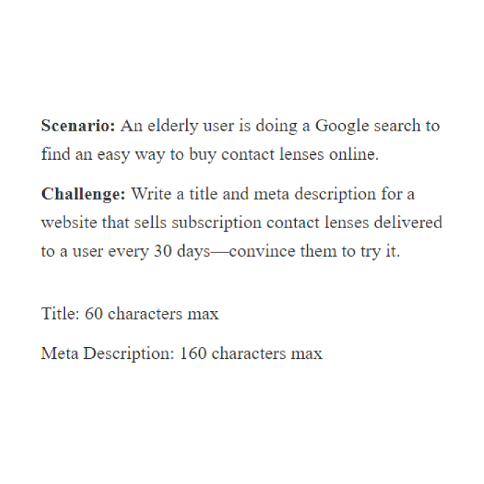
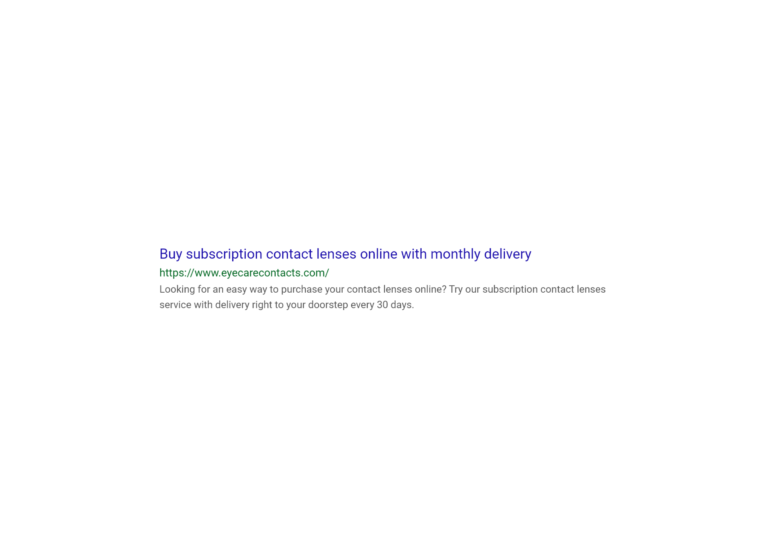
Takeaway: Do research
This challenge was about SEO (Search Engine Optimization) related content. So I did a couple of quick Google searches using keywords from the challenge. After going through the top organic search results, I realized that most meta descriptions included a question, Which makes sense because that’s what users would be typing into the search engines. So I decided to follow what’s already working. I also included top related keywords in both the headline and the description. Doing research results in creating worthwhile content that goes beyond meeting expectations.
Challenge 12


Takeaway: Be clever, but not too clever
I wanted to make the error message somewhat clever, but I also didn’t want to be clever to the point of annoying or upsetting the user. For example I could have said “that’s a unique name, but I don’t think it’s real’” or something similar, but what if it’s actually the users real name. So instead I used that we are “unsure” whether that’s the users real name. Just as mentioned in the challenge I wanted to communicate with the user to fix the error without inadvertently shaming them.
Challenge 13


Takeaway: Don’t make the user think
This takeaway also ties up with several points that I have mentioned before. I wanted the message to be direct, concise and most importantly I wanted the user to not dwell on the notification and be stuck on thinking what to do next. So I wanted to keep the language as simple as possible so the user could clearly grasp the message and the available options, so they can quickly make a decision.
Challenge 14
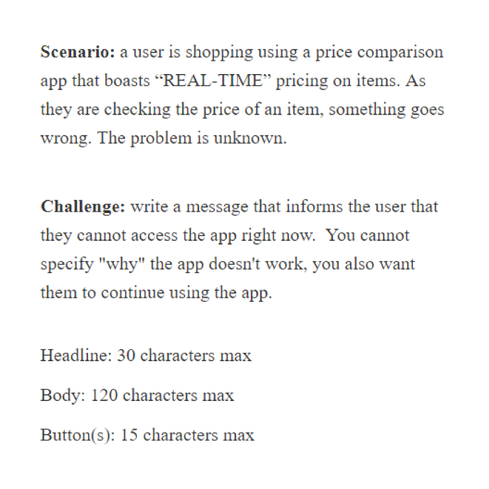
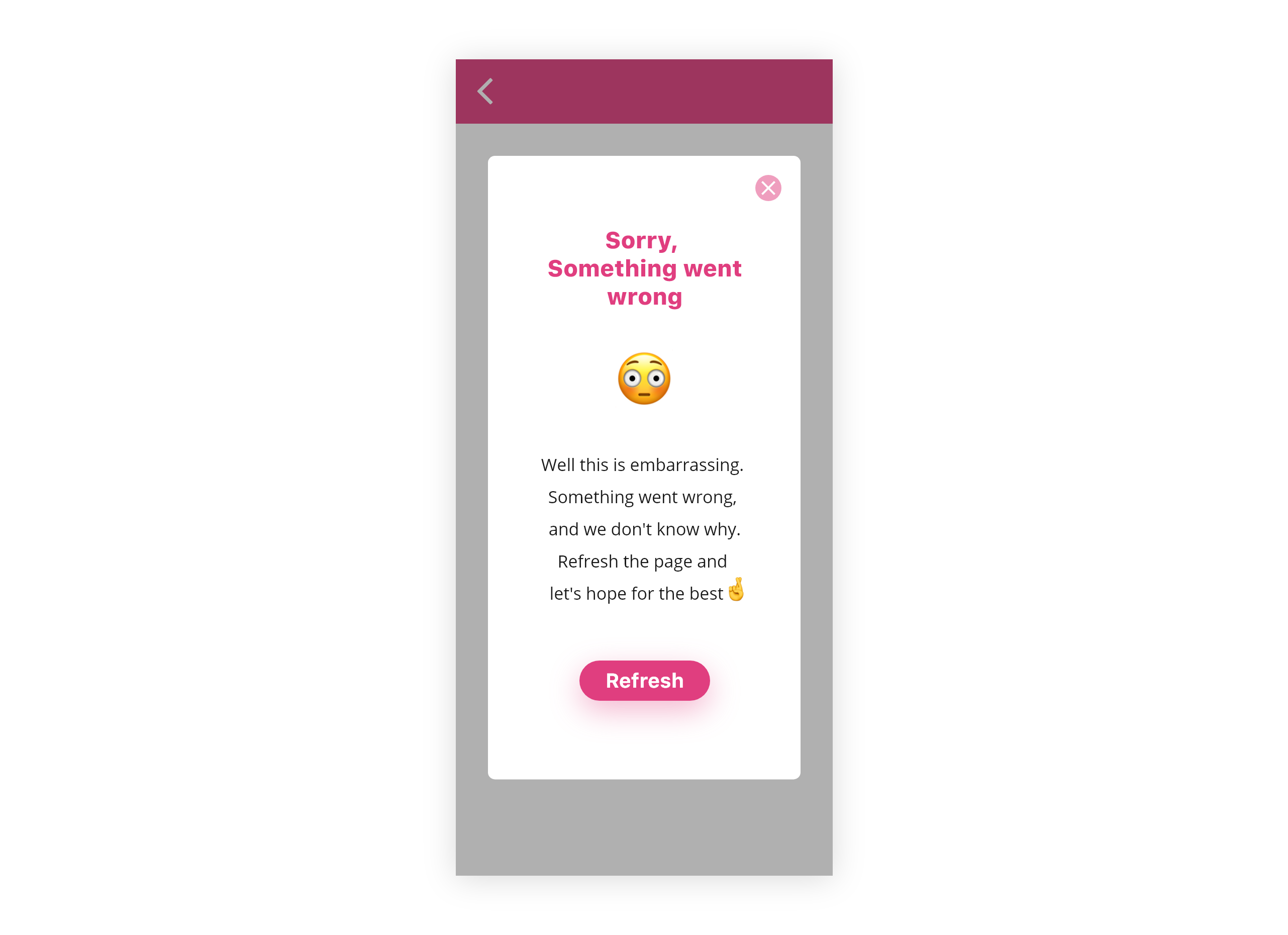
Takeaway: Say sorry
It’s a good thing to apologize when you know you are in the wrong, which was the case in this scenario. The app can’t figure out the exact cause, but it’s not functioning as it should be. So I wanted to make the message take an apologetic and regretful tone when delivering this information, but towards the end I changed the tone back to a hopeful one, so the user isn’t left feeling too blue. It is also important to keep in mind not to constantly apologize as well, specifically for things that are out of the applications/ systems control. Doing too much apologizing can make the users think that our product isn’t a good product, even though that might no be the case.
Bonus Challenge
There was an unexpected bonus challenge. I thought about including this, but then I decided I must leave some mystery for anyone who decides to take on the challenge. So here’s a link to the site again so you can join and find out the mystery bonus challenge for yourself.
And we’re done 🎉 Did you enjoy going through all the challenges? What would you have done differently than I did? Any tips, criticism, anything I can improve? let me know, I would love to hear your ideas.
Also this is my first ever medium post. So let me know if you think I did a decent job or not, I would really appreciate your feedback. Have a great day and Thanks for reading! 💛


