
Immersive Design: The Next 10 Years of Interfaces
A look into what happens when we design beyond a screen
Like many designers, I started my career as a Graphic Designer. I dealt in picas, carried Pantone books, and swore to measure twice and cut once. Then the web came along and with it came Web Designers. We had to become acquainted with HTML, CSS, Javascript and we’re still trying to keep up with the right way to build for it.
These websites quickly demanded more interaction from us when Flash entered the scene and conquered our hearts. We turned our attention to animation to convey expressive user flows through interaction design. Then, the iPhone showed up and forced us to think smaller. We got excited about skeuomorphism, learned about pixel density, and made a vow to design mobile first.
After a while, we tried to combine all of the above into a holistic practice that would buy us “a seat at the table,” where we could think not just about aesthetics, interactions, and user needs, but also business needs. And so, the modern Product Designer was born.
I’m willing to bet that, like many designers before it, the Product Designer is approaching extinction, and setting the stage for the Immersive Designer.

Virtual Reality (still) matters
Over the last decade, we’ve seen content move from newsstands, to desks, to our laps, and then into our hands. It seems clear that the next step is to remove the device altogether and place the content in the world itself, eliminating the abstraction between the content and its audience. We call the process of designing for this Immersive Design, which includes VR/AR/MR/XR — basically all the Rs.
We are seeing this realized today in phones through Augmented Reality. Tech giants like Apple, Google, and Samsung are rushing to conquer the AR space like a modern Christopher Columbus in search of spices. We’re seeing identity transfer setting a trend in animojis and virtual characters walk around our videos like a Roger Rabbit fever dream. However, designing for mobile Augmented Reality today feels like developing for the Commodore 64 in 1982; investing in a platform that’s novel but filled with practices that will be rendered obsolete before they’re relevant. I’ve found that Augmented Reality in 2018 has two major limitations when it comes to Immersive Design: field of view and input.

Field of view
So far, Augmented Reality is still restricted to a rectangle in your hands. Content can only aspire to be a window into another world; it hasn’t quite inhabited our own yet. Users feel trapped outside in the mundane world while all the fun is happening inside the phone in their hands as if A-ha’s Take on Me never made it to the first chorus.
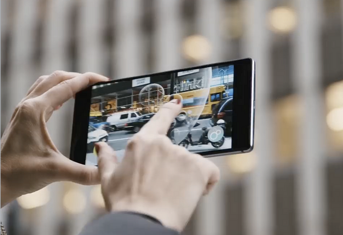
Input
In 2018, we’ve developed a language for using facial gestures like opening our mouth or raising our eyebrows to control Augmented Reality masks, other experiences rely on the now primitive touch interaction, while the ambitious ones rely on voice commands to interact with the world inside the screen. The input available on the market limits these interactions. However, once we inevitably obviate the phone and achieve immersion through AR glasses, we’ll have to go back to the drawing board and try to answer the billion-dollar question: how do you interact with content in space?
This is where Virtual Reality comes in.
The jury is still out on whether Virtual Reality belongs in your living room or as a museum-like destination that you plan for. We’re still experimenting with the medium to find the adequate cadence for virtual experiences and navigating worlds in the much-adored metaverse. If you think about it, it took film quite a bit of time to arrive at the standard 90-minute duration, which is about as long as it takes your bladder to digest a liter of Coke at the cinema.
Today, Virtual Reality has found a fit as the best way to explore Immersive Design problems present in the Augmented Reality future we crave by taking advantage of a more immersive field of view and using natural gestural interactions. Challenges like thinking in 3D and using volumetric UI that reacts to the environment and the people in it.
Not only can Virtual Reality improve our quality of life by providing great escapism, but it can also open up a bunch of questions around how people could interact with technology if it were all around us. Among other things, I’ve found that Immersive Design invites designers to question the line between content and UI and rethink the process for creating digital products.
Content is changing
As designers we’re often told to get out of the way. To be “content first” and make room for the reason people are using your product in the first place. However, Immersive Design poses an interesting question: where does the line between content and UI start and end?
Game designers have been asking themselves this question for decades. As they envision a world to be inhabited by players, the interface to navigate it can often be abstracted into menus that live outside the world’s logic. For example, the interface to start a game often lives in this weird in-between software that acknowledges the existence of the world inside the game by using the game’s characters and aesthetics, but operates based on the rules of the player’s world.
And so, video game companies draw a line between UI and Game Designers. There’s logic to this decision: Game Designers are often proficient in 3D tools while UI designers generally work in 2D. This decision can sometimes lead to immersion-breaking solutions that require players to suspend their disbelief when the game reminds them they’re in a video game with video game systems.
The explicit line between UI and content is tolerable in a video game, but as we step into the world of Immersive Design, we won’t necessarily have the luxury of flat menu trees that exist outside our reality. We are tasked with finding solutions for UI that follows the rules of our augmented world; where do the menus come from and how do we interact with them?
As they’ve matured, video games have given us examples of how design can be woven into the environment and blur the line between content and interface.


On the left image above, 2011's Skyrim shows UI to manage inventory plagued with floating text alerts around the screen, using the typeface Futura for a game that takes place in medieval times. Although the menu is intuitive and efficient, it grossly breaks immersion and reminds the player that dragons aren’t real. On the right, 2018's S.O.S. relies on a more immersive schema that pulls out a physical map in the player’s point of view and requires the use of a radio (with radio channels and static) to communicate with other players.
We are seeing similar practices arise in Virtual Reality games. Although some games rely on the traditional 2D menu systems, others place cues in the environment to educate the user. This is important because, in VR, the player has fewer abstractions to escape to. VR controllers are often shaped around a player’s hand to promote natural interactions that don’t typically lend themselves to menu trees.


On the left, Doom VFR uses a traditional approach to user interface — a 2D panel of information floating in space. On the right, Wilson’s Heart places the UI in the world as a clipboard that can be grabbed and reacts to the lighting in the environment. Doom doesn’t seem concerned with reminding users that they’re in a video game, which of course needs to provide you with text cues for learning how to play the game. However, Wilson’s Heart makes an effort to insert those cues as a plausible element in the environment, further enhancing the immersion of that experience.


On the left, Space Pirate Trainer asks the user to literally shoot menu items to select the game mode. On the right, Arizona Sunshine lets the user grab and insert cartridges into a retro console to pick a game mode. The point-and-shoot interaction is carried over from the mouse and keyboard era and ported into the context of the Space Pirate Trainer while using cartridges to select a game mode fits perfectly within the tone of Arizona Sunshine and evokes a feeling of nostalgia that many VR players crave.

Arktika 1 applies a clever, mind-bending technique to enter a tutorial: the user is handed a VR headset inside the VR experience. By putting the headset on, the user agrees to suspend their disbelief and enter a virtual world that doesn’t follow the same rules as the Arktika world. It’s a tongue in cheek moment that ambitiously aspires to create not one but two alternate worlds. By contrast, the Arktika world feels much more real because it appears self-aware and higher fidelity than the training environment.
These are a few examples of the great Immersive Design work happening in Virtual Reality right now. For many of us, stepping into Immersive Design means placing a bet that content won’t be confounded to the boundaries of a screen. We see that as an opportunity to invent interactions that are so intuitive they become invisible — like pinch to zoom or pull to refresh. Today, our work consists in finding those interaction patterns, which will seem obvious in retrospect.
If you’d like to chat more about this, or simply just send me pictures of your dogs, feel free to reach out on Twitter.

