Member-only story
Improve your designs with these typography tips
Learn the rules so you can break them

Choosing the right typography can make or break your design. There’s an infinite amount of ways you can play with type to add character, evoke a certain mood, or achieve a specific goal. You can adjust the type size, kerning, tracking, leading, alignment, and color just to name a few. Once you’ve mastered the basic elements of typography, you can pair with an additional font to create more diversity and hierarchy.
Typography is the art and technique of arranging type. Whether it’s a poster, pages in a book, or the words you read on an app screen, it’s all typography the designer used with intention to create an experience.
Typography serves two main purposes. The first is it has to be legible, can the user read it? And the second is how can you use typography to create a mood or design aesthetic to attract a specific audience.
Learning the fundamental rules of type (so that you can learn how to break them later) will help you become a better designer. It takes practice and a little knowledge, which we’ll go over next. First, let’s discuss some of the basics.
Typeface vs. font, what’s the difference?
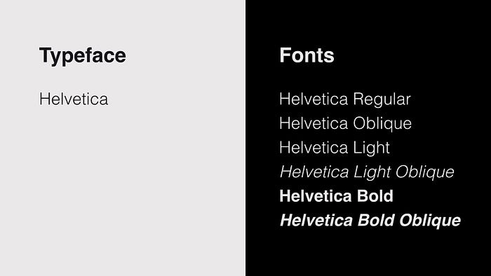
Sometimes the terms typeface and font are used interchangeably so it can be a little confusing. A typeface is a collection of fonts while a font refers to a specific style or weight within a typeface family.
For example, Helvetica is a typeface but Helvetica Bold is a specific font within the Helvetica typeface family. Here’s a visual example so you can see the difference between a typeface and fonts.

Categories of type
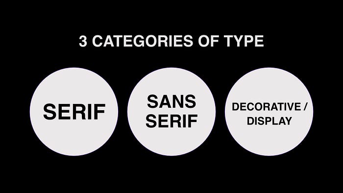
Three are three main categories of typefaces a font will fall under. These categories are serif, sans serif, and decorative or display typefaces.


