Improvements to accessibility in UX design for mobile devices

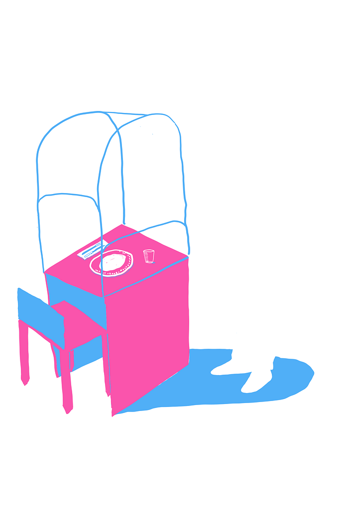
 Looking at bad usability in the design of a space, I’ve thought about when I worked in a restaurant with a service lift that was a foot off the ground and two foot deep. This gave all sorts problems to the staff, least of all constant back pain, as well as slower service. Both its placement and the device itself, hadn’t been designed with the user in mind.
In mobile both the hardware and software are designed around the user and to some degree, so is the packaging. How could the design of the packaging, inform the software use?
Phone design being rather uniform over the past few years, pushing for the usability of the most surface area, there isn’t much more that can be done with the technology that is available, except the lean toward foldable devices to push the market forward. But packaging, that can still be adapted to allow for more accessibility in its design. Look at Microsoft’s Adaptive Controller. The team that built it spent as much time on the hardware design as the packaging, making it as adaptive to use the hardware as to open the box the hardware sits in. We need packaging design that takes note of what may appear like fringe use cases.
Look at the packaging for the two leading phone manufacturers. Both Apple and Samsung have near identical design, the difference being, Samsung’s box lid can be lifted with one hand (that is of course, after cutting the tape around the sides) and Apple’s cannot.
Now look at the Adaptive Controller from Microsoft, yes, it may destroy the resell-ability of the packaging with the use of loops attached to strips of tape, causing irreparable aesthetic changes, but shouldn’t the users experience with the packaging and the device take priority over the desirability of the design. Which is more important, or to what percentage should it be the user and what percentage should it be desirability?
If we allow for a more seamless unpacking of a mobile product, taking the design notes from Microsoft’s Adaptive Controller team, then could we also think in that respect to the software design, how a user’s first interaction with a new mobile device could setup all their later interactions.
 A definition for play: to engage in an activity for enjoyment and recreation rather than serious or practical purpose. What can be learned from game design other than the gamification of reward systems and learning practices?
My parents bought a Gameboy to share between myself and my brother on a family trip to New York in the summer of 1990. It was heavy and the screen was crisp and bright. That’s how I remember it, now I know the screen was dull and hard to see in low lighting, so you mostly needed bright daylight to get any play out of it.
Primary interactions on the Gameboy were simple, you had a d-pad, a, b, start and select. There was a contrast wheel, volume wheel and a power button. If you look at design now, with gesture controls on touch screens the limits can be whatever the designer sets, but it shouldn’t be to the whim of the designer, but the use-cases of the users.
I recently picked up a copy of Nintendo DS title: The Legend of Zelda: The Phantom Hourglass. The DS handheld tried early on to adapt the users to the hardware, rather than the hardware to the users. It takes a lot of time for a product and its usability to become common practice, and that is only after success. The original iPhone being a clear example of confusion as most users had never used a touch sensitive screen, let alone a phone with a touch screen.
The Phantom Hourglass is one such case of forcing limits on the user, in order to work for the design of the game. This can be frustrating, and it was upon first using, but once the user gets comfortable it can sometimes prove a more enjoyable experience. It can create Play.
But we’re not talking about Play within mobile, we’re talking about how the request or offer of a solution by the designer can create informative design. Upon setting up The Phantom Hourglass you’re informed that the game is primarily controlled through touch, on the touch display (the bottom screen), while the top screen is used for inventory systems and maps. It is recommended that all interaction is played with the stylus, for its accuracy over a finger. The smaller DS’ bottom screen size is 3.5 inches, so it’s an understandable recommendation. The user is asked, do they hold the stylus in their right or left hand. If you choose right, it asks if you use your right hand, as a final check. This sets up the comfort level of the game for the user, as it is adapted to their prominent hand.
It’s such a simple choice for the user, but it makes the interactions more comfortable and enjoyable. What if we took this same idea, to give the user options with initial start-up of a mobile operating system, but to increase the accessibility of the system, rather than create gamification.
 To go back to definitions, accessibility can be defined as “the quality of being easy to obtain or use.” I know the design of software is usually built around the average user, what the average interactions are, how they are carried out in a standard set of possibilities. As a user with an accessibility issue, you must go through settings to set all the interaction controls to fit your ability, depending on how abled you are this can be a frustrating task. Yes, the options within these screens are helpful and suit the users needs, but why there isn’t a simple a/b question within boot up of the operating system. A linear set of questions that allows the user to set the device to their preferences, so that there’s no need to open up multiple screens after set up, which may cause discomfort to the user.
Let’s look at it within three differently abled perspectives: sight, sound and touch.
With sight, a visual impairment can cause multiple concerns, whether the user is colour blind or has varying issues with sight. Voice interaction can help users who have little to no sight, while using larger icon, text and input sizes, working with specific colour choices that work with not against the user. They may not be the prettiest, but it will be what the user needs.
The sounds created in the software, can cause pain or irritation for some users, like those with varying forms of tinnitus. Having tinnitus, I’ve experienced this in my every day outside using certain technology, but also while listening to some podcasts introductions or sounds used in button input. If you have no hearing, then a more detailed use of haptics to create better interaction could prove significant.
I think touch is the more obvious of the three, as it’s common to look at a user interface through how the user interacts with the software. If you look at an average user, on a work commute or sitting in a café the hand placement on their device suit the needs of the interaction required. Playing a game in landscape mode two-handed, using a web-browser while holding with one-hand scrolling with a thumb. Any added interaction can be completed by the users free hand. But what if the user hasn’t?
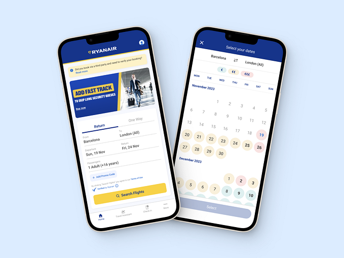
If you look at standard app design, they are built around a hamburger or off-menu drawer, usually placed on the top left of the screen. This can be for primary or secondary navigation depending on the type of app it is. Google has been focusing on primary interaction with a floating button placed on the bottom right of its apps, such as with Gmail and keep notes, but all design is built around what interactions work best for the app use-case. Like in social apps, the primary inputs are on a bottom screen input bar.
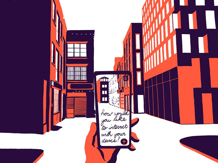
Starting with setup there should be a prompt for how the user interacts with the product. Let’s go with the below as a rough set of interactions:
1. A/B Question: Do you need to set device to accommodate accessibility options? Yes/No. You may answer by voice or touch at any stage of the setup.
2. A/B/C Question: Of the following three options, which best defines your needs? Choose as many options as you like. Sight/Sound/Touch.
3. Sight: What best defines your needs? Choose as many options as you like. Colour definitions/Poor eyesight/No eyesight. This leads to the setup of on-screen text, text size, colour correction/text to speech. A large block button with a visual representation of text re-size would work well here.
4. Sound: What best defines your needs? Choose as many options as you like. Tone definitions/low hearing/no hearing. This leads to the setup of speech to text, muting of sounds, vibration replacement for sound types, adapting sound types to levels that are more suitable for hearing type etc…
5. Touch: What best defines your needs? Choose as many options as you like. This leads to the setup of your prominent hand (if it can be defined), the standardising of the OS interaction for your specific touch use, touch & hold delay, vibration setting to show interaction was successful with simple input (before input leads to next interaction), power button ends calls, voice input for standard use (make calls, open apps etc…), accessibility menu for controlling phone use etc…
If we look at Googles accessibility menu, it allows for added functionality during everyday use with its own sub-menu. However, the device’s original setup could make it much easier and less stressful for differently abled users to use its device, as well as all other mobile OS’.
We should be thinking about how the user interacts, from the packaging of the product, to the boot up of the mobile OS. This would improve the experience for all users.


