Improving control usability in Luigi’s Mansion 3
In this case study, I consider interaction design principles, empathy and accessibility guidelines to enhance game control usability in a favourite Nintendo title.

Author note: I’m not affiliated with Nintendo. Opinions are my own and all suggestions are simply illustrative rather than definitive.
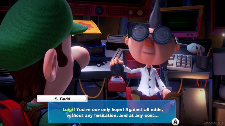
Luigi’s Mansion 3 was one of the titles I was most looking forward to getting my hands on in 2019. Enticed by its clever puzzles, stunning visuals and innovation, I was slightly disappointed by its limiting controls. Based on game reviews, discussion forums, observations from play tests and first-hand experience, this seemed to be a collective pain point amongst a great deal of players.

Having a closer look at user feedback and design decisions helped me understand why the controls were a pain point. I then used this opportunity as a learning experience to improve the default controls, with the ultimate goal of enhancing usability and the gaming experience.
Reviews provided insight into why default controls did not lend themselves for smooth gameplay:
- Controls cannot be remapped, in spite of many functions being attached to multiple buttons (Accessibility not thoroughly considered)
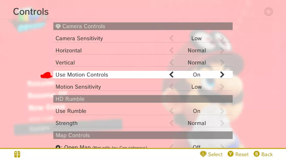
- Y-axis cannot be inverted (No player customization)
- Players often found their hands in awkward placements and constantly having reposition their grip (Hand limitations not considered)
- Players don’t feel “in control” of their movements (Non-intuitive and unconventional mapping)
Importance of designing with a user-centric mindset
While many are willing to look past the limiting controls, others may find restrictions such as not being able to invert the y-axis a dealbreaker. However, we have to keep in mind people with disabilities (temporary, situational and permanent) may not even be able to play the game at all.
The suggestions I provide in this article are only a fraction of all possible solutions for improving usability. As I did more research into usability whilst writing this article, I fully realized the importance of designing for accessibility. With the breadth of information surrounding this topic, I believe it deserves its own separate article.
Part of our responsibility as designers is to build inclusive products, we are solving not only for people who look like us, but a larger, diverse population. Ensuring everyone can enjoy our product and feel included in our wider society.
Evaluation of default controls
Hidden control menu
While Luigi’s Mansion 3 does not offer remappable controls, they do map multiple buttons to single functions, giving players the option to choose between the face and shoulder buttons. In one play test, a participant unintentionally discovered there was a shoulder button alternative for every face button, a personal preference for her, on the last level of the game when she was browsing through the menu.
Usability can be improved by simply having the settings being where players expect to find them, rather than hidden away within the games system menu. Users should also be made aware (through a splash screen for instance) that alternate modes of playing are an option.
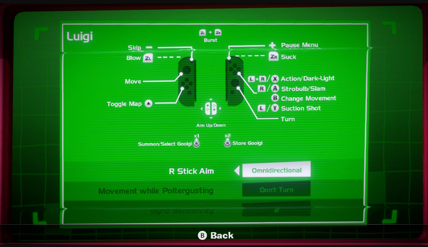
Super Mario Odyssey is a great example of a conveniently located as easily accessible control menu. With the click of one button, players can view their control mappings and reconfigure them.
This observation brought to forefront the following:
- Clearly inform users during onboarding that alternate controls are an option
- Menu information architecture needs to be reconfigured in order to give users quick and non-intrusive access to control menus
*Note: I will expand on the features mentioned above in a separate article I am currently working on where I redesign the onboarding experience and menu UI of Luigi’s Mansion 3. It will be available for viewing here when completed.

Hand limitations not considered enough
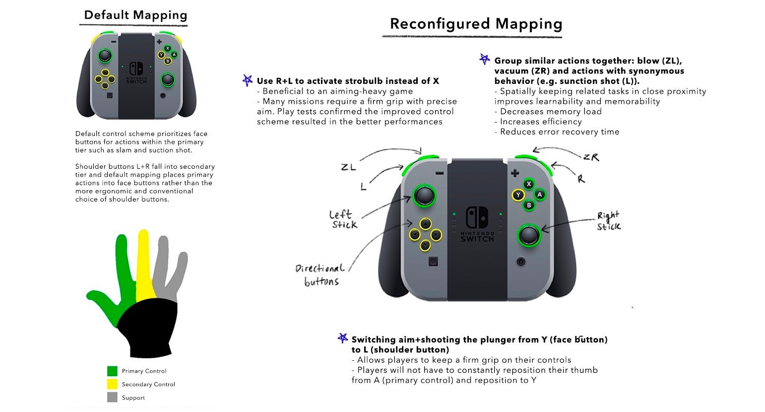
When designing controls, we should always consider our hand limitations — for maximum efficiency the most frequent actions should be in the most accessible places and match the primary control group of the player’s hand. Actions such as the suction shot is activated through the Y face button. In a play test I conducted, 80% of users preferred using the L shoulder button for this action as the shot spatial distance meant they did not have to constantly reposition their grip.
Gameplay example of how flawed controls can hinder the gaming experience
Boilerworks floor mission
One of the most cleverly designed floors in the game. Players have to maneuver Luigi on a duck floaty through shark and bomb-infested waters, all while completing a complex set of tasks as Gooigi. Strictly looking at the gameplay, Luigis Mansion 3 designers have masterfully created a challenging level that calls for great timing and strong attention to detail. The designers added a layer of complexity by making a single-player play as two characters — Luigi and Gooigi.
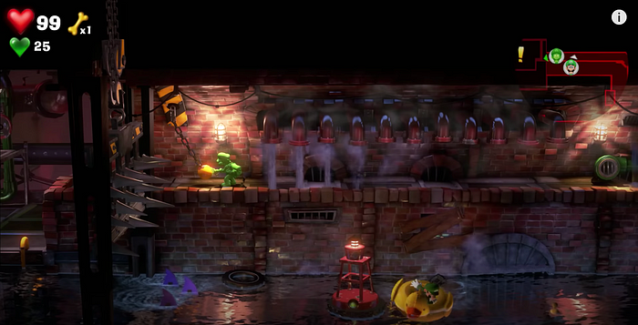
Let’s take a look at what this mission entails regarding controls:
Luigi’s actions:
- Floating, walking (Primary action — def: requires active decision-making and constant attention from player, the main mechanics used.)
- Vacuum/Blow (State change — def: actions that switch control modes, Slightly increase the overall level of required attention. Often “hold” actions.)
Gooigi’s actions:
- Activate Gooigi (Contextual action — def: appear from time to time in the context of the primary “Verbs”, Require short-term periods of high attention.)
- Vacuum/Blow (State change)
- Walking (Primary action)
- Aiming (Primary action)

As it is, the player is required to handle 3 primary actions, 2 state changes and 1 contextual actions to successfully complete this mission. The real challenge however, comes from the complicated user interfaces of confusing-to-use controls. In the midst of playing a complex stage as two characters, players find themselves at battle with the controls. Controls feel non-intuitive, resulting in poor memorability and ultimately placing themselves as an unprecedented obstacle players are forced to overcome.
Users find themselves fixing problems that should never be there in the first place. They want to be challenged by the game, not the controls themselves.
Improving existing controls
In an ideal world where designing for accessibility is the standard, every control for every console would be remappable and fully customizable. However, this is not always the case. I’ve designed improved controls that consider concepts such as mental models, alternate control schemes and hand limitations with the goals to make them more efficient, ergonomic and intuitive.
Good controls bridges good interaction between the game and player. Well designed controls therefore means high-quality interactive experiences.
1. Use mental models to reduce cognitive overload
Luigi’s Mansion 3 introduces a handful of innovate mechanics — burst, shoot, vacuum. This is where we introduce mental models — images in a user’s mind that inform their expectation of a certain interaction and how something works in the real world. By effectively using mental models, we as designers can: create systems that “feel intuitive”, familiar, have a sense of control and allow users to have a better understanding the system. Without these considerations, the wrong mental model is created for the user. In addition, you’re at risk of confusion and user error because they are trying to operate the app in a way the designer did not intend.
Controls should communicate the player’s intent in a way the player expects and create a feeling of full control.
Modern FPS games such as Call of Duty and Overwatch on consoles such as PlayStation or Xbox have set the shoulder buttons as defaults for aim/shooting. This said, using a face button (default: Y) for a primary action (suction shot) is arguably outdated, the improved controls make use of shoulder button L for aiming and shooting actions. When we design our controls based on mental models, there is a sense of spatial familiarity. For first time players they are introduced to a control scheme which will improve their learnability and memorability for Luigi’s Mansion 3 and modern titles which adopt a similar mapping.

2. Offer flexible and diverse controls
Everyone’s gaming background and experience is unique and the controls we design should reflect that. This can be accommodated by:
- Providing alternate and limited control schemes: By doing so, you’re keeping the gameplay within reach for players with disabilities. You’re also considering gamers of different skill levels — a beginner player may want a more simplified control scheme.
- Allowing controls to be remapped: Many people with and without impairments would benefit greatly from being able to move essential controls into positions more easily reachable for them. In addition, pro gamers may want to completely reconfigure their control. Y-axis inversion was surprisingly not an option in Luigi’s Mansion 3. This was a dealbreaker for many as preference for using inversion or non-inversion comes down to habit. Those who developed early habits of playing with an inverted y-axis did not find the default Luigi’s Mansion 3 controls intuitive and were forced to adapt.
3. Consider hand limitations
Our hands have physical limitations and should be considered when designing to ensure users can play efficiently while having an ergonomic grip. In my reconfigured mapping, I considered that our thumb and index finger are the most flexible and agile and therefore primary actions such as jumping and shooting should be allocated to them. Whereas our ring and pinky finger, where not very flexible, should be left for secondary actions.
Briefly to conclude…
UX testing metrics and constant iterating need to be implemented in every stage of our digital work process. Just as important is discussing the importance of accessibility early in the project. This way we are making better products and larger impacts when we’re creating by being inclusive.

Thank you for reading :) Feel free to leave your thoughts on this article, and I’d love to hear your own experiences playing Luigi’s Mansion 3!

