Improving the loan application process on an instant credit app — a UX case study
Background
Aella Credit exists to provide instant loans to people living in Africa. As long as you have a steady income and a bank account, all you need to do is sign up, provide some personal information and get access to instant loans based on your “credit profile”.
Role
I was responsible for user research and user experience design. From evaluating the application funnel to conducting user interviews to uncover any potential areas of friction preventing users for completing their loan requests and ultimately proposing solutions to address the issues we uncovered. Although I was the sole designer on the project, I collaborated closely with a product manager and two engineers.
Objective
The primary goals were simple, expose areas of friction and explore feasible ideas aimed at increasing the amount of successfully completed requests. Something else we set out to do was give the app a more modern look and feel in order attract and retain younger customers.
User Research
Interviews
To get started, I reached out to some users of the Aella Credit mobile app. My goal at this stage was to understand why they were abandoning the credit request halfway as well to discover any other areas of friction that we could improve on.
Three key takeaways from from the interviews:
- Users struggled with understanding the relationship between interest rates and payback amounts.
- Users had no way of knowing the loan amounts they were eligible for which resulted in a lot of declined loan requests.
- Amount of information required for profiling users on sign up was a bit overwhelming.
Ideation
At this stage, I did a bit of brainstorming and came up with a few ideas aimed at resolving the issues that were uncovered during my interaction with the users at the interview stage. The top three ideas were:
- Restrict loan request amounts to only amounts that a user is eligible for.
- Provide clarity around the loan amount, repayment amount, interest rate and loan duration, thereby making it easier for users to make an informed decision about their loan.
- Make the process as straightforward as possible; remove all unnecessary steps.
User Flow
Still thinking very high level, I broke down the process into a few simple steps.

Design & Implementation
Wireframes
At this stage, I tried to still limit my focus to the flow and functionality of the app while also including some interface details to give more clarity to the purpose of each screen. This allowed me to rapidly test and improve my ideas before moving on to design the interface properly.

User Testing, Feedback & Iteration
I tested the wireframes with a different set of users and made a few notes which were largely reflected in the hi-fidelity designs. Here are some of the key updates I made to the design based on the feedback and observations I made while testing the wireframes. (The updates were reflected in the high-fidelity screens).
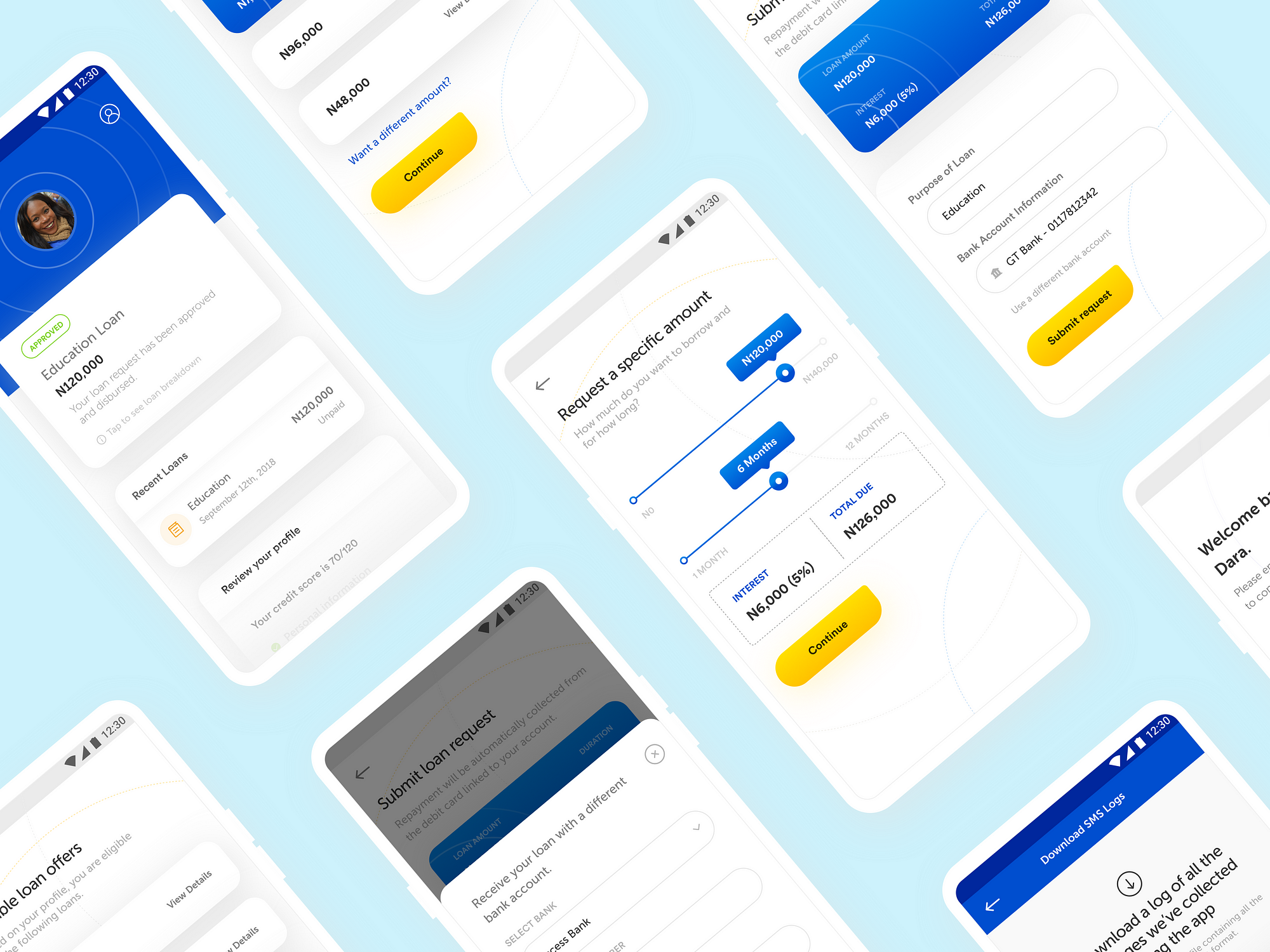
- Allow users to request a different amount and repayment period.
While testing the wireframes, one question that came up very often was; “What if I want an even smaller amount than any of the loan amounts specified?”. I went ahead to include an option for users to select a specific amount while still restricting the highest possible amount to what they are eligible for.

- Include the option to use a different bank account to receive the loan.
At the point of submitting the request, I created an option for the user to receive the loan using a different account. Upon adding the new bank account, they would also have the option to save it to their profile for later use.

- Replace the call to action “Borrow money” with “See loan offers”.
The primary users of the AellaCredit app live in West Africa. While testing the wireframes, I realized that “Borrow money” might not be the right call to action to use on the home-screen, given that Africans are generally averse to being identified as “borrowers”. I replaced the call to action with the apter “View loan offers” which actually leads the user to see and choose from three offers or select a different amount.
Request a Loan
Here’s what the final flow for requesting a loan looks like.

Other Hi-fidelity Screens

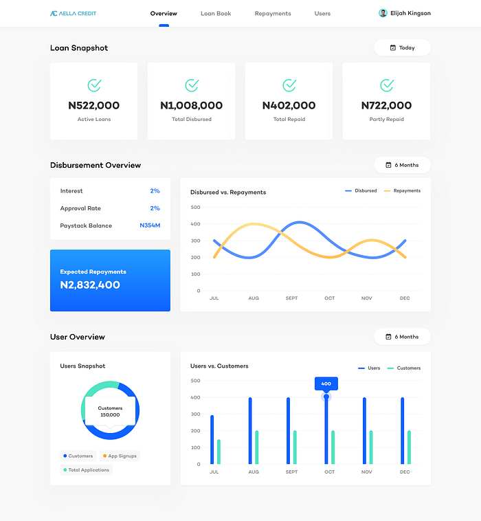
Tracking loan repayments and improving recollections
My work also involved designing a tool for the Disbursement team to track loan requests, repayments and other user activities.
Takeaways
It was a really interesting project and I’m pleased with how much we were able to get done in a small amount of time. To summarise, a key part of designing products is interacting with users early and often. Relying on our assumptions of the problems (and possible solutions) is never enough. It’s also interesting to see how three small changes to the process could have such a huge impact on product usage as a whole.
Key Wins In A Nutshell
- Eliminated manual loan approval and disbursement.
- Increased efficiency of the internal team.
- Eliminated loan request failures.
- Increased disbursement rate.
- Improved the visual design of the app
Next Steps
For the next version of the app, we’ll be looking at areas of friction around the registration and onboarding process. The thinking here is, the more people get on-boarded, the more loan requests would be made on the platform. I’ll be sure to share more about this endeavor in the near future.
Thanks a lot for reading all the way to the end. Please leave a comment and 👏🏻 if you enjoyed reading. You can follow me on Twitter; @ElijahKingson if you’d like to chat about design or business. Also, leave a comment if you think there’s something I missed out or if you have any thoughts at all. Cheers.