In design, small things can make a big difference

“How do people read on the web?” The simple answer is, “They don’t! They scan.”
- Jakob Nielsen
Scannability is identifying what content needs to be most visible in the designs. What is the business objective and what are they trying to provide effectively to the user?
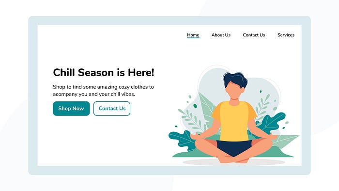
These items need to be obvious, and landing pages thus become crucial to get right, after all, it’s the first impression.
Collaboration is a mainstay of design, and it can be quite tricky. You will notice, the minute design decisions, that may not be picked up by non-designers at a conscious level, are the ones that have the greatest subconscious impact. These small changes are what make the design truly sing.
An inescapable part of the design process is the endless rounds of feedback and iterations. However painful (or enjoyable for some people) feedback helps narrow down the focus of the designs. Having a strong, well-defined focal point will help understand hierarchy. What would you like your users to scan and then read?
This gets us back to the point of scannability in design.
Well Structured UI

An underlying goal of every designer is to make users stay on their website. Achieving this requires scannable content. Good structural UI designs are pleasing to the eye and therefore, invite users to stay (and return).
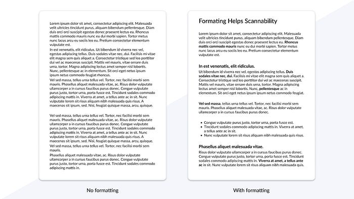
Structure is predominantly the key of scannable content, along with the use of subheadings, text size and weight.
The un-denying aim of product design is effective communication. Therefore, the focal point of UIs should be the business’ objective.
Designers have the ability to show users whatever they (and their clients) desire. The mindset is “what I want to be seen, is what users will see.” That holds power.
Unlike the example above, scannability doesn’t only apply to text. Images and navigation buttons can be scannable too, and as a matter of fact, they should be. Now let’s take a look at how you can master scannable content.
Mastering Scannability

Scannability is essential to grab your users attention. Take a look at what understanding scannable content can do for your designs.
- Scannability allows users to grasp the navigation faster.
- Scannability enables users to complete their tasks more efficiently.
- Scannability corroborates an increase in retaining users.
- Scannability ensures the interface looks more credible, and thus trust is imposed.
- Scannability allows the users to have an overall better user experience.
- And last but not least, scannability decreases the number of bounce rates.
Following this encourages engagement with your users, thus it's one of the most critical aspects of UI.
What do you want users to read first?

This depends on the business' objectives. What they are asking of the user, should be most obvious. Next, comes the supporting details. Great UIs use five main techniques to enhance important aspects of their design.
These techniques include,
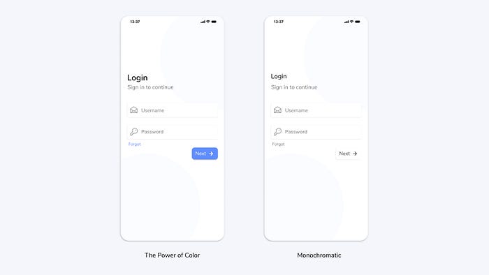
- Using an accent colour (limit to one or two colours)
- Highlights
- The contrast of text (bold, Italics)
- Hierarchy of text (sizing)
- Use of negative space
Don’t overdo it. For best results, limit yourself to two or three of these and use them sparingly.
Mix and match these techniques to see what works best for you.
A user should see what the designer wants them to see

Navigation plays an integral role in understanding how your users interact with your product. It improves user experience by ensuring users know where to find what they need.
Our innate response is to spot the obvious and fixate on what we see. This is effective and supports the navigation process tremendously. It is literally guiding you through the UI step by step.
A good product designer needs to find balance in doing what’s best for the business as well as the user.
For example, an easily cancelable subscription will make the user feel rest assured, however, it is also likely to increase the cancellation rate. A “cancel subscription” button shouldn’t be burdensome to find yet it shouldn’t be obvious either.
This way, designers can focus on maximizing the number of users. It’s a win-win situation. You can learn more about this here.
Aesthetic Usability Effect

Fine-tuning is an indispensable part of the design process. It allows the designers to catch the earlier, questionable design decisions. This is one of the primary reasons it takes hours (sometimes days) to design. Fresh eyes always see better.
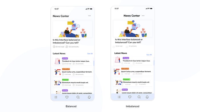
Aesthetic usability effect insinuates that products that look better work better- even if that’s not necessarily the case. People believe visually appealing UI’s are more intuitive and credible than those of less aesthetic value. In saying this, the slight imbalances in UI can drive users away.
These subtle differences can be difficult to pinpoint for non-designers, however, once noticed, they cannot be unseen. Let’s see how a well-done design can benefit the UI.
- Users trust the product more
- Increases users happiness
- And increases the usability of the product
Beautiful UIs improve the overall user experience which in turn guarantees the retention of users. Balanced designs are like a sigh of relief and a subconscious nudge.
Subconsciously nudge a user through good design
Despite the meticulous demands of the design process, you will notice the fine-tuning transforms UI designs immensely. Good structured UIs can ensure users interact with your product for long periods of time and more importantly, result in a good user experience.
Highlight what you want people to see and make it easy for the user to follow along. To create a well-done, balanced UI, focus on the minor details.
If you are known to nitpick or be a perfectionist (you know who you are), this is your time to shine.
The Canvs Editorial team comprises of: Editorial Writer and Researcher- Paridhi Agrawal and Anjali Baliga, the Editor’s Desk- Aalhad Joshi and Debprotim Roy, and Content Operations- Abin Rajan
Follow Canvs on Instagram and LinkedIn. Don’t forget to follow us here on Medium as well for more design-related content.


