Inclusive design: usable vs accessible
The key to any product is usability. If people can’t use it, then it obviously becomes ‘useless’. So how usable is an app if it’s not built to support Accessibility Settings but will potentially be used by someone who relies on these configurations?

We’re all familiar with user personas. They represent the expected or ideal users we’re designing for and are usually based on market research or real data. They help us identify with who’ll be using our products, how they’ll be using them and in what likely scenarios; helping shape the goal of creating a product that fits specific user needs and wants.
We’ve recently taken this one step further within my current project team, with the challenge of creating an application that needs to be accessible for a very wide range of people; increasing the possibility of users with disabilities. The value proposition of the app is not related to a specific disability but due to the broad nature of the audience, we want to ensure we’re accommodating as many potential users as possible and aim to bring an inclusive product to market.
What is Accessible Design?
Most designers will be familiar with ‘accessibility’ in terms of colour contrast and font size but the Accessible Design process is about considering the needs of people with specific impairments.
- How will a colour blind person be seeing your design?
- Will they still be able to identify a link or button when the colour or possible underline is removed?
- How might a blind person navigate your application? (Yes, this is actually possible!)
- Or a partially sighted person who has trouble reading smaller copy?
- Will users with hearing impairments still get the personality of your product if they can’t hear sound?
- How might you focus the attention of an autistic user or those with attention or sensory challenges, so they can complete specific tasks without getting side-tracked?
These are just a few scenarios but they’re all capable of being accommodated to and allowing yourself to think in this way, helps put into perspective just how many people we might be excluding from the experiences we’re creating, if we don’t at least try to support their needs in some shape or form.
Here’s a tweet from blind veteran Rob Long, venting his frustration as a blind Twitter user…

“As accessible as it is personal. The world’s most personal device was designed for every person. So a person who’s blind can take group selfies. A person who’s deaf can call Mom from overseas. And a person who can’t move from the neck down can send text messages to friends.”
- Apple
Experience it for yourself
Try adjusting your native Accessibility Settings on your device — it’s pretty interesting to see which of your favourite apps support them 👏 and those that (sometimes surprisingly 😵) don’t…
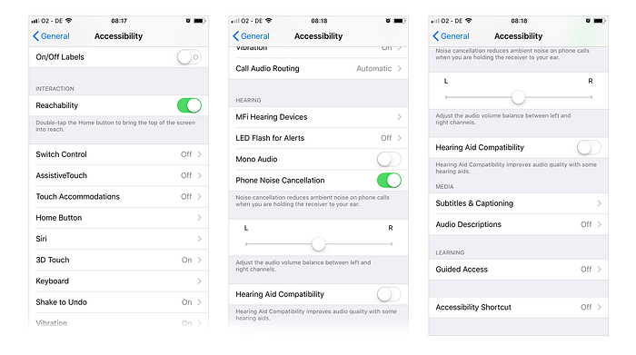
Not all of these iOS controls can impact your application but certain aspects can be taken into consideration and built to support them. Configurations such as Large Text, Voice Over and Guided Access can all have an immediate impact on your application if you accommodate for them. A lot of these options will affect the build of the app only, so shouldn’t necessarily impact the UI design itself but to support these functionalities it requires the developer to create custom labels so the content can be translated correctly.
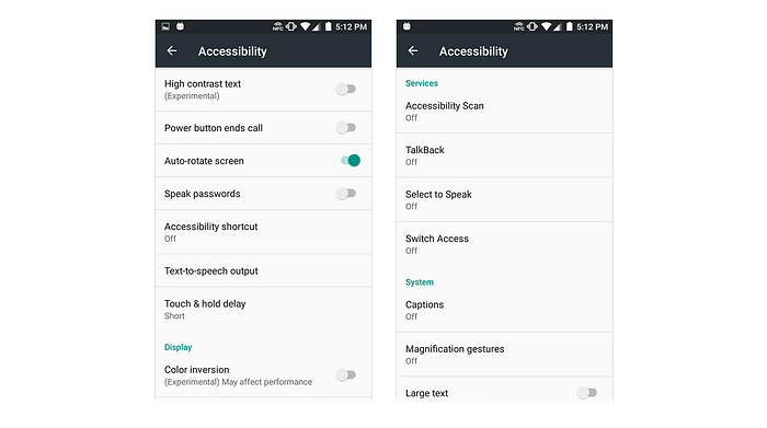
Try turning on Voice Over (iOS) or TalkBack (Android) and see how this changes your experience. This might seem tricky to navigate if you’re someone without a visual impairment but it should help you appreciate the type of experience you can still offer to someone that you might have otherwise disregarded; and empathise with those that can’t engage in the same way you do.
It takes a lot of time and effort (especially from the Quality Assurance team!) to ensure a product behaves correctly to support peoples’ needs to this extent but the next time you find yourself groaning about that specific shade of smaragdine* you painstakingly picked not passing the contrast test for the visually impaired, imagine being that visually impaired person and the experience you’d be getting otherwise. Complying to rules as minor as a contrast checker are the least we can do as designers to ensure we’re accommodating as many users as possible and eliminating those potentially poor experiences.
“Exclusion happens when we solve problems using our own biases. As Microsoft designers, we seek out those exclusions, and use them as opportunities to create new ideas and inclusive designs.”
- Microsoft
Need a bit more perspective?
Here’s a TED talk from Sinéad Burke. She shares a few scenarios of life as a little person and asks “Who are we not designing for?”. She may be referring to Accessible Design within the physical world but hearing how her needs are commonly not met, makes us even more determined to build a product that can be as inclusive as possible.
*yellowish green
I’m a Product Designer, with a background in delivering solutions across multiple platforms from ideation to launch. Currently based in Amsterdam and forming part of the team at MOBGEN — Part of Accenture Interactive.
Hopefully you found this post interesting! You can say Hello on Twitter, or feel free to troll me for being another designer stating the obvious…