Infinite Scrolling, Pagination or ‘Load More’ Buttons? (and other UX links this week)
What’s hot in UX this week:
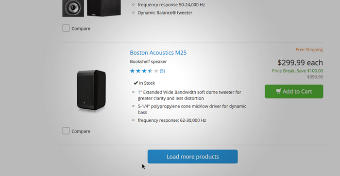
Infinite Scrolling, Pagination Or ‘Load More’ Buttons? →
Pagination is still the most popular way to load new items on a website because it ships by default in almost every single e-commerce platform. However, our usability test sessions found “Load more” buttons combined with lazy-loading to be a superior implementation, resulting in a more seamless user experience.
We found that infinite scrolling can be downright harmful to usability — in particular, for search results and on mobile. However, it’s not black and white, because the performance of each method varies according to the context of the page.
In this article, we’ll present Baymard Institute’s usability research findings for both “Load more” buttons, infinite scrolling and pagination, including for both mobile and desktop. We’ll see how search results need to be implemented differently from category navigation, along with several pitfalls with implementation and examples from leading e-commerce websites.
Quality Wireframes Inspiration →
A well produced, quality wireframe is a critical phase in the creative process and could make all the difference while working with different stakeholders.
via Fabricio Teixeira
The New Web Typography →
We can trace a nervous path through the links and hearts that occupy our timelines. In search of answers, we’ve peeked under the covers of Material Design and examined hundreds of pattern libraries, since one of them might be secretly withholding the principles of good design within.
via Fabricio Teixeira
Microinteractions in Mobile Banking →
During the last year I have been working in the digital financial world designing new banking experiences. Right now small and big banks need to evolve and get them self up to speed in the current disruption they are suffering.
via Fabricio Teixeira
Why Circular Profile Pictures Accentuate Faces →
What shape are your app’s profile pictures? Chances are they’re square. A square isn’t the best shape to use because it makes it hard to visually process faces. A circular profile picture works better because it accentuates faces.
via Fabricio Teixeira
Design as Participation →
This new generation of designers that work with complex adaptive systems. Why are they so much more humble than their predecessors who designed, you know, stuff?
via caioab
Motif (Site Preview Image Generator) →
Motif helps you generate beautiful preview images for your site in just a few clicks. Make your whole site more sharable in minutes.
via Fabricio Teixeira
Ready-to-Print Device Templates for UI & UX Designers →
Phones, tablets, Apple Watch, desktop browsers. All files contain a blank and dotted grid template in .png and .pdf formats.
via Fabricio Teixeira
Brought to you by your friends at uxdesign.cc
Like the links? Share the love ♥


