Instagram can’t touch the visual glory of blank VHS tapes
The arranged marriage between color and typography lives on
A thing of beauty will never fade away. Those blank VHS tapes from the 80s? They look just as good in 2021. Vibrant Instagram images with layers of filters can’t hold a candle to these boxes in black. While I did have a tank of a VHS player at home (remember those?), I only got to see blank tapes at film rentals and aftermarket video cassette boutiques.
My cupboards were stacked with the tapes of the garden variety, those laden with films. I’ll never forget watching the first Pokémon movie and Disney’s Hercules off VHS tapes. But the blank tapes, they’re the ones I wish I owned.
A designer’s wet dream, blank VHS tapes were born at a time when design budgets were well above marketing budgets. And while the designers of yesteryear didn’t have to deal with crippled attention spans and digital distractions, they still had worthy foes: each other.
Common relics
Used bookstores and old rentals remain a breathing bloodline for the defunct video format, with VHS enthusiasts still able to net old titles for pennies. Despite VHS tapes being ejected out of mainstream media over a decade ago, they’re still alive and kicking underneath all the noise. DVDs took center stage after the creaky tapes left and Blu-Ray discs succeeded them only to be consumed by an intangible force it could not see.
While the spinning wheels of the entertainment industry have gone digital, VHS covers remain a masterclass in visual design. The complicated relationship between typography and color makes them all the more intriguing. If you’re looking for a primer on how these tapes work, here’s a guide that doesn’t shy away from the technicalities.
The ones that didn’t end up in a landfill remain prime examples of how the designers of the 70s and the 80s seized the rapt attention of their audience. From emphasis to color theory, they really did go all guns blazing. If you don’t need the tour, dive right in. Here are a few evocative stills of VHS’s winding journey across eras and the lessons one can glean from them.
Symmetry and Variance
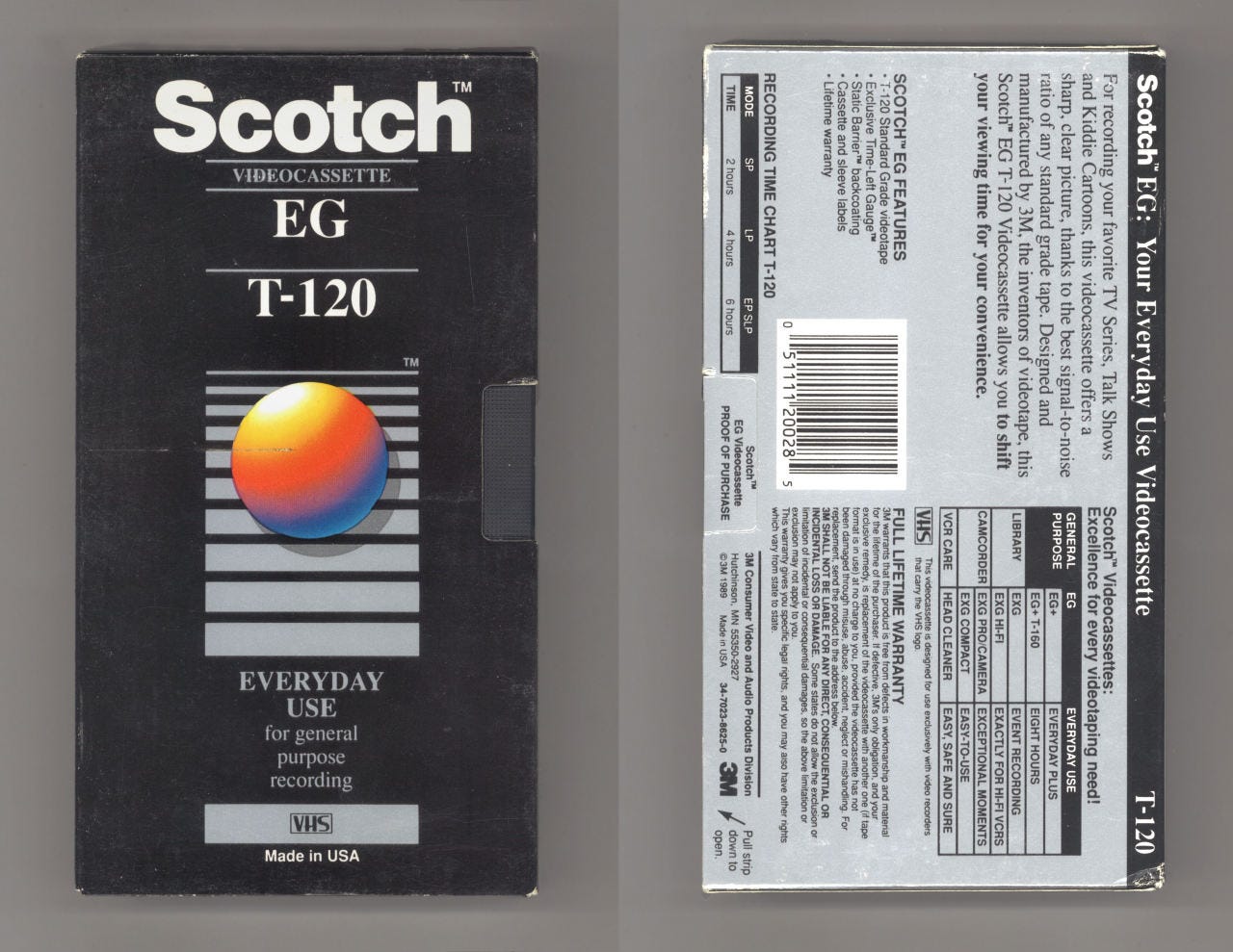
3M Scotch used to make videotape too. And the results were glorious. The now-iconic gradient draws your attention to the steady transition in the proportions of the grey rectangles. The colors and typefaces are recognizable even today. An instant classic.
Motion and Color
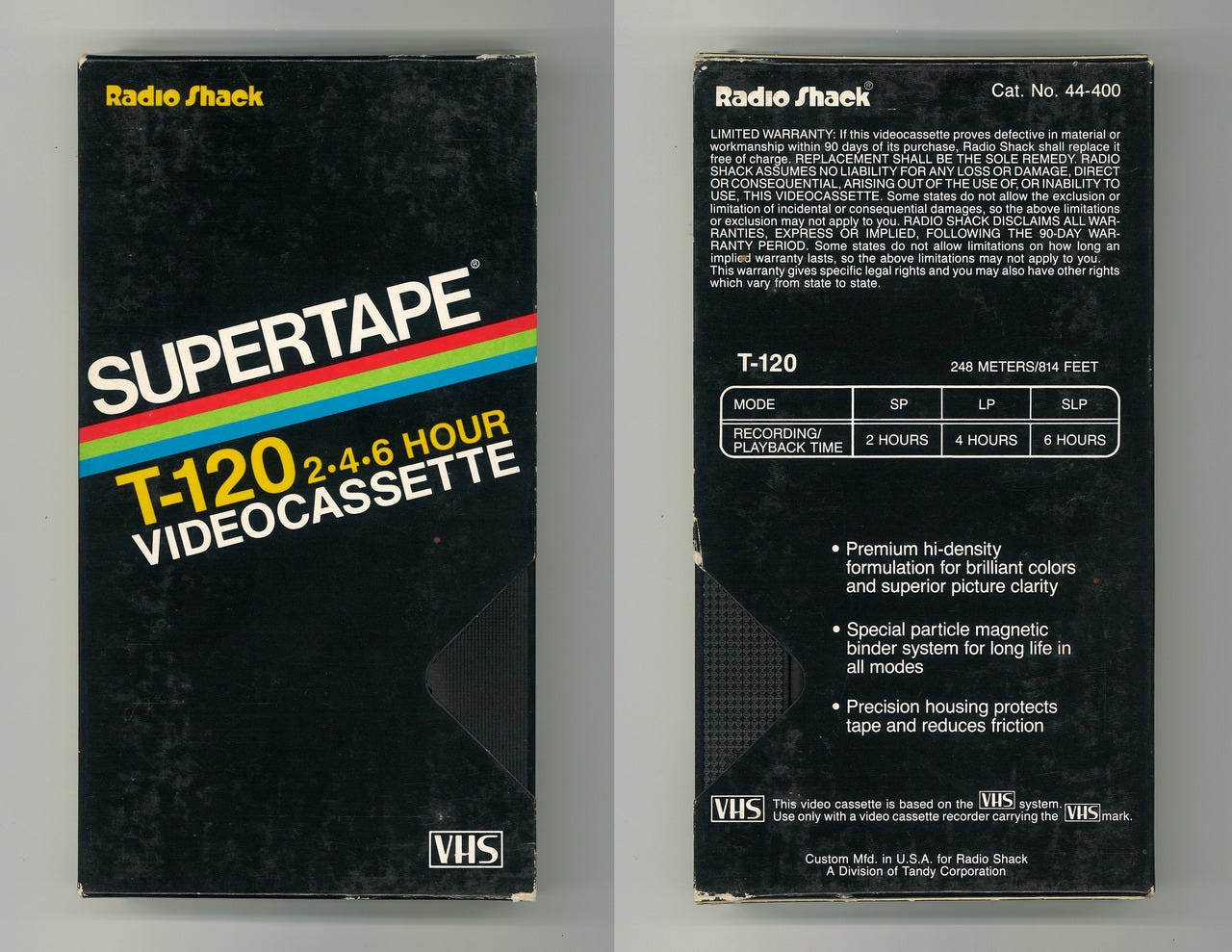
RadioShack kept things simple with its neat branding. The clean lines stand out on a shelf filled with tapes of all kinds. While several manufacturers adopted the usage of colored lines, few could contest with the colors chosen by RadioShack.
“Though many other tape manufacturers used a similar theme of straight colored lines on simple backgrounds, the Supertape manages to capture with its slant and its peppy yellow font both the feeling of the ’70s yesteryears and the new decade to come; a feat not so easily achieved by other designs with similar themes.”
- Madeleine Morley, Editor at Eye on Design
White Space
Unlike most of the tapes on this list, Fuji embraced minimalism and left plenty of white space on its tapes. It helped people scribble their names onto them, lending them a touch of personality. Despite sounding like a winding tape (ha), I can’t help but appreciate the color and typeface choices in every tape on this list.
Bold and Loud

Walmart dialed up the colors all the way up to 11 with this design. The reds and the blacks overpower most of its competitors. The Afro-oriented design is quite unlike anything else on this list. As for the massive “6” in your face, it sure does get the job done.
Pixel Art and Color Palette

Remember those fancy idle animations on an old Windows computer? That’s the image that formed in my mind when I saw this treat. Quasar nailed the color palette on its pixel art piece, transitioning neatly into white space. I bet no one had a problem picking this off a shelf back in the day.
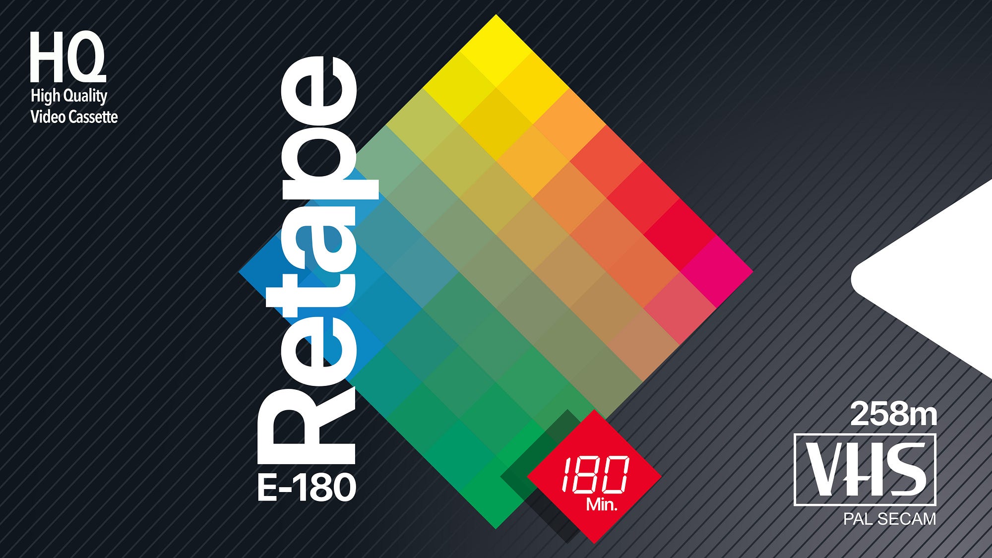
Position and Proportion
Truth be told, I wouldn’t be surprised to see large fonts and vivid colors like these on a minimal Instagram post. The designers of today unknowingly borrow from a rich heritage of powerful color combinations and strong fonts. The alignment of the letters doesn’t fail to incite one’s curiosity.
Dimensions

It’s 3D! Samsung really went all in on its covers. The colorful bouncing balls stood apart from the line-heavy and 2D-focused VHS tape covers at the time. The shadows convey a sense of height missing from its rivals. Add to that the void at the back and the ball drop for simulated depth and Samsung had a winner on its hands.
Time-lapse

Fast forward a couple of decades and the entertainment industry has transitioned from physical forms of media over to the internet. Platforms like Disney Plus and Netflix fight for dominance on a global scale, reaching millions of users despite facing a pandemic on an unprecedented scale.
Releases that once drove hordes of fans to theatres are now muted in comparison, reeling in virtual audiences from the comfort of their homes. In an era where tangible media is slowly slipping into irrelevance, VHS enthusiasts keep the old dream alive, that of tactile tapes and content you could hold onto.
Despite the efforts of designers to painstakingly transfer new movies over to the VHS format (complete with covers and tape), it’s still a format that belongs to the past. Some have even begun selling cassettes with film soundtracks at a reasonable price. While they’re distributed more than something you’d find in a museum, the VHS tapes of today live on borrowed time. But when VHS tapes reigned supreme and were at their peak, the medium produced some gorgeous art that remain signposts to the intricacies of visual design.
Key Takeaways
- Symmetry and variance
- Motion and color
- White space
- Bold and loud
- Pixel art and color palette
- Position and proportion
- Dimensions
Further Reading
- From Ignored Ubiquity to Design Classic: the Art of the Blank VHS Tape — Eye on Design
- Vault of VHS — Tumblr
- “Stranger format”: an ode to the retro branding of our VHS memories — TypeRoom
- Blank VHS Cassette Packaging Design Trends: A Lost Art — Flashbak
- Intro — Inside the VHS Cassette & VCR — Gough Lui
- VHS tapes are back in vogue as everything old is new again — NBC News
- VHS era is winding down — LA Times
- This neat Twitter thread with even more examples

