You're reading for free via Michal Malewicz's Friend Link. Become a member to access the best of Medium.
Member-only story
Instagram makes bad navigation good?
Is popularity enough to switch nav patterns?
Instagram is one of the most popular apps in the world. It started humbly in 2010, initially as an iOS only app. The first versions of the app used skeuomorphism for visual communications and introduced photo filters which fueled a lot of it’s popularity.
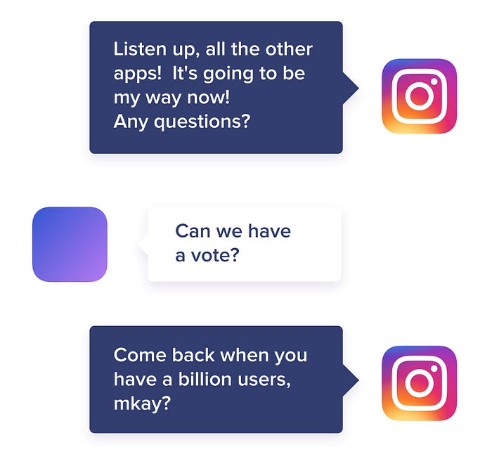
Today Instagram is used by at least 1 billion people each month, with around 500 million using it every day. Is this enough to influence the entire app industry? Let’s find out.
Before we begin
Let’s get the most obvious problem out of the way — touch targets. They are not going to be the main focus here, but they’re still worth mentioning. Instagram somewhat fixed it (or at least made it slightly better) in the latest versions, but still trying to tap on user names can be cumbersome — especially in the part where it shows the most recent likes under your post. This is of course due to the fact that the text is too small and slightly too close to other elements, that can also be activated. More whitespace or a bigger font would do the trick.
Tab bar navigation
While tab bars are “the way to go” with mobile apps the way Instagram handles it is far from ideal. This is mostly due to the fact that depending on where you are and what you did, the tab can contain different information. It means that if you go deeper into the flow of each tab, the tab itself stores the current page information all the time.
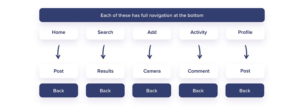
The main understandable pattern would assume all of the main tabs have the bottom menu. However the next step you take (deeper) removes the menu in favour of the back button. That makes the navigation more linear, and possible a little bit slower, but at least it’s logical.
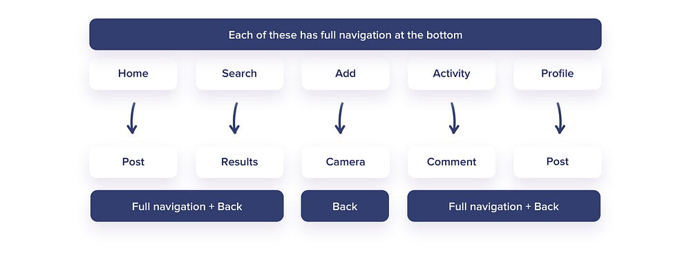
Instagram decided to take another path. The only tab that adheres to the Apple imagined good navigation practices is the camera. All the other tabs have BOTH a back button and all the tabs available.
The flow in search results can look something like this.
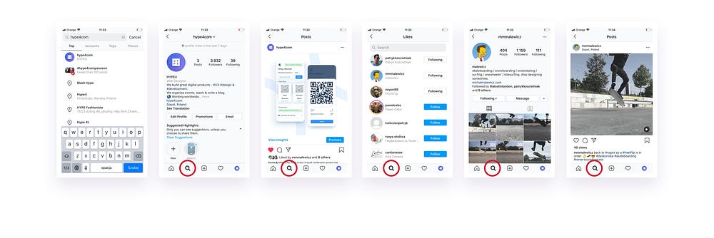
If you look closely, we started at search. Then clicked on a profile. On that profile we selected one post. From that post we went to likes. From those likes we proceeded to one of the profiles. And then to that persons post. We can of course go on and on, supposedly forever.
Notice how the selected tab is always the one we started with. Search.
It means we went through most of the page-types and had the same tab highlighted.
Now imagine we switch tabs.
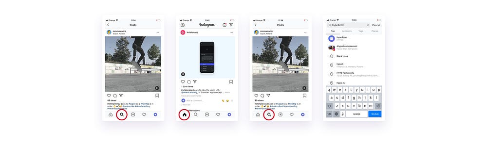
We were in search / someone’s post — at least 5 levels down. Then we go “Home”. And then to search again.
Instead of the expected search tab we end up with that profile again. We can of course “back out” of it by using the back arrow or simply tap the search icon again to go back to front.
Again this is not what we naturally would expect from a SEARCH tab.
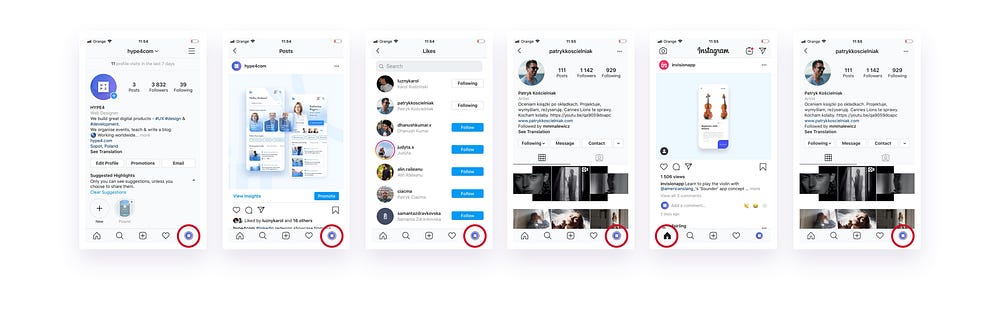
Here’s another example. We go to our own profile. Then we go to a post. After that to our likes. From the likes list we select a profile of one of our friends. We look at his cool photos. Then switch tabs to home.
When we come back to our own profile — it even has our logo as the icon! — we end up on our friend’s profile instead.
This loop breaks the logic and expectancy. It may make sense on a high level of the “entire navigation”. But deep down, logically it doesn’t.
This should be OUR profile, not someone else’s.
Unnatural vs cumbersome
If we didn’t have the tabs available all the time, we’d have to back away the cumbersome way (one by one) which would take forever. So looking at it from that perspective it seems they made a conscious choice here that works.
It is however still unnatural and the only thing making it natural is the sheer popularity of the platform.
Not logic. Not easy-to-understand interface. Not some “great UI navigation pattern”.
We grew to understand it or even like it because we had no choice.
There is no right way.
There is no “right way” to do this kind of navigation. You’re either a bit illogical, or a bit more cumbersome but preserving logic and consistency.
So the question here is — should other apps adapt to it? Or should some use the more common “regular tab pattern” instead of “instagram tab pattern”?
Because for the sake of the experience we should probably stick with one at least until we make a major breakthrough and come up with an even better solution.
Otherwise people that are really into Instagram will have a hard time using other apps.
________
I write weekly longform stories. Follow to stay in the loop.