Interface concept for Tesla in-car dashboard — a UX case study
Role: Research, Product Design
Contributors: Louis Moody
Date: 05/11/18
For millions of people, Tesla needs no introduction. For everybody else, Tesla creates electric vehicles that can be better, quicker and more fun to drive than gasoline cars (imo). But if you’ve ever driven a Tesla, you’ll discover something incredible. Tesla designs their vehicles not for the perfect driving experience, but for the perfect riding experience.
The sum of all parts
I divide my process into the following structure. Makes it easier to communicate my rationale.
- Problem
- Solution
- Approach
- Learnings
1. Problem
We’re all visual thinkers. Most of the time we have to see something for us to understand it. By creating visuals (in my case some rough sketches) I can turn the idea of a concept into a North Star (your guiding light) sometimes in the form of “problem statement” that can keep me stable, on the path for product delivery.
“As a Tesla driver I want the experience to be comprehensive, easy to navigate, and to be close to 100% efficient at every interaction, so I can feel safe while I’m driving.”
2. Solution
I’ll begin by showing you what I did. Then, we’ll move on to how I did it.
Components, components everywhere
By creating low-fi layout concepts, I can easily visualise the product architecture and how people will interact with it. From these foundations, I can create user flows from the beginning of the journey to the desired destination.

Atoms and molecules
The text content represents more than 80% of the design (I read somewhere), so understanding typography is crucial. I always put readability first. The default font for iOS is San Francisco, which is made in-house by Apple. I always use this system font for my projects because it’s beautiful, free and most importantly, designed for legibility.

Transmissions and transitions
I also enjoy creating mood boards. This helps me visualise the aesthetics of the project. It keeps me aligned with the vision and gives me something to revisit and helps to keep the coherency of the project. It’s a way to keep myself inspired, too.

Let’s go for a ride
I care about my projects more than I know about them. I’ve found that when you care, you will spend more time on learning, execution and iterating that will produce better results, and just like a great process is nothing without master execution, a great design mockup is nothing, without careful consideration to UI from the UX research and extreme dedication to details.


You’ve almost convinced me I’m real
By creating a product quality deliverable to learn is a huge investment of resources. Even if it is of minimal design and functionality. By testing prototypes rather than functional products, I can move even quicker and pivot when an opportunity is discovered.
All my interactive prototypes current prototypes are built with Framer X. This was built with Framer Classic.
You can interact with the prototype above by following the link. Click Grimes for Light mode, Elon for dark mode.
3. Approach
When designing the experience and interactions of a product, my focus and objective are to get the user to her desired destination with as little work as possible. To do this, I need to discover what the secrets are at the core of her problem, define objectives and then expand outwards.

Setting the scene
During my research I discovered many different scenarios of the driving experience which resulted in the following:

No pain no gain
Summarising the data from the user persona’s, I created multiple empathy maps and developed the following considerations:


Pencils before pixels
After synthesising the context of the pains and gains and assuming scenarios, comes my favourite part of the process. Ideation.

Pedal to the metal
Implementation of the components after the sketches and blueprints were validated.

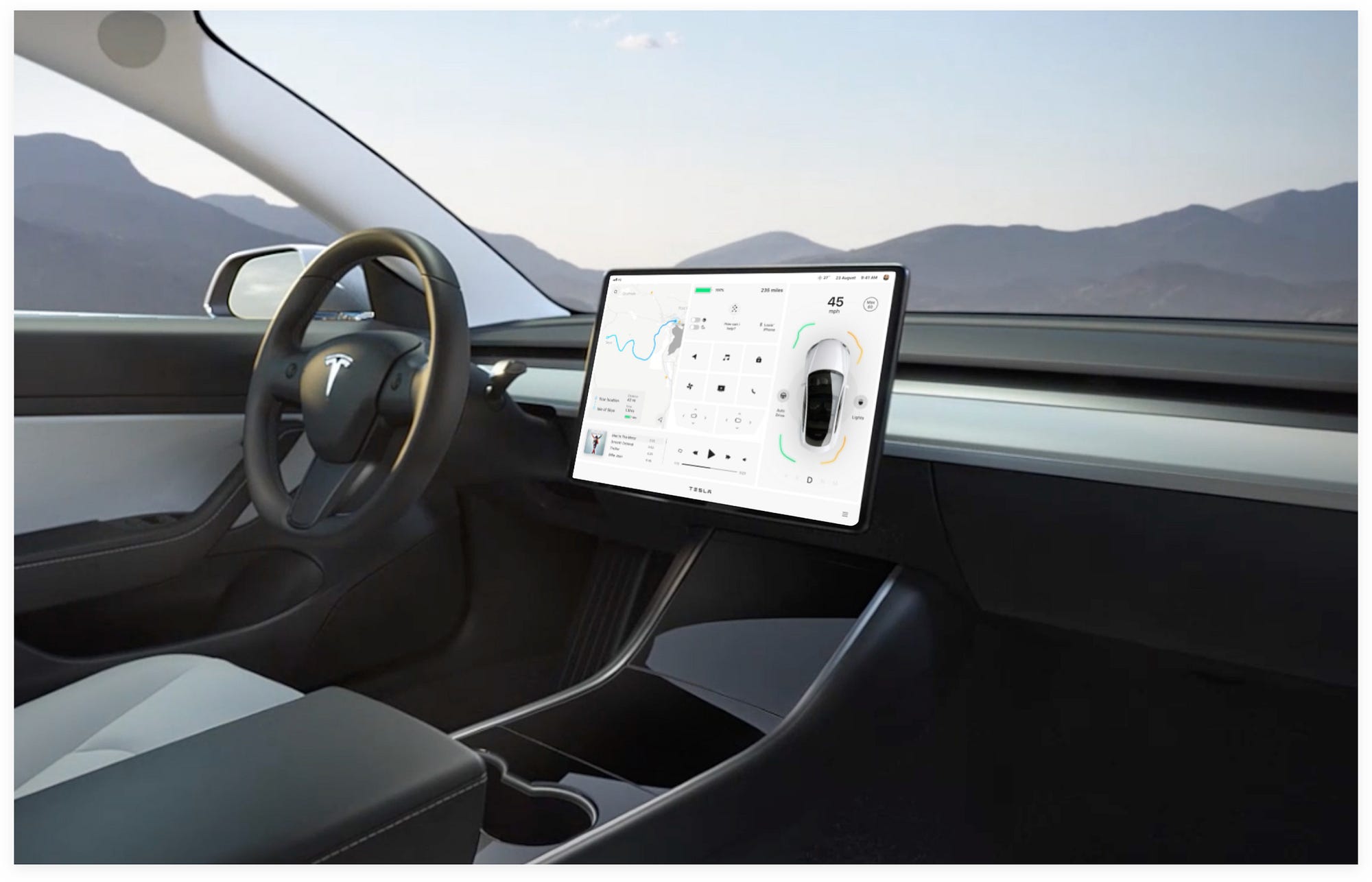
- Starting from the right side of the dashboard. Why? Because we’re driving on left here in the UK. That means the driver will be sitting on the right-hand side so it’s important to have this high priority information closet her.
- The component is sleek and minimal. Avoiding unnecessary distractions.
- Speed dials are a thing of the past. With digital improvements to car interfaces, text-based representations of the vehicles speed the simplest way to show the user how fast they’re travelling. It’s big and bold and hard to miss.
- The model of the car very effectively illustrates the states of the vehicle, especially when the autonomous drive is activated.
- The two interactive buttons to the left and right of the image of the car are clear on what they do. Switch on/off the lights and activate autonomous driving.
- The circles under the car image are the visual representation of the car creating a 3D map of the world (this is how auto driving is able to function technically. I discovered this after the research I did for this project)
- The coloured lines are “proximity warnings”. If it’s green there’s a safe distance between you and the exterior object, orange it’s pretty close and red you should be extra careful.
- At the bottom is a clear transmission indicator. the other forms of transmission are faded to ensure the user knows what way they’re moving.
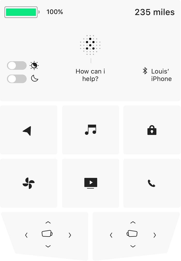
- The control centre is conveniently located in the middle of the screen. That’s because it’s the second priority to the driver. If she wants to see how much power she has for her trip, the information is noticeable and clear. Right at the top. It’s unmissable with its colour identification.
- Toggles are a familiar part of interface design. There’s no point re-inventing the wheel. It’s important to adhere to common practices to avoid confusion.
- You guessed it — the dotted icon is Elliot, the AI assistant for the car.
- The use of appropriate icons is also essential to the control buttons. Don’t be abstract for the sake of cool design. Cool doesn’t mean it’s good. In this situation, the icons need to be an exact representation of the physical object.
- Are you wondering what happens if you tap a button? Hold tight, you’re about to find out.
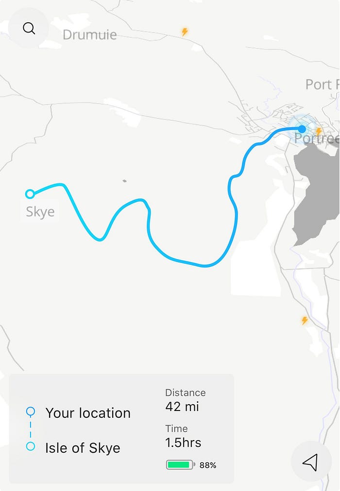
- The next component within the Main Dashboard is the GPS map interface. Simple and clean. Only important information is visual on the map.
- The user has a visual on the distance and time it’s going to take. The battery is an estimation of how much power will be available when the journey is complete.
- The thunderbolts display charging points that are compatible with a Tesla. The thunderbolts that are faded represent charging points that are out of range for the user to drive to.

- This is a music player in it’s simplest form. The user can view it’s current loaded album/playlist, select songs and play.
- If a user wants to choose a song from another album/playlist, she can tap the music icon within the control centre to see her full collection.
- Need to adjust the volume? If the user taps on the sound icon, she’ll be presented with full-screen volume control.
4. Learnings
What I found out during my discovery, research, implementation, and iterations.
It’s been one hell of a ride.
The team at Tesla spend every waking hour to make the perfect riding experience. The amount of research, testing, and iterations go beyond what I can personally imagine and the time to get it right last much longer than the average software delivery cycle. However, they have access to a lot of data and research to accomplish what they have (I don’t).
The amount of research and data collected by myself is mostly based on assumptions and what’s available on the web, so I don’t claim that my decisions are better, simply from a different perspective, based on those assumptions.
There are still many more features that I haven't explained, but like any design project, I’ll keep iterating and explaining my rationale behind the decisions, big or small. If I discover better data the better I can design solutions.
Thanks for reading. I hope you enjoyed and learned something from this case study. Feedback welcome in the comments!
Hi, I’m Louis Moody.
I’m a product designer from Shoreditch, London.
Check out my Dribbble, Instagram and Twitter to see my UI designs, follow my process and to stay in the loop.
This is a self-initiated design concept. All car images and materials presented in the current project are the intellectual property of their creators and owners. (www.tesla.com)