Invisible Design Systems, UX from 1989, the World’s Ugliest Color — and more UX this week
A weekly selection of design links, brought to you by your friends at the UX Collective.
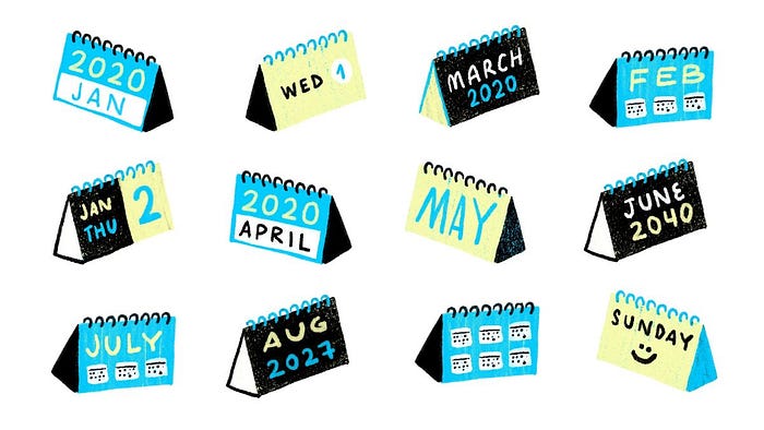
What to expect for UX in 2020?
- Rediscovering information architecture →
- Embracing new superpowers →
- Invisible design systems →
- Designers, unite →
The UX Collective newsletter is a self-funded newsletter read by over 124,500 designers every week, curated by Fabricio Teixeira and Caio Braga.Stories from the community

What UX from 1989 can teach us →
By Dina Zuko
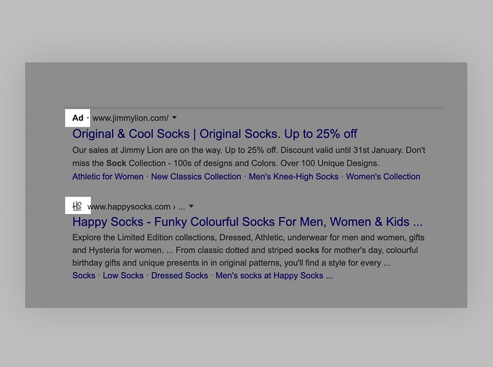
Why Google’s new search results are a dark pattern →
By Johnny makes ⚡
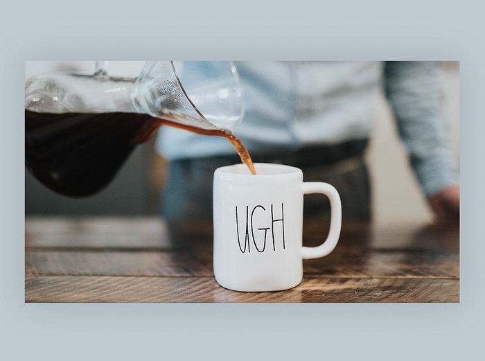
Burnout: the ugly side of UX →
By Olga Wojnarowska
More top stories this week:
- Design research doesn’t generate hypotheses; you do →
By Konstantin Sokhan - Is it time we move beyond the NPS to measure user experience? →
By Nikki Anderson - Pattern brands know the rules and when to break them →
By Caitlin Sowers - Applying Asimov’s laws of robotics to user experience design →
By Luis - The one thing Netflix understands that HBO Now doesn’t →
By Patrick Thornton - Pareto principle, the 80/20 rule that every designer should know →
By Tania Vieira - How the Anchoring Effect can change your customer experience →
By Jen Clinehens
News & Ideas
- The Evil List →
Which tech companies are doing the most harm? - Ugliest Color →
Meet Pantone 448C, the world’s ugliest color. - Google Well Being →
Google’s new tools, from ingenious to offensive. - Writing Accessibly →
How to meet WCAG2 standards in your writing.
Tools & Resources
- Browser Defaults →
Search elements and find browser default styles. - Tuple →
Remote pair programming for macOS. - Mine →
Decide where your data should or shouldn’t be. - Eunoia →
Words that don’t translate.
We believe designers are thinkers as much as they are makers. So we created the design newsletter we have always wanted to receive.

