iOS Notification redesign concept — a UX case study
Giving more control to the users.
Disclaimer: The concept was proposed before the launch of iOS13
Introduction
Like many others, I carry my phone around everywhere because it is the source of connection to the outside world. As citizens of the Information Age, people want updates on everything, and platforms are developing every day to fulfill this desire. In particular, notification plays an imperative role in communicating the users not only with those physically unreachable, but also with the technology itself — in other words, all the applications installed on the phone.

However, as an iPhone user for many years, I find the iOS notification very frustrating to use. We all had experiences when a long list of notifications was sitting on our lock screens, making us feel very overwhelmed. Stumbling across many posts and videos, I was able to easily find many people complain about the same problem I felt and wanting to see improvements made in the current notification system.
Aim
Feeling the sense of empathy, JooHo Yeo (Facebook SW Engineer) and I decided to form a team to first fully understand the iOS notification system and to explore opportunities around it to give better notification experience to people.
Problem:
iOS notification isn’t doing its JOB

According to Apple design guideline, its role hugely lies in providing timely and important information anytime to the people. However, the iOS notification is designed in a way that doesn’t help users to focus on the information they need. Instead, it creates unnecessary clutter on their screens. Thus, we acknowledged users have difficulties with digesting the information provided by the iOS notification system.
Solution:
A feature providing notifications based on people’s priority
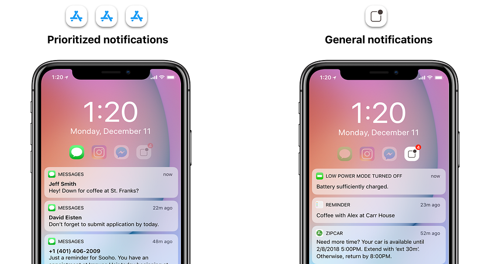
To give users more control over information they get from notifications, the concept provides users to read information separately in two sections: up to three most important notifications and general notifications. This allows users to digest information from applications in their priority order, allowing users to understand and read information easier.
Scroll down to bottom to see the final design
Process
Now I will go through the process of how we discovered the problem, the main takeaways from the process we used to frame and how we segmented our ideas and solutions to the problem.
Understanding our users
As a team, we first looked into our own experiences and found issues that we had encountered. By doing so, we were able to ask the questions to other users throughout each phase of product development and iteration to be sure that we were designing for other voices other than ourselves.
Here are some questions:
- What is the story of the experience that we want people to have?
- What is happening before people get in and start interacting with the notifications?
- What are they feeling and thinking?
- What got them on the screen in the first place?
- What happens afterward?
- What changes would make the notification system valuable to the users?
Understanding why people have difficulty engaging
User Research
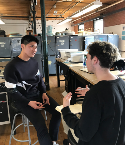
We interviewed students about their experiences in iOS notifications. Our goal was to learn about how users interact with the current iOS notification system and how they digest information sent from notifications.
Here are the main pain points and insights:
Main pain point:
Users do not have control over incoming notifications
Pain point #1: Incoming order causing clutter
In the current chronological order, time is the only factor considered for the ranking of notifications.

Thus, users have to look for important notifications in a scroll list of notifications that contains a lot of text that is not always important. It also fills up the whole lock screen and takes up a lot of space visually.
“once I missed an important notification because it was lost in the shuffle as it was overwhelming to look through it“
Pain point #2: Lacking Accessibility
Users miss notifications because the phone resets the lock screen to the clean state

After users open a notification to do a task, when coming back to the lock screen, unread notifications are vanished. This often causes users to forget the unread notifications, causing anxiety to assure that they need to remember getting back to notification center for unread notifications.
Pain point #3: Control notifications only in the Settings
Hard to filter out noises

Users had experiences of having two or three applications that they do not want to be notified about. However, in order to control incoming notifications, users need to go into “setting” and define individually for each App.
This is a long and tedious task.
Insights:
Users want to prioritize information
- Although people feel distracted to see a list of notifications from different apps, they find it comfortable to digest a list of notifications sent from a single app
- Even if people receive important notifications, they ignore to focus on something else and decides to come back later
- People have certain notifications they care about more than others
- Notifications that people receive are mostly human connection related notifications. Ex) messengers, emails, SMS
- Users get most of their notifications from 2~3 applications
Analysis
Users want to organize and read incoming notifications in their priority order, but users do not have any control over incoming notifications
At first, we thought users had difficulty digesting notification information, only because of it’s overwhelming information. However, we found out that users had difficulty because they had no control of incoming notifications.
As a result, we learned that digesting information not only depends on the amount of the information, but also on the prioritization of the information.
Finding Opportunity Space
Figuring out what way to implement through HMW questions

After gathering all our insights from research and interviews, we gathered to generate How Might We questions to find an opportunity space. Then, we had one of our interviewers to participate in voting for the ideal HMW question.
How might we help users prioritize incoming notifications but also provide balanced interruption?
Ideate and Sketch
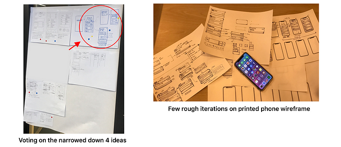
For our ideation process, our team came up with as many ideas that could possibly help solve the users' problems. We did different variations, went about crazy as possible and narrowed down to 4 realistic ideas. Then, one idea was chosen from voting to be continued as the potential solution to the problem.
UX Concept:
Break into “Prioritized” and “General” notifications
The concept provides users to read information separately into two sections: up to three prioritized notifications and the general ones. By doing so, our hypothesis was enabling users to digest information from applications in their priority order will allow users to understand and read information easier.
Explorations for breaking into prioritized and general notifications
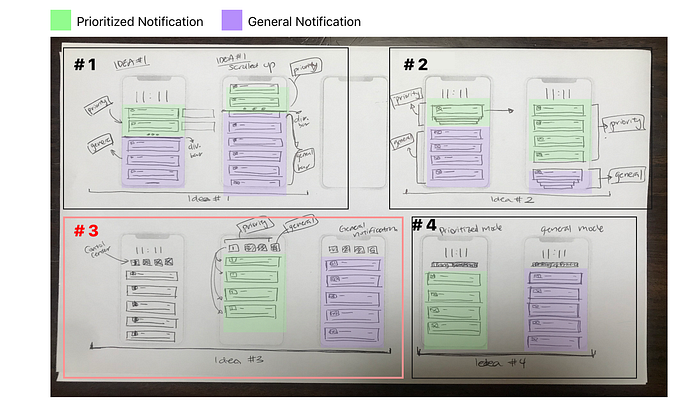
- Dividing two type of notifications using a division bar
- Grouping priority or general notifications when not in use
- Viewing notifications by prioritized apps and general notifications
- Using segment control to see two types of notifications
Chosen Idea:
Viewing notifications by prioritized apps and general notifications

Among four ideations, we decided to proceed with the 3rd idea, because it had the most potential for users to have control over prioritizing notifications sent from apps. Others were simply distinguishing the “prioritized” and “general” notifications, but the 3rd idea enabled users to personalize what apps that they prioritize and read general notifications separately grouped in one pool.
User Flow Task Analysis

After constructing user flow task analysis, we needed to find a way to implement “prioritize” feature to the notification system. From the user research, we have observed that users feel controlling notifications in “Settings” is a long and tedious task, meaning that users will not use this concept if it is the same process.
How might we implement “determining priority” feature on the lock screen?
With the aim to optimize the user’s accessibility, we sought the opportunity of the current notification interaction on the user’s lock screen.
As a result, we found redundant and overlapping interactions for opening the corresponding app, opening an expanded detail view, and removing as an opportunity space.
Rather than adding another interaction, we decided to substitute the “determining priority” feature with one of the redundant features to make sure it is intuitive and familiar to the users.
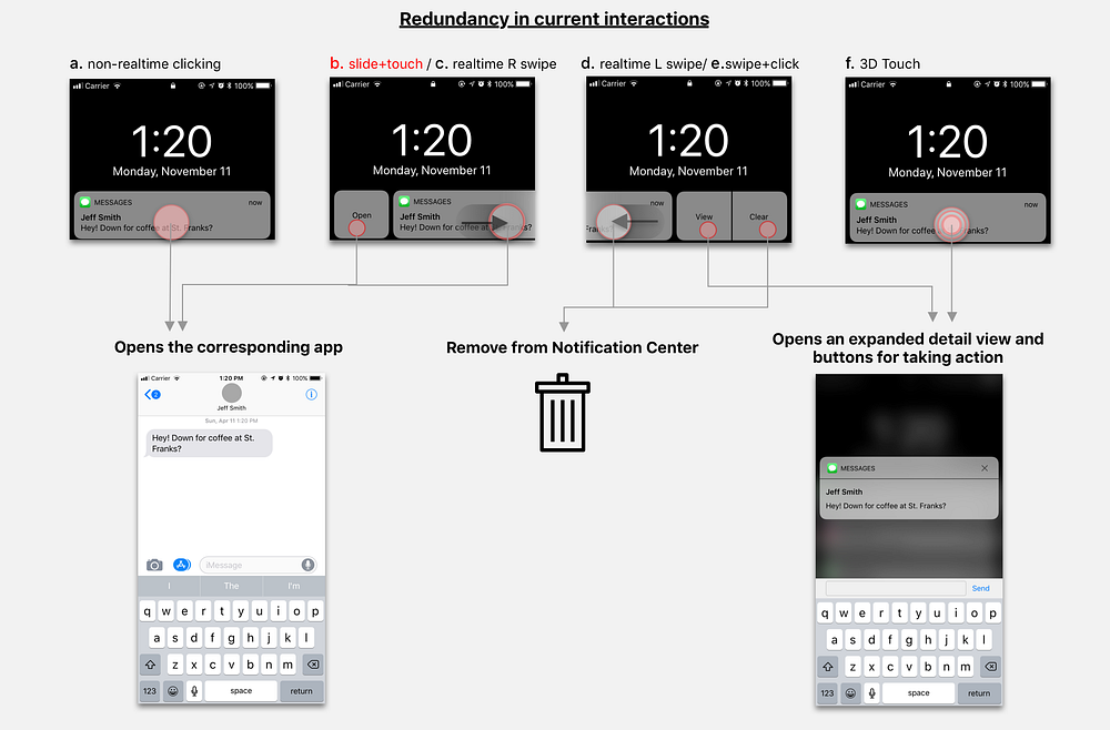
We pursued with B.Slide + Touch “opening the corresponding app” interaction to be substituted because it was the least used interaction from our user research and it could also avoid confusion with the most used interaction.
Explorations in implementing “Determining Priority” feature
Focusing on implementing the feature, we explored which components are necessary on the action tab to encourage the users to engage.

We decided to land on D. Word + Notification among five explorations, because it clearly signifies “prioritize” with the icon. Although B. is consistent with the other interaction feature, we found out that D. was more clear for users to approach to turn the feature on and off easily.
Wireframe & User Flow
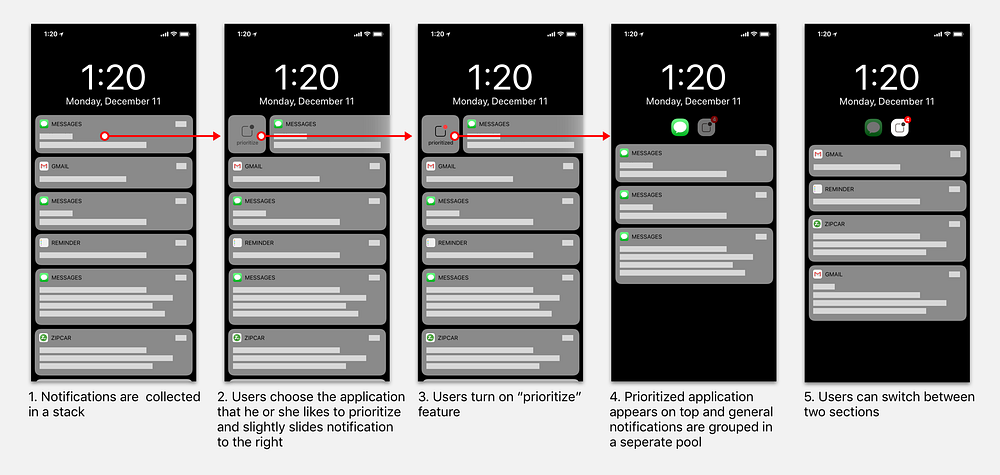
New priority feature Breakdown

Users prioritizing notification
Lock Screen after taking an action on application

Final Design

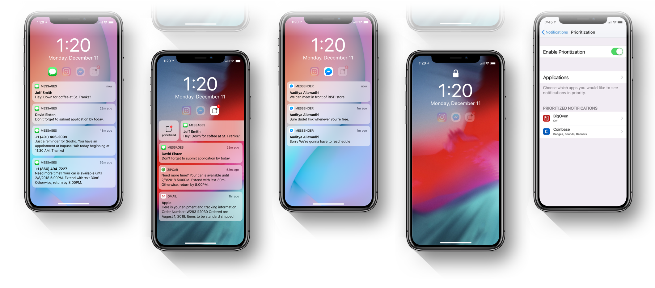
Read by users’ priority
Users read informations separately into two sections: up to three prioritized notifications and general notifications. This enables users to digest information from applications in their priority order, allowing users to understand and read information more easily.

Easily prioritize with a swipe.
Users have the control to personalize what apps that they prioritize. With a simple swipe to the right on the notifications, users can easily switch on and off the “priority feature” to organize their notification center. The feature is also available in the Notification Settings.
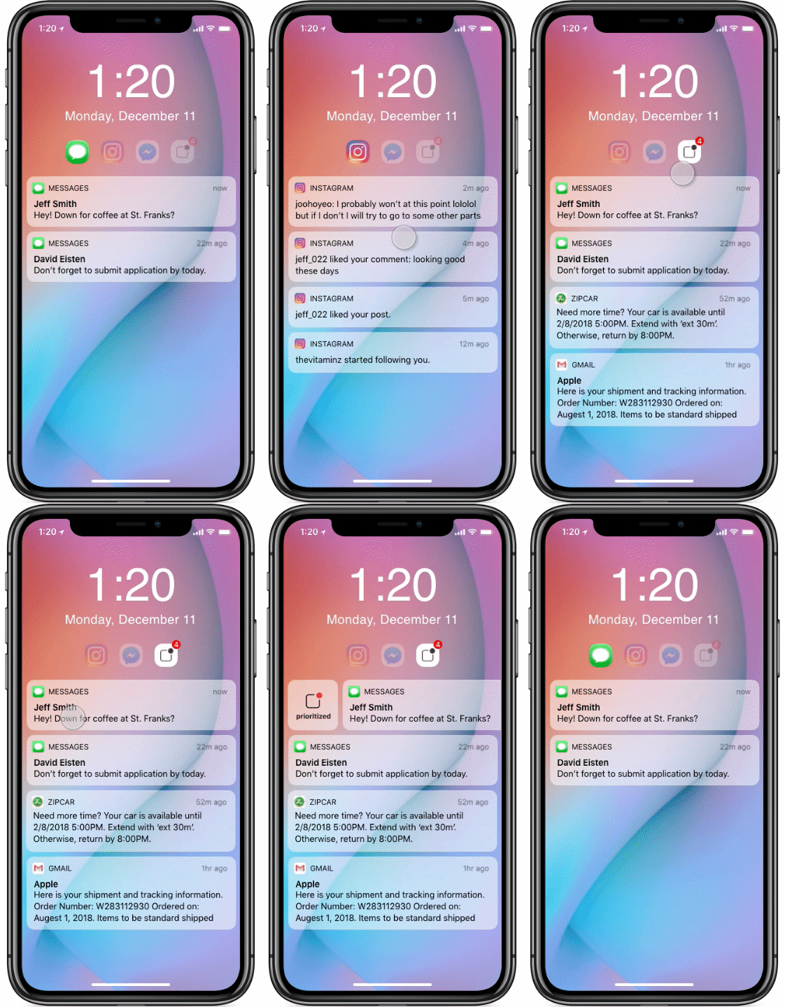
Organized by users’ priority
Once users set their priority, the notification center organizes and pushes notifications into prioritized and general sections so that users can receive them in their priority order and read information more easily.
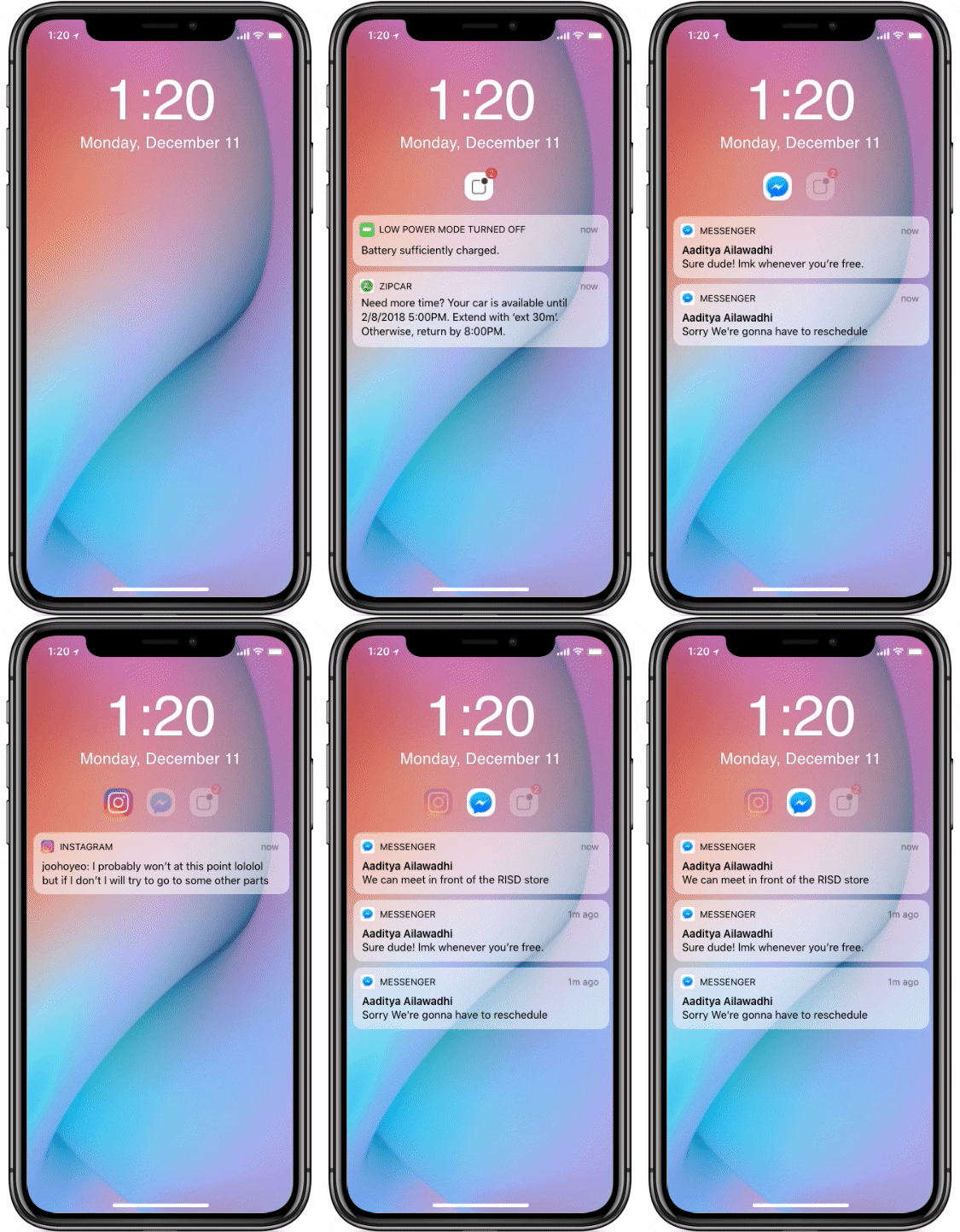
No more missing notifications
By keeping unread notifications on the lock screen, it ensures users to stay on top of all things. Unread notifications in inactive mode don’t demand users’ attention and assures going through notifications later is not a hasteful task.

Looking Forward
Opportunity
iOS notification is a significant product that communicates with users in a form a notification from multiple applications. However, we feel that it undeniably lacks engagement with the people in communicating information. People are less likely to read and understand information in notifications that they do not have control of.
There are more opportunities to create more meaningful features on iOS notification system. iOS notification system should serve more than just delivering information through the form of notification and to lead users to be more familiar with controlling information that they are communicating with the notifications.
Thank you for reading!


