IoT design: user experience in a connected world

When you say the words “UX design”, the first things that come to mind are likely websites and software. Sure, it’s also used in pretty much every product we use, but you don’t often hear about UI/UX conferences for people who design bookshelves, toilet paper rolls, or pillows. However, this all might change as the Internet of Things starts taking up more and more real estate in the public conscience. Since your fridge, your sofa, and your boots will all have smart features soon enough, they’ll all become a priority for people who, prior to that time, have never dealt with them. So instead of playing catch up later, let’s talk about the general guidelines of designing user experience for IoT. In other words, Iot UX and other long abbreviations are my topic of the day so prepare accordingly.
What is IoT?
I’m not going to dwell on this too much and go into tech specifications because it’s all been said before and you can follow the link for a longer explanation. But, just for the sake of clarity, today I’ll be talking about UX in IoT devices, meaning devices with Internet connectivity and network capabilities that serve up unique functions and often deliver completely new features enabled by their programming and Internet capabilities. It’s not anything complicated even if you’re not much of a tech person, just think of an Apple Watch or a Smart TV as a basic example.
How Does IoT UX Differ From Regular UX?
UX design in websites and software is like an old friend. We all know what to expect from it, how to behave around it, and how to best use it for our benefit. Okay, the analogy got away from me. The point is that UX for sites/software is easy and we all know the standard paths, structures, and tricks there. UX for IoT includes all that and more, since you won’t just be designing the actions your users take. You need to make these minimalistic futuristic products feel like home, help users personalize them and integrate them with all of their other IoT devices. Besides, IoT, as you’d expect from the name, depends on the Internet. Which means a downed connection can lead to devices failing to respond or doing so with a delay. That’s a huge hit to the user experience and must be accounted for every single time. Similarly, in regular UX, the user presses a button and sees a result. In IoT, where remote controls are king, you need a way to make the user feel satisfied and notify them that their remote interaction bore some kind of fruit. Otherwise, there’ll be repeat taps on buttons, frustrated grunts as no visual result is seen, and a whole lot of complaints.

So yes, despite having some common ground with regular UX, IoT design still requires a new approach. Mostly, this comes from the fact that IoT isn’t just one uniform thing. There are few set rules on what constitutes an IoT product and it might very well be a network of things instead of just one screen. Any time you develop UX for IoT, you need to be prepared to work with wildly different functionalities while keeping the feel of the system consistent. Let’s see what are some of the most important aspects in IoT design.
The Must Haves in IoT UX Design
I’d actually call consistency a big priority, all because of how varied IoT products are. You should always strive to have some unifying elements in your design so that the consumer can intuitively navigate the functions of each product with little knowledge of it. In lieu of a 100-page instruction manual, you need to be providing a visual/tactile set of hints on how the product should be used and what it can do. Think, for example, of Amazon Echo. With just four buttons on top of it, the information presented to the user is quite sparse. However, the designer’s goal here was to make the icons on these buttons representative enough of their functions that the user could figure out the meaning of each on their own. And once the user knows how to turn the Echo on, its voice assistant capabilities will guide the process from there on out. This deceptive simplicity eases the consumer into using a product that’s actually quite intricate and I’d go as far as calling it great UX design. (Maybe not so much on the UI, the Echo Dot does look like an ashtray.)
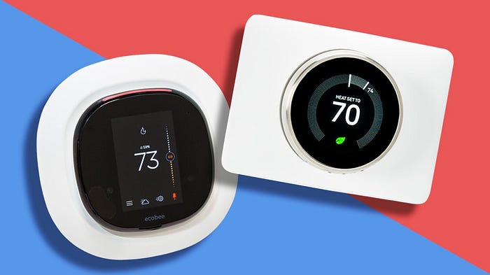
Another big factor is familiarity. The current generation of IoT devices serves up a smart take on old household staples: thermostats, light bulbs, home protection systems etc. Thankfully, their designers are (predominantly) smart enough to keep the look and the interactions true to these gadgets’ predecessors. In other words, all of these feel familiar. One of my favorite examples is the learning thermostat. You pop it onto your wall, much like a regular thermostat. You set the temperature, exactly like you would with a regular thermostat. That’s it, that familiar process is all the device needs. Later on, it learns what temperature level seems to be preferable for you and sets itself automatically. This is a small quality-of-life improvement, sure, but it works wonders. The combination of a familiar device with novel functionality makes it an accessible gizmo that people want to try even if they’re not techy. Remember, there’s no programming, there aren’t any extra prompts such as “Temperature set. Sure you like it? Maybe a bit higher? What is this, the Arctic? Put some socks on.”. The designers of this device trusted in its features and the customers’ familiarity with the thermostat to carry the experience. They kept it simple and it seems to have paid off in spades.
Speaking of simplicity, that aspect of the design is not going anywhere. Regardless of the type of IoT device you’re making, the UX should be simple, easy to navigate, almost natural-feeling. Even if you’re working on some super niche gadget that will be used by skilled professionals, you must keep in mind that UX is never about the bare minimum effort needed to get to the point. It’s about delivering an experience that feels effortless, intuitive and, above all, simple. What’s the difference between effortless and simple you may ask? Well, let me put it this way: navigating a path like “Menu — Options — Sound Settings — Mute Sound” doesn’t take much effort, especially on a responsive touch screen. So it is effortless, sure. But any UX designer that would call this simple must be slacking off. Every single action you take in that chain can be replaced with a mute button or prompt right on the menu screen or the “home page”. A simple one-stop prompt is all it takes and that’s what you should be aiming for. The industry and usage specifics will always matter, yes, but it’s much more valuable to have your UX be usable even when the consumer doesn’t feel like thinking too hard about what they’re doing. Come home, press a few buttons, your apartment is lit up, the Echo is awaiting command, the thermostat is already warming up the air, and the Smart TV is keeping the volume low because it’s the evening and you just want some quiet entertainment. That’s what IoT promises and that’s what good simple IoT design should deliver.
Disclaimer: Though it can be hard to practice what you preach, I always strive to do so with my work at Incode Group and personal design projects, which you can find on my Dribble and Behance pages. Don’t hesitate to contact me with feedback about my articles or collaboration offers!

