iPhone’s focus features and Hick’s law: a context-first design approach
In this article, I’ll explore Hick’s law and contextual design — providing relevant options at the right time. We’ll see how designers can use context to create true user-focused experiences that delight.
In September 2021, Apple released iOS 15, and with it, Focus. According to Apple, “Focus is a new feature that filters notifications and apps based on what a user wants to focus on.”

We open our iPhones 150 times a day.¹ By default, our phone displays 28 apps and numerous alerts vying for our attention on the Home Screen page. We scan, review, and process a cumulative 4,200+ app icons a day. Even if it only happens in subconscious milliseconds, this repeated process adds up in time and cognitive load—the amount of mental processing required to understand an interface.
Apple’s answer to our constant phone checking and the distractions presented therein is their aptly named Focus feature.

Focus
Turn on Work Focus, for example, to silence non-work-related notifications and view a single Home Screen page of work apps like Google docs, email, and Slack. You can even set contextual triggers to enter Focus mode, like location awareness. Pull into work, and your phone automatically starts Work Focus—removing all non-work-related apps and notifications. Options are reduced and decisions are faster; the principle findings of Hick’s law.
What can be learned from a 70-year-old study about choices and decision time, the iPhone, and a context-first design approach?
Hick’s law
In 1952, psychologists William Edmund Hick and Ray Hyman studied the relationship between the number of stimuli and a person’s reaction time. They found that response times increase in proportion to the logarithm of the number of potential stimulus-response alternatives². In layman's terms, the more choices and complexity, the longer it takes to make a decision. This common-sense premise is the foundation of Hick’s law, a psychology principle often applied to modern user experience design.

Hick’s law is a logical and measurable concept. However, it’s important to establish some background information when discussing Hick’s findings that concluded long before the advent of the internet and smartphones.
A core component of the Hick-Hyman study was that the choices are of similar magnitude.³ Think website dropdown menus, links, buttons of equal merit, and the time a user takes to make a decision. If not similarly weighted, you are introducing other factors that affect decision time. Also a variable to the study, if a user knows what they want before seeing a list of options, their reaction time will be less and doesn’t fit within the strict definition of the law.
Hicks Law does support several design principles:
- Reduce cognitive load
- More choices, longer decision time
- Avoid choice overload
- Display fewer options
- Reduce complexity
- Prioritize options
- Categorize, organize, group appropriately
- Do not overwhelm users
- Eliminate distractions
- Simplify the decision-making process
Only display relevant apps
Only displaying relevant apps can have a positive impact beyond decision-making time. Lab and field research studies found that people are more likely to purchase items or take on optional assignments when offered six choices instead of 24 or 30.⁴ The study participants also reported greater satisfaction with their selections and even performed better with their assignments when their options were limited.
One of Apple’s copy points of Focus is “Only display relevant apps.” This context-first approach aligns with Hick’s law and is a welcome update to the busy and disorganized method of app management that has remained largely untouched since the first iPhone in 2007.
Remember, you open your iPhone 150 times a day. That’s approximately ten opens per hour, every waking hour, where you process the same Home Screen information of 28 apps of similar hierarchy. The cognitive load, while fast, is heavy at the scale we’re discussing.
How often have you opened your phone to accomplish a specific task, get distracted by a multitude of options, and close your phone without completing your goal? Inattentional blindness, or perceptual blindness, causes users to miss readily apparent things. The red alert notifications on the top right corner of app icons introduce competing options. Your goal was to check the weather, but the seven apps with alerts drew your attention. You are now blind to the weather app icon, even though it is right in front of you, and instead examine the screen for red dots.

Suppose you are able to ignore the stimulus of the red alerts. But your search for the blue weather app icon makes you see all the blue app icons, particularly if they are in proximity to each other. Decision time is increased as your thumb hovers and hesitates over which icon to press.

The gestalt principle of similarity says that similar elements are perceived as related. The human eye tends to group the icons above due to their similar size, color, and shape. We group, assess, think, delay, or choose the wrong app due to similar characteristics.
Lastly, maybe you stay the course and select the predetermined app as desired, but you still quickly scan your screen and think about unrelated apps and alerts, adding to your cognitive load and decision time. Usability expert Steve Krug, in his popular usability book, Don’t Make Me Think,⁶ puts it this way:
“Every question mark adds to our cognitive workload, distracting our attention from the task at hand. The distractions may be slight, but they can add up, especially if it’s something we do all the time like deciding what to click on.”
Displaying only relevant options removes a lot of question marks.
Hick’s law and context-first design
Categorizing choices helps the mind quickly understand the context and reduces decision time. That is to say, grouping or chunking similar items together helps reduce cognitive load.
At a basic level, grouping apps already exists with folders. Drag an app on another app to create a folder and name it. A typical user approach to this organization is to group similar apps by task; music, health, social, etc. Swipe left on your Home Screen pages until you reach the end of screens and you’ll see an app library organized by Apple the same way—by categories.

Focus removes distractions by providing the ability to select specific, relevant Home Screen pages—a context-first design approach and a fundamental shift in organizing the apps that have become an integral part of our lives. It’s representative of how people actually organize and compartmentalize their daily routine: by context. Rather than displaying all apps at all times, users can now group by context — your circumstance, activity, setting, and routine.
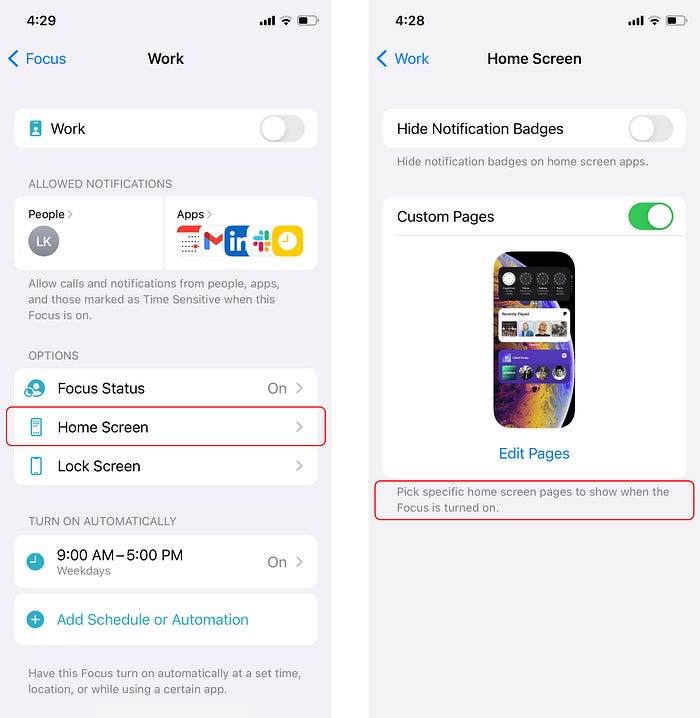
Default Focus modes are Do Not Disturb, Work, Home, Fitness, and Personal, or you can add your own. You can choose what alerts and notifications you’d like to receive and which Home Screen you’d like to display within each. Selecting your Home Screen is where Hick’s law and Focus intersect to reduce options and distractions.
The left image below is my standard Home Screen, and the image on the right is my custom Fitness Focus Home Screen page. The Fitness Focus is a vast improvement that removes choices and complexities. It’s a carefully curated offering of only the apps I need to exercise.
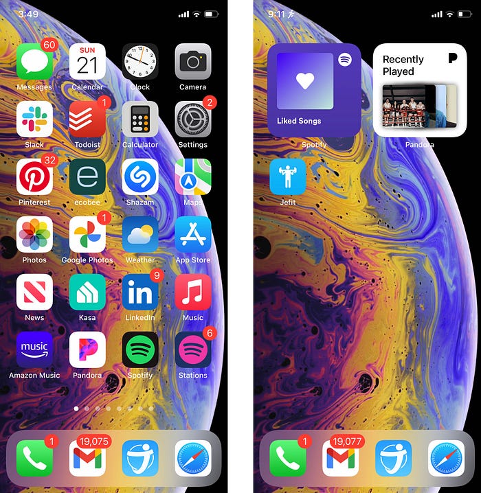
As I pull up to the gym, and without a single interaction from me, Fitness Focus is turned on. When I open my phone in the gym, only three relevant options are displayed. Reduced significantly are the distractions, choice, and cognitive overload. My decision time is reduced dramatically, and my experience is more enjoyable.
Diving deeper into context-first design, Focus includes Schedule and Automation options. Here, users can add the context of Time, Location, and App contexts that turn Focus on automatically. Time and Location function as expected where Focus turns on with specific days and times, when you reach a destination, or both.
App automation allows you to enter a Focus mode when opening an app. For example, you decide to exercise at home instead of at the gym. Your Fitness Focus will automatically start when you pull into the gym parking lot, but you can also set an App automation that turns on Fitness Focus every time you open your gym app.
Again, this approach is backed by Steve Krug’s Don’t Make Me Think:
“A good visual hierarchy saves us work by preprocessing the page for us, organizing and prioritizing its contents in a way that we can grasp almost instantly.”
Automatically eliminating options as determined by context is the ultimate manifestation of Hick’s law.
Hick’s expanded
Hick’s law is a fundamental design principle that provides the most value when combined with other design principles. Suppose you wanted to improve reaction time further by removing distractions that are not technically choices to consider?
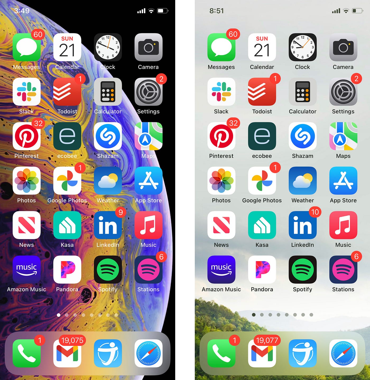
The red Todoist and the purple Amazon Music app icons in the above screens blend in with the background, reducing recognition and increasing time to find and select. Also, the busy wallpaper background image has many color variances. Replacing it with a minimal image that does not compete with the app icons is another step toward an improved user experience with fewer distractions.
Hick’s law works best when paired with established design principles and best practices.
The Hick-up
Reducing options is core to Hick’s law, but where do you draw the line?
Jon Yablonski, the author of Laws of UX, Using Psychology to Design Better Products & Services,⁷ notes that we must be careful not to oversimplify. Reducing options to this level can hide important details and introduce barriers to users. Without careful consideration for how you manage Focus, this issue will appear.
My newly created Fitness Focus provides a custom Home Screen page with only my gym-related apps. However, I see storm clouds rolling in and decide to check the weather only to find my additional Home Screen pages are gone. I can no longer swipe left or right to see them and open my weather app in its usual place. To view my other Home Screen pages, I must now turn off Fitness Focus, a process that takes fives interactions to finally return to my standard pages.

I could add a weather app to my Fitness Focus, but this circumstantial outlier doesn’t justify altering my settings. And this is just one example; there are countless possibilities in every Focus mode where a user may seek an outlier app.
An alternative workaround is to add all of my Home Screen pages to each Focus area, providing full access to all things at all times. However, this reintroduces complexity, and herein lies the complexity of removing options.
As noted in Redefining Hick’s Law:⁷
“The process of minimizing options for users without impairing functionality is not an exact science and no easy task.”
There are alternative paths to reach my weather app goal in the scenario described, but I primarily would like to turn Focus on and off at will. When locked, I can quickly turn Focus off with two interactions; I would like to see the same ease of use when my phone is already open and in use.
Test with users to find the balance between eliminating distractions and maintaining usability. Also, do not reduce functionality at the expense of adding barriers, steps, and cognitive load.
Try it out
To experience the benefits of Hick’s law first hand, create additional Home Screen pages on your iPhone and group the few apps needed for different contexts like work, fitness, or home.
- Do you feel your cognitive load is less?
- Are decisions easier and faster?
- Is your experience more enjoyable?
Now, take it a step further by turning on a Focus automatically by adding a Schedule or Automation. Experience how a deep context-first design approach can reduce decision time to near zero as initial decisions are made for you, and only minimal relevant choices remain. The principles of Hick’s law come to life by automatically stripping away all options and presenting the right information at the right time.
Illustrating Apple’s commitment to contextual UX design, they also offer a Smart Stack widget that “automatically rotates widgets to show the most relevant information throughout the day,” as well as a Siri Suggestions widget that suggests apps based on your usage patterns.
Conclusion
Take note of your surroundings, and you’ll see just how many everyday interactions provide a streamlined experience based on context, removing options, and guiding the user.
- In March 2021, Google Chrome revamped their profile experience, noting that Chrome will prompt you to switch profiles “when you might benefit.”
- The iPhone provides “10 minutes to home” based on user patterns when a car connection is detected, without any setup or interaction.
- Adobe XD recently started displaying efficiency tooltips that match a user’s actions and steps taken at that moment.
- Spotify opens when headphones are paired.
- Car headlights turn on when dark, windshield wipers start with rain. Thinking and decisions are removed entirely while remaining accessible and adjustable.
For UX designers, a context-first design approach is a natural and exciting application of Hick’s law. The benefits of simplifying are universal and proven to yield results in virtually all applications.
In a world that continually adds complexity, try reducing it with minimal and meaningful experiences and interactions at just the right moment.
Perhaps famed industrial designer Dieter Rams said it best:
“Less, but better.”
References
¹ John Brandon (Nov 2019) These updated stats about how often we use our phones will humble you. Inc.com
² Hick, W. E. (1 March 1952). “On the rate of gain of information” (PDF). Quarterly Journal of Experimental Psychology.
³ Hyman, R (March 1953). “Stimulus information as a determinant of reaction time”. Journal of Experimental Psychology.
⁴ Iyengar, S. S., & Lepper, M. R. (2000). When choice is demotivating: Can one desire too much of a good thing? Journal of Personality and Social Psychology, 79(6), 995–1006. https://doi.org/10.1037/0022-3514.79.6.995
⁵ Steve Krug (2014) Don’t Make Me Think, Revisited. A Common Sense Approach to Web (and Mobile) Usability. New Riders, 3rd edition
⁶ Jon Yablonski (2021) Laws of UX: Using Psychology to Design Better Products & Services
⁷ Jason Gross (2012) Redefining Hick’s Law. Smashing Magazine

