Is dark mode satisfying?
We are living in an ever-changing world, new technologies, software updates, system upgrades, mindset changes, and so many more. We seem to be happy with some changes, and we are also often excited about them. However, it is also us, that always complain about changes, concerning how different things have become, and how frustrating the new experience can be.
So here is a simple case to focus on dark mode.
Before this concept was a thing, serval applications were trying to dim the appearance to what it appeared to be “dark.” Later on, operating systems, Android, of course, customized their settings and provided system-wide dark mode to their users. Until Google officially adopted this idea and put it in Android 10, no one could tell precisely how fast this trend was going to take over. Then Apple did it too, with a highly anticipated keynote revealed its new iOS 13 dark mode.
Are people happy with this? Yes, and no. Yes, there’s a dramatic change between light and dark in appearances. And no, not every app is optimized for this feature.
Optimization has come a long way.
Twitter can be dark themed without requiring the operating system to have a dark mode. Many apps have already gone too far in this game. So whatever and however you want, they’ve got you all covered.
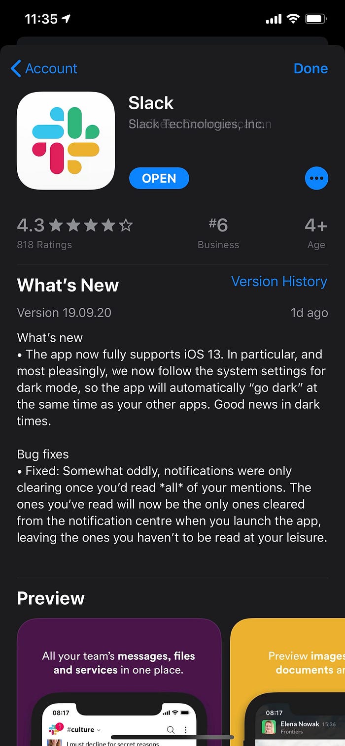
Apps like Slack can only switch with the system setting, meaning that when you choose a light theme on your phone, then Slack will be white, not dark, vice versa. This is quite annoying in some cases if you want a degree of freedom.
Nevertheless, some apps remain light-themed. For instance, Instagram, WhatsApp, Facebook, even WeChat, some of the most used social media platforms, seem to be less passionate about the new changes. We may not know why, but the struggle is real.
As a designer, I question design decisions or new changes that involve design thinking a lot. So I’d ask, why do we need dark mode in the first place? Some may answer with protecting our eyes, making it easier to read when it’s at night, and even battery life matters in this discussion, etc.
But we’ve also seen problems with the natural dark mode setting, where content becomes harder to read, like Outlook. And more dimed themes are looking better than just dark, or the true black.


Speaking of the true black, only OLED is taking full advantage of this. For the rest of the LCD world, looking at those black content will not be as satisfying as it sounds, it still hurts your eyes; neither does it save your battery life.
Then what’s the real use of bringing a dark mode to life? The bottom line is, people want to feel and have a degree of customizability no matter what that is. And maybe that is also why not everyone is chanting for this feature.
Sooner enough, dark mode is just a symbol of customization, and we might see other themes going forward, like minimalistic style, anti-blue light, cartoony ones, and more.