Member-only story
Is it ok to ‘grey out’ disabled buttons?

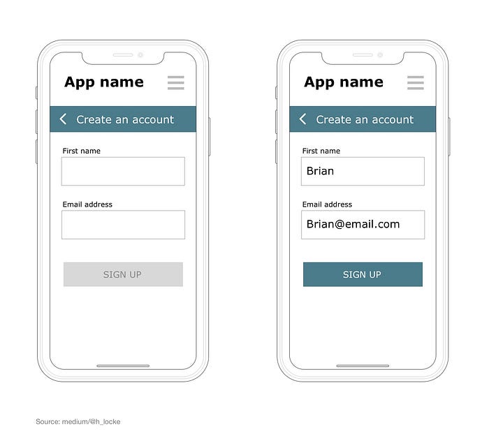
Disabled or inactive buttons are often “greyed out” — with white or grey text on a grey button. These can be used to communicate to the user that some kind of task needs to be completed by them before they can proceed, such as entering an email address in a text field prior to sign up.
But how accessible is this?

This is such an accepted design pattern, that for some reason I’d never questioned it, until I was raging about colour contrast (I do that) and realised that a grey on grey, faded out quasi-invisible CTA (call-to-action) has to be one of the worst
