Is Neumorphism a trend or design nonsense?
Neumorphism is an upward trend in 2019–2020, a style to which we owe the appearance of dribbble. Already the fact that this style was born on this site, should have warned the thinking designer: many know that dribbble — a collection of often insanely beautiful, but absolutely not working design. Design for likes — that’s what dribbble is all about. In my opinion, it is not surprising that neumorphism is completely unviable, impractical and unrealistic style in design. What my opinion is based on is this material.
Newmorphism, or neumorphism, most likely came from a combination of the words “new” and “skeuomorphism”. Skeuomorphism in its heyday was quite an interesting style: the interface elements inherited the properties of real objects — materials, shape — and it looked very attractive. Although nowadays we see a lot of interfaces in this style: for example, basket in macOS, most of the interfaces of music processing plugins are still very “skeuomorphic”.
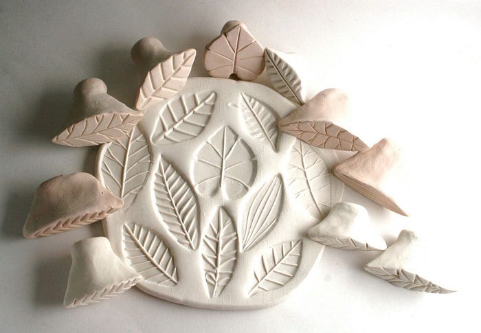
Neumorphism is something between ordinary flat design and material design principles: all objects made in the Neumorphism style are either squeezed out of the background or pressed into it. The elements of the Neumorphic interface really want to seem like objects from the real world: for example, stamping on clay is very similar to this style.
I will try to describe my fears when using numeric design.
The extra parameter is an extra burden on the user
I think it’s a pretty big problem. In modern interfaces the user is quite easy to understand: all elements are familiar, their hierarchy is clear. Neumorphism adds a new parameter to the object — its thickness. Remember, how everything is clear in the material design: “Here’s the object, it’s flat and lies in the background; here’s the object with a shadow, it’s raised, first I’ll press it, then I’ll get to the bottom” — to put it simply.
Neumorphism begins to confuse the user at first sight. Objects become thick, and they all look the same, elevated to the same height above the background; all the elements compete with each other for the user’s attention, they don’t obey some clear hierarchy — all this leads to the fact that the user has an additional cognitive load, he has to think, understand or, worse, think for the designer, what exactly and how it should happen on the screen — there will be a lot of errors.
Button, card, radio-button, sweater — everything looks the same, and you can not predict the behavior of these objects: what is pressed, what is switched, what is now highlighted and what is not.
A good design doesn’t blow up the user’s brain.
It’s a pity, by the way, that most of the authors of Neumorphism-style shots probably haven’t tried to use their own interfaces themselves. By the way, just in case: I’m not trying to insult authors by using their examples for illustration, it’s just difficult to draw everything by yourself. If you are an author and do not want to see your design here, write, I will replace everything.
Micro Interactions
Interface animation is the most important element that allows the user to understand what happened to the object. From painting or enlarging the heart during liking to shifting the product card during piling, all these micro-interactions give the user a good feedback on his actions.
Neumorphism will add a lot of complexity to designers who animate interfaces. The user feels completely at ease with the product card “leaving” the edge of the screen — he understands that everything is physically accurate. Here’s the card, here’s its shadow, it is raised above the background, here it is “gone”. In the case of the Neumorphism-style card squeezed out of the background, I can hardly imagine how the designer will explain to the user what happened to it during the animation :)
Neumorphism will add a lot of difficulties in the implementation of microinteractions of interface elements.
Perhaps soon we will see a perfectly animated interface, completely made in the style of neumorphism. But no.
Contrast and visual limitations
It feels like neumorphic designers instantly forget everything they taught before, how they tested their designs for contrast, how they proved to customers, why they make the buttons on the sites as contrasting as possible.
Contrast, one of the important features of the interface, is thrown overboard in the works in the style of neumorphism. It’s for the weak, the main thing is beautiful!
If you plan to make the interface as non-contrast as possible (and you can’t do it otherwise — object and background of one color separated by a pale shadow), which will be uncomfortable to use — dare to make it in the style of neumorphism. All users with color blindness, color blindness or any other visual impairment will thank you. And everyone else, if they use your interfaces on sunny days.
Visual garbage
Having looked through enough works in the style of neumorphism, I concluded for myself that I do not like it yet — visual garbage. The designer goes from complex graphic-saturated layouts to clean and practical designs, getting rid of all sorts of stripes, dies, dividers and, in most cases, shadows along the way.
Neumorphism offers us the opposite — it adds a lot of visual noise to interfaces. All shadows, external and internal, not only add extra elements to the design, but also take up useful space. Normal radio-button will take up 32x32 px of the whole area, will be large and accessible to press with your finger on a mobile device. A “Neumorphic” radio-button in the same size should also hold shadows around its hook.
I had to communicate with several designers from subscribers of my channel about design, who when developing the interface in the style of Neumorphism faced the limitations and problems that the use of this style, scrambled to solve these problems and did only what will look beautiful. And in the life and real design of interfaces, especially complex or highly loaded, these problems will have to be solved — most likely, the refusal in favor of another design style.
I am sure that even partial use with other styles will not save the situation — all elements in the style of Neumorphism will look foreign, cartoon and stupid.
There are many ways to train in design, invent new styles and meanings: illustration, drawing, poster — I can advise designers to try to find themselves in these areas, not to support the development of the style of neumorphism in the interfaces, often changing the logic of the familiar elements.
In 2020, our task as designers — to make interfaces and design as accessible as possible to people with disabilities (especially since it is an important modern trend), to remove the boundaries between reality and virtual, immersing the user in the product without creating unnecessary boundaries, creating designs, adapt them directly to the design systems and algorithmic design. And I’m glad we’re going to do it without newmorphism.
Thank you, write comments if you want to discuss this opinion or fight with the author :).


