It’s 2019 and we are still using floppy disk icons

Just spending a short time googling “floppy disk icon” returns tons of results about the fact that we are still using it! The oldest post I found in my quick search was from 2011, but it wouldn’t be surprising if people have been writing on this topic before that.
If the icon’s meaning is understandable, that’s all that matters. That’s mostly true, but I doubt that in the future anyone born after 2011 will think that using a floppy disk icon is “intuitive”.
It’s interesting that the floppy disk itself is still relatively recent in spite of how obsolete it is. Many of us designers who have created designs that still utilize the floppy disk icon, actually saved something onto a floppy disk at some point in our lives. We’re probably a little biased.

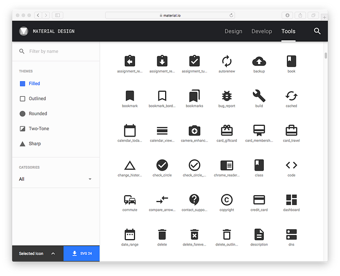
Icons mimicking real-world objects is not something that’s going away any time soon. In the small sample above from the Google Material Design Icon Library, I can spot at least ten different objects being referenced.
We’re not in any hurry to do away with gears for settings icons, locks for security, or envelopes for e-mail. But the floppy disk is not entirely analogous with these examples. These objects are still recognizable and have specific uses. Can you think of another single widely used icon that has as obsolete of an object used for it as the floppy disk save icon?
From the other side of the argument, many expressions are still widely used in English that reference manual actions that no longer make sense. For example, “rolling up” the windows in a car. Maybe floppy disks are destined to become the icon version of these idioms with unclear (to future generations, at least) linguistic origins.

Even though the floppy disk icon is still widely used, there are now alternatives that are becoming more widespread, as in the Material Design example above. The version of the save icon is something you’ve probably seen on many mobile apps. In these cases, it makes much more sense to use the alternative icon instead of the floppy disk. The down arrow and tray communicate the action of tapping down to save something, as well as the idea of collecting something you are saving.
In my work, I started thinking about this when we needed an icon to represent travel itineraries that had been saved by a user.
So, instead of using either of these options and calling it a day, I tried to consider what was happening in the interface. We were using the word “save” but in reality, what it was representing was something that had been customized or edited by the end user, and therefore saved as a new thing.
When it comes to UX Design, there’s always an opportunity to investigate further. Understanding the deeper meaning behind the user’s actions and goals provided a lot more context and led me down the path of creating a custom icon representative of that.
Maybe by reducing ambiguity in our designs, we can eventually eliminate the need for the floppy disk icon? What do you think?


