You're reading for free via Michael Beausoleil's Friend Link. Become a member to access the best of Medium.
Member-only story
It’s not just you, shopping at Apple is really complicated
Apple’s online store demonstrates how complicated the shopping experience and product lines have become.
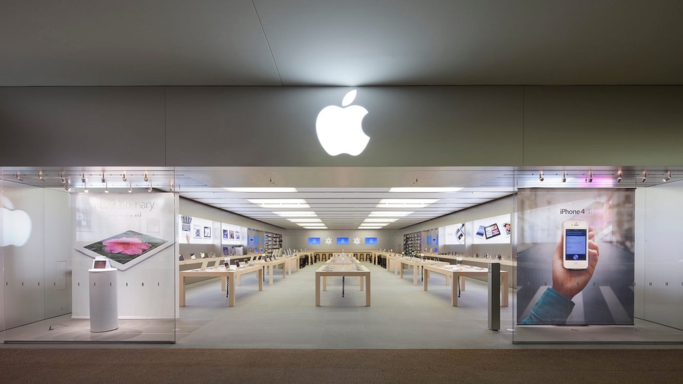
When it comes to the retail experience, Apple has risen the standard. They place a huge emphasis on employee knowledge so they are able to comfortably and confidently talk to customers. I know from experience that Apple cares about its employees and customers, and they want the customer experience to be the best one possible.
There was a time when I was super knowledgeable on Apple’s product lines, but I also thought they were super intuitive. Each product had a name and potentially a descriptor. Think back to 2005: you had the iPod and the iPod Mini. If you opted for an iPod, you would probably be able to deduce it was larger than the Mini variation. There were many other differences between the two products, but you were able to identify the key difference on name alone.
Over time, Apple would produce more products. We had “Airs,” “S”-lines, “Pros,” and new products with no descriptors. As Apple added more, understanding the products became a little more complicated.
The iPhone 12 and the iPhone 12 Pro lines are becoming available so interest in the smartphones are going to be high. We are approaching the holiday season and living in a time where e-commerce is more important than ever. As someone who has been an Apple consumer for the better half of my life, I go online, browse products, and ask myself: how do I know what I want?
Apple Online
For a company as intuitive as Apple, it seems their online presence leaves something to be desired. In fact, their retail section wasn’t integrated with their product pages until 2015. If I wanted to purchase an iPad Mini when it was first released, I would start by landing on the product page. After looking up information I would need to migrate over to the “Store” section of the site.
Remember, Apple has had a presence online since the ’90s. Before the retail stores opened Apple would sell their products in select retailers as well as their online store. The first Apple Store dates back to 2001, but Apple’s online retail store opened in 1997. This gave them the freedom to craft an online retail experience before many other brands.
Apple probably wanted a no-pressure shopping experience, but this would evolve into a non-familiar experience. If you shopped at a store like Best Buy or Verizon you would be able to get a product description and add the item to your cart on the same page. As a brand, Apple is known for having their own style, but eventually, they would have to cave and provide the experience that was familiar to customers.
Regardless of how Apple built their online presence, they are a frontrunner in the retail landscape. Even if they opted for an unusual e-commerce experience, we’d expected it to be easy to use. Now, when going online, Apple customers are going to find something the brand once tried to avoid: complications.
The iPhone: Layers of Confusion
I went onto the Apple website trying to answer two questions: what phones do they sell and how much do they cost? I began the process with one key piece of information: the iPhone 12 is here and the line-up is different.
Keep in mind, Apple added an extra layer of complexity to this equation. Last year they introduced their first “Pro” model during iPhone 11 release. This year, the iPhone 11 retired its pro variation, meaning this is an iPhone line that is not longer available.
So I began this journey by clicking “iPhone” on the top menu. Simple enough.

This did take me to a dedicated iPhone page, but the information I needed was somewhat buried. In fact, I started to get a bit more confused as I scrolled. Keep in mind, this article is being written shortly after the iPhone 12 announcement. Some products have already been released, but other products are still yet to be released.
At the top of the iPhone page, I did see a list of five phone models on the secondary menu. So, I assumed these are the available models. As I scrolled, I found that these products were being compared to one another about halfway down the page. This left a few sections before the comparison.

This comparison left much to be desired for two reasons. Firstly, the iPhone XR is not part of the list. This phone was released in 2018, but Apple still sells the phone. Admittedly, the iPhone SE is newer and cheaper, but does that matter? Apple is still selling the XR, so why are they hiding it?
My bigger issue comes from the two sections above the comparison chart. In these sections, the iPhone 12 Pro Max and iPhone 12 Mini are introduced. As of the writing of this article, the two variations are yet to be released.


After doing a bit of research, I’ve come to understand these are size variations. The 12 Pro Max is the iPhone 12 Pro with a larger screen while 12 Mini is the iPhone 12 with a smaller screen. This is not clear, especially if you have any familiarity with prior Apple products with similar names. My first Apple product, the iPod Mini in 2004, was different from an iPod Classic is more ways than size alone.
I will admit I became more comfortable on the iPhone page as I played around with it more. Apple does feature a more comprehensive comparison page where you can compare 3 iPhone models. This allows you to get a better idea of the features and price points, given the number of models they’re currently selling, this page is probably a later stop on the buyer journey. When Apple has at least five models for sale, a three-column comparison isn’t going to be an adequate starting point.
The iPad: Right Until It’s Wrong
My second destination when browsing the Apple website was the iPad page because I wanted to see the new iPad Air. I will admit this, I think they look really great. I love the color varieties and the build of the tablets.

As I scrolled through the iPad page, it felt much different than the iPhone page. There were fewer animations and announcements. Rather, it felt like an introduction to the product lines. The first four sections were dedicated to the available iPad models, their starting prices, and a button allowing you to buy. Then, you get to a side-by-side iPad comparison similar to the one on the iPhone page.
I’ll be honest, I wasn’t dazzled by this page, but I understood it. This is more what I’d expect in my Apple. It was clean, simple, and put the product on display. Virtual simplicity made shopping easier, but it also emphasized product-line complexity.
In the case of the iPad, the product line has become increasingly difficult to understand since 2017. hen Apple introduced the 5th generation. To be clear, this was a great move that probably extended the life of the iPad and slashed the price, but it was a silent rebranding. Apple nixed the clamshell design from the original iPads, slimed the frames, and made the bezels smaller. The 5th generation iPad looked less like a 4th generation iPad and a lot like an iPad Air.
Essentially, Apple merged the iPad and iPad Air into one singular product line. They kept the Mini, added the Pro, and made the flagship iPad extremely affordable. This worked until Apple rereleased in 2019 then updated it in 2020.
I really do love the style of the new iPad Air, but it’s actually thicker than the main iPad. I am sure the 2020 ‘iPad Air” is a great tablet, and it’s getting great reviews, but it is not reminiscent of prior iPad Air generations. This is confusing to customers, but it can also be harmful to Apple’s branding. It will undervalue the potential of the 2020 iPad Air. When customers think “iPad Air,” they think of a thin aluminum frame with a home button. They don’t think of the new design we see today.
The Mac: Doing It Right?
When I looked at the major products at Apple: the iPhone, iPad, and Macs, it appeared the Macs are the most organized. I can look at the products and immediately see the differences, which is what you want in an e-commerce experience. If you’re prioritizing size and cost, go for a MacBook Air. Need power and portability? MacBook Pro. Home computer? iMac.
It’s pretty easy to understand, but it wasn’t always that way.
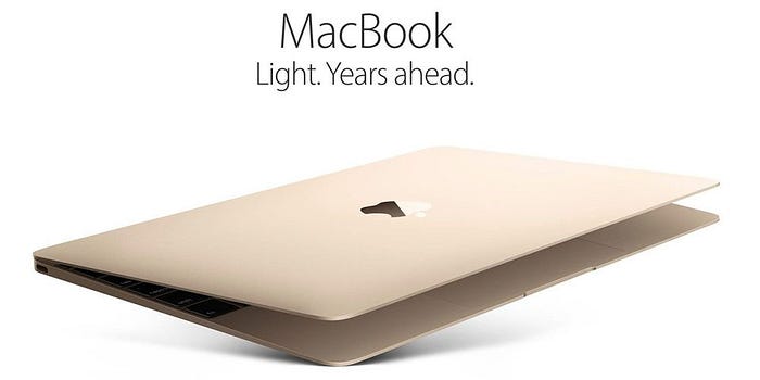
In 2015, Apple released the 12-inch MacBook into a MacBook family that already had Air and Pro variations. This ultra-slim model was super portable, but that’s why we had the Air. It wasn’t particularly powerful, and it had its share of problems. People complained about is singular USB-C port and keyboard issues, not to mention that its inclusion in the MacBook family wasn't necessary. It was a reflection of what Apple could do, not a reflection of what customers needed.
In some regards, I now see similar issues in the iPad family. The naming is being recycled and rebranded to the point that “Air” and “Pro” don’t mean anything. However, the iPads are doing something right; the “iPad” will provide you with core functionality. If you want something beyond that you will look into different iPad models. When the “MacBook” existed, it wasn’t really core MacBook performance. It was an experiment that slowly improved.
In 2019, Apple cut the “MacBook” and left just the MacBook Air and Pro notebooks. This makes the buying experience much easier, and customers generally have a better idea of the right product when they’re shopping.
Everything Else: It’s a Hunt
If you watched one of the fall 2020 Apple Keynotes, you might be interested in Apple’s HomePods. Where do they lie on the website? You’ll need to click “TV” or “Music” from the main menu at the top. Looking for AirPods? You’ll need to click “iPad,” “iPhone,” or “Music.” What about the Apple Card? That’s housed on the “iPhone” page.
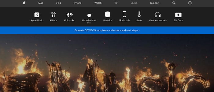
If you’re tying to find an Apple product on the Apple website, you might need to turn to Google before Apple. Finding an iPod might require some guesswork, but really, who wants to do that? As a tech company, Apple should want to make their products easy to find. Certainly there has to be a clearer way to advertise your credit card than to house it under the “iPhone” page.
This is especially alarming after the recent keynote. I would expect the HomePod to be front and center. I’d also expect more prominence to be placed on their non-hardware services. Instead, they’re scattered around the website.
What’s Wrong With Apple?
Despite all of the critiques and criticisms of Apple’s site and branding, I still find a lot of excitement on their website. The images are beautiful and demonstrate the best of their products. As online profiles, they excel. As an online retail experience, I encounter barriers to making a purchase.
By this point, Apple’s problem is clearer than the solution. They are too complex to have a simple website. From a consumer standpoint, their site is too simple to explain complex products.
I wondered if all of my confusion came for a lack of exposure more recent years. After all, all of my Apple products are at least 2 years old now. Then, I looked at all the iPhone variations we have now: the color options, screen sizes, older models, the Pros and and the Minis. I never had to make all those decisions before.
When I went on the website, I had a hard time knowing the price I would pay for a new phone. I also had a hard time determining why I should get a Pro over a regular iPhone 12. I’d think the answers would be easy to find, but they were buried under pictures (admittedly stunning ones, but still buried). As you navigate the website, these problems persist. I started to wonder what Apple really meant they said “Pro?” Better yet, what is a “pod” in the world of Apple? Are the iPods, AirPods, and HomePods related, or was “pod” just the best word Apple could think of?
I don’t expect Apple to slow the growth, and I imagine the experience in a brick and mortar store would be much better. If someone was there to answer all of my questions, I would be more confident in my decisions. This holiday season, many people won’t have the luxury of talking face-to-face with a Specialist. This will leave customers with questions, and every question unanswered will be another barrier to making a purchase.