It’s not you, it’s your form
5 tips on form design to improve your relationship with users

Filling in a form online is one of the most important points of interaction a user has with an organisation.
And we interact with them often. We fill in tax forms, grant applications, make online purchases or sign up to dating sites.
Forms can be the first step in a relationship with an organisation, or the final one in a journey to achieve a goal. For example get a grant, a drivers license or a partner in crime. Sometimes not filling them properly can carry unpleasant consequences like an interrogation by immigration officers at the airport, or your profile on OkCupid matching you with the wrong date💔.
“A form [ ] collects information from at least one party, and delivers it to at least one other party, so a product or service can be provided.”
The role of a UX designer is to help create easy, fast and productive form experiences. To entice users to fill in forms. As form design expert Jessica Enders states, designers should “create an optimal user experience, such that the needs of both the users and the owner of the form [organisation that owns the form] are met.”
The case study
I was tasked with re-designing a product for The Queen’s Fund, one of the oldest charities in Australia. This charity provides small emergency funds to women in distress and their children. The women are referred to the charity by welfare agencies and community organisations. The task was to re-design the online communication portal these social workers use to interact with the charity.
This article is about the practical UX tips used to improve the usability of the charity’s forms.
(For brevity the article focuses only on the funds application form.)
Team effort
I needed to understand the context in which form-fillers (users) used the form. So I asked users for insight and to test what worked and what didn’t. Discovering pain points, listening to their needs and acting upon feedback was crucial for improving the existing solution.
“Gather feedback on a form by watching users attempt to complete it”.
~Jessica Enders
Our developers were also involved in co-design sessions. This was important as the team needed to understand the impact their decisions have on the flow of the experience.

The existing form had most of the information the users needed. But there was room to improve its usability and reduce the workload of the users.
Here’s a selection of the 5 UX tips I found useful when re-designing the form. You can try them should you wish to review or design online forms.
#1 Provide structure
#2 Make it scannable
#3 Make it conversational
#4 Give certainty
#5 Provide a sense of closure
#1 Provide structure
It is a fact that most users tend to scan documents online, something that user advocate Jakob Nielsen already told us in 1997.
This means that at a glance, a form should be engaging to keep user interest. It should make sense, and have a clear and consistent structure. Its architecture must be robust with elements clearly identifiable: headings, sections and instructions. Users want to gauge the size of the forms to know how long it will take to complete. Structure, clarity and brevity are crucial.
In our case I printed the full form and asked people not familiar with it if the form made sense to them. Some of the feedback was that there was a lack of focus and it felt “confusing”. It missed a sense of direction.

To create meaning, we applied a progressive disclosure pattern. This means that the content was broken into smaller and digestible chunks to make it more compact. We numbered the questions and grouped them under specific headings on an accordion layout. This way the form-filler can focus on one topic at a time. This grouping technique of focused design, made clearer distinctions and improved the content experience.
#2 Make it scannable
Today users are doing more scanning than in-depth reading. So they tend to be hesitant to fill in forms if it requires too much effort. We have to accomodate this reality. The job of the designer is to make this process as quick and painless as possible. The less user effort, the higher the conversion.
There is plenty of literature on how to make forms more scannable or easy to digest. Inspired by experts and good practice, we applied many of these tips. I will highlight two of them.
1.Make it one column
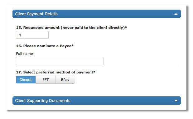
The Nielsen Norman Group recommends presenting fields in a single column layout. This adds clarity and the form-filler knows exactly what they have to do. The reading vertical momentum is not interrupted. (An exception to this rule is when presenting short/strictly related fields, see “NOW-Applicants details” on Fig. 1)
2.Make it smart
A smart form reacts to user input, making it more effortless. For example, it will pre-fill an address when the user starts to fill it in.
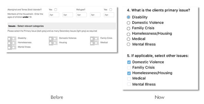
We made our form smart in different ways. See in figure 3 how question #5 removes the primary issue selected by the user in question #4 (Disability).
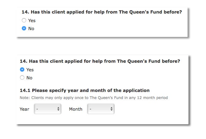
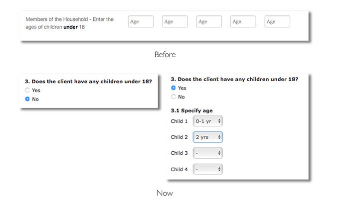
In our project we also used conditional questions, to save space and to make the form lighter. Some questions only pop up depending on the answer. This makes the task less burdensome as users skip questions that are not relevant to them.
#3 Make it conversational
Communication is a process of sharing meaningful messages, and one of the most common ways to communicate is a conversation. So apply a conversational veneer to the form to make it more engaging. Make it feel less automatic and employ users’ language.
‘Consider the form as a conversation.’
This way the exchange of information would feel natural, efficient and more trustworthy. There should be a natural sequence of prompts/answers that the user perceives as logic. Sometimes this requires re-writing questions. Be clear without being too verbose or technical. This will reduce users’ cognitive workload.
In light of this, some prompts for The Queen’s Fund project were re-worded to make them look like questions. The questions became a bit longer — yet still brief — but the task of completing the form is more efficient and simplified.

#4 Give certainty
When designing a form, we should present users with all the information they need so they can navigate the form easily. Don’t keep them guessing or be ambiguous.
The achievement of the goal should be clear and leave the user with the feeling that the task is (really) done.
When examining the previous form we noticed that the closure of the form was a bit unclear.
There was an inline scroll box with a confined privacy statement, which introduced needless friction. This design pattern can be convenient to fix space problems but it adds extra complexity: there is a lack of overview of content, and most operating systems hide non-active scroll bars. It is not very intuitive and not savvy users can miss information.
We also discovered that users can’t make changes after submitting a funds request. This rule could be a surprise to some form-fillers. Since the user can’t reverse the ‘submit’ action we thought it was important to highlight this.
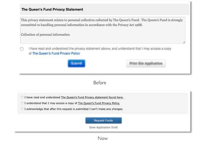
To improve the closing section, we removed the inline scroll box and opted for a ‘bulleted list’ of checkboxes of all the conditions that had to be met before submitting a form. A compact, clean and simple solution that makes each item stand out and easy to scan.
We also included a checkbox note to remind users that they can’t make changes after submitting an application. This will invite users to pause and review their submission before they commit.
Insights from testing sessions
One of the issues raised by users after the launch, was that they had limited time to complete the form. Form fillers had to complete the application in one go. Sometimes users had to, however, interrupt the form filling task to conduct further client research.
There should be an opportunity to continue the conversation ‘later’. So to ‘pause’ the conversation we added ‘saving draft’ as a secondary option (see Fig. 6). Now the form filler has the certainty that the effort they put into completing the form will not be lost.
#5 Provide a sense of closure
We tend to end conversations with a clear intent: “I will shoot you an email”, “I will bring dessert” or “See you tomorrow”. No clear intention creates confusion: “You hang up… No, you hang up… No, you do… Ok… no, no you hang up…”.🙄
One of the 8 rules to design better interfaces by computer scientist Ben Shneiderman is to “design dialogue to yield closure”. On form design, users should be guided through a process that leads them to achieving a goal. Hence, we have to provide a sense of achievement. This can be a feedback message: “Room successfully booked”, or it can be a clear call to action (CTA) related to the ‘conversation’ they are having with an organisation.
“Sequences of actions should be organised into groups with a beginning, middle, and end.”
~Ben Shneiderman
If we conceive forms as conversations with users, they should end with intent. For the conversation to flow fluently, we should direct users to take specific actions. So we can’t be vague and should avoid unexpected surprises.
In our case the previous form included two competing CTA buttons. There was “Submit” and “Print this application”. At this point users won’t know if they can print the form after they hit “submit”, or if they print, will the page refresh and lose all data?
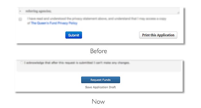
To improve this, we moved the “Print this application” button from the application form page to the following confirmation page. This flow is familiar to most users. Users print their concert or plane tickets after they hit the “buy” button, never before.
After removing the print button, the “submit” button got a prominent and centred position. Still there was room for improvement.
A CTA button is action-orientated, it should describe what it does. This makes them more meaningful. It should “state the intent” and a generic “submit” wasn’t doing that. So it was changed to “Request funds”(see Fig. 7). As usability expert Jared Spool would say, it describes exactly what “that link is going to deliver”. Bringing certainty at the end of the journey.

Over to you
When your communication with users is not working well, try reviewing your forms to rule out that “it’s not you” or “your form”. Test them. Make sure you give users a good impression with clear and structured formats. Give them a friendly hue.
Design with intent on quality. As UX consultant and form expert Gerry Gaffney states, designers should write with care, be ruthlessly brief, use the user’s language, help users understand the questions, and avoid ambiguity. This way your forms will communicate. Will work.
Thanks so much for reading!
Special thanks to Dropbox Words Designer John Saito and Jessica Enders for their feedback for this article, Gerry Gaffney for recommending Jessica Enders book, and a big heads up to Nick Babich and Andrew Coyle for your articles on form design. And of course to Mark Johnson from Shine Solutions for giving us the opportunity to do some pro-bono work for The Queen’s Fund project.
Illustrations by Mario Quintana inspired by Someecards.
If you like the article please tap the 💚 button and spread the ❤️. It will mean a lot!
- Article first published on www.shinesolutions.com


