Search made easy with the JobStreet app — a UX case study
A UI/UX case study and revamp of the JobStreet app

This case study on JobStreet app revamp is a documentation of a project undertaken during the UXDI immersive course in General Assembly, Singapore
The case study covers UX Research ( User Interviews, Heuristic Evaluation, User Personas, User Flow, Competitive Analysis), Interface and Interaction Design with Sketch & Invision followed by Usability testing.
Objective
The brief was to work in a team of three and identify problems/opportunities with an existing mobile application and apply the UX design methodology to revamp the app. My team decided to go ahead with revamping the Jobstreet app.
(Disclaimer: This is a self- inititated project. The content and creator of this article is not affiliated with the company/organisation mentioned).
My Role
The team comprised of three UX Designers — myself, Sophia Lim and Wanlei. I took the role of UI design and ideation lead and collaborated with the team to conceptualise,ideate and redesign the Jobstreet app experience.
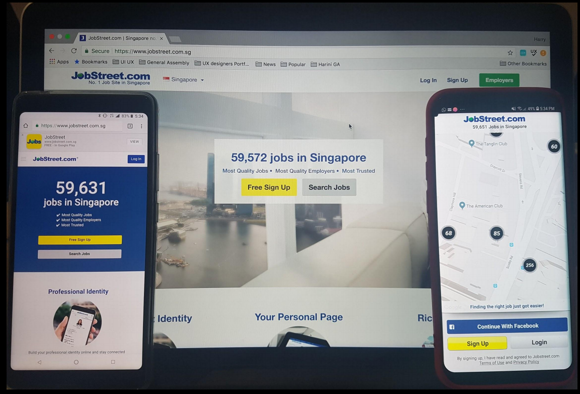
Job Street.com Overview
JobStreet.com is Southeast Asia’s largest job portal company, according to Forbes. It caters to around 80,000 companies and 11,450,000 jobseekers (as of 2012). It has a large bank of job postings by both companies and recruitment firms. It allows job seekers to register and create a profile and directly apply on the website or app.
Our Methodology
With a time frame of 2 weeks, We broke the UX sprint into research, synthesis, prototype and testing.

Tools Used
- Sketch, Invison, excel sheets and post-its.
The Opportunity
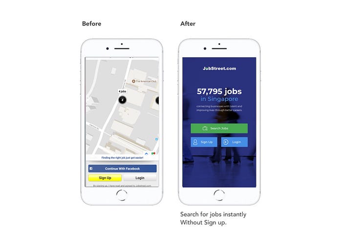
Our team started with research and took a look at what JobStreet.com currently offers to its users. During the research we noticed inconsitency across the desktop, mobile and mobile browser. The existing JobStreet app did not reflect the features and functions of the JobStreet desktop website and mobile website. Both the Desktop and mobile browser allows for quick access to ‘Search Jobs’, while the app requires the users to sign up/ register.
This gave us an opportunity to relook at the app, since there was a lot of room for improvement to stay consistent with the website and provide users with a seamless experience searching and applying for jobs.
Heuristic Evaluation
Before diving deep into user interviews, we evaluated the exisitng JobStreet app with heuristic principle to find out current usability issues with the app.
The key findings from the evaluation were:
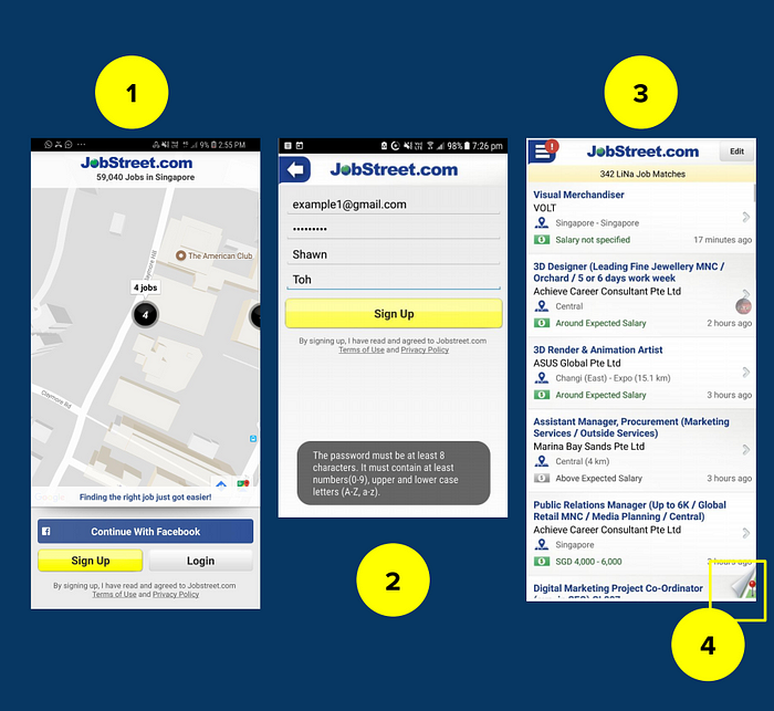
1. Opening Page — A hard to comprehend static map at the opening page, showcasing the number job opening in nearby areas. We also noticed that the jobs on the map are not clickable and this feature does not have any value on an opening page of the app.
2. Sign up page — The password prompt for sign up is not upfront. The prompt appears only after you click ‘Sign up’ (hidden requirement). This can make users give up when they try to sign up for an account.
3. LiNa- “LiNa” is meant to provide job recommendations for the user. However, the app failed to explain what “LiNa” is suppose to do. The function of this feature ‘LiNa’ is not clear or explained.
4. Job page map — A map view of the jobs page at the bottom right which was difficult to find,toggle and hard to comprehend. The positioning of the map button did not consider visibility or affordance.
User Interviews
We followed up with user interviews to understand motivations, user behaviour and pain points of using the app. We conducted 5 interviews to know more about how job seekers search and apply when looking for job opportunities.

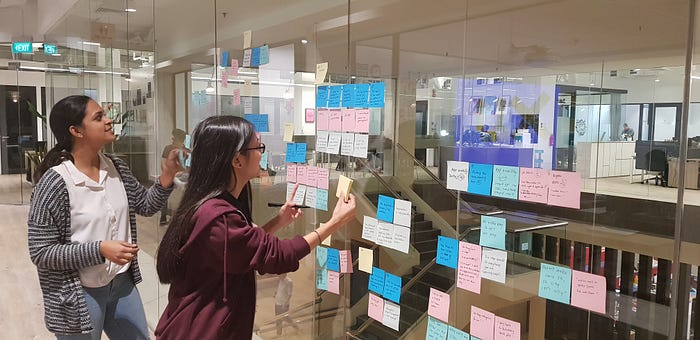
Some of the key findings from the user interviews were:
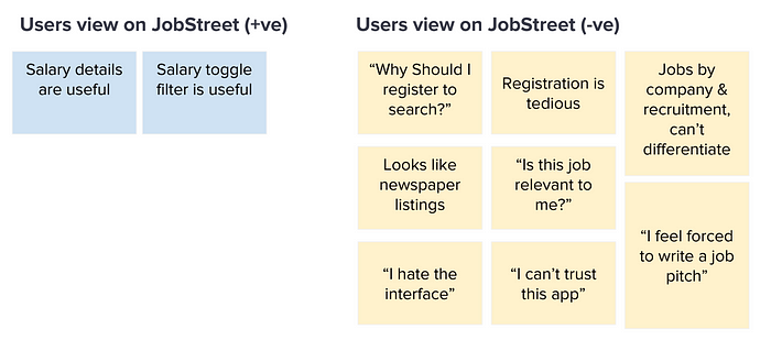
- All the users wanted the salary details on job postings.
- All users wanted to know more about the company and company culture before applying for jobs. Users trust job postings by companies more than job postings from recruiters.
- Mid to experienced job seekers liked to browse and get a quick overview of what the job market has to offer.
Usability test on existing JobStreet app
We set a series of tasks asking users to search and apply for jobs at the entry, mid and execute levels. Some of the key findings from the were:
One of the biggest frustrations with using job street app is the tedious registration/sign up process before even searching for job opportunities.
On an average, all the users took between 7- 10 mins to complete the sign up process. We also noticed that 50% of them skipped the sign up process mid way.
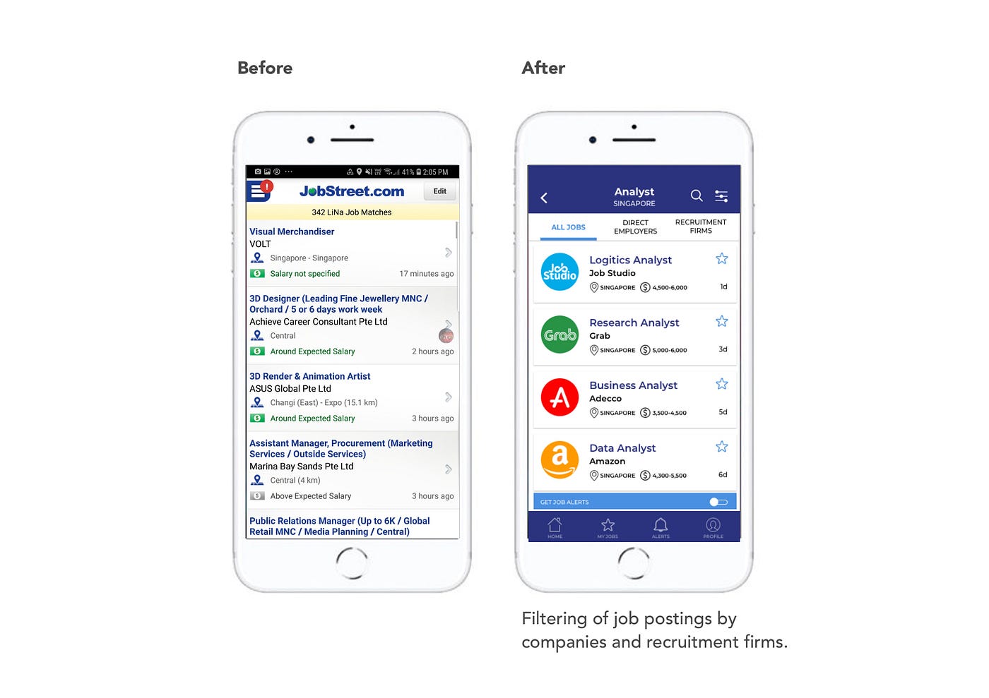
The second biggest pain point was- all the users found it difficult to differentiate between jobs posted by companies and recruiters.
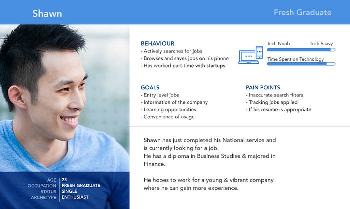
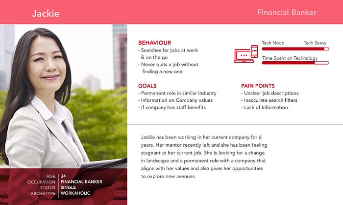
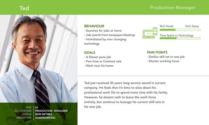
Personas
Based on the user interviews, we came up with three main personas as shown below.
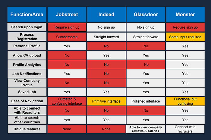
Competitive Analysis
We did a competitive analysis comparing Jobstreet with other job search companies including Indeed, Glassdoor and Monster with common parameters. We found that job street app features were not on par with its competitors.
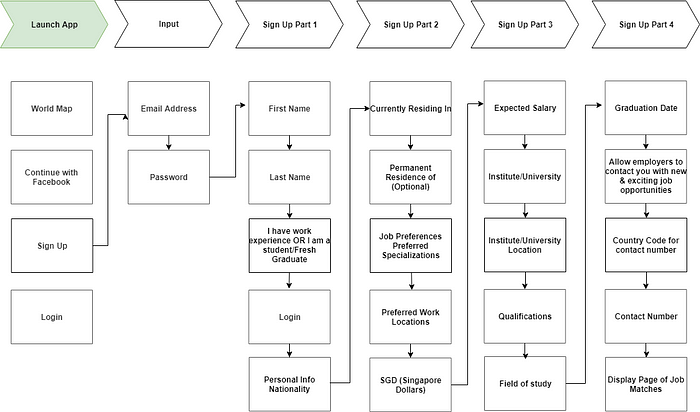
User Flows
Here is the user flow for sign up/registration process. Based on user interviews and existing app usability test we found users take between 7–10 minutes to complete registering.
Problem Statement
Based on all the research findings we defined the problem statement as
Job Seekers need a quicker way to search for jobs as the current sign up process is too tedious.
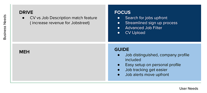
Feature Prioritisation
Based on the problem statement and user research findings, we shortlisted some important features that can address the pain points of the identified personas. We focused on two main personas — Shawn and Jackie, as job postings for entry and experienced professional generate more revenue for Jobstreet.
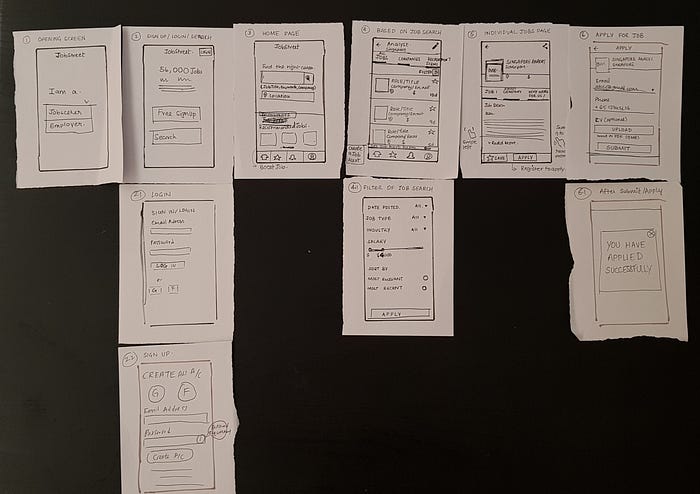
Lo-Fi Prototype
With the selected features, we created a lo-fi prototype and conducted a usability test with 4 participants.
Feedback from the lo-fi usability tests were:
1. Found the search page to be cluttered
2. The login button is not prominent
3. There should be a sign up prompt before applying for jobs
4. The filter for jobs can be more prominent. (was not instantly findable)
5. What does the star mean in global navigation?
Hi-Fi Prototype
Based on the feedback from lo-fi wireframe we develop the hi-fi prototype and did a usability test with a series of tasks. here is a link to the prototype.
What did we improve
Here is a comparision of the existing app and revised design. We have highlighted the different features that enhance the usability and user experience of Jobstreet app.


Usability Testing
We did a final usability test with 5 participants and used the SUS usability scale to evaluate the results. We set a series of task that included
- Search and apply for jobs for an entry-level analyst role.
- Search and apply for jobs with a fixed salary range and find out more about the company.
The tasks were completed by all 5 participants and the revamp app got a score of 85. Any score of 80.3 or higher is an A. This means people love your site and will recommend it to their friends.


Key Learnings
This project helped me to get a deeper understanding of user personas and get a better understanding of user motivations, behaviour, needs and goals. Some of the areas where we could have improved would be developing a customer journey map to build empathy and address pain points and areas of improvement.
In terms of design, we would also relook at some design elements to consider designing for accessibility. A key take away from this project was to keep in mind designing for accessibility and having come from a brand design background I have a found deep interest in this topic.
Overall it was a great experience working with a team of two talented individuals Sophia Lim and Wanlei. This project was a great learning curve and it’s important to always ‘trust the process’.

