Language in digital product: the thin line between clarity and confusion

As a designer, one of the most difficult parts of my job isn’t making things look nice, or making them function well. It’s not anything you’d think to be obvious when considering the challenges of working in the world of product design. One of the biggest challenges is something much more subtle: language.
How many startups have copywriters? Or digital content writers? This position certainly feels like a luxury in the early days of new, budget crunching companies, so the task is often owned by different subject matter experts depending on the project. This creates confusion in the end, because who get’s final say on copy?
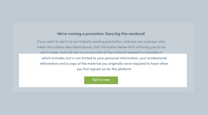
I’m guessing at one point or another, every product designer has seen a paragraph that looks something like this:
“If you want to opt in to our industry leading program, and you are a person who meets the criteria described above, click the button below that will bring you to an opt in page, and will ask you to provide all the material needed to complete it which includes, but is not limited to your personal information, your professional information and a copy of the material you originally were required to have when you first signed up for the platform”.
Now… I may be exaggerating here, but I think you get the idea. As a designer, I just want a single line that says “Opt in below, conditions apply”. It’s descriptive, simple and creates enough curiosity that drives engagement. It keeps the UI clean, and it communicates to the user efficiently.
Like form fields, copy follows a similar narrative that the more you have, the more drop-off you likely have. It’s simple: the longer the text, the more work you’re asking of the user, and the less likely they’ll be to complete the task. Communicating this to the subject matter expert can often be complex in nature, because ultimately they are the expert in what needs to be said. However, you are the designer, and you are the expert in how users will ultimately use the product.
The truth is, long paragraphs of text can suck the life out of the brilliant product experience you’ve created, and can end up causing more harm than they do help.
When there’s a lack of clarity around who owns the final decision on a long string of copy, here are a few ways to support your desire for a “less is more” approach.
Showcase the blur test
Have you tried one of those pictures you were supposed to stare at, and “look past” so you could see something different? This blurry eye engagement has been a constant reference point for me during my time as a designer, and has really helped create more minimal design that uses descriptive language and proper typography hierarchies. When you look at your page text, you can use this technique to quickly determine how busy it is.
If you can’t quickly scan the page with your eyes out of focus and understand what you’re looking at, you’ve got a little work to do to clear things up.
What writers think users will see:

What users actually see:
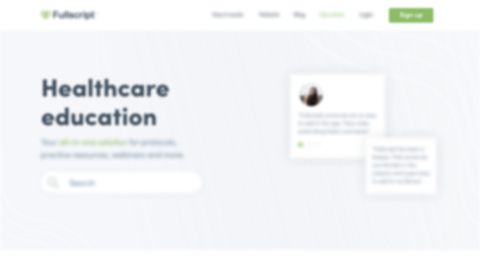
Now, the above example shows a reliance on page hierarchy.
Given this test, I understand this page as “healthcare education”. Is that good enough? If someone walked away, would they say “I was just on a site, it was healthcare education”. What is the message you want people to walk away with after they quickly view your page? What if we just changed the header to something more descriptive:
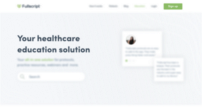
How does this challenge the “less is more” approach to copy? It simply proves that paragraphs upon paragraphs are typically scanned, where headers have a more lasting impression. As the designer, we focus on this content a lot when putting a page together — so should the writer. Use this example when you’re talking to a subject matter to explain that although the fine details matter, what people walk away with is usually only a few words.
Another test: Use blinders
This is similar to the blur test, but narrows in on focused design, where the blur test can focus on passive design. I often use this for button labels and text links. The idea is simple enough: when users look at your screen, they will often have a much smaller focus point than most people assume they will. As a designer, we’re used to seeing a full art-board, because we’ve stared at it long enough that our brains have actually permanently printed the remainder of the image that lays outside of our immediate focus area. The truest test of descriptive language is an ability to read only the label, out of context on the rest of the page, and be able to describe the outcome. The same can apply to paragraphs of copy. The bigger the focus area, the less context a user will actually have. Below I’ve shown a pretty regular example of this in practice, where a header and it’s action are not connected by a focus area. Again, a button label should be enough to communicate an outcome, but context will be lost if we can’t keep everything together in one focal point. This is a simple practice of centralization that creates clarity.
What we think users will see:

What they actually see:
Again, this example relies heavily on type hierarchy.
By doing this, it exposes a fundamental problem with the content: page flow. I can understand the outcome of pressing the button as “I’m opting in”, but the context is completely lost because a literal wall exists between the memorable, and descriptive text, and the call to action. I actually need to go back to the header to quickly understand the action, which breaks the flow of top to bottom I naturally want my eyes to take — it’s backwards. I focus on the button, then need to double back.
Another consideration is that the average person can read between 200 and 250 words per minute. We know as product designers that interaction and time are the two biggest barriers when guiding users to performing an action. By adding more text to sell someone on an action, we’ve created a decentralized environment that has quite literally built a larger barrier to them performing an action. How do we fix this? We aim our efforts at working within focus areas.

Takeaways:
Language in digital product can rarely have a consistent owner. Often times as designers, we work with a subject matter expert that has more than enough knowledge of the material to make it clear to the user group. However there are times that, for better or worse an expert can provide content and context, but at the same time complicate the user experience.
The two tests I’ve described are not an argument against text, they are a way to showcase how people use a product verses how it’s been written. This approach to language in product, web and print can make collaborating to create an easy to use, beautiful and optimal experience much more streamlined.


