Redesigning the Los Angeles Public Library website & app — a UX case study
A few months ago, I decided that I wanted to redesign the digital user experience for the Los Angeles Public Library (LAPL) to better showcase their wealth of resources and services. About a week into the project, I realized that I needed to scale back my ambitions…so I redesigned the Library’s homepage, their logo, and their mobile app experience!
Note: This independent project is not sponsored or endorsed by the Los Angeles Public Library.


Why the Los Angeles Public Library?
I moved to LA three years ago for grad school, so I’ve become well-acquainted with what LAPL has to offer. Generally speaking, I *love* public libraries — not only because they provide many ways for people to access knowledge (through books, e-books, movies, public programs, etc.), but also because they serve their surrounding communities. For instance, LAPL offers classes to help people get their high school diploma, as well as resources to help immigrants gain American citizenship.
Libraries in general (and LAPL in particular) are a fundamentally human resource and a community service, and I wanted to take on the challenge of helping LAPL’s digital presence better meet their users where they are.
Creating A User Survey & LAPL’s Strategic Plan
To kick the project off, I created a brief user survey that touched on how LAPL’s users:
- interact with the Library in-person
- interact with the Library digitally (via the website and the mobile app)
- think of the Library as a public asset
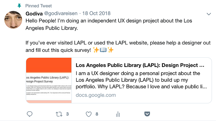
Despite my best efforts at sharing and spreading this survey via social media, it didn’t get as much engagement as I would have liked! I couldn’t in good faith build an entire project on my own assumptions from the small sample of responses to my survey…
…so, rather than throw up my hands in frustration, I figured that LAPL must have already done this kind of user research. And they did!

In their 5-year strategic plan for 2015–2020, LAPL outlines six major goals for their patrons, and for how the Library can contribute to the communities of Los Angeles. These goals are as follows:
- Cultivate and Inspire Young Readers
- Nurture Student Access
- Champion Literacy and Lifelong Learning
- Contribute to L.A.’s Economic Growth
- Stimulate the Imagination
- Strengthen Community Connections and Celebrate L.A.
With these research-identified and mission-driven goals in mind, I rolled up my sleeves to redesign LAPL’s homepage!
Deconstructing LAPL’s Existing Homepage
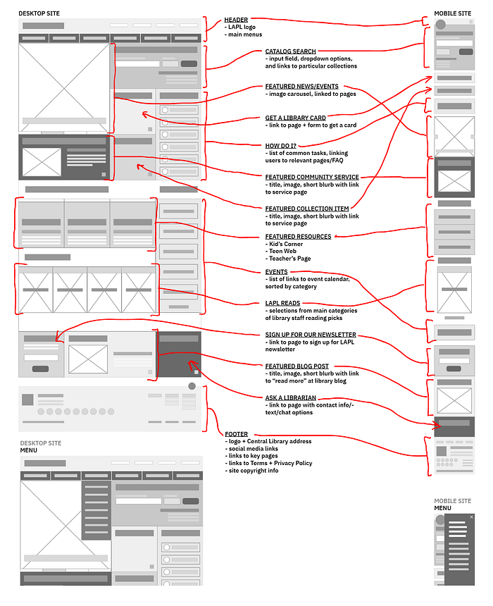
To get a sense of how the existing LAPL homepage is structured, I labeled each part of it according to the function it serves. Doing so made it easy to see what information was and wasn’t prioritized, as well as what we easy or difficult to interact with:

After doing this formal breakdown, I took a step back to see how this prioritization of information might align with how LAPL envisions its users’ interaction with the resources and services they have to offer:

To better understand the resources and services that LAPL has to offer, I did an initial content audit, visually juxtaposing the name of the service, with how it appears to users on the Library website:


How does LAPL’s existing homepage compare to other public libraries?


To see what the public library digital landscape is like, I compared LAPL’s homepage experience to that of the public libraries in five other major U.S. cities. Some insights from this comparison were:
- Each library’s Updates are most often put front and center, followed by Catalog Search / Search.
- Imagery and icons are used to break up the amount of textual information on the page.
- Seattle’s use of a sticky header allows the menu to stay in view while exploring other content on the homepage, which helps to avoid getting lost in all of the available information on the page.
- San Francisco’s small page outlay + dropdown menu navigation isn’t very “up-to-date”, however, it makes the different avenues of information easy to digest.
User Stories & Homepage Content Strategy
Before putting pen to paper (or pixels to screen), I created personas and user stories that would help to anchor my design decisions to the goals and values of the Library and its users/patrons alike. By connecting user goals with the Library’s goals as outlined in the Strategic Plan, I can ensure that the homepage redesign is mutually beneficial.
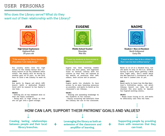
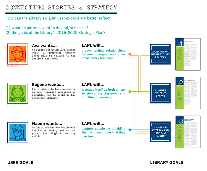
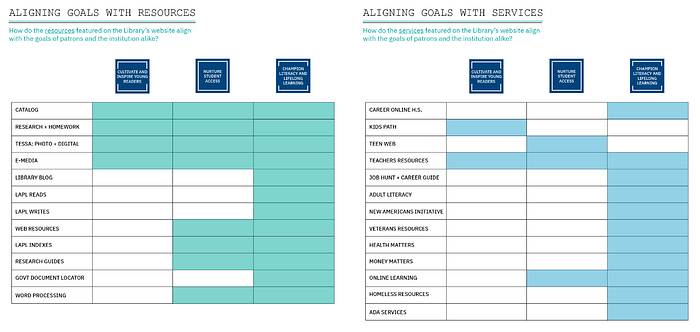
In order to connect these strategic goals with what resources and services the homepage can connect users to, I conducted a partial content inventory. Keeping in mind how these resources and services align with the goals of the Library and its users alike, I revised how content is organized on the homepage, as well as how different pages are categorized.


Sketching & Lo-Fi Wireframes
After revising LAPL’s homepage content and structure in spreadsheet form, I used diagramming and sketching to imagine what a more useful homepage content structure would be like in the abstract, for both the desktop and mobile version of the site.

I used Sketch to translate these pen and paper sketches into the first very rough wireframes of the desktop + mobile versions of the LAPL homepage. By blocking out different page areas, and sequencing them according to what information is a priority to both the Library and their patrons, these wireframes begin to give a sense of the structural changes I am making to the homepage and its content:
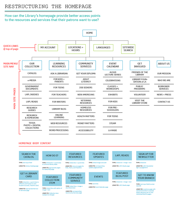
Information Architecture & Rethinking Visual Style
Before creating higher fidelity wireframes, I wanted to better define the structure and form that the new homepage would take on. To define the structure of the homepage, I mapped out a simplified information architecture, showing what content will be accessible from the homepage:
To define the form of the homepage, I took the opportunity to flex my visual design muscles and create a brand new logo and logotype for LAPL. The new visual style was largely based on the Library’s Strategic Plan publication, as well as the visual language of the mosaics on Central Library’s tower:


Mid-Fi Wireframes
Building on the initial lo-fi wireframes, the mid-fi wireframes contain high-level content, as well as some experimentation with how the visual style could be applied to the homepage look-and-feel. The modular grid structure is inspired by the Seattle Public Library’s homepage that I analyzed in an earlier research phase.


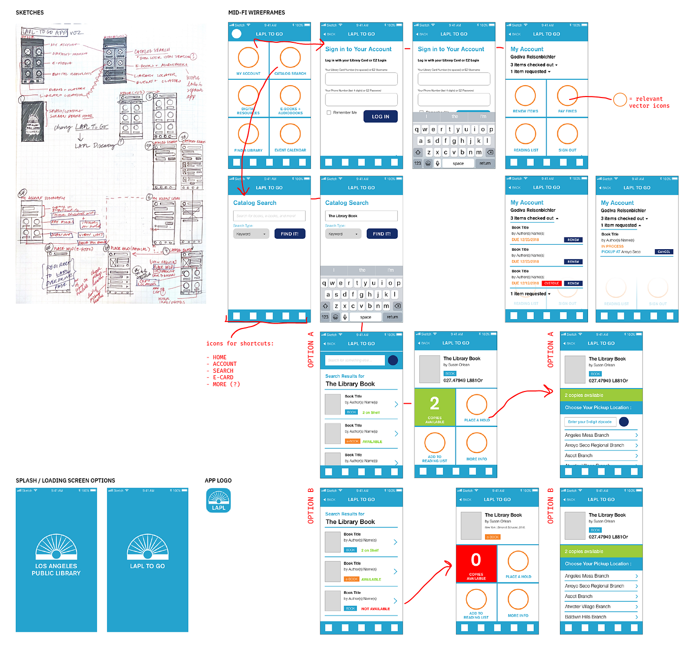
Rethinking the Mobile App: LAPL To Go
Functionally speaking, LAPL To Go (the Library’s mobile app for browsing the catalog and checking your library account) does everything that it needs to do. But if the LAPL mobile app is an extension of (and concentration of) the Library’s homepage, then it’s important for me to consider how the web redesign would be reflected in the mobile app experience.

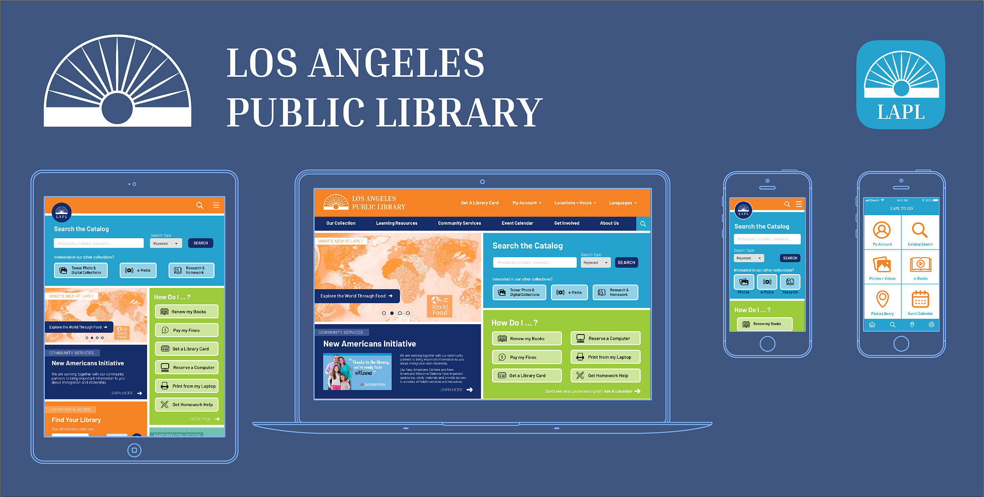
High-Fi Wireframes & Interactive Prototypes
Using ProtoPie, I was able to create interactive prototypes using the high-fidelity wireframes I created in Sketch. Previously, I had only used Keynote (which works but can be tedious and limiting to use) and InVision (which I had used up all of my free projects on), so I tried out a bunch of new prototyping apps. ProtoPie was the one that gave me the flexibility I wanted to make my hi-fi wireframes interactive. Check them out below!
Desktop Homepage Demo ↘︎
Tablet Homepage Demo ↘︎
Mobile Homepage Demo ↘︎
LAPL To Go: Mobile App Demo ↘︎
Next Steps & Conclusions
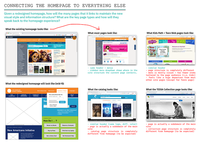
Now that I’ve redesigned LAPL’s homepage and one dimension of their LAPL To Go mobile app, I feel like I’ve just taken the first step in redesigning their entire digital user experience. The logical next step is to figure out how all of the pages across the LAPL website can be redesigned to harmonize with the homepage, both in structure and form.
After considering what most pages on the existing site look like compared to the homepage redesign, I took a first pass at sketching out what other core pages could look like:


If I were to do this project again, what would I do differently?
Well, where do I begin?! Since I did this project completely on my own, without the support of a budget, a team, or direct access to LAPL users/patrons, I had to make some informed assumptions based on the precedent that LAPL has already set. I worked on the project anywhere from 10–15 hours per week over nine weeks, so I also had to make the most of the time I could give to it.
If I had all of the support and time that an official project with LAPL would make possible, here are a few of the things I would do differently:
- Expert Interviews & User Research: While I was thankful that I could access LAPL’s 2015–2020 Strategic Plan to anchor my project to the research and insights that they’ve already collected, it was not an ideal method of design research. I would love to work directly with LAPL leadership, interview librarians at different branches, and conduct a more thorough and interactive study of how LAPL users interact with the Library digitally.
- Card-Sorting & User Testing: Conducting a card-sorting exercise with LAPL leadership, librarians, and LAPL users would have been very useful when mapping out the new information architecture (and probably would have helped me to arrive at a more streamlined navigation scheme). Testing my prototypes with users early on in the process would have also helped me to clarify what content should be featured on the homepage.
- Content Strategy: I would have liked to work directly with LAPL programming and strategy teams to inform how the website homepage can better showcase the resources, services, and programs that the Library wants to promote.
✨📖✨ Thanks for reading! If you have any questions or feedback, feel free to leave them in the comments or send them to godivareisen@gmail.com.