Member-only story
Laundry symbols make no sense
Here is a potential solution, with all due respect.
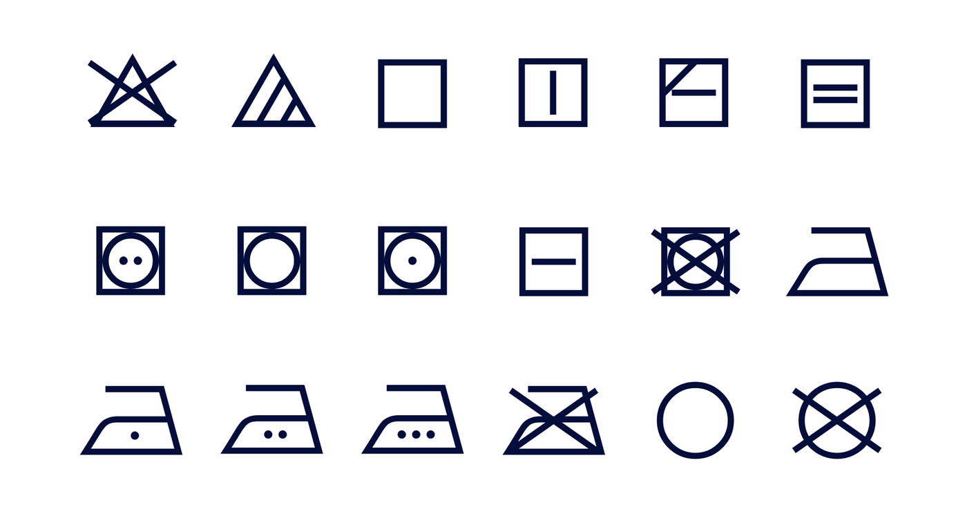
Never paid attention to those laundry symbols? You should. Not only do they save clothes, but they are also elegant and beautiful. The design (at least a version of it) is produced by GINETEX, a France-based association in the 70s. Thanks to the superior craftsmanship that goes into each icon, it aesthetically holds up half a century later.
The problem with the current laundry symbols
Despite the fact that we literally carry these symbols with us every day, they fail to educate us on what they stand for and that is the one and only job symbols have. Researcher Joni Browne showed four basic laundry symbols to the respondents, but only 1 out of 15 people got the symbols right. Almost half respondents got every symbol wrong.

The problem is that these symbols are designed to be memorized or looked up. In reality, people rarely memorize them, nor do they look up the symbols before doing laundry. Furthermore, these are not error codes where you can Google to get a quick corresponding answer. These are abstract icons, sometimes with subtle differences in between, that require a user to pull up a chart to compare and identify. Laundry itself is a hassle, the symbols should help save work and not do the opposite.
A redesign can fix this!
Unlike many unsolvable things in life, these symbols are so abstract that even the smallest modification can be the improvement needed to save thousands of innocent clothes. For the redesign to make sense, we need to understand and define the goal and constraints.
- The laundry symbols should be as understandable as possible
- The laundry symbols should work universally
- The laundry symbols should be easy to print and make economical sense to produce
- The laundry symbols should be readable when small
- Each laundry symbol should make sense when used as a standalone

