Learnability in UX: How It Creates Magical Experiences for Users

As a senior UX designer, one of my favorite aspects of the job is mentoring new talent. One particular day stands out in my memory — it was the day our team welcomed two new user experience interns. Part of my role was to guide them through the onboarding process, introduce them to our design approach, and dive into the strategies we follow.
But, as always, the most interesting part of these sessions is when they ask questions that prompt deeper discussions. On this particular day, I was racking my brain for an example that would really connect with them. While heading to lunch, I decided to heat up my meal in the office microwave. That’s when it hit me: the perfect topic to discuss with the interns was “learnability.”
As we grabbed our food, I asked them a simple but often overlooked question: “What’s a product you’ve found frustratingly difficult to use?”
It’s a question most people don’t get asked often, but it’s crucial for designers. We’ve all experienced the frustration of grappling with a poorly designed product, cursing under our breath as we struggle to make sense of it. And by the time we finally figure it out, we often forget just how maddening the learning curve was.
The interns responded enthusiastically, sharing examples of apps and gadgets that left them puzzled and irritated. The conversation naturally flowed into a deeper discussion about the concept of learnability in the user experience.
What is Learnability?
Learnability is the measure of how quickly and easily a user can grasp a new product or interface. The more intuitive it is, the less effort, time, and training users need to start using it effectively.
Here’s an example to illustrate:
The Bad: Parking Signs in Los Angeles
Parking signs in Los Angeles (LA) have been the epitome of information overload for decades. They’ve always been notoriously hard to understand, because the traffic rules are complex, resulting in the need to convey a lot of information in a small area. Look at the example below:

Imagine you are a driver along this road on a Tuesday morning at 9 a.m. Can you park at this spot? What sounds like a simple question takes a lot of mental processing to answer.
As designers, we’re often faced with situations where we have to design for a lot of information to be displayed in a small space. The parking signs in LA might be an extreme case, but many times designing for mobile apps means facing the same problems. Is there a way out — for both the parking signs and designers in general?
Designing a sign to display all the information, while being easy to understand, sounds like an impossible task. But that’s exactly what Brooklyn designer Nikki Sylianteng did.

Nikki’s proposed parking sign was eventually used in LA as part of a trial run.
Part of why Nikki’s design works well is that it is user-centered. Nikki realized drivers simply want to know whether they can park at a spot. Yes or no — that’s all drivers need, and that’s all the parking sign shows.
Her design also made use of visuals, rather than text, to convey information. The result is incredibly intuitive: green for OK, red for No Parking. It’s even designed for the color blind, with stripes for No Parking.
Now, when you look at the sign, you’ll know that on Tuesday at 9 a.m., parking is not allowed. The bars show what’s what at a glance — simple.
This is one of the simplest examples of learnability. Though this might feel simple, it could be one of the reasons why people should use your product when compared to your competitors. If they don’t understand it, it’s easier for them to quit and try a new one.
The Growing Complexity of Everyday Products
Similar is the case with appliances in our daily life. These are supposed to make our daily lives easier and help us perform actions quickly. Instead, they are being designed in such a way that it takes a while for the average user to learn how to use them
It is proven by data and a recent research study shows that many users usually prefer devices and products which are not limited to the mobile phones and digital cameras, products that are more easier to use and understand.
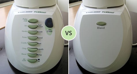
Here is a design of a TV remote: 43 Buttons !!! Are you kidding me?
Though there are many useful buttons, there are tons which appear to be unnecessary and confusing.
Also users don’t try to learn first — instead, they typically try to do what they want to do, and explore the interface to see if they can figure out how to do it. This practice is usually called learning by doing, and it means that the user is starting out with a goal already in mind; they are more interested in achieving that goal than in learning the user interface (so any learning that happens will be secondary); and the burden is on the user interface to clearly communicate how to use it and help the user achieve their first goal at the same time.
Why Learnability Matters
When users understand how a product works, they’re more likely to engage with it and keep coming back. On the flip side, if a product is too complicated or confusing, they’ll abandon it for something easier.
As designers, our goal is to make sure users can quickly grasp our interfaces. We’re not designing Photoshop — where complexity is expected. For most products, especially websites and apps, users should be able to navigate them without needing a manual.
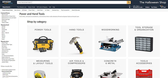
Take Amazon, for example. With its vast array of categories and products, you might expect the site to be a chaotic mess. Yet it remains surprisingly easy to use. Why? Because its design prioritizes clear, relevant components that help users understand the interface quickly.
How to Design for Learnability
So how can we ensure our designs are learnable? Here are a few principles:
Give Feedback: Users need to see the results of their actions, whether it’s submitting a form or clicking a button. Simple animations or responsive elements can provide that feedback and guide users.
Leverage Natural Mapping: Mapping involves creating intuitive connections between controls and their effects. For example, turning a knob clockwise should logically increase volume. The more familiar these mappings are to users, the easier the interface will be to learn.
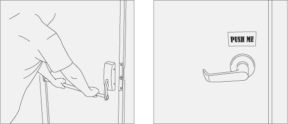
Use Affordances: Affordances are visual cues that suggest how something can be used. Think of a button that looks clickable or a handle that suggests pulling.
Minimize the Need for Help & Documentation: While help resources should be available, a well-designed product should require minimal guidance. Users should be able to figure out the basics without needing a manual.
Maintain Consistency: Consistent design elements help users build mental models. When a product is inconsistent, it feels disjointed and frustrating, making it harder to learn.
Conclusion
Every product should prioritize learnability. By focusing on intuitive designs that align with users’ expectations, designers can create experiences that feel natural and easy from the start. In today’s fast-paced digital world, where users have endless options, learnability can be the key differentiator that keeps them engaged.
So, the next time you’re designing, remember that making your product easy to learn is not just a bonus—it’s essential for creating lasting value and user satisfaction.
Please clap and encourage me to write more.
To learn more about me, Visit www.vamsibatchu.com
Here are a few of my articles on User Experience (UX):
- LinkedIn User Experience Reimagined
- 10 tips on how to conduct a perfect Heuristic evaluation
- 5 Navigation Tips to Improve UX of your Product and Business
Thank you for your time.