Member-only story
UX Design
Learnings for designers, from Indian movie posters
Some Indian movies have been brilliantly made keeping in mind the mood and theme of the story. Not all, but many use strategical colour theories and moods, right in their posters, that designers can learn a lot from.
So, without wasting time, let’s look at them, starting with —
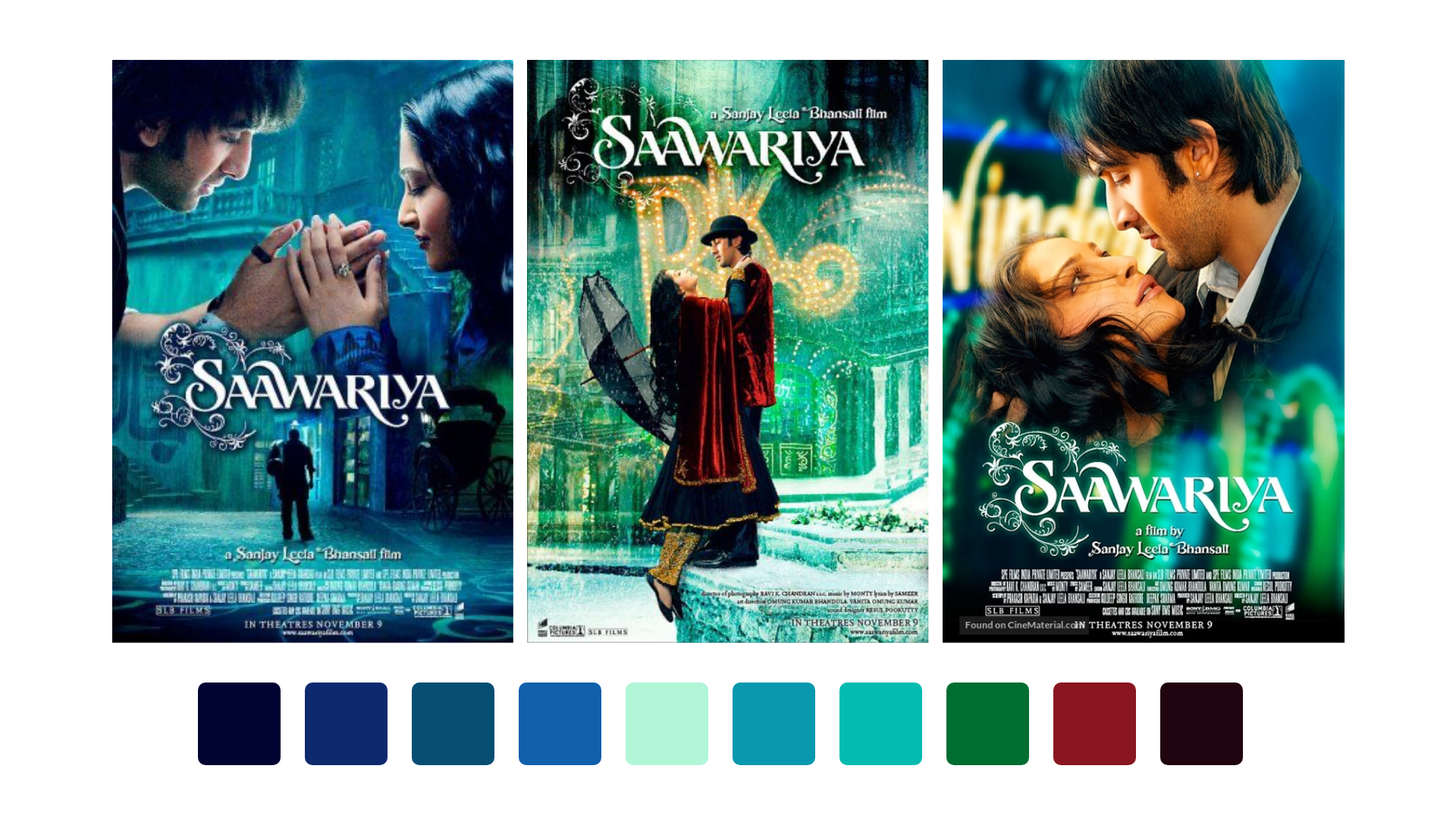
1. Saawariya (2007)
Director: Sanjay Leela Bhansali
This movie despite being more than a decade old, has brilliant music and a very strong colour theme with blue being the major colour. The story revolves around a boy who falls for a girl who is waiting for her lover, who eventually does come back by the end of the movie, and the boy turns from a lover who’s waiting, to a lover who is heartbroken.
The movie has a dull and dark setting throughout, because the climax isn’t a cheerful one. It seems as if right from the first frame the movie tries to prepares its audience for the inevitable heartbreak.
This movie is majorly about hope, heartbreak and the loss of a loved one. That is why you see a dominance of blue in the posters. However there is also a significant use of red, depicting love.
2. Devdas (2002)
Director: Sanjay Leela Bhansali
This movie is like an Indian cult-classic, based upon the novel of famous Bengali author Sarat Chandra Chattopadhyay published in 1917 by the same name. The story has a lot of twists and turns, but the crux is that the protagonist keeps his love alive for his girl, till his last breath, but the ill-fated lovers could never marry or be together.
You can also see images of Indian classical figures, drawn on curtains in the background. It depicts a ‘tale being told’, as many stories were narrated through sculptures, art and drawings in caves and temples. Many Indian temples still have a lot of carvings and detailed sculptures that narrate different stories of kings and queens of that time.
This movie is about heartbreak, jealousy, loss of love, death and alcohol. A lot of it…