Legibility: how to make text convenient to read
When using text in a user interface, you want to be sure that your users can read it without effort and make good use of the information you want to convey. Therefore, the most crucial requirement for text is that it is legible. Learn what to be aware of to assert legibility, your first step to creating great content and self-descriptive user interfaces. With a few simple rules concerning text size, contrast, and basic typography, you can easily avoid the common mistakes of text display.
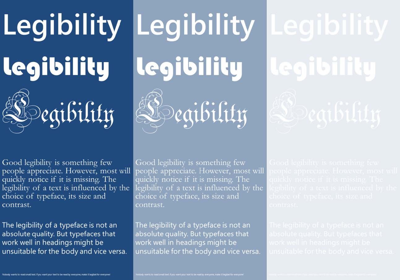
Your first step in making your texts legible is to understand what legibility means. It is closely related to readability, but there is a distinct difference. While readability is the overall ease with which a reader can understand the meaning of a text, legibility describes the features of a text that enable the reader to recognize and distinguish between the individual characters and words. Legibility is a result of the chosen typeface and font¹, its size, spacing, and the contrast between text and background. It can also be affected by the layout of the text, e.g. the text orientation and length of lines. Thus, legibility is one factor that strongly influences readability; others are phrasing, vocabulary, and use of paragraphs. As a reader, you can judge the legibility of any text that is written in a familiar script, e.g. a French text, even if you do not understand French. But to judge its readability, you have to understand the language in which it is written.
Don’t let your design resist your readers. Don’t let it stand in the way of what they want to do: read.
— Steve Krug (usability consultant, author)
Examples of Bad and Good Design
Legibility of a text is something most people will not appreciate as long as it is adequate. Only if it lacks, it becomes a nuisance that will severely worsen the user experience of any human–machine interface. When dealing with space restrictions or trying to achieve a particular design language, user interface designers often choose to adjust the text size to the space deemed available. Many texts in user interfaces or online publications are on the thin line between being convenient to read and being not.
The pictures below show the (former) homepages of BMW and Mozilla as examples of two different approaches to text size. BMW chose a text size of 11 pixels for regular content and most of their headings and links. On a 24″ screen with Full HD resolution (1920 × 1080 pixels), capitals of their typeface (Arial) at 11 pixels are 1.7 mm high, which is too small for the average person to read comfortably at a typical viewing distance of 50 to 70 cm. The text in their logo is even smaller, making it very hard to read. Moreover, most of their buttons feature dark grey text on a light grey background. This contrast leaves something to be desired, worsening legibility needlessly. On the other side, they chose black/dark grey on white for most of their links and headings and white on dark blue for some buttons, which offer excellent contrast.

Mozilla chose 16 pixels for most of the content on their homepage. Their headings, subheadings, and text sections are at least 20 pixels high, making them very convenient to read. The contrast between text and background is good as well, although they chose red and pictures as background for some of the text.
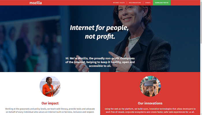
Both BMW and Mozilla use plain sans serif typefaces that work very well as both headings and text body.
The Checklist
As a user interface designer, you generally have to be aware of three properties of the text in your design:
- Is the text large enough?
- Is the contrast high enough?
- Is the typeface feasible for the job?
Fortunately, there are well-established guidelines for the first two questions. The third requirement is harder to fulfill because reading and the effects of typography on legibility are not well enough understood to give you a straightforward rule for your choice of typeface. But if you respect the following guidelines, you will be able to design content and interfaces that are convenient to read for all your users.
Choosing the Right Size
The recommended cap height of text legible for all kind of users is
- 0.00582 × viewing distance for headlines and important labels
- 0.00465 × viewing distance for the text body
However, this recommendation is not what most designers expect. How does this translate to points or pixels? And where does it come from?
The size of the letters will, of course, influence the legibility of a text. For most, the expected unit of measurement for legible text would be millimeters, inches, or points, the unit of letter size in printing. Would it not be easy if you just took one recommended minimal value for your text, say 12 points, and it would automatically be considered legible? Unfortunately, choosing a legible text size is not that easy. The reasons for this are:
- Besides text height, legibility is dependent on viewing distance, which can differ significantly between devices or use cases.
- The height of the letters is not reliably defined by the point size, but also by the typeface.
- Although point size used to be an absolute unit for text height in print, it is not handled that way by many modern software systems and will be rendered differently on different devices.
The features of a typeface that determine legibility are mainly cap height and corpus size (also called H-height and x-height). Point size originates from the height of the metal types originally used in printing. The point size does not necessarily equal the body height of a typeface because it can include a certain amount of spacing, as intended by the typeface designer.

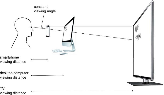
A comprehensive recommendation for text size is not given in millimeters, inches, or points, but as an angle to address the dependence on viewing distance. The human eye can distinguish between different things if they are about one arc minute (1/60 of a degree) apart. So if the angle between an object, your eye, and another object is smaller than one arc minute, you cannot tell the two objects apart.
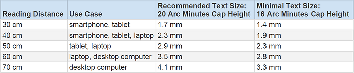
The recommendation for text size in ISO standard 9241-303:2011 “Ergonomics of Human-System Interaction — Requirements for Electronic Visual Displays”:
- The recommended cap height for an electronically displayed text is 20–22 arc minutes.
- The minimum cap height is 16 arc minutes.
For a given angle, we can calculate the text height for any viewing distance:
text height = 2 × viewing distance × tan(viewing angle / 2)
If you do the math, you will see that the ISO recommendations above lead to the simplified formulas given in the beginning. For convenience, the following table shows cap heights for typical reading distances to electronic devices.
A common rule of thumb used to be that 12 point text is generally large enough for text display on the web and in applications. If you use the above table and test the H-height of your favorite typefaces, you will find that many popular typefaces are legible at 12 points for distances up to 65 cm. This was good enough as long as the largest screens available were 24″ wide, and we did not have to display the news on smartwatches. But since the advent of 27″, 30″ or even larger screens, typical viewing distances have increased to 70 cm and more; mobile devices are held closer and allow smaller text. And future devices we cannot imagine yet will bring new requirements regarding legibility. So do not rely on over-simplified rules like “text has to be 12 pt.” The only rule that asserts legibility in all use cases is an actual height for a specific viewing distance because that is what your user will have to deal with. As designers, we have to consider all classes of devices our users might see our content on, from smartwatch screens to wall-sized advertising panels.
The Technical Obstacles
Knowing the right size is only the beginning. What makes implementing legible text hard is also the fact that the prevalent technical systems deal with text size very differently. For designers, it is essential to know that designs using point (in printing an absolute measure: 1 point = 1/72 inch) or pixel (the physical “dots” modern screens consist of) are not guaranteed to be displayed identically across devices. Some systems try to compensate for different viewing distances and pixel densities; others do not.
How sharp a screen can display its content depends on the size of its pixels. This pixel density is measured in pixels per inch (PPI, commonly also called dots per inch, DPI) and can vary from screen to screen. If a text is specified in pixels, it is three times as large on a screen with 100 PPI as on a screen with 300 PPI. Browsers on modern mobile devices with high-PPI displays try to compensate for this by behaving like they have a smaller resolution than their physical screen resolution. This leads to the confusing situation that designers have to deal with a second kind of pixels for this smaller resolution: reference pixels or “CSS pixels”. A reference pixel’s size is dependent on the viewing distance. Manufacturers have to determine a typical viewing distance for each device and display reference pixels accordingly. Unfortunately, some manufacturers implement this principle rather freely; not all of them use the same CSS pixel densities for the same screen sizes.
Besides reference pixels, there are several other units for font-size in HTML: point, pica, inch, cm, mm, em, rem. In a nutshell: Only use pixel, rem, em. All seemingly absolute units like point or mm are tied to the reference pixel at fixed ratios (i.e. 12 points = 16 pixels). This means they will seldom be displayed correctly. If you want to know more about HTML’s units, look here: https://www.w3.org/Style/Examples/007/units.en.html
In application development, text size is usually defined in point, which is unreliable as well. Many desktop and laptop computers cannot determine the pixel density of their screen and assume a density of 96 PPI by default. On many modern displays with higher pixel densities, text specified in point may be displayed too small.
Providing Adequate Contrast
Besides text size, the contrast between the text and its background is just as critical for legibility. Fortunately, checking if your content offers sufficient contrast is rather easy. The guideline by the W3C demands a contrast of at least
- 4.5:1 for small text
- 3:1 for large text (at least 18 points or 14 points if bold)
You can use tools like http://webaim.org/resources/contrastchecker/ or http://contrastchecker.com/ to find out the contrast between your text and background.
While white text on a black background offers the same contrast as the other way around, you should prefer dark text on a light background as long as you expect your content to be read mainly in daylight. Light-on-dark themes are preferable for night use and some indoor work environments. Reading on bright screens in the dark is tiring for the eye. The same is true for the opposite, to a lesser extent. It worsens legibility.
If you plan to have text on inhomogeneous backgrounds like images, check if the contrast is high enough in all areas. If the image behind the text has both light and dark parts, it might be a good idea to insert a half-transparent or opaque layer behind the text.
Avoiding Unfavourable Colour Combinations
The following color combinations between text and background may lead to poor legibility and should be avoided:
- red and green
- blue and yellow
- red and blue/purple
Due to the way our eyes work, most so-called color-blind people usually cannot distinguish between red and green, some between blue and yellow. If there is a high contrast between the colors, this is not a problem; but if the contrast is only moderate, the text can be unperceivable for them. Nearly 10% of men and 1% of women have trouble seeing colors in some way. Take a look at your designs in grayscale to check if all texts offer sufficient contrast.
Red text on a blue background and vice versa may be hard to read as the text “sticks out” or is hard to focus on. The reason for this is that those colors are far apart in our visible spectrum, so if the eye focuses on the one, the other will be slightly out of focus (Chromostereopsis).
Choosing a Suitable Typeface
Typographical design should perform optically what the speaker creates through voice and gesture of his thoughts.
— El Lizzitsky (typographer, designer)
When choosing a typeface, some designers only rely on their taste or dubious rules. Which features make a typeface easily legible is not fully understood; centuries of research show somewhat contradicting results. However, the following information can help to avoid the most common mistakes.
Serif or Sans Serif? Originally, sans serif typefaces were generally recommended for text display on screens because serifs could not be displayed on low-resolution displays without looking fuzzy. In print, serif typefaces have been preferred for centuries, being deemed particularly legible because the serifs help the gaze to follow the horizontal reading direction. In summary, scientific findings show no clear superiority of serifs vs. sans serifs or vice versa. So if you know for sure that your text will be displayed on screens with sufficient resolution, you can choose either one.
Designers like even grayness, which is the worst thing for a reader.
— Erik Spiekermann (typographer)
For most typefaces, regular and bold fonts offer the best legibility (weight between 400 and 700). Both light weights and very heavy weights (extra bold, black) will usually considerably worsen legibility.
Light/condensed fonts should only be used in situations where text size and contrast are more than adequate. If you choose a typeface primarily so that your text body has an even texture, it is probably not as legible as it could be. Bold font might improve the legibility of typefaces with notably light weight in difficult reading conditions.
To estimate if your preferred typeface is legible, you should compare it to the most common typefaces. Research shows that readers read faster and are happier with familiar typefaces than with unfamiliar ones. So, the more your potential typeface differs in weight, spacing, or letter style from the most common typefaces, the more likely it is that your readers will suffer a disadvantage. While large headlines leave a little room for artistic freedom, do not experiment with your text body.
Styling Special Text
There are several possibilities to emphasize certain parts of your text: Bold, italic, underline, all-caps, highlight, different typeface, different text color, shadows, frames, etc. But excessive use of style variants worsens the legibility of your text:
- There should ideally be only three style variations of your text close to each other. Considering there is already normal text and underlined text for links (at least on the web), you should usually choose only one of the above for emphasis.
- Keep the total number of text stylings to a minimum. As a rule of thumb, there should be no more than five different variations of text style for websites that primarily display text. Interactive web apps should not use more than seven. While different text stylings can help to communicate the importance and structure of the elements in your user interface, every additional variation makes it harder for the reader to understand the differences.
- Long sections of underlined text are hard to read. Keep the linked part distinct, but short.
- Elements that show by design that they are interactive, like buttons and menu items, can omit the underline for better legibility.
Why Legibility is Important
Unfortunately, you will find many, even very prominent examples of user interfaces and web content that do not conform to the guidelines in this text. It is tempting for a designer to follow their lead because some of those examples are successful and seemingly good enough. But think twice about the following points and why truly great design has to be strict about text size, contrast, and good typography.
- If you think a small text size is sufficient, it may well be because you have average or better-than-average eyes. But do you want your design just to be good enough for the average? That means making life hard for half your potential users.
- Do not rely on the possibility that users can enlarge text. Most users never change the defaults of their devices. They will most likely live with your design choice and have a sub-par experience.
- The majority of people are visually impaired in some way and need a form of correction like glasses. But many of them do not wear them during their daily routine. Do you want your design to force them always to get their glasses?
- If you think people that cannot read your text just have to come a little closer to the screen (or hold their phone closer), be aware that a quarter of people are far-sighted. They will instinctively move farther away, making small text even harder to read.
- Even if your text is just a little smaller than it should be, it will take more concentration to read. This additional effort will subconsciously lead to frustration with your interface in the long run. Do not give away an opportunity to be superior to your competitors.
The Take-Away
The legibility of your text is paramount for any user interface because it is a prerequisite for readability and therefore usability of your design.
- Provide sufficient text size, contrast, and a typeface that does not deviate too much from the readers’ expectations.
- Point size is not a reliable unit for legibility concerns. Measure the cap height of your typeface of choice.
- Find out on which devices your content might be read and calculate the minimal text size for all relevant viewing distances.
- Only the actual height on the screen is relevant for the user. If you cannot be sure that the technical specification of the text size will guarantee adequate cap height, a ruler and a test device are the way to make sure.
- Your readers are very diverse and may not have as good visual acuity as you. Being a bit finicky about text size and contrast is a good investment, which in the end will lead to better user experience.
References & Where to Learn More
An overview of scientific findings about attributes of typefaces that influence legibility: Sophie Beier, Reading Letters — Designing for Legibility, 2012
The different units for size in HTML: Bert Bos, Units of length: px, em, cm, etc., 2010: https://www.w3.org/Style/Examples/007/units.en.html
A summary of what a reference pixel is and how it affects web design: Scott Kellum, A Pixel Identity Crisis, 2012: http://alistapart.com/article/a-pixel-identity-crisis
¹ This text uses the original distinction between typeface and font. The typeface (or font-family) is the general style of the letters, e.g. Arial, Helvetica, Times New Roman. In computer programs, available typefaces are incorrectly called “fonts”. Fonts are variants of typefaces with specific attributes changed, e.g. bold, italic, condensed.

