Let’s talk about card design in web design
“I want a card”, this is the first demand point that the customer said in the last issue when talking to me about demand. There is no doubt that the card type is excellent for both PC and mobile phones. From online shopping malls to social media sites, card design has become a powerful trend in web design. The most important reason must be its flexibility.
Cards can be of any shape, color and form. But in general, they all contain pictures, icons and some basic text information, such as title, user name and location information.
“However, the core of its popularity is its simplicity. You rarely see complex card designs. The reason why it appears is to guide users to click it.”
As a web designer, how do you use cards? When designing cards, what should you pay attention to? Let’s talk about it below.
What makes card design unstoppable
When it comes to practicality and beauty, card-style design can be said to be superior to others. The characteristics listed below may be the reason why it can win.
1. Responsive
Responsiveness is an old saying, it has become a hard requirement. Most customers have prepared responsive solutions for various endless mobile devices, so the card-type is born. In order to meet the needs of various screen sizes, the card design can help users focus on specific content very conveniently, and also allow designers to lay out the content reasonably and concisely during design.

2. Orderliness
The chaotic website is a headache. When we organize different kinds of elements on the page, the card design can provide a wonderful order for the layout of these contents. This is good for designers and users. Kelsey Drake ‘s website may show this feature.

3. Legibility
A very important feature of the card design is that the information they contain is very concise, which makes them interesting and fascinating, but it also makes the content of the website relatively simple and quickly glances at a glance. Websites like NamesForChange.org make every card vivid and easy to understand.

4. Favored by social media platforms
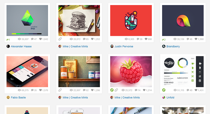
Think about how a social media website is built? What they need is a clear, easy-to-read and fast display. Considering the card design again, don’t you find the connection? The most famous examples of card design are Pinterest and Dribbble.

5. Equality
Another characteristic of the card design is equality. The equality here is of course not absolute. That is to say, the importance of each card in the card design in the entire web page is almost the same. This saves everyone the trouble of ranking the content. You might as well look at the AHH website and you will understand.
6. Versatility
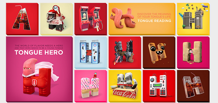
The card design can be used for almost any purpose in any industry, and its creative flexibility is very great. It can be said that there is no conclusion on the design style, which gives the designer a very large creative space to play. Take the website Futurefabric.co.uk , for example, the designer uses a card design to display his different types of works.

What should we pay attention to in the card design
Come to the point! As a UI designer, if you want to apply the card style, you need to pay attention to these places (the following is my experience)
1. Leave blank
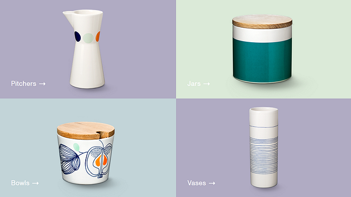
Blank space is an old topic, but card design will easily ignore this problem, because your focus is on the card, and you will fall into a mess if you are not careful. You must make good use of blank space (or negative space). Not only the space outside the card, but even inside the card, the space outside the product display also needs to be handled carefully. Take a look at the product display on the Danish company website and use the blank to make the website very smooth and natural.
2. Details
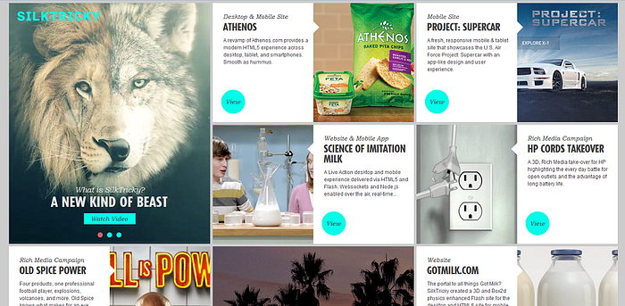
The card design brings simplicity, but at the same time it must be emphasized that the richness of the content. This must ensure that the page can provide enough page content to guide the user on a certain basis, otherwise the user will only feel dazed. [Silk Tricky] (Silk Tricky) ‘s website perfectly balances simplicity and content richness. It allows two adjacent cards to display the same content, one picture and one text, and cuts the page due to the tiled screen. Out of monotony. It also uses the highlight button of “VIEW” to remind and attract users to click to enter the details.
3. Something different
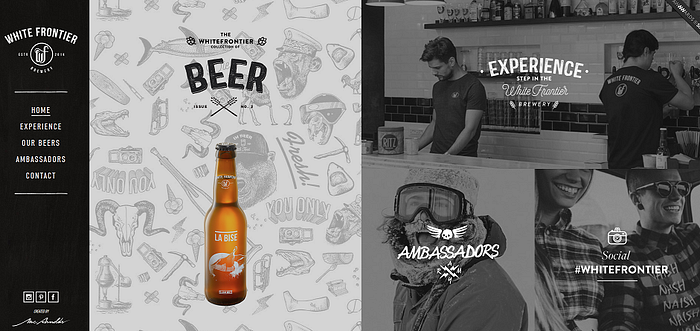
The card design has its repeatability, but it does not mean that it must be monotonous. Don’t be afraid to add attractive personalized things to your project. The client may reject it if he doesn’t like it, but it increases the possibility of paying for your creation. Dazzling little animations, unique color matching styles or refreshing fonts are all worth trying. Just like the efforts made by the White Frontier website.
4. Use grid
Needless to say, this one is really useful for making web pages look more coordinated.
Postscript
The extension of the card design is almost endless. Open your Photoshop and see how many card design layouts you can come up with?


