Member-only story
Let’s talk Neumorphism and Accessibility

Neumorphism is predicted to be one of the top 2020 UI design trends. You might have seen it everywhere as a Dribbble shot. Neumorphism is a play on words based on New + Skeuomorphism. It is a style that uses blur, angle, and intensity of an object’s shadow to highlight the object. It’s a design that looks realistic, futuristic, modern, appealing and extremely breathtaking due to its soft shadow and overall appearance.
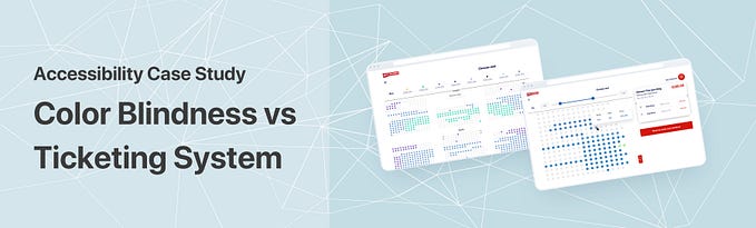
But let’s be honest, it’s not the most practical design for actual use. Try building and releasing a product that has used Neumorphism as its main style, and you’re most likely going to frustrate everyone — including your developers, users, and accessibility users (There are currently 57 million Americans who have a disability of some sort with 54% of adults living with a disability go online. Disabled users are NOT a myth.) — [Source: W3.org]
According to W3, Web and Mobile accessibility encompasses all disabilities that affect access to the Web and Mobile, including:
- auditory
- cognitive
- neurological
- physical
- speech
- visual
Neumorphism alone does not support cognitive, physical and visual disability, as it is.
Let’s dig in as to why Neumorphism and Accessibility can’t get along.
Disclaimer: I am not an accessibility or neumorphism expert. This article was initiated for sharing ideas and thoughts on Neumorphism. The Dribbbel shots used below are only intended to be examples to highlight my points on the matter. I do not intend to bash, insult or make fun of any designer below. Do not send them hate. If your design is listed below and you’d like it to be removed, please feel free to send me a message.
— Visual: Neumorphism is hard on vision loss, blindness and color blindness

When you design a button with an important CTA, you often consider and take note on the contrast ratio to make it stand out, as well as easily readable…