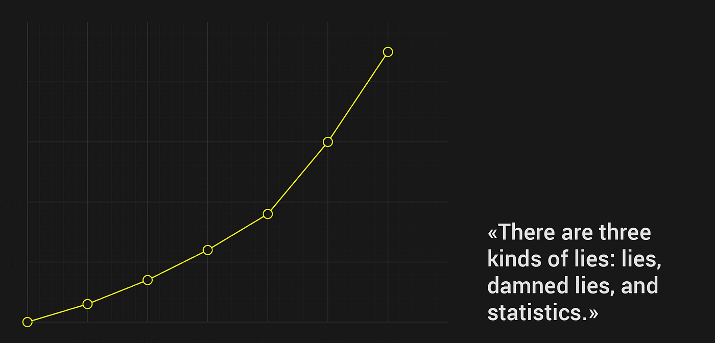
Line chart design made simple
How the increasing amount of data around forces users to search for the most effective ways to consume it.
How did my income change in the past 5 years? Did I lose weight? Did world carbon emissions grow this year? We likely do not want a 10 min. read answer to any of these questions. We want to get the answer fast and move forward. We want data to be visualized.
What is a line chart
A line chart or line graph is a type of chart which displays information as a series of data points called ‘markers’ connected by straight line segments. — Wikipedia
A line chart is one of the multiple ways to visualize data. It is well known by both analytics and non-professionals. We will try to find out, which data is best understood in the form of a line chart, and what design detail is needed to provide the best user experience for this kind of data visualization.
History
People have been using line charts for hundreds of years.
William Playfair is believed to be one of the first to use a line graph to represent statistical data in the 18th century.

But here is the visualization of the Planetary cycles from the 10th century — a line graph from more than a 1000 years ago!

The humanity had quite a while to bring line charts to perfection. And with the development of computation we are now able to present huge amounts of data as charts, also making them interactive, colorful and even 3D.
With all the benefits of digital data visualization, we have to be particularly careful about the user experience. The accuracy of data representation, the visual integrity, and the graphic design have to work together to help the user scan the data. We do not only provide the visual, we teach our users to see and find their insights between all those numbers.
What data should we represent in the line chart?
Line chart is a good idea if you have continuous data and you want to show:
- Change over time
- Trends
- Comparison of the change for several groups
- Prediction
When working on data visualization…
- Do not be afraid of the data. Ask for a real data series to use in your design. If you can’t make sense of the data, there will be someone to help you. But if you get confused and decide to “just through the numbers in”, you can end up creating a pretty mockup, that will be a total mess in real life.

2. Know your users. As obvious as this might be, knowing your users is key to the good data visualization. A data analyst and a high school student would probably have completely different goals and perceive information differently while looking at the same chart.

3. Above all else show data. I try to always go back to Tufte’s data-ink concept when working on data visualization. What is there in my chart, that does not help the user? Will it be better if I remove it?

When designing a line chart
- Do not get tempted by the pretty picture. Your goal is to help the user to interpret and understand the data. WOW effect is great if you are making a promotional page, but if you are designing a dashboard, you probably want the “Now I get it!” from your user.
- Start at zero or make it clear. There is no rule, that axis has to start at zero (as in the bar chart). But most users will assume it is starting at zero if you don’t clearly show the opposite.
- Do not show too many lines. If there is a need to compare data series, be especially careful choosing colors for them. It will work best if you let the user choose what he would like to see.
- The legend should be available if your goal is to show more than one data series.
- The axis should always be named. When showing multiple y-axes — name them all.
- You don’t always need grid lines. But you always need readable titles and labels.
- Hover tooltips are great, but they are only a helpful detail. The information should be clearly communicated without the user having to hover over each line.
- Use trendlines, thresholds, and predictions with caution. These are detail that bring value to the user. So the goal is to differentiate them from the rest of data. Let the user choose if these are what he wants to see. Maybe he just wants the data.
- There is no need to include everything in a single chart. Always start with a single user goal and choose the best design elements, that will lead to achieving it.
- Do not use 3D charts. Just don’t (exceptions apply to AR and VR industries).
The list of these rules can be much bigger, and we probably could get into detail around each part of the line chart. But the most important rule is to think “Value”. If you have to break all the design rules to provide your user with the insights — do it.
Inspiration


Resources
Explore my other posts
Liked the read? Leave some ‘claps’ below so it will be visible the other members of the community 🙂
I will be excited to read your feedback and get this design to the new level!

