You're reading for free via Rita Kind-Envy's Friend Link. Become a member to access the best of Medium.
Member-only story
LinkedIn is an example of a bad product we just got used to
Hell is empty — all my colleagues are here.

LinkedIn is a type of social media. Social media obeys usability heuristics, like everything else on the web. For example:
- Users often perform actions by mistake. They need a marked “emergency exit” to leave the unwanted action without having to go through an extended process.
and, to add to it:
- Users should not have to wonder whether different words, situations, or actions mean the same thing.
However, LinkedIn, once you try making sense of it, breaks both of these rules. Look at this:
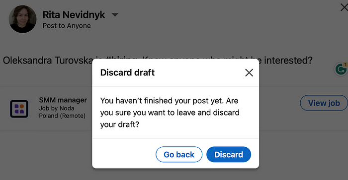
Here’s my journey: I’ve decided to repost a position from my ex-employer (because Noda is a nice company) but changed my mind.
1. How many times do you need to “you” me? Apparently, five times in two sentences. “You (1) haven’t finished your (2) post yet. Are you (3) sure you (4) want to leave and discard your (5) draft?”
2. “Go back” and “Discard” — seem to perform the same action to me. “Go back” is associated with cancelling an action and going back to the Home page. Discard=discard draft. So what’s the difference? I’m losing it.
3. Other languages average 1.5 times longer than English, so text that’s short may be long when translated. So, three lines of text? I’m scared to see how it looks in German.
How Google would write a similar screen:
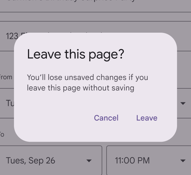
A good thing about the Google example, besides:
- being concise
- not overly crazy about you (Google recommends using the second-person pronouns “you” and “your” to help the user feel like the UI is talking to them and referring to their actions)
- simplifies English: “Leave” or “Cancel” instead of “Discard” and “Go Back”
it also tells users what will happen if they take action right away, without the lyrical “You (1) haven’t finished your (2) post yet.”
But that’s just my little UX Writing tantrum, just a drop in the ocean. LinkedIn, as a whole, isn’t that good at all. Let me demonstrate a few more “product” examples.
1. Recommendation algorithms are corrupt
LinkedIn is “corrupt” as hell. If a job is irrelevant but sponsored, LinkedIn will still show it.
As a UX Writer, I get recommended random sponsored jobs with ridiculously long and “pushy” names, such as “Platform Engineer — Elite Quant — Up to £160,000 Starting base + Exceptional benefits/bonus package Fund”:

This is bad for several reasons:
- Poor job-matching algorithms. LinkedIn is either prioritising paid job ads over relevance or using flawed recommendation logic.
- Lack of user context awareness. My profile says “Content Designer | UX Writer,” how much clearer can I get?
- Deceptive framing of “You’re a top candidate.” It suggests personalised validation, making me believe I am a “strong candidate,” but in reality, no effort has been made to assess actual fit.
2. Workarounds to get to saved posts
A user workaround is when people have to find their own way to complete a task because the system doesn’t provide a clear solution for that.
If you want to find your saved posts, you won’t find them in the profile menu (where they logically should be because I saved them to be close for a reason). Instead, you have to:
- Go to “Jobs”
- Click “My Jobs”
- Find the “My Items” tab
- Finally, see a way to your saved posts:

LinkedIn knows exactly why it’s popular — connections. For now, there’s no real alternative corporate job-seeking platform because, like it or not, this is where all my colleagues are. And since hell is empty, we’re all stuck here.
3. How much Premium does one need?
And LinkedIn is very self-aware of this monopoly. That’s why the push to buy Premium is everywhere.
I had Premium once (wasn’t impressed at all), and now my Home page is filled with at least three advertisement entry points at the same time:

If Premium was a truly valuable feature, it wouldn’t need this level of aggressive marketing. Just saying.
4. The “artificial” help of filters in job search
This one was pointed out by Ashwin Mohan on UX Collective.
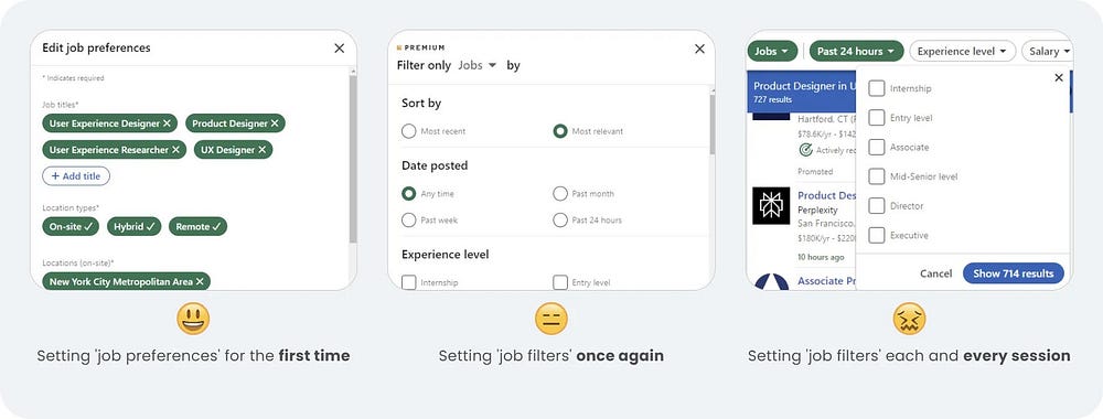
LinkedIn’s iconic filter function was pretty much built around the nuances of job opportunities. While they’ve evolved with time with various features like ‘top applicant jobs’, ‘location types’, ‘easy apply’, and ‘salary range,’ etc., they are still ineffective as the overarching function of filters fail on many fronts.
The main point is that no matter what filters you set, they don’t save for the next search. It’s a half-baked feature that shows just how little value LinkedIn actually puts into them.
You do not find a job in one day. Users are definitely returning to search. So why not make their lives a bit easier?
5. Pointless repetitive actions
“Show less like this.”
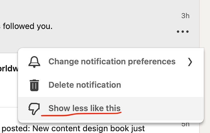
This option makes sense when you’re dealing with algorithm-pushed recommendations — posts, job listings, or trending topics. But when it’s an actual event, like someone following you or a birthday notification, what does “less like this” even mean? Putting “Show less like this” under every notification just doesn’t make sense to me.
6. The profile menu is useless
Take a look at the profile menu:

This profile menu is a textbook example of poor information architecture — a collection of low-value, scattered options:
- “Settings & Privacy” is the only useful one
- “Reactivate Premium” is another ad disguised as a menu item
- “Help” and “Language” — seem like rarely used items for me, especially the “Help” one.
- “Job Posting Account” is a niche for a small subset of users — I never use this one.
So it seems like LinkedIn really didn't know what to put under the avatar menu and resorted to very random or very basic items.
Also, isn’t it scary that you never see the bottom of the page on LinkedIn? That’s usually where the language options are. LinkedIn uses a “bottomless” method of YouTube, except that here, most of the suggestions are trash.
LinkedIn wants you to have three eyes, not two
I find it very tiring to deal with the platform also because of its layout:

LinkedIn’s layout is exhausting because it forces your attention in 3 competing directions at once, making it cognitively draining.
Each column is trying to make me do something different:
- Left column. Manage my profile, check analytics, and maybe click on “Saved Items”. Wait, saved items?! (???) OMG, I’ve found them! 3 years after I started using LinkedIn.
- Center column. Start a post, consume the feed, and interact with content.
- Right column. Read LinkedIn News, play puzzles, or — wait — should I reactivate Premium?
It fragments the experience by pulling attention in too many directions.
I feel exhausted even after this shallow dive into the platform, and I’m left with more questions than answers:
- Do users really just get used to bad products?
- What psychological factors drive adaptation to poor design?
People don’t always choose the best design or the smoothest experience.
There are hidden costs that keep users tied to a product*— factors beyond UX that determine why they stay. And when it comes to LinkedIn, these reasons are impossible to ignore:
- Utility-over-usability effect. Users tolerate bad UX until a competitor makes usability a differentiator. For now, there are no real competitors.
- LinkedIn has social proof and value. A product can become someone’s identity if there is enough social or emotional attachment. A LinkedIn profile is a status symbol, reinforcing professional credibility. Plus, when everyone else is using it, it validates continued use — staying on the platform feels necessary.
LinkedIn is not good, okay? But it’s an exception. People don’t stay here for the UX — they stay because everyone else is here. And for now, there’s nowhere else to go.


